

Filed under: printmaking | Tags: art, artist, drawing, Ink, Monotyping, Paul Klee, print, printmaking, visual art
Today, I took a great class with Joyce Silverstone. We focused on trace monotypes, which is something that she incorporates into her work (which is outrageously beautiful). Apparently, Paul Klee often used this technique. You can see an example of his work here. How it’s done: you basically ink up a plate, gently lay a piece of either blank or previously printed paper on top, then use any sort of tool to make marks on the back of the paper. The paper is pushed against the inked plate, and will pick up the ink, where you apply pressure with a tool (pencil, finger, anything!). It seems that Klee would often watercolor these trace monotypes. We just printed other layers of color on our drawings.
Here is my first print…I was relatively happy with it:

I liked the little yellow boxes…This next print didn’t start out well, but I worked to improve it:

I am now more happy with it. It could probably do with more attention, but I stopped to work on other prints. Here’s the next one:

I think that I’m content with it. While I think that on it’s last pass through the press, I “equalized” the color more…which wasn’t so great…but I created the abstract yellow marks, which were what I intended. The last print:

I like this one too. I had some technical troubles with some of the white lines. If I had had more time, I would have worked on improving them. But, it was the last print that I was working on, so I think that it is complete enough for now. You may notice that elements of one print sort of show up in another print. I sort of worked on all four prints simultaneously, so they all influenced each other. It was also really great to see what other people in the class did…so inspiring.
All in all…it was a very fun day. Plus, I got a Happy Meal for dinner…what more could a person want? Well, one of those Takach presses would be nice, but a Happy Meal fits my budget more. (Anyone have a press that they are “tired” of? I can promise it a good home!) 🙂
Filed under: printmaking | Tags: art, artists, drypoint, Ink, print, printmaking, visual art
Today, I printed those tiny plates that I made. I had moderate success. It was amazing to me how difficult it was to wipe the plates well. How it works: you smear ink onto the plate, in order to push it into the grooves/scratches onto the plate. Then, you need to wipe off the excess in order to print it. This final stage of wiping the plate is so demanding, especially with these tiny plates. It was so hard to tell if I had taken off too much ink, and would end up with a pale print…or leave on too much, then end up with a dark print. I don’t think that I “hit the nail on the head” with any of them, but I think it’s really interesting to see how differently a plate can print, depending on how the plate is wiped. First, here is an image to give you a general sense of how small these plates are:

So, what is that…less than 2″ x 2″? Something like that…it’s TINY. So, here are the prints. My first test print was of a building in Montreal…I wasn’t so happy with this print. I took off too much ink:
 It just turned out too faded. Then, I printed this first “tractor” image:

I decided that the red was not good, so I printed it more monochromatically:

This was better, but I think that I overwiped the plate. So, I tried again:

This seemed better…but I still wanted to try again:

This one was too dark. Hmmm! I think that I try to print this plate yet again sometime. This plate is only around 1.5″ x 2.5″ big, so I’m holding this tiny thing in my hand…trying to be so careful as I wipe the ink off.
Here is the other plate that I worked on. I think that the best print was the first one:

I like how this turned out, even though his face is a little strange. But, I thought that it was perhaps a bit dark, so I tried again:

This was much too pale! Frustrating. So, I tried once more, and got this one:

That was a better balance of light/dark, but I think that I overwiped some of the details. I am using just the tip of my finger with a cloth on it to try to gently wipe away the ink. I look sort of like King Kong tickling a triscuit. Overall, I liked working with these.
Anyone else out there print drypoint plates? Suggestions? Comments?
Filed under: printmaking | Tags: art, artist, Ink, linoleum print, print, printmaking, pronto plate, Relief print, Visual Arts
Just want to extend a very grateful “thank you” to the Arlington Center for the Arts! They had a lovely reception at the “Images of Arlington” show opening, and a nice ceremony where…I received my award! It was great to see everyone’s work…such a diversity of media, ideas, viewpoints, etc… The show is up until mid June, I think, so stop by!
This morning, I finished up a TINY linoleum print, and the pronto print that I was working on. The tiny linoleum print is a mere 1″ x 3″ (approx). So small! The darkest color was actually a layer of transparent blue…but it becomes a deep reddish/purple on top of the other colors. This photo makes it seem a little darker than it really is:

What do you think? Kind of interesting…I think that the faces turned out well, considering how tiny they really are…This was a reduction linocut, so I can’t reprint this one! I’m going to do more of these with transparent ink…
This is the finished pronto print:

I like the “vintage” feel that these prints have. I think that printing on this new paper is also better. In addition, I bought some “anti-skin” spray for my inks. This stuff is AMAZING. Normally, this ink will dry and form a tough, chewy skin on it, which has to be removed. This is messy, frustrating, and wastes a ton of ink. This happens, even if you cover the ink with wax paper, etc., in the can. But this spray somehow works miracles, and keeps the ink soft. I love it! Everyone should go out and buy some!
I had my first carborundum class with Christiane Lippeveld. She does amazing work. We created some plates, which need to dry to print for next week. I think that I may try to get some more plexi and make some plates on my own.
Also, I have made several more TINY plates. I will try to print them tomorrow. If they turn out reasonably well…I’ll hopefully have photos to post. Bonne nuit!
Filed under: printmaking | Tags: art, artist, collagraph, Ink, print, printmaking, pronto plate, visual art
I’m working on this new pronto plate image. You’ll probably recognize it as a photo I posted recently. We’ve recovered from the snow, so I can see this plant again. I’ve finished up the magenta and cyan layers, and now am just waiting for the ink to dry so that I can do the black layer. Here’s the progress so far:

And now I add the cyan:

Almost done! I like it. This is using the bigger brayer and the new paper. I think that it is working much better than before. I wanted to do this image, as the majority of the colors were not primary. I’m so fascinated with how a halftone image of CMYK makes a full spectrum of color! Sorry it’s so gray again…another overcast day. I also added a little to this test print:

Not great. This time, I used a litho crayon to make the plate. This created a nice, sketchy line. The only drawback is that I don’t think that I can clean the plate, without also cleaning off the crayon. Hmmm. This is unfortunate. I’m not keen on these test prints, but it’s been helpful to learn more about the methods of pronto printing.
I’m also working on another lino print…very basic. I’d like to get it a little farther along before I post it. I know…I should just post it anyway. Too bad!
This Thursday is the opening of the local “Images of Arlington” show. It will be fun to go, I think, as I’ve never been to an opening when I have something on the wall. I should probably have some kind of business card. I have nothing of the sort at the moment. Hmmm. Maybe a handwritten card will be “casual” and “artsy”, not “ill-prepared”.
I was thinking, yet again, the other day, that I still don’t have one “look” to the work that I produce. I know. It’s been less than a year. I’m just always noticing where things are still up in the air with me. I am a bit envious of those who have found their “thing”, whatever it may be.
My first carborundum collagraph class is this Thursday night! (before the opening, somehow…) I am excited to work on this medium, as I like it. The prints from my last post were carborundum collagraphs, if you want to see what this type of print can look like. I think it’s a type of printmaking that appeals to me, probably because you don’t have to spend an enormous amount of time planning. It becomes closer to painting. I’ve been looking at wood engravings lately. That type of printmaking seems to take more planning that I probably would want to do. Does anyone out there do “spontaneous” wood engraving? Or, is that some kind of printmaking oxymoron? Thoughts?
Filed under: printmaking | Tags: art, artist, collagraph, print, printmaking, visual art
Yes, you heard me right…snow. The lawn is COVERED in it. I want it to go away. Now.

Trust me…everyone is moaning about it.
Today was not a super day at the studio. It’s a new semester, and the studio is crowded…very crowded. Not that I don’t want myself and everyone else to be there, but it’s just harder to work. I think that there are around 14 students for one press. This results in enormous printing queues, scrubbling for a workspace, lots of shuffling and squeezing around one another just to move about. I’m using this as an excuse for my shoddy prints today.
This first print was a total disaster. I had way too much transparent medium in the inks, and the ink itself was so sticky…I had a horrible time trying to wipe the plate. So, here is the first mess:

See…I even made the picture tiny! I’d like to make it disappear. So, that was a bit disappointing. THEN, I reinked the plate with a different type of ink, and got this:

Isn’t it fascinating that this is the exact same plate? So different, right? Well, still not good, but closer to what I wanted. Then, I made this print with the other new plate:

(The photos are so dark, as it’s an overcast day. It’s also raining/snowing out, so I can’t take my prints outside to photograph). Anyway, this one was somewhat interesting, but the border is messy. I need to file the edges of the plate. They are rough, and impossible to clean. I can imagine trying this one again, but with better colors. Here is the last one, which is a ghost print on top of a ghost print:

This turned out okay. Not thrilled with it. I do like the texture that you can get from these carborundum collagraphs. Here’s a detail:

Well…I don’t think that you can see the texture that well, but it’s there. Overall, I didn’t feel thrilled with these. It felt like an off day, as I started out with the purple mess. I think that the prints did improve, but still just so-so and blah.
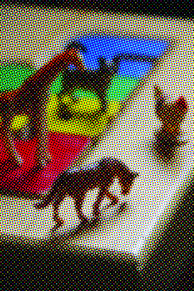
I showed my teacher the pronto print of the toy animals. She was TOTALLY not impressed. I think that her only comment was, “oh…you must have used multiple plates because you got all of these colors.” Hmmm. I’m still going to keep doing these halftone pronto prints, as I think that they’re kind of neat. Maybe she’ll like the flower one that I’m working on…
Any helpful comments about today’s prints? Suggestions? Likes? Dislikes? Who here is sick of snow? Who here wants a trip to Miami? Bermuda? Somewhere without snow…Alabama? Hmmm…
Filed under: printmaking | Tags: art, artist, collagraph, lithography, print, printmaking, pronto plate, visual art
So, I received a phonecall today, telling me that one of my prints in the local show has won an award! Seriously!!! I was so thrilled. Here it is:

I’m really happy, as I’m just a novice in pronto printing…but I did this anyway, and the judges liked it. I’ve been working on my technique a bit more, and I think that I’m going to be able to produce better results. I’ve only started another one, but I think that it’s going better:

Sorry it’s so grey…it’s very overcast today. (We’re supposed to have SNOW tomorrow! WHAT?) Anyway, I bought a bigger brayer, which I think has helped. I am also working on new paper, which I think is also helping. Of course, I’ve only done the first color out our four, so we’ll see when I get the rest on there…but so far, I feel that it’s going better.
This is a little sketch that I work on, when I’ve finished printing something more involved, like the print above:

It’s just two colors right now, but I’m going to keep adding to it.
I’ve been SUPER FRUSTRATED with a lino print that I’m working on. I can hardly bear to show it to you, as it’s turning out so horribly. It’s just the first layer, so bear with me here:

You have no idea how many times I have tried to print this. I’ve tried different paper…different ink…it always turns out blotchy. I’d like to think that I could do lino prints without a press, but I’m starting to feel that this isn’t true. IF ANYONE OUT THERE SUCCESSFULLY PRINTS LINOCUTS BY HAND BURNISHING, PLEASE HELP! What paper do you use? What ink? How do you not get blotchy/unprinted areas? I think that if I was working on an image that was mostly carved, it would probably be ok. But this one is mostly solid, and it’s just proving to be a pain.
I prepared two carborundum plates for tomorrow’s class. I think that they’re kind of neat, so we’ll see how they print!

I have a slight dilemma for next week. The official opening of the art show is next thursday, which is the same night as my first carborundum collagraph class. Egads. I have to figure out which to do, as I can’t do both very well. I may go to the class for an hour, then head over to the opening. It’s my first award, so I kind of feel like I should go…I don’t want them to think that I’m blasé about it!
Filed under: printmaking | Tags: art, artist, Ink, Paper, print, printmaking, Screen-printing, visual art, woodblock printing, Woodcut
I’ve finished up the woodcut print that I started last week. I’ve printed this woodcut several times…with several different types of ink and paper. This is on a grey Stonehenge paper with oil based relief inks:

Here is the group on our coffee table:

I’m still not happy with the printing. I’m going to have to get some feedback on it. I think that a press would help, but besides that…there must be other things that I can do to get a better print.
I also did a few abstract screenprints. I need to redo the actual screen, as it started to leak ink out of the side a little. I like these, just as a start of something…

I still haven’t found paper that I think is great with this. I’ll have to ask around. Any suggestions?

I’ll have to remount that one…

I liked that one a bit. Last one:

I’d love to have a real setup for screenprinting. One more thing on the to do list…
If anyone out there does either woodcut prints or screenprints…please give me your recommendations on paper & inks!
It’s an amazing, sunny day out there. It might even be in the 40s! We’re starting to see some activity in our “garden”. I put this in quotes, as it’s a small miracle that anything decides to come up at all. I don’t have a green thumb, even though I have good intentions and try hard. Here are what’s popping up today:

Filed under: printmaking | Tags: art, artist, CMYK color model, Halftone, printmaking, visual art
It has been brought to my attention that I might want to describe the process for the pronto prints of my previous post. Makes sense! So, here it goes:
1. Pronto plates work by having ink stick only to the marks on the plate (not the blank parts of the plate). The ink only wants to stick to distinctly black marks on the plate…no greys. So, think of a black and white photo…there is a lot of gray in there, right? Well, you can’t use that black and white photo as a basis for a pronto plate. The ink will not adhere to the grey areas.
2. In order to create the illusion of greys, one has to convert the photo to a halftone. In a halftone, the entire image is composed of dots. In darker areas, the dots are more dense, in lighter areas, the dots are smaller and fewer. So, the dot itself is not grey…it’s black, and the ink will stick to it. It’s the density of these dots that creates the shading. Think of a newspaper image…
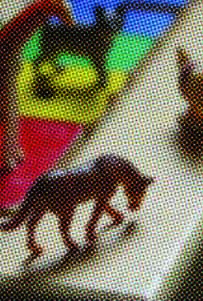
3. As I was not doing a black and white image, but a color image, I needed to create a halftone of each process color used to make the image. For printing, the process colors are cyan, magenta, yellow and black (K). This is different than the colors for your monitor, which are RGB (red, green, blue). So, I created a halftone image for each color…and when you layer them all together, it creates the illusion of a shaded image. Here is a closeup of the horse:

You need to have photo editing software to both create the halftone image, and to separate the original color photo into each of the four “channels”, CMYK. So, for this image above, you can see the cyan dots, magenta dots, yellow dots, and black dots. The patterning of these dots creates the image below:

You can control how large the dots are. The larger the dots, the easier time that the ink will have sticking to the dots…but the more abstract the image will be. Here is how the image would look if the dots were big…

This is a digital image, not an actual print from a pronto plate. So…you have to decide what look you’re after. Also, you have to see what works best with the pronto print process. You might like very fine dots, but perhaps the ink won’t stick well to tiny dots. I’m still figuring out what I think looks best. Clear as mud? 🙂
Filed under: printmaking | Tags: art, artist, Brayer, cmyk, lithography, Paper, photo, print, printmaking, visual art
Okay, my internet connection hiccuped, and I’m writing this for the second time. Grr.
So, I finished the pronto prints that I started last week. I had to print each CMYK on a different day, to let the ink dry. I also tried out three types of paper, to see which I liked best. After doing all of this, I thought of a fourth type of paper that I think will work great, but too late! Next time…
This is printed on paper #1 (Rives lightweight):

This paper worked fairly well, but it’s wrinkled. I’ll have to experiment to see if I can flatten it.
Here is paper #2 (Arches 88):

This paper is smooth, and picks up the ink well. Unfortunately, the paper isn’t sized, so it doesn’t react well with the wet pronto plate. Oh well.
Here is paper #3 (Rives BFK):

Not great, as this paper has too much tooth.
Also, I just ordered a larger brayer, which should help enormously. Right now, I’m working with the tiny speedball brayers. As a result, there are always lots of brayer marks on the prints, as I can’t roll over the image in one motion completely. I have to go over it twice, and the circumference of the brayer is also too small. SO! We’ll see what happens when I get the bigger brayer, and try on a different paper. One other thing that I think: this image has only part of it in focus, the rest is out of focus. This looks cool as a photo, but I’m not sure if it works with this type of printing, as it just ends up looking too blurry. Next time, I’m going to use an image that is all in focus, to see if that looks better. These aren’t supposed to be exactly photographic. (If I wanted that, I would just print it on my inkjet!)
This weekend, I went to the Craft Fair held by the Boston Society of Arts & Crafts. So amazing! So much gorgeous stuff. Lots of beautiful pottery, clothes, jewelry. Needless to say…I got a sandwich there, that’s about it. Maybe I’ll start to save up, and get something spectacular in 2015.


