

Filed under: Fleeting thoughts..., sculpture | Tags: art, decordova, Jaume Plensa, Lincoln Massachusetts, Parks and Gardens, sculpture, Sol LeWitt, Tony Feher, turkeys, Visual Arts
This week, I took my five year old son to the DeCordova Sculpture Park and Museum in Lincoln, MA. I LOVE this museum. In spite of the fact that I had to keep saying, “AAAAAAA…DON’T CLIMB ON THAT,” I think he had a great time. He met some other kids and they spent a good amount of time climbing on some logs cut up from a fallen tree. I was wishing that I’d somehow brought a latte and a lawn chair, but no luck. They should rent those. (I mean the chairs, not the lattes…)

Okay Mountain, 4-Wheeler Rollover
This was the sculpture that I wanted my son to see. Hilarious, right? So awesome. The tire ruts in the ground are in a swirly/loopy path that noodles around until you reach the tipped over ATV. It just makes me laugh, for some reason. (I hope that doesn’t offend the artists…) It’s great to have this kind of thing in a place that’s rather highbrow…not that this art is lowbrow…(or Loenbrau…) but you know what I mean.

Tony Feher, The Nothing Before Something
Tony Feher currently has a solo exhibition at the DeCordova. I wrote about the show here. This is very striking…a brightly painted telephone pole. It’s like the Z axis…or a big stake in the ground…It makes me think of the astronauts putting a flag on the moon…kind of monumental.
Speaking of monumental…
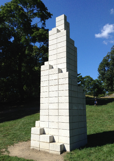
Sol LeWitt, Tower (DC)
I like how pure this is. I kind of wish it was enormous…building sized…except that you can’t go in. That would be cool, right?
The next three works are all busts…so different, though!

John Wilson, Eternal Presence
I am SUCH a fan of his work. Gorgeous. He had a solo show at the Danforth, which I wrote about here. He is supremely talented and brilliant.
I’m kind of pondering the base, though. I think that they need to fill in the dirt around it so that we don’t see the rough bottom edge of the concrete. Thoughts? It kind of makes it look like an afterthought, or as if it could be moved anywhere, and isn’t properly rooted to it’s ground. Just my two cents. It’s a stunning work of art, though.
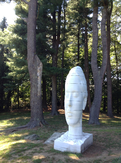
Jaume Plensa, Humming
I love how this is distorted and elongated. Don’t you love the title too? I think of the sound of Buddhist monks chanting a long “Om……” I like how this one is in the shade….seems right.

Joseph Wheelwright, Listening Stone
Fascinating, right? I don’t know whether to think his upper ear is listening, possibly to the sounds of nature or of my son’s yelling, or is he listening to the earth? Thoughts? Sometimes as a parent, I feel like my head’s made of stone and I’m not listening. Is that bad?
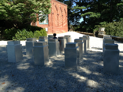
Aaron Stephan, Untitled (16 Cans)
You can see the silhouette of my son standing amongst this sculpture. It’s pretty minimal. It’s also kind of funny, because if you turn around…this is what you see:

No, that’s not part of the sculpture. That’s just a trash can. Don’t you love the DeCordova???
Besides this excursion, we also went to visit a friend who was renting a house on Plum Island. My son and my friend’s son had a blast generally running around and yelling. You know how it is, right? No? Well, you’re damn lucky, then.
Take a look at this RIDICULOUS dahlia we saw:

No joke.
Speaking of ridiculous, take a look at this turkey we saw at the same farm:

They are SO CRAZY looking. He really is like a big butterball. Sometimes, he would raise and fan out his scraggly tail feathers, like a moth eaten peacock. What an odd creature. I love the dark iridescent feathers on the main part of his body. I could do without the blobby snood. Look how freakish the domestic turkey is compared to the wild one:

Right???? If I was that wild turkey…I’d run, or rather fly, out of there STAT! It makes me think of these guys:

Run, Alice! RUUUUUNNNNNN!!!!!
Filed under: Drawing, Fleeting thoughts... | Tags: art, arts, Cambridge Art Association, godzilla, iced coffee, Mixed media, painting, toast, Visual Arts
Is there anything more annoying than a sluggish computer mouse? I think not. I may have to fling this one into the backyard with the lawn clippings…
How has my week been? Perhaps I can summarize by asking if you can you guess what song my son has had on repeat today? No, not “The Wheels On The Bus.” No, not “If You’re Happy and You Know It.” He’s been playing the brooding Godzilla theme song all day. Why…WHY, you may ask? Well, because he listens to it (with the volume WAY UP) and then pretends to be Godzilla knocking down a block city and stomping on matchbox cars, that’s why. Most of his peers are interested in Skylander Giants, Ninjago, or Spiderman. My son finds those marginally interesting, but his heart belongs to Godzilla.

Sigh. He’s kind of a social outcast with his Godzilla obsession. As a worrier, this concerns me. Why can’t he just like Batman like all of the other kids? In addition, I am concerned that he will want to BE Godzilla for Halloween. This would be totally beyond my non-existent costume-making ability. Maybe he’s settle for a green sweatpants/sweatshirt combo with some strategically placed tie-hangers on his back?

No? Oh well. I give up. I’ll worry about that again in half an hour…
So, I had a meeting this week at the Cambridge Art Association about an upcoming group show. While I was there, I got to see the New Member Show that was up. This is an exhibit of the people who were recently accepted into the Cambridge Art Association. Congratulations all! There was some great stuff to see:

Elizabeth Hardjono, Silence, Magnesium Plate Etching
Ahem. I love this. This print is sooooo beautiful. I wish that the artist had a website. (HINT HINT) I’d love to see MORE of her other work. Don’t you LOVE the delicate figure? Isn’t the composition amazing? I love it.

Lynne Klemmer, Intuit Images: TD Woman #5, Gouache / Pigment
This painting is so different, yet also beautiful. Great colors…great form and markings…I love how it fills the paper…look at her face! I’d love to see more in this series as well. You can check out her website, but it seems that this series of paintings are not up yet.
Tom Stocker, Tom + Sally, Acrylic on Canvas
No, these aren’t fabric, they’re paintings! This artist’s technique is inspired by textiles, as I learned from his website. The images are comprised of tiny blobs of multicolored paint, gridded much like needlepoint. No joke. Isn’t that amazing?

Conny Goelz Schmitt, Luftschloss, Mixed Media
I was SO excited to see this beautiful piece, as I know this artist! (Does that somehow make me more important?) She participated in the Artist’s Professional Toolbox program with me at Montserrat College of Art. He work is amazing. She often works with materials from old books as well. Great job, Conny!
What have I been up to? Well, not much…

I’ve discovered how delicious cinnamon toast w/ butter and an iced coffee is for breakfast. I may have to make this my meal of choice for the whole day! Who needs vitamins? That’s what Flintstones are for!
I’ve also rediscovered how I love to make weird stuff and mail it to people. My latest:

This is one of those “fortune tellers” that we used to make as kids. I kind of made mine a photomontage. SO MUCH FUN. I know. I’m brilliant. What? The living room is a mess? No one has fed the fish today? Why is there spilled iced coffee on the dining room table? Pshaw. Don’t bog me down with such BANAL matters. I’m makin’ STUFF.

What’s this mess, you may ask? MWAH-HA-HA!!! It is an INSANE little patchwork project that I’ve started. LOOK AT HOW TINY THOSE PIECES OF FABRIC ARE! The small squares are 1.5 cm x 1.5 cm. I kid you not. CRAZY. Luckily, I’m nearsighted.
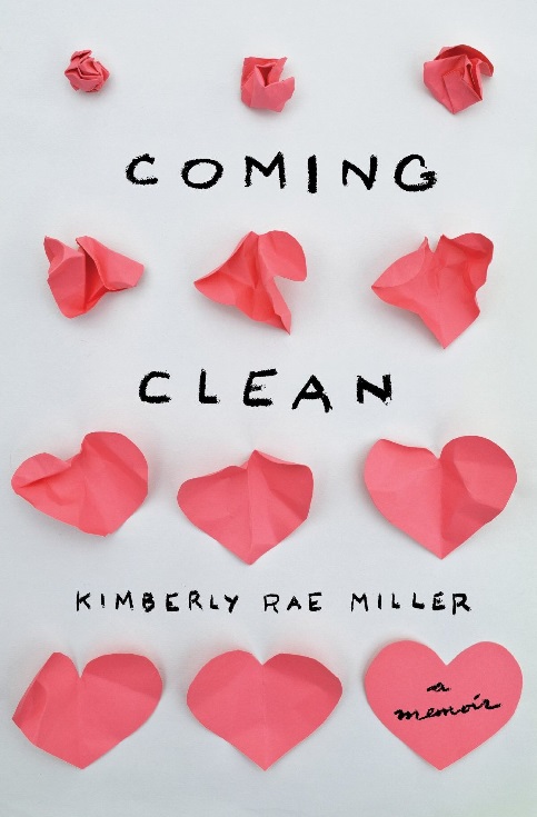
Umm…if you’re wondering how my latest drawing is going…it’s coming along. Sloooowly. Well, I don’t like to rush perfection. (That’s a joke). Actually, the truth of it is that I have A.D.D. when it comes to MAKING STUFF. Does anyone else have that problem?????? What’s the opposite of A.D.D.? O.C.D.? Sometimes, I do wish that I had O.C.D. about cleaning stuff, as I’m particularly weak in the housekeeping department. (I’m not making light of O.C.D….that’s serious, and I’m not.) I do SOMETIMES make an effort not to be messy. But, as I just finished reading, Coming Clean: A Memoir, by Kimberly Rae Miller, I feel like the queen of clean! Please read this book. It is a heartbreaking memoir of a woman growing up with a father who is a hoarder. Not just messy, like me, but an actual hoarder. It’s an AMAZING read.
Hmm. Maybe I will go and clean up something just to reassure myself that I’m not a hoarder…starting with my spilled iced coffee and the fallen block city that my son so lovingly toppled over this afternoon…then I’ll likely get distracted and start making stuff again…SEND HELP!
Filed under: Fleeting thoughts... | Tags: architecture, artist, arts, concord, painting, Room of One's Own, Visual Arts
WELL. This was an exciting week because:
1. I got some work done.
2. It didn’t snow.
Is the bar set a little low here? Probably. Wellll, as long as I can rest my drink on it, it’s fiiiine with me! Did I mention that I did three loads of laundry today? YES!!! WATCH OUT, MARTHA STEWART!!!
Now, I’m sure that some of you performed brain surgery, or split an atom or two, or whatnot. I drew and did laundry. (so nyah!!!) Such is the life of the hybrid housefrau/artist. No, I didn’t draw my laundry, (I barely folded it for Lord’s sake) but that’s definitely going to be my next series. I’m trying to keep this new series under wraps until I have TWO drawings done, as you don’t really have a much of a series without at least TWO, right? (Or is that just to make a thing go right, a la Rob Base?)
Are you still reading??? AMAZING!
So, tonight I went to the opening of my advisor’s new show at the Concord Art Association. The show is titled, “A Room of Our Own.” On exhibit is the work of a group of female artists who regularly meet to discuss the profession and support one another. The title of the show is, of course, a reference to Virginia Woolf’s, A Room of One’s Own. These artists and their careers have been enriched not just because they each have “a room of one’s own” (a studio), but also because they have had each other. Lovely! The show is curated by Merrill Comeau. I have some images, but not many…as it was a crowded event!

Adria Arch, Red Blue Diptych
So THIS is the work of my advisor! Don’t you love it? I’m sorry for the weird angle of the photo, but it was impossible to get directly in front of it and back up far enough for a good shot. Her work is inspired by the subconscious mark-making of others. She plays with scale, color, layering, etc. It was great to see her and hear her talk about her work.

Kathleen Volp, The Town
You might recognize this artist’s name, as I featured her in another recent post. It was great to hear her talk about her work as well! This piece was about the universal pain of loss. Very beautiful. She’s really masterful with both material and image. I was hoping to chat with her, but she wasn’t feeling well and left soon after speaking.

Margot Stage, Water Words
This artist described herself as a bit of a scavenger…taking delight in the often overlooked objects that she finds on her walks. This series incorporates driftwood in a study of repetition of form. I should have taken a close up so that you could see the detail of her work, comprised of driftwood and brass rods. I like how she’s arranged them, not in a linear was as a sort of “sentence,” but as almost the visual representation of primordial sounds. I also think of the scratchy marks of a polygraph, revealing what is invisible to the eye.

Ilana Manolson, Navigation I
Ilana Manolson is well known for her gorgeous, watery landscapes. Here, she is also incorporating some image transfer of what must be nautical charts, reminiscent of ripples of water. It’s fascinating to see her subtle painting overlap and interact with the clean lines of the transfer.
Jeanne Williamson, (Fence) Shirts and (Hot) Flashes #1 – 6
Now, I was lucky enough to be introduced to this artist. I’ve seen her work in many other shows, so it was really nice to finally meet her. I love how graphic these are, but if you could see them up close, you would notice the delicate stitching throughout each piece. They are compelling on many scales.
Unfortunately, I didn’t get photos of all of the artists (not even close to getting it of all of the work.) SO, you’ll have to GO and see the show yourself! Ahem, that’s an order. Since quitting my job to be a better mommy, I’m good at dishing out tasks, but not so good at completing them myself…I used to be the opposite when I was working, so I feel that this shows some “growth.” Again…pulling myself up to that LOW bar…
Did I mention that I did three loads of laundry today?
Okay, besides laundry, I also finished knitting a hat that I’ve been toiling over for a few weeks:

Cute, right? I had to rip out 1/4 of it, when I decided that I didn’t like the colorway of the second ball of yarn. AND, I made a pom pom. Check THAT out, you atom-splitters out there…
My son brought home this creation from school today:
He tells me that it is a house. I love it. I love it not because I’m an architect and I’m partial to buildings, but because this lumpy, misshapen thing on the curling paper plate is my son’s design. I’m wondering what the significance of the yarn halo is at the top, but I’ll have to ask about it tomorrow. No, my son is NOT a first year student in an MArch program…nor was this a study model for Selfidges by Future Systems:
That’s fondly called “Blobitecture.” NOT my cup of tea, thankyouverymuch. I’m all for design that pushed the envelope, just not quite like THAT. Push it back. Please.
No, my son is in preschool. By the time he’s old enough to be in an MArch program, we’ll all be living in blobitecture pods, eating synthetic meat, and using a 3D printer to make everything from our clothes to our houses. I’ll be crabby and sullen and complaining that he doesn’t come to visit me in my retirement pod, nor does he bring me any synthetic meals, nor does his online avatar ever call. Ever. Actually, by then I’ll probably not know how to even answer a phone…so i’ll just end up accidentally turning on the robotic lawnmower instead of accepting his call.
Sigh.
At least I”ll HAVE a robotic lawnmower…
Filed under: Drawing, Fleeting thoughts... | Tags: art, Cambridge Art Association, Claybord, Cy Twombly, drawing, Visual Arts
So, this past week has seen the opening of two, group shows that I am participating in. The first show is “Community of Artists” at the Danforth Museum, in Framingham. The other show is the “11th National Prize Show” at the Cambridge Art Association, in Cambridge. I have one drawing in each show. Here is my drawing in Cambridge:

Can you see my wee drawing? Here it is again:

I’m happy with how this turned out. It would look better with ALL of the other drawings in the series, but then it wouldn’t really be a group show, now would it? You should also take note that I took this photo with my messed up camera. Luckily, the people at the camera shop were able to remove the maple syrup and saliva that my 4 year old graciously smeared all over the lens. I somehow felt that if I told them exactly what I thought was on the lens, this might help in their cleanup operation. I believe that this makes me a “helicopter customer” as well as being a “helicopter parent.” Two words: micro. manage.
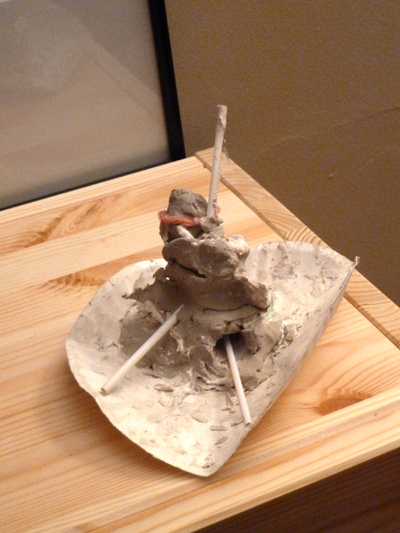
I want to show some of the other works that I saw. I only have photos from the Cambridge show, as my camera was still out of order when I visited the Danforth. Here’s an interesting sculpture:

I can’t seem to get into her website, but I like the little house. I think that it spoke to my inner architect. I’d like to see a room of these dilapidated houses. I used to always dream about having a little cabin (with no doorbell, on the other side of our front lawn, mind you), where I could escape. This little house made me think of that. I’m going to also say that the Cambridge Art Association should reconsider it’s choice in flooring material. It hurts my eyes. Just sayin’.

I think that this is speaking to my inner architect again. I like it. I don’t know why. Something about it feels kind of dated, but I like the space that’s created…especially in the right hand side. I keep wanting to crop it into a square…with the lighter side becoming just a slim rectangle next to the darker side. Maybe that’s just me. If we were in architecture school, and a critic felt the same way…(s)he would likely get a hacksaw and start cutting the canvas to show you how much better it would look. Actually, because this series of paintings is based upon airports, this symmetry and landscape orientation makes more sense to me conceptually. (not that it didn’t make sense before…)
Yes, I finally have some amazing artwork by my son to show you. Ok…this is the point where anyone seriously interested in art can basically sign off. Now, begins my “Refrigerator Front Gallery”. Here is his latest creation, co-created with Grandma:

Don’t you LOVE it???? Or, is this the kind of scribble that only a mama could love? Should I mention that the house is on fire? Should I be worried? As long as my son does not know how to use a match, I’ll try not to worry. Maybe we should get rid of our “strike anywhere” matches? Hmm. And another:

I imagine this as sort of a Cy Twombly hopped up on froot loops.
So, I keep experimenting with different drawing substrates. (is that what it’s called, or am I slipping back into architecture?). This week, I experimented with Ampersand’s Claybord. Here is my experiment:

Now, all was going well until I tried to make DARK marks. Then, it was like trying to draw with a candle on Teflon. The soft pencil just slid across the surface, and didn’t really work. Here’s a closeup of the shadow:

See how scratchy it is? I almost feel that the only way to work on this board is to keep the pencil very light, and think of it almost as a silverpoint drawing. I know that the two people out there (yes, you’re one of them) who read this blog never respond, BUT:
Have you ever used Claybord with pencil? Did you like it????? (Bueller?)
If it wasn’t 9am and trash day, I would probably hear crickets about now…
Filed under: Drawing, Fleeting thoughts... | Tags: art, drawing, graphite, Pencil, Sandra Allen, Visual Arts
I’m so concerned about this post being boring that I’ve decided to post an image of the drawing that I’m working on…which is still in process:

There! Now, is this post exciting??? No? Too bad.
This drawing is waaay too pale. I need to generally bring up the tones, etc. etc. But, I think that it’s coming along. These drawings take forever, so I’m often pining to do something more “scribbly”, just to get that visceral, mark-making feeling out of my system. Actually, I sort of get that out a little when my son and I do a “group” art project. Here is our latest drawng:

I do NOT like to draw on my son’s drawings, as I obviously “ruin” them if I do. But often, he insists that we draw together. I get yelled at if I slack off. So, above, you can *clearly* see a soccer field…a baseball diamond…and a football field. I drew the little brown people on the sidelines watching the game. My son asked why they had no arms. I had no good reason, so he decided to add arms. You will notice the short, orange arm extending off of the lowest person. BUT, if you look at the person second from the top, you will see LOOONG, swirly arms coming off of him. That blob that looks like a spiky sun on the bottom of the page is one of his hands. BRILLIANT! See? This drawing would be so much better if I didn’t have to contribute to it.
The reason it’s posted on the wall is because my son wanted to cut a hole in the wall. Even though I pointed out to him that our staircase is on the other side of that wall (I didn’t bother to mention the more obvious reasons of not cutting holes in walls), he still insisted that we cut a hole. After much wrangling and debating and struggling to tell him that we are NOT cutting a hole in the wall, he agreed that we could draw what we imagined would be in the hole. Thus, we have several athletic fields. Go figure.
In my poking around on the internet, I found the GORGEOUS drawings of Sandra Allen. Here is a sample of what she does:

Sandra Allen, Auspice, 60″ x 42″, pencil on paper
CAN YOU BELIEVE IT? That’s a PENCIL drawing, for Lord’s sake!!!!! Look how big it is too! That’s actually tiny for her…she does some truly enormous drawings. Please check out her website. I’m pretty flabbergasted by it. She has a drawing that she’s done which is 37 FEET TALL! No, not 37 inches…37 FEET…I kid you not. Go look at her work. Now. Isn’t it amazing??? I’m not going to give my usual whining speech lamenting that, in comparison, my drawings look marginally better than putting a pencil and a sheet of paper in a clothes dryer for an hour. Okay, that’s an exaggeration…but only slightly. I’ll just give a dramatic *SIGH* to express my discouragement.
Can anyone recommend the work of other artists who work in graphite? I’m always interested in seeing what others are doing (in my masochistic way). Hmmmm??? Suggestions? Whom should I look at?
Here’s something that you should look at:

That’s in our garden! No kidding! I wish I could take some kind of credit for this lovely iris (am I right?), but I cannot. Not only did I play no part in it’s budding (obviously)…but I also didn’t even put that silly bulb in the ground in the first place. It was here when we moved in. For someone like myself, who has the tendency to inadvertently kill most plants, it’s great to see something lovely in the garden that I haven’t destroyed by sheer ignorance. Now, if I can just keep my son from hitting it with a wiffle ball bat…
Filed under: Drawing, Fleeting thoughts... | Tags: art, charcoal, Danforth, drawing, Visual Arts
So, this week I went to the New Art Center in Newton, MA to see a drawing show titled, “M(i)(A)cro: A Contemporary Drawing Exhibition.” SO AMAZING!!! It’s so great to see a drawing-only exhibit. Sometimes, I feel that drawing gets neglected…works on paper are fragile…they are often just black & white…yadda yadda yadda. Whatever. Here are a couple of highlights:

Greg Fuqua, Study in Dynamics, Charcoal, 69″ x 42″
LOOK AT THAT! Look how BIG it is! Seriously. That drawing was gorgeous. I could have sat all day and just looked at it. So amazing. Here is the artist’s website, just in case you missed it: Greg Fuqua. Trust me…if you saw that in person, you’d “oooh” and “aaah” as well. It’s a CHARCOAL drawing, for goodness sake…
Here is another artist from that show:

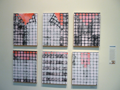
Barbara Blacharczyk, Botanical Flux, Acrylic and ink on multiple layers of Duralar, 57″ x 40″
SOOOO COOL!!! She has many layers of Duralar (which is what I use as well), which she has painted on…cut into…collaged. The drawings really look “alive”, as there is so much depth to them. They’re fascinating. If anyone is in the Newton, MA area…go see this show NOW! It’s almost over! Seriously. Put down your silly IPad and get over there. I mean it.
As is always the case, I find it impossible to look at another artist’s work and not automatically compare it to my own. Actually, I do that less so with UBER artists, like Picasso…but more so with anyone who hasn’t quite achieved that stardom. WHY do I do that??? WHYYY???? It’s some sort of automatic, self-torture reflex. I can’t be the only one with such a neurosis, can I? Yes? OK fine…don’t answer that.
So, I framed my drawing for the Danforth show. Here it is!

Now, do you understand why feel deflated??? (Okay, I’ll be quiet). I go the The Framer’s Workshop, in Brookline, for the framing. I have this hair-brained notion that it will be cheaper, if I do some of the labor. Also, I am so neurotic that I don’t quite trust someone else to frame these drawings. Crazy, right? I trust MYSELF more than the professional? How flawed is that thinking??? You should have seen how I struggled to mash and smooth the putty in the frame’s corners. It took me probably 10x as long as someone who works there. I dislike the whole chore of framing. SO TEDIOUS. Plech pleh pflu.
I got very little done in my own work this week…EXCEPT that I finished yet ANOTHER dress! Here it is:

Don’t you think that it’s cute??? It even has pockets! I am all proud of myself, as I added the shaping around the middle. Can you imagine what this looked like without that? Sort of like a multi-colored potato sack…you know, like my usual sewing projects…
My son made me some playdoh food this week:

mmm…yummy, right? The only thing that looks marginally appealing is the hot dog on the right. Perhaps the food on the left is what a hot dog normally looks like for someone who is colorblind? Not sure. He also drew a self-portrait:

Isn’t that hilarious??? I love it! I’m also glad that he drew himself “happy”, not frowing or crying. I must have been doing an ok job of parenting at that moment. I feel like I need a sticker “How’s My Parenting? Dial 1-800-KOO KOO U” on my forehead sometimes. Luckily, my son can’t use a phone, or else I’d be getting lots of disgruntled calls. Have I already mentioned that when my son is mad at me, he’ll either say, “I’m going to throw you in the trash!”, or “I’m going to put you in jail!”? When I tried to outsmart him, and tell him that he couldn’t put me in jail because I was already in the trash, he said that he’d put the trash can, with me in it, in jail. I died laughing, which, of course, made him angrier. WOO HOO…it’s never a dull moment when you’re a parent! If fact, if it gets TOO QUIET…that usually means he’s up to no good. I typically grab a wet sponge, a roll of paper towels, and then start searching…
thank god for washable markers…
Filed under: painting | Tags: abstract, acrylics, art, artist, Paint, printmaking, Visual Arts
So, I’m happy to say that my portrait drawing was accepted in the show at the Belmont Gallery of Art. Yay! This is a show titled, “See you, See me”, and it’s only portraits. I saw some of the other works when I was dropping off my drawing. Should be interesting! (You can see what the drawing looks like in my September 8 blog post). The show opens on September 30 and runs through November 13. Please stop by!
This weekend, I went to the Hyde Park Open Studios. This was great, as my printmaking teacher, Selma Bromberg, has her studio there. Her work is really beautiful. She draws gorgeous flowers, then turns the drawings into prints. She was doing a woodblock demonstration when I arrived. I also saw Prilla Smith Brackett, whom I met at my woodblock print class. She’s primarily a painter, but is starting to work more with prints. Her work was also lovely. It was fun to see some of the completed woodblock prints that she began in class.
My painting class is still fun. My teacher did not like the big paintings that I brought in. He likened one of them to a “shower curtain”. I can tell you all of this as I’ve gone through many an architecture crit, and have heard it all. I really appreciate his honesty. I think that he’s a good teacher. Let’s see if I can learn something, though! He wants me to try figurative work, as that’s my background (as evidenced by the portrait drawing). Hmm…okay…we’ll see! I also did a few mini-paintings. These are only 6″ x 8″.

It was fun to work on these tiny canvases…

I may have to revisit all of these…we’ll see…

On another note…I’m horribly disappointed that the portrait class that I’m signed up for will likely be cancelled. It’s called “The Expressive Portrait”, and it’s at the Arlington Center for the Arts. We need THREE more people in order to have the class. I’m so sad, as it’s highly unlikely what we’ll get them in the time left. Having a class cancelled on you is so frustrating. I’ve had this happen several times. I’m always dumbfounded when it does happen. You mean…not EVERYONE wants to take this class??? WHY NOT???? I’ve tried to send out emails, etc. to other people who might be interested in signing up. No luck so far. If you’re interested…PLEASE sign up! Seriously. Do it now. No joke.
I wish that there wasn’t a minimum number for a class. I mean…don’t I count at all? Doesn’t my enthusiasm make up for the low enrollment???? I guess not…*DRAMATIC SIGH*
Filed under: Drawing | Tags: art, artist, charcoal, drawing, portrait, sanguine, Visual Arts
A while ago, I took a portrait drawing class. This is really one of my favorite things to do. I don’t know why, but I really do love drawing people’s faces. But when I am not in a class, I find it really hard to do so. I mean, who is going to sit still long enough? Nobody. The other thing about this is…I don’t think that I would necessarily want these drawings hanging up in my house. I love crazy abstract art. I am less inclined to like realistic art. So…these are attempts at realistic images of people that I don’t even KNOW. Why would I put these drawings on my wall? Hmmm. I am considering taking another portrait class, just because I love doing it, but I’m not sure. If I don’t like the end products, then why do it? Or, is that just me being too “product/end result” oriented? Here are the drawings. Note how the corners of them got crumpled in the attic. Sheesh. I need a flat file.

I’ve managed to flatten that one out a bit. I may try to enter it in a portrait show. Who knows. I don’t think that it is really “original” enough, but we’ll see. He was kind of a character. Here is the second drawing:

She got quite crumpled. Hmm…I will have to work on that. I managed to crop my feet standing next to the drawings, as I thought that would look odd. This was a hard pose to draw, as a profile doesn’t give much depth. A 3/4 view is always better. In a crowded class, though, you can’t always get the good spot.
I’m still chasing after abstract art. Is it futile for me? I’m not saying that these drawings are amazing…but I have some modicum of ability here. Should I keep going with the portaits, or try out the crazy abstracts, which I love?
I have a painting class that starts next week. Wish me luck! I’m hoping it will help me a bit.
Hey, if anyone out there wants to sit still for a few hours so that I can try to draw you, let me know. No, you’re not allowed to fall asleep! I also don’t want to draw someone with a “zoned-out/tv-coma” face. Not a good look.
Filed under: Fleeting thoughts..., printmaking | Tags: art, artist, chine colle, drypoint, printmaking, Visual Arts
There are lots of goals that one can have in life. One of mine is to pursue art. Lucky me…I’m getting to do that a bit! But, then what? Art is a field where there is no clear path. In some ways, being an architect is simpler…as once you get hired, someone is coming to you with their problems to solve: “We’re designing new student housing for this college”…or…”Find out what the zoning restrictions are for this site”…or…”Draw up some wall sections for this facade”…etc. Even when you own your own firm, and you’re “the decider” (silly word), the client comes to you with their problem to solve. In art, you’re coming up with the problems, and the answers.
Back to goals: there are so many different goals that one can have as an artist. Someone might dream of getting their work shown at the Whitney. Someone else might dream of just making a living off of one’s art. Another person might just want to feel happy with the work itself, regardless of any outside recognition. These are all reasonable, of course, but they require different strategies for working. In the first one…the cutting edge fine art world is your “client”. Are you innovative enough to be at the Whitney? In the second example, the art buying population is your client. Is your art buying population people who love landscapes…so, you’ll do landscapes? Or, is it people who love photographs of people? old buildings? puppies? In the third example, you are the client. Are you happy with your work? Do you feel satisfied/stimulated/excited by the work?
Ideally, I suppose, one would be able to satisfy all three of these goals at once: to be recognized by the fine art world as worthy…to be able to live off of that worthy art…and to feel a sense of satisfaction with the work. Not an easy thing to do! I have yet to decide where I’m putting my energies. For the moment, I seem to be focusing primarily on goal three: just being satisfied with the work.
If you are an artist, what have your experiences been in regards to these types of goals? What are your goals?
Food for thought that I have been gnawing on for some time now…
Here’s is what I printed last night in class:

On the day that I was making sketchy scribble doodles, I also made a drypoint plate. This is the print from the plate. I like it. I like the feel of it and the look of the lines. I may do more of these. I also added some chine colle to another printing of it:

Sort of interesting…the paper looks very dark in this photo. It’s actually a sort of dark, orangeish, sand color. I’m not sure about these pieces, as they are a bit of a distraction. I may try this again with a more neutral/lighter color of paper…but I didn’t have any at the time to try out. Here’s a close up:

I also made another print of a child, similar to the previous one. This one was printed with different ink and different paper, however. I think that I might prefer the other ink that I was using. Here it is:

This is based on an image of my friend’s daughter. I’ve also got a closeup, so you can see that the black area actually has some texture:

I think that on my next print in this series, I’m going to do more with that texture…play with it a bit more. Any comments?
It is very cool and mild today…we had lots of rain and thunderstorms yesterday. I love this kind of post-storm weather. I also like pre-storm weather as well.
OH…for those of you in the Boston area…you MUST go to Berryline for frozen yogurt. There is one near Harvard Square on Mass Ave. SO AMAZINGLY DELICIOUS. I despise TCBY, which tastes like frozen plastic. Berryline, however, is so delicious. The yogurt actually has that tangy, yogurt taste…and it’s FABULOUS. You know it’s good when instead of getting M&Ms on my yogurt, I decided that fresh mango was better. It was. Go now and get some. I’m suffering from some serious Berryline withdrawl, I think…
This week, I’m working on incorporating stencils into my collages. In spite of the fact that I do this ALL THE TIME in printmaking, I haven’t really done much with it in collage. My initial moves are pretty minimal:

What I really like about collage is that it seems like a purely compositional exercise. I know…all forms of art are concerned with composition. But in collage, one can simply arrange found scraps of paper…it’s the arrangement that is the creation. Sure, some people make their own collage material…and one can certainly draw, paint, stencil, etc. on a collage. But at its most basic…collage (2d) is a composition of found papers. I find it really challenging.

I have a book of collages by Richard Meier (famous architect). They’re amazing. SO simple…yet so beautiful and provocative. He does mark his collages, so he isn’t a collage “purist”, so to speak. In grad school, we could only work with found papers, the collage had to be rectangular, and no additional marks were to be made. I know…these are more reasons why I didn’t enjoy that class.
