Filed under: printmaking | Tags: art, artist, collagraph, print, printmaking, visual art
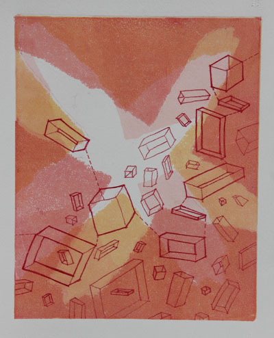
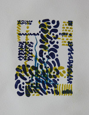
More collagraphs! I’m continuing to work on collagraphs, which I find to be very fun. This time, I decided that i would make prints with a full bleed. What does that mean? It means that the print runs to the edge of the paper, instead of floating like a rectangle within a larger sheet of paper. I don’t often do full bleed prints…I’m not sure why. They can be a bit messy, so perhaps that’s it. (if you want to know more about collagraph, see an earler post this month)
Here is the first print:
I’m not sure why I’ve called it “clouds”. I mean…it’s slightly obvious, but that wasn’t my intent while making the plate. I think that there is something serene about these black and white prints. They’re sort of cartoonish, in a way. Comments?
In the next print, I incorporated some colored paper:
This feels very incomplete. I will work on this more, but I’m leaving it for now. It’s always good to leave something to ponder a bit before working on it more. Two people in studio suggested, “red”. Hmmm.
The last one is a bit odd! Also very incomplete:
I layered in a very interesting paper that I have. It’s very textured…almost like bark. The texture does get flattened quite a bit in the press, but you can see the interesting edge to this paper in the detail:
See those curls at the edge? So interesting! I think that the rust colored paper is too long on top, and needs to be trimmed back a bit. I like the overlap, but it may be a bit much. Anyone out there have an opinion?
I am going to the MFA today to see the Chihuly exibit. I’ve heard mixed reviews. Because it’s so extreme, it seems that people either like it or hate it. I’m not sure where I stand on it…as I’ve yet to see it in person! Because his work often has “practical” applications…I been wondering if it doesn’t somewhat edge close to the world of “craft”. I don’t mean gluestick and hello kitty scissors “craft”, of course…I mean Craft, with a capital “C”. For example, there is a lovely museum called the Fuller Craft Museum in Massachusetts. I’ve only been a couple of times, and I’ve really loved the exhibits. Anyway…it’s interesting that they had the work of a glass artist there, Josh Simpson. His work is much more restrained than Chihuly’s…but I suppose that isn’t saying much. Anyway, Simpson’s work is at the Craft Museum, not the MFA. Why is that? I wonder if that is purely a function of Chihuly’s international fame? When does something move from “craft” to “art”? I know…such a broad and hairy question. Chihuly got me thinking about it…has anyone seen the exhibit? Comments?
Filed under: Fleeting thoughts..., printmaking | Tags: art, artist, collagraph, intaglio, Mixed media, print, printmaking, visual art
I made a new collagraph plate this week. What is a collagraph, you may ask? I’ll give you the description provided by the book that I’m also going to review.
“Collagraph is essentially an experimental form of printmaking which involves adding layers of adhesive or solid material to the surface of a printing plate, making it possible to incorporate both relief and intaglio printmaking methods on a single plate.” – Brenda Harthill & Richard Clarke
While some types of printmaking, like engraving, require pricey copper plates…collagraph is about using whatever you’ve got to make a plate. It is like making a collage. In fact, the word “collagraph” is based on the Greek word “kollo”, which means “to glue”.
For my birthday, I asked for a couple of books, one of them being, Collagraphs and Mixed Media Printmaking by Brenda Harthill and Richard Clarke. It is such a fascinating book. It is not an in-depth, how-to guide. There are only a few places where any steps to making and inking a collagraph plate are shown. There are, however, many images of collagraph prints by various artists. One thing that is particularly interesting about collagraphs is that it is often unclear how a print was made. For example, a drypoint print is somewhat self-explanatory. A hard plate (copper or plexi typically) is scratched with a sharp tool, and this is how the image is created. But for a collagraph…who knows how the artist got the shapes and textures that they did on their print! It’s suprising how very mundane things can be wonderful printing surfaces. This is a great book if you already like collagraphs, but should not be your introductory book, as it mostly shows final products, not process. Has anyone else out there read it? Comments to add?
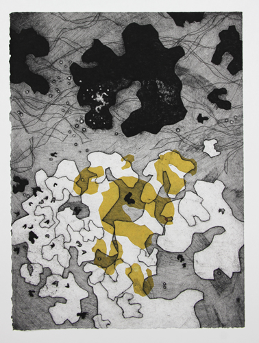
Here is my collagraph print this week:
and a detail:
I like this print. It has a sort of surreal, Miro-esque quality to it. What do you think? This is a 9″x12″ plate. Maybe I’ll make an even larger one! I thinking about doing a large, full bleed print in this “series”. Why not, right? It’s just time, energy, sweat and tears, right? Okay, that’s a little dramatic. Maybe.
Filed under: printmaking, travel | Tags: art, artist, collagraph, Mount Rainier, printmaking, Seattle, woodblock printing
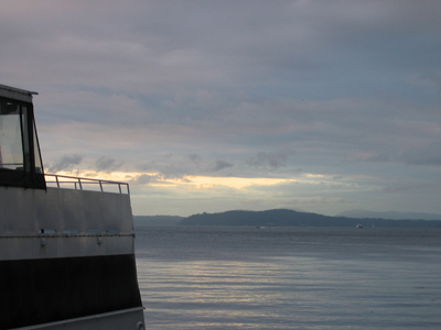
I just got back from a great trip to Seattle! It’s such a fun city. My brother, his wife and their two kids live out there. We had a great time visiting with them. We spent the 4th of July at the beach on Bainbridge Island. I’m used to the weather being so hot that you HAVE to go swimming to survive. Not so in Seattle…the weather was clear and warm, and the water was icy. As a result, vegging out on the beach while the kids created general chaos was just fine for me. Here’s the view we had at the beach:
Yes, that’s Mount Rainier. I’m not used to being at the beach and seeing mountains in the distance. Heck, I’m not used to seeing mountains at all. Did I also mention that they don’t have mosquitoes? I kid you not.
I have the usual array of tourist photos to show:
That’s a chocolate brioche from Fuji Bakery. You must go if you’re in Seattle. So divine. I was directed to go there from the owner of Cullom Gallery. I have wanted to see this gallery for ages, as it focuses on woodblock printmaking, especially Moku Hanga. Moku Hanga is traditional Japanese woodblock printing. Please go visit this gallery if you can. The owner was so kind. She took out all sorts of beautiful prints for me to look at. I was thrilled! In May, I took a Moku Hanga course with Annie Bissett. Annie’s work is at Cullom Gallery, so it was great to see her work again. If you can’t make it out to visit the gallery, definitely check out the website.
I have my own woodblock printing class tomorrow evening, which I have not prepared for. I had dreams of working on carving one of my blocks in the evenings in Seattle, but no way. I was completely beat by the end of the day.
Before I left on my trip, I did this collagraph print:
I’m really happy with how it turned out. I plan on doing more like this. Comments?
While it was a great trip, I’m happy to be home!
Filed under: printmaking | Tags: art, artist, collagraph, print, printmaking, Relief print, visual art
I received a phonecall this week, telling me that the class that I had been SO looking forward to is going to be cancelled for low enrollment. WHAT? Am I the only person who was interested in doing huge woodcuts? I highly doubt that. Needless to say, I am really disappointed. This has happened to me before, and it’s always a big bummer. I suggested that perhaps the artist could do a one day workshop. I was told that I needed to speak to someone else about that. Sigh.
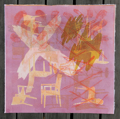
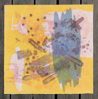
I don’t have class tonight, as it’s vacation week. So instead, I tried to work on carborundum collagraphs in the spirit of the work that my teacher does. Hmm. It’s much harder than it looks (of course). One of the challenges of printmaking with transparent inks is that you have to have a good sense of what the print will look like with each layer that you add. Layers of printing on top of another can bring depth and interest into the print. It can also make your print a muddy mess. My teacher makes this layering look easy. My work today seemed to only be marginally successful. I worked on these next two prints simultaneously:
and this one:
You can see that they have many similar elements. I’m fairly content with the first one, but the second one still makes me think that it needs something. The risk, of course, is that I do another layer and say, “nooooo! It was better BEFORE!!!!” This is typically why you should sort of leave your prints alone, and get back to them again with fresh eyes.
Here are other ones that I did:
The background is actually slightly “greenish”, which I don’t think comes through with this photo. Can you tell that I liked that blob? It keeps appearing…
This one is another that is borderline for me…add another layer? Keep it as is?
Then, I tried doing two plates together. This is harder to do (for me):
I like how this one turned out. I’m not sure if each print individually would have been interesting, but together I’m happy with it. Apparently, there are new colors for these inks coming out. Exciting!!!
And now for something completely different…I’ve also been working on a lino print. This has taken ages. I have done it in a few color schemes. This is the “green” scheme:
Kind of odd, I know. I like it, though. I like the boldness of relief printing. THUS, my serious disappointment with my cancelled class. Yes, I’m whining about that again. Yes, I’ll give it a rest. So, any comments? No…not about my CLASS…about the prints! (I can hear you playing your tiny violin for me…stop it!) :p
Filed under: printmaking | Tags: art, artist, carborundum, collagraph, drypoint, Ink, print, printmaking, Relief print, visual art
This has been a blah week, work-wise. Most of what I’ve done, I’m not thrilled with. Last night, I had my carborundum collagraph class. I was NOT pleased with how things were turning out. Here is the result:
*insert big sigh here*
I’m NOT happy with that at all. It’s just a mess.
I made another tiny plate. I kind of like these tiny plates. This one is just 2″x3″. That’s a bit bigger than my other tiny plates, but still small. My first printing was over wiped:
So, I left more ink on it this time, and it was much better:
In general, I like these kind of plates, because I can work on them at home. I’m not very good at working in a busy studio. I know how ridiculous that sounds, but if I have to try to concentrate and think…then I need to be alone with time and space. So, if I prepare a decent looking plate in peace and quiet, I can be productive in the studio with printing. But if I don’t prepare, and try to work in the studio…I can’t do it well. I know that I have to work on this a bit, but it does made me feel pretty deflated at times. Like, right now.
I’m also working on a lino print. Here’s a little preview picture:
I’m happier with these, as they are very “graphic” and “punchy”.
I know…why so blue? Well, I wasn’t thrilled with this week’s output. At least there was some experimentation, with the woodblocks and trace monotypes.
So, back to the drawing board…*SIGH*
[UPDATE: I’ve decided to throw in a trace monotype at the last minute…here it is below…definitely a work in progress…]
Filed under: printmaking | Tags: art, artist, collagraph, Ink, print, printmaking, pronto plate, visual art
I’m working on this new pronto plate image. You’ll probably recognize it as a photo I posted recently. We’ve recovered from the snow, so I can see this plant again. I’ve finished up the magenta and cyan layers, and now am just waiting for the ink to dry so that I can do the black layer. Here’s the progress so far:
And now I add the cyan:
Almost done! I like it. This is using the bigger brayer and the new paper. I think that it is working much better than before. I wanted to do this image, as the majority of the colors were not primary. I’m so fascinated with how a halftone image of CMYK makes a full spectrum of color! Sorry it’s so gray again…another overcast day. I also added a little to this test print:
Not great. This time, I used a litho crayon to make the plate. This created a nice, sketchy line. The only drawback is that I don’t think that I can clean the plate, without also cleaning off the crayon. Hmmm. This is unfortunate. I’m not keen on these test prints, but it’s been helpful to learn more about the methods of pronto printing.
I’m also working on another lino print…very basic. I’d like to get it a little farther along before I post it. I know…I should just post it anyway. Too bad!
This Thursday is the opening of the local “Images of Arlington” show. It will be fun to go, I think, as I’ve never been to an opening when I have something on the wall. I should probably have some kind of business card. I have nothing of the sort at the moment. Hmmm. Maybe a handwritten card will be “casual” and “artsy”, not “ill-prepared”.
I was thinking, yet again, the other day, that I still don’t have one “look” to the work that I produce. I know. It’s been less than a year. I’m just always noticing where things are still up in the air with me. I am a bit envious of those who have found their “thing”, whatever it may be.
My first carborundum collagraph class is this Thursday night! (before the opening, somehow…) I am excited to work on this medium, as I like it. The prints from my last post were carborundum collagraphs, if you want to see what this type of print can look like. I think it’s a type of printmaking that appeals to me, probably because you don’t have to spend an enormous amount of time planning. It becomes closer to painting. I’ve been looking at wood engravings lately. That type of printmaking seems to take more planning that I probably would want to do. Does anyone out there do “spontaneous” wood engraving? Or, is that some kind of printmaking oxymoron? Thoughts?
Filed under: printmaking | Tags: art, artist, collagraph, print, printmaking, visual art
Yes, you heard me right…snow. The lawn is COVERED in it. I want it to go away. Now.
Trust me…everyone is moaning about it.
Today was not a super day at the studio. It’s a new semester, and the studio is crowded…very crowded. Not that I don’t want myself and everyone else to be there, but it’s just harder to work. I think that there are around 14 students for one press. This results in enormous printing queues, scrubbling for a workspace, lots of shuffling and squeezing around one another just to move about. I’m using this as an excuse for my shoddy prints today.
This first print was a total disaster. I had way too much transparent medium in the inks, and the ink itself was so sticky…I had a horrible time trying to wipe the plate. So, here is the first mess:
See…I even made the picture tiny! I’d like to make it disappear. So, that was a bit disappointing. THEN, I reinked the plate with a different type of ink, and got this:
Isn’t it fascinating that this is the exact same plate? So different, right? Well, still not good, but closer to what I wanted. Then, I made this print with the other new plate:
(The photos are so dark, as it’s an overcast day. It’s also raining/snowing out, so I can’t take my prints outside to photograph). Anyway, this one was somewhat interesting, but the border is messy. I need to file the edges of the plate. They are rough, and impossible to clean. I can imagine trying this one again, but with better colors. Here is the last one, which is a ghost print on top of a ghost print:
This turned out okay. Not thrilled with it. I do like the texture that you can get from these carborundum collagraphs. Here’s a detail:
Well…I don’t think that you can see the texture that well, but it’s there. Overall, I didn’t feel thrilled with these. It felt like an off day, as I started out with the purple mess. I think that the prints did improve, but still just so-so and blah.
I showed my teacher the pronto print of the toy animals. She was TOTALLY not impressed. I think that her only comment was, “oh…you must have used multiple plates because you got all of these colors.” Hmmm. I’m still going to keep doing these halftone pronto prints, as I think that they’re kind of neat. Maybe she’ll like the flower one that I’m working on…
Any helpful comments about today’s prints? Suggestions? Likes? Dislikes? Who here is sick of snow? Who here wants a trip to Miami? Bermuda? Somewhere without snow…Alabama? Hmmm…
Filed under: printmaking | Tags: art, artist, collagraph, lithography, print, printmaking, pronto plate, visual art
So, I received a phonecall today, telling me that one of my prints in the local show has won an award! Seriously!!! I was so thrilled. Here it is:
I’m really happy, as I’m just a novice in pronto printing…but I did this anyway, and the judges liked it. I’ve been working on my technique a bit more, and I think that I’m going to be able to produce better results. I’ve only started another one, but I think that it’s going better:
Sorry it’s so grey…it’s very overcast today. (We’re supposed to have SNOW tomorrow! WHAT?) Anyway, I bought a bigger brayer, which I think has helped. I am also working on new paper, which I think is also helping. Of course, I’ve only done the first color out our four, so we’ll see when I get the rest on there…but so far, I feel that it’s going better.
This is a little sketch that I work on, when I’ve finished printing something more involved, like the print above:
It’s just two colors right now, but I’m going to keep adding to it.
I’ve been SUPER FRUSTRATED with a lino print that I’m working on. I can hardly bear to show it to you, as it’s turning out so horribly. It’s just the first layer, so bear with me here:
You have no idea how many times I have tried to print this. I’ve tried different paper…different ink…it always turns out blotchy. I’d like to think that I could do lino prints without a press, but I’m starting to feel that this isn’t true. IF ANYONE OUT THERE SUCCESSFULLY PRINTS LINOCUTS BY HAND BURNISHING, PLEASE HELP! What paper do you use? What ink? How do you not get blotchy/unprinted areas? I think that if I was working on an image that was mostly carved, it would probably be ok. But this one is mostly solid, and it’s just proving to be a pain.
I prepared two carborundum plates for tomorrow’s class. I think that they’re kind of neat, so we’ll see how they print!
I have a slight dilemma for next week. The official opening of the art show is next thursday, which is the same night as my first carborundum collagraph class. Egads. I have to figure out which to do, as I can’t do both very well. I may go to the class for an hour, then head over to the opening. It’s my first award, so I kind of feel like I should go…I don’t want them to think that I’m blasé about it!
