Filed under: Fleeting thoughts..., printmaking | Tags: art, artist, collagraph, intaglio, Mixed media, print, printmaking, visual art
I made a new collagraph plate this week. What is a collagraph, you may ask? I’ll give you the description provided by the book that I’m also going to review.
“Collagraph is essentially an experimental form of printmaking which involves adding layers of adhesive or solid material to the surface of a printing plate, making it possible to incorporate both relief and intaglio printmaking methods on a single plate.” – Brenda Harthill & Richard Clarke
While some types of printmaking, like engraving, require pricey copper plates…collagraph is about using whatever you’ve got to make a plate. It is like making a collage. In fact, the word “collagraph” is based on the Greek word “kollo”, which means “to glue”.
For my birthday, I asked for a couple of books, one of them being, Collagraphs and Mixed Media Printmaking by Brenda Harthill and Richard Clarke. It is such a fascinating book. It is not an in-depth, how-to guide. There are only a few places where any steps to making and inking a collagraph plate are shown. There are, however, many images of collagraph prints by various artists. One thing that is particularly interesting about collagraphs is that it is often unclear how a print was made. For example, a drypoint print is somewhat self-explanatory. A hard plate (copper or plexi typically) is scratched with a sharp tool, and this is how the image is created. But for a collagraph…who knows how the artist got the shapes and textures that they did on their print! It’s suprising how very mundane things can be wonderful printing surfaces. This is a great book if you already like collagraphs, but should not be your introductory book, as it mostly shows final products, not process. Has anyone else out there read it? Comments to add?
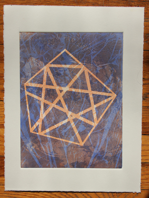
Here is my collagraph print this week:
and a detail:
I like this print. It has a sort of surreal, Miro-esque quality to it. What do you think? This is a 9″x12″ plate. Maybe I’ll make an even larger one! I thinking about doing a large, full bleed print in this “series”. Why not, right? It’s just time, energy, sweat and tears, right? Okay, that’s a little dramatic. Maybe.
Filed under: printmaking | Tags: art, drypoint, intaglio, print, printmaking, visual art
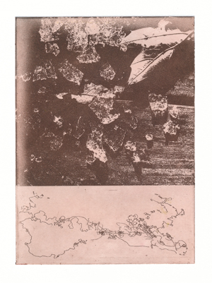
I have a few new, drypoint prints to show. These are a bit different that the woodcuts that I just posted. I got some positive feedback on the woodcuts…so, what do you think about these prints? Comments? Do you like the woodcuts better, or are these interesting in their own way? Feedback, please!
I’m going to post them in the order that I made them. I really liked how this one above turned out. The odd, prickly image is a magazine clipping of a strange sea creature. I loved how it looked, so I thought that it would look cool incorporated into a print. This odd sea creature is making me think of my odd plant woodcut. Maybe there is actually a theme here. Next print:
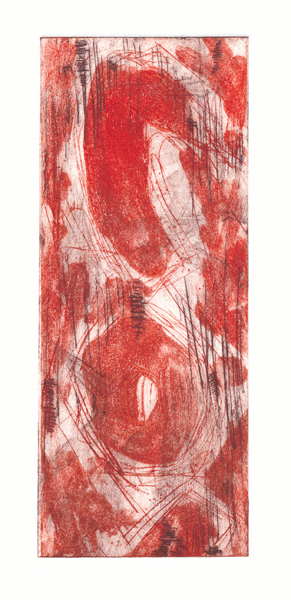
I also like this one. I like the punchy, graphic quality with the scratchy marks. I may do more like this one. Next:
You can see the red plate printed again here on another magazine scrap. I thought that the vertical arrangement in the photo of the people worked well with the long plate. I think that this one initially looks abstract, until you notice that there are figures in the print. Next:
I was on the fence about this print above. I wondered if it was too “even”, without any focus. Someone in my print class thought that it was nice, but does anyone else have a comment? As this is not a big print, perhaps it doesn’t need much more. The print size is only 3″ wide x 7.5″ tall…thoughts?
It’s so hard to decide what kind of printmaking to do. I loved the woodcuts, but I also like doing these intaglio prints. I feel that I should have a certain aesthetic that I build on, but you can see that my aesthetic thus far is rather varied. I suppose only time will tell, right?
Any artist out there have a suggestion on how you narrowed down your focus to get a unified body of work?
Any non-artist have thoughts on this as well?
Filed under: printmaking | Tags: art, chine colle, collagraph, Ink, intaglio, printmaking, solarplate, Stencil, Visual Arts
I made quite a few prints this week! It’s also been a lovely 55 degree day today. I think that we’re all giddy with the warmth and sunshine. It does feel wonderful to look up and feel the warm sun on your face and a fresh breeze…as opposed to biting wind and frigid air that makes your eyeballs ice over.
So…dabbling. Lots of dabbling this week. The prints are all over the map.
This week, I had a class with Debra Olin. She was wonderful! So talented and fun. You can see her work here. She showed us stencil work, and chine colle. Chine colle is sort of like collage, but one typically puts the pieces of paper to be glued onto the print not directly ON the print, but on the plate instead. When the plate is rolled through the press, the glue backed chine colle pieces adhere to the print. Very cool! I didn’t do much of it. Here is one with a collaged piece:
The large square is another piece of inked paper stuck on the larger print. Neat!
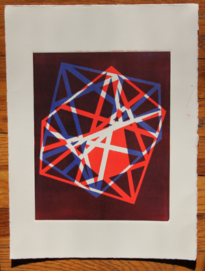
Here are some things that I did with stencils:
These were fun to do. I’m definitely going to play around with this stuff some more.
I also tried a collagraph. I wasn’t thrilled with it. I kept trying to rework it to improve it. A collagraph is a plate where things are stuck onto it, and those things are inked and a print/emboss is made from them. Here it is:
It looks like a circus. Hmmm…
In my other printmaking class, I made a couple of solarplates. I was pretty lukewarm about these. Also, you will notice in the brown print that there is a whitish margin. This is caused from the solarplate having a slightly curved edge, which allows light to seep in and make that mark. GRRRRR…shoddy plates. So, next time, I may try making a smaller image, and then cutting the plate edges, to hopefully get rid of this problem. VERY frustrating.
See the whitish margin? Frustrating. I was excited to do solarplates, because of the photographic possibilities. But, I haven’t yet done anything that I’m thrilled with. Perhaps the fact that I’ve only been printing them with one color…
This last print is one that I did at home. You’ll notice the sort of washed out look of it. This is because I hand burnish it, as I don’t have a press. I looks okay. I always seem to encounter some registration problem. I’m still happy with it, though.
So, what do you think? Do you like any of these? Throw them all out? Keep them?
