

Filed under: Drawing, Fleeting thoughts... | Tags: art, artist, Damien Hirst, drawing, Ikea, John Kerry, Pencil, playdoh, portrait
So, I survived a trip to Ikea this week with my 5 yr old son. I think that because he found an enormous stuffed leopard to carry around with him and call, “Lepy”, he was reasonably accommodating. Yes, I am not beyond bribery, and yes…at least it was on sale…

He looks sort of sweet, right? Trust me…he came to our house bearing the filth of being dragged around Ikea. Now we have a UN of filth in our house…our domestic filth intermingling with this international/Swedish filth. Maybe I should be Secretary of State instead of John Kerry, based upon my diplomatic prowess in successfully bringing my 5 yr old through Ikea? Maybe if we bought everyone in Syria a “Lepy”, things would be better? Hmm…perhaps not. I’d better stick to being a domestic goddess, or demigod, rather, and leave the real problems in life to those more capable…
Case in point: this is the latest playdoh project that my son and I made:
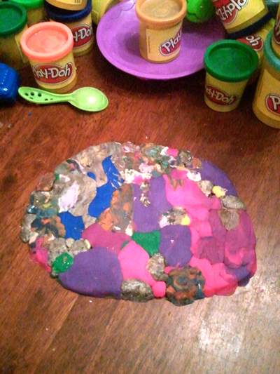
Wouldn’t Martha Stewart be proud?
We decided that making a multicolor patty was clearly the best use of playdoh. Forget those fancy moulds and cookie cutters…PSHAW! (not MOLD…mind you, I’m not THAT bad of a housekeeper) Can’t you see Damien Hirst doing something like this??? No?
Is it not the sculptural equivalent of THIS?:
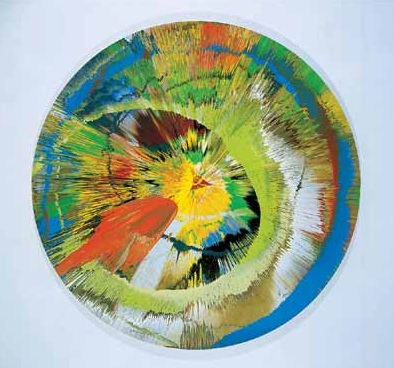
Damien Hirst, Beautiful revolving sphincter, oops brown painting, 2003
No?
Do I need to get out of suburbia more often?
Probably. Maybe we do have mold, and the spores are starting to affect my brain…
So, I finally got a chance to update my website with new artwork. YES! So, I’m going to do a little self promotion now…you’d better grab that double espresso…
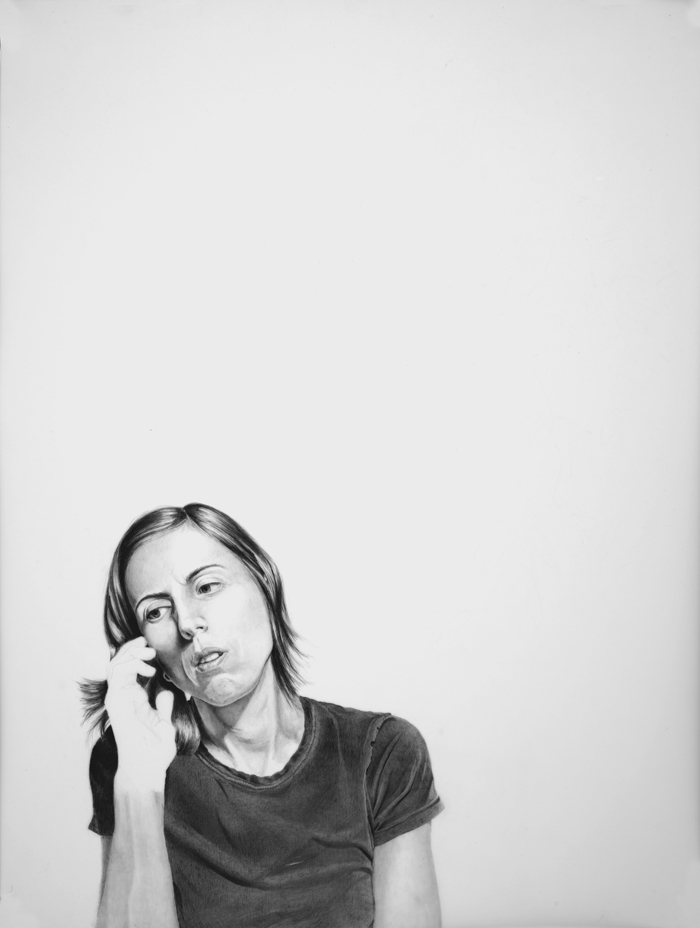
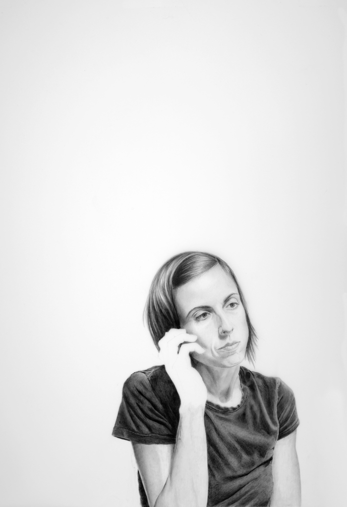
Elizabeth Kostojohn, Are You Still There? #1, 2012, 15″x20″, Graphite on mylar
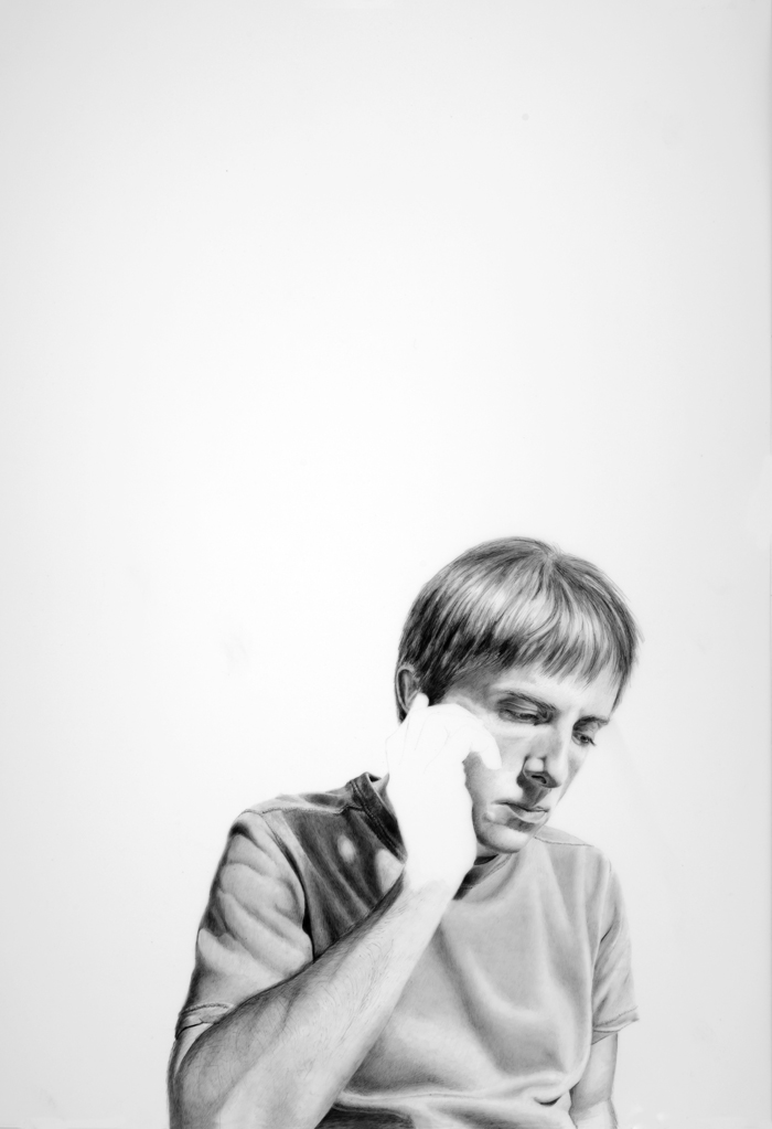
This series is titled, Are You Still There?, and it’s about the struggle to communicate in our significant relationships. (Everything is fine, Honeeeeeey!!! xoxoxo)
Elizabeth Kostojohn, Are You Still There? #2, 2012, 15″x20″, Graphite on mylar
Next:
Elizabeth Kostojohn, Are You Still There? #3, 2012, 15″x20″, Graphite on mylar
Next:

Elizabeth Kostojohn, Are You Still There? #4, 2012, 15″x20″, Graphite on mylar
Next:

Elizabeth Kostojohn, Are You Still There? #5, 2012, 15″x20″, Graphite on mylar
What do you think?
Do you know what I think?
I think that it’s going to be next to impossible to get people to volunteer to model for me…that’s what. Actually, my son wants me to draw him. Seeing as he typically refuses to have his picture taken, resulting in multitudes of photos of the side of his head, I’m surprised to hear that he wants me to draw a picture of him. Perhaps he only means a drawing of the side of his head? Hmm. Example:

Classic. Even less subtle:

Okay…okay…I can take a hint. Sheesh. I’m sure that Durer never had this problem…
Filed under: Fleeting thoughts..., printmaking | Tags: abtract, art, artist, drypoint, portrait, printmaking, Rosenberg
This week, I went to the Danforth Museum in Framingham (which I love) to see Rhoda Rosenberg’s works:

GO. SEE. THIS. SHOW. I loved it. Her work is so beautiful. Most of the works were some form of printmaking…woodblock, carborundum, etching, drypoint, chine colle, etc. etc. She has an amazing ability to juxtapose colors and textures. Many of her works referenced either her mother or father. She did a really stunning carborundum print titled, “Bubbie’s Bag”. It’s so simple…just an inky, abstract silhouette that you recognize as someone’s handbag. But the depth of the color is amazing for something so minimal. The richness of the dark bag almost makes it some kind of emotional black hole that you feel the heavy density of. Beautiful.
My own work this week was varied. I had my last portrait class, where I did this drypoint:

It’s such a caricature of the model, but I was happy with it anyway. I love drypoint, but it’s difficult, as you can’t erase and it’s hard to see the “drawing” as you’re doing it. I’m sad that this class is finished, as I loved it!
I also did more on this series of abstract woodblock prints:

and:

and:

and:

and:

and:

I haven’t had time to carve more blocks for this series. I was only working with three colors to start, but you can see the amount of variations possible. I added the red ink towards the end of the class. Some of the prints needed something more, and so this was an attempt at that “more”. I definitely like some more than others. That’s the surprise of printmaking…sometimes it’s a good surprise…sometimes not! At least you can keep running prints, as long as you have paper and time!
The holidays are coming up, and I have yet to catch the “spirit” of the season. Maybe if I bake some xmas cookies today, that will change. There’s nothing like sugar cookies with a thick and colorful crust of sugar from my son’s heavy handed application to get one in the spirit! In spite of many sweepings, I invariably hear that crunching sound under my feet from the sugar explosion for at least a month. Don’t get me started on the whole pine needle extravaganza. I feel like those things don’t go away until sometime in mid-June.
This year, we’re getting a real tree. Last year, it was my fake aluminum tree…so this year we do a real one. I must admit, my fake tree doesn’t have the lovely pine aroma…but what it lacks in smell it makes up for in exuberance. When we get our tree, I’ll post a picture…(you can vote on whether you prefer the shiny tree or the real one). Kidding! Actually, I really don’t want to know if you prefer the real one.
Filed under: Drawing, painting, printmaking | Tags: art, artist, charcoal, drawing, painting, portrait, woodblock printing
So, a bit of good news!!! I submitted three pieces of work to the upcoming show at the Arlington Center for the Arts…and all three were accepted! I was pretty excited, as I had no idea what to expect. The work is all abstract, but varied: one woodblock print, one monotype, and one acrylic painting. Exciting! The show, titled “Regeneration”, runs from November 21 through January 27. The opening is December 2 at 7:30 pm…I hope that I can go! Here’s what was selected:

and:

and:

So exciting!
On another front, I wanted to highlight the work of a local artist, Regina Valluzzi. She is uber smart, and combines her scientific background with her artistic vision to create amazing works. This is one of her paintings, titled, “Vacuum Energy”:

“Vacuum Energy” by Regina Valluzzi
Amazing, right? I wish that I could begin to understand the influences in her work, but as I am lacking a doctorate in physics, I can only talk about how I really love what she does…Please check out both her website and her blog. Here is another of her paintings, titled, “Emergent Order”:

“Emergent Order” by Regina Valluzzi
I’m such a fan of the colors, layering and complexity…She has two works that are going to be in an exhibit in Boston’s Hynes Convention Center from January 4 – 7. In addition, two of her drawings will also be in the aforementioned upcoming show at the Arlington Center for the Arts! Congrats, Regina!
I’ve been working on a WIDE variety of stuff, as per usual. In my portrait class, we worked with that same model that you’ve seen me draw in past blog posts. This time, however, instead of drawing….we did linoleum prints! Here’s mine:

Kind of interesting…in a Durer-esque sort of way. I wasn’t really finished with it, but I printed it anyway, as we were running out of time. Lots of stuff that I’d do different next time, but my first linoleum print from a model. The model looks like a brunette Gwen Stefani to me.
I also did a couple more woodblock prints. These are just using the blocks that I already carved before:

I actually did several, but that one is just an example of the colors that I was using. I also made ghost prints as well:

I’m not totally sure about the colors. It was good to play around with these blocks again, though!
I’ve been continuing to work on my vise study/series. I’m enjoying these drawings, as they are rather quick and messy (charcoal!). I am forcing myself just to do them, without over-analyzing the whole thing. I love using charcoal…it’s soooo tactile. I mean, you can draw a thin line…a fat line…a really WIDE line with the side of the stick…you can smudge it…lift it…amazing! I’m going to end up with black lung by the time this is over. I need a drawing-vac to suck up all of the charcoal dust. Again, does wonders for the laundry area where the vise is situated…But, I digress…here is one from last week:

I started to play with the anthropomorphic qualities of the vise…one from this week:

and one from today:

I really like that one. I’m not sure if I’m finished with it. I think that I should just leave it, so that I don’t “over-work” it. That’s what my painting teacher is always threatening us about. I am a virtuoso at over-working…both in my art and my life…but I’m trying to fix that in both too!
Speaking of painting, my recent painting from that class turned out…hmmm. Here it is:

Hmm…I was trying to do a self-portrait…but from memory. No photo or mirror. Once I got home, and looked in the mirror…I saw TONS of stuff that was off. It will be obvious to those who know me that this is only marginally a likeness. I think that I might try it again. Detail:

I really don’t think that my painting teacher liked it. I think that he was concerned that I looked so depressed! He asked us to do a painting inspired by writing/literature. I was working from Shakespeare’s sonnet #159, which I had to memorize in high school. DID I MENTION THAT I CAN STILL RECITE IT???? Scary! Anyway, thinking of all of that generated this painting. Once again…I got sucked into “realism”. I just love painting faces, though, so I like to do it. Next time, however, I’m going to really try to stay with abstraction, as I prefer that kind of art generally. Well…just as my high school field hockey coach would yell with her Dutch accent…”PUUUUSH YOURSELF!” Thanks, Anneke!!!
Filed under: Drawing, painting, printmaking | Tags: abstract, acrylic, art, artist, colored pencil, etching press, klimt, painting, portrait, profile, Stencil
Today, my car said it was 32 degrees. That’s cold. I know…talk to me in February…that will seem balmy. Still, I feel like I was wearing sandals just yesterday. Not only is it cold…but it SNOWED last night. Here’s what is left on our yard:

Look at that sad little water table in the background! It can be a skating rink for squirrels.
This week, I definitely made some odd stuff. I decided to dabble again with figurative work. I started by “copying” a face from a Klimt painting:

Klimt’s painting is, of course, stunning. I was just trying to study his way of rendering the face. Then, I did this one:

A little blurry…think of it as a “fuzzy filter” to improve the appearance. Hmm! Then the next one:

Strangely enough, that one looks a little like me. Not on a good day, of course. I showed these to my painting teacher. He said that they were “postmodern”. Hmm. I guess that means anything that isn’t “modern” pretty much. He likes modern painters, like Pollock and De Kooning. So…I think that he prefers much more loose and “painterly” paintings. That means more apparent brushstrokes, etc. As a result, I tried in his class to invent a figure painting that was more painterly:

I know. The red is a bit much. I think that I’ll try again, but with a more neutral color for the figure. It’s hard for me to paint a figure without one in front of me to look at! I know…practice, practice, practice. Detail:

He had some positive things to say…but this might have been to encourage me. He did not like the red, though. Hmm!
In my other painting class, we worked on an long 18″ x 48″ painting. We were told to pick three colors inspired by “regeneration”. Then, we had to mix the colors, and choose one for the background. The shapes were made with stencils that we cut out of paper which were insipred by shapes from green/red peppers. Interesting! The teacher, Adria Arch, is wonderful. I highly recommend taking one of her classes. The outcome:

It was fun to do. I’d flatter myself to think that it looked a bit Marimekko.
In my portrait class, we used colored pencils. I asked why colored pencils never seem to be in “high art”, only commercial art. Who knows??? Somehow, it’s just not seen as a fine art medium. Does anyone out there know of an artist who uses colored pencils? What do you think of his/her work? Here is my profile portrait:

I was really happy with how this turned out. This isn’t a great photo, but I think that I got a good resemblance and the coloring was decent. Maybe I should do portraiture? Only because I enjoy it so much…

Okay…the BIG surprise of this week is….
I have a small etching press!!!!!!!

CHECK. IT. OUT!!!!
Yes, it’s small. But it has a press bed of around 13″ w x 20″ l. This will take some typical sized plates and paper: 8×10 plate…9×12 plate. Ideally, I would have a bigger press. BUT…a bigger press is big $$$$. This little press was being sold by a lovely gentleman in Newburyport. It was his wife’s. I hope that he felt that it was going to a good home. I’m worried that the shoddy desk will collapse under it’s weight. I hope not. I haven’t printed with it yet…CAN’T WAIT!!!!
Filed under: Drawing, printmaking | Tags: art, artist, Center for Contemporary Printmaking, drawing, portrait, printmaking, visual art, woodblock printing
So, this past Friday evening was the opening to the portrait show that I have a drawing in! It’s really VERY low key…but I was excited nonetheless. The show is titled, “See You, See Me: The Art of the Portrait”, and it’s at the Belmont Gallery of Art until November 13, 2011. Here is what some of the works looked like in the first room:

See the two women standing in front of a large painting? The woman on the right is the artist of that painting, and it was so amazing. It appears to be a portrait of her daughter looking at picture books in a sunny, but dark, room. It’s an oil painting, and she’s clearly a talented painter. Her name is Noriko Fox, and here is her website.
This is the room where my drawing was…you can see it on the back wall…just to the left of the guy in black:

closer…

Here it is!

Here is the funniest thing…So, I had to put a title on this drawing. I did not know the name of the model, nor did I know any possible way to find out his name. So, I made up a name…”Michael”. He just looked like a Michael to me. I just didn’t want to call him “Man”, or “Portrait”. WELL…would you believe that there was someone else who had also done a portrait of him? I am not kidding! Of course, she had his correct name, which is “Dan”. My friend, Janet, came to see the show and recognized him and confirmed that his name is really Dan. Sigh. If only I knew that! At least we both did a good job creating a likeness of him, as pretty much everyone recognized that it was the same person!
Some other good news this week is that I sold three prints from the show at the Center for Contemporary Printmaking in Norwalk, CT! I was really happy. Only one of my prints was selected for the official show, but the other two prints were in binders with all of the other prints that didn’t make the cut. However, someone bought not only the one officially in the show, but the other two as well! Not the same person, I’m sure.
My last bit of good news is that my basement workspace is finally furnished, and I’ve moved in! I will show you a photo at some point, but it’s a bit messy right now. I’m preparing for the Arlington Open Studios, so I haven’t had much time to really organize it. I’ve been trying to make progress on packaging all of the prints that I plan to bring to the open studios. Mark it on your calendar! October 15 & 16 from 12-5pm at the Arlington Center for the Arts. I’ll be in the big auditorium space.
Here is part of a woodblock that I have been working on. This was printed by hand, but I’m hoping to print it with a press on Monday. I’ll update you on how it turned out!

Filed under: painting | Tags: acrylic, art, artist, Paint, painting, portrait, self portrait, still life, visual art
My painting teacher asked us to bring in an object to paint, or “present”, in his words. I didn’t know what that meant, but it sounded intimidating. He brought over a Rauchenberg book to show me an example of what he meant when I asked him about it. Hmmm. No pressure. Setting the bar astronomically high…okay. Have I already mentioned that I love Rauchenberg’s work? I probably should have just crawled under my easel at that point, but I didn’t. Maybe if I had a stuffed goat and a tire, I might be able to sort of get within the same solar system as Rauchenberg’s work. Maybe not.
Anyway, I picked a small elephant toy that I’ve had since I was a kid. My childhood friend, Anita, gave it to me. Her dad was from India, and they went there on vacation. So, here is my little elephant…in pretty good shape if you consider how old it is…

Cute, right? He doesn’t stand up well, and tends to tip forward. I think that either his trunk puts him off balance, or his front legs are a little too short. I empathize.
So, here is my painting of this little guy:

I’m happy with it. I mean…it’s no Rauchenberg. I know. Trust me. This is what happens when you don’t crawl under your easel. I’ve always thought that still life painting was kind of…ummm…not so exciting. I gravitate towards abstract and messy art, so still lifes are so…well, still. Maybe I need to try it again? My teacher said nice things about it. Again, I know. He has to walk that delicate line of being somewhat frank, but not completely squelching me with reality. It’s only my third class, so I think that he’s still trying not to scare/offend anyone. He mentioned that three people left one of the other classes that he teaches, so perhaps he was worried about making the beginners in the class, like myself, run as well. Comments?
So, I’m still not done with this odd/icky self portrait. I know. Just paint over the whole thing and start again. My teacher suggested some abstract colored blobs to break it up a bit:

I don’t know. I’d like to help it somehow, but it might bother me too much to keep working on it. This is one of those painful confrontations with reality. I need to go out and buy a lot more titanium white to fix this thing. Maybe just getting a large tub of gesso and a paint gun would do the trick…I think that I get points for even posting it though, right? Maybe not. Sigh.
Filed under: painting | Tags: acrylic, art, artist, Canvas, charcoal, figurative, Paint, painting, portrait, visual art
For one weekend every year, my husband and I go back to where we were married…sans enfants. Thanks to the generosity of my mom who is willing to watch my son, we can have a weekend escape! I know. How lucky! We go to the place where we were married in the Berkshires. It’s SO lovely…so quiet…just the noise of the wind moving through the trees. Ahhhh. I wish that I could bottle that and bring it home. Perhaps that’s what those Bose noise cancelling headphones are like…sounds appealing.
So, I’m thinking about my next painting class coming up. My teacher suggested figurative work. I like drawing people, so perhaps I’ll like painting them too! I made an effort not to “draw” the paintings. Don’t get me wrong…I love the way that drawn lines look in a painting. I just thought that I’d try to keep my paintings truer to the medium. I basically reworked the two canvases that I had started in class. This proved to be a challenge, as both canvases were VERY textured. I mean…REALLY textured. So, it was tough to do something on top that wasn’t abstract. Here was the first one, based upon a suggestion by my teacher:

I think that you can see what I’m talking about with the “extreme” texture. Here is a close up:

Okay, it wasn’t an assemblage, but still. It was really tough to paint over that goopy surface. Anyhoo…this was kind of fun. I liked using the odd colors too. I decided to do another one:

Hmm. I layered this one a bit more, as I felt that it needed something to tie the abstract background with the portrait. Perhaps I need to be a bit more abstract with the portraits. Hmmm…
I’ve started another one, but this time…I began with a charcoal drawing on the canvas. I have also added some texture to the canvas, but it actually relates to the image, as opposed to the two paintings above. We’ll see how this one goes!

I found that the charcoal sort of smeared when I went over it with the acrylic medium, so I actually put most of the medium on the background.
I’ve also got a woodblock that I have to make some progress on. I’m not using the gourmet shina plywood, but some other plywood from Woodcraft, a store in Woburn. This is a royal pain. I’m so spoiled with the shina plywood. This other plywood splinters, is hard to cut, and is a general pain. It’s made me sort of drag my feet about carving it. I need to finish it up though! Hopefully, I’ll have some prints next week to show of it.
The opening reception for the portrait show that I have a drawing in is this Friday! So, if you are in the area…please stop by the Belmont Gallery of Art between 6-8pm on Friday. I’ll be there!
Filed under: Drawing | Tags: art, artist, charcoal, drawing, portrait, sanguine, Visual Arts
A while ago, I took a portrait drawing class. This is really one of my favorite things to do. I don’t know why, but I really do love drawing people’s faces. But when I am not in a class, I find it really hard to do so. I mean, who is going to sit still long enough? Nobody. The other thing about this is…I don’t think that I would necessarily want these drawings hanging up in my house. I love crazy abstract art. I am less inclined to like realistic art. So…these are attempts at realistic images of people that I don’t even KNOW. Why would I put these drawings on my wall? Hmmm. I am considering taking another portrait class, just because I love doing it, but I’m not sure. If I don’t like the end products, then why do it? Or, is that just me being too “product/end result” oriented? Here are the drawings. Note how the corners of them got crumpled in the attic. Sheesh. I need a flat file.

I’ve managed to flatten that one out a bit. I may try to enter it in a portrait show. Who knows. I don’t think that it is really “original” enough, but we’ll see. He was kind of a character. Here is the second drawing:

She got quite crumpled. Hmm…I will have to work on that. I managed to crop my feet standing next to the drawings, as I thought that would look odd. This was a hard pose to draw, as a profile doesn’t give much depth. A 3/4 view is always better. In a crowded class, though, you can’t always get the good spot.
I’m still chasing after abstract art. Is it futile for me? I’m not saying that these drawings are amazing…but I have some modicum of ability here. Should I keep going with the portaits, or try out the crazy abstracts, which I love?
I have a painting class that starts next week. Wish me luck! I’m hoping it will help me a bit.
Hey, if anyone out there wants to sit still for a few hours so that I can try to draw you, let me know. No, you’re not allowed to fall asleep! I also don’t want to draw someone with a “zoned-out/tv-coma” face. Not a good look.
Filed under: painting, printmaking | Tags: Acrylic paint, art, artist, gelatin printing, gouache, Ink, Paint, painting, portrait, print, printmaking
I spent the morning doing some gelatin printing. I’m not sure that I’m a huge fan of this type of printing. I was also testing out different inks and paints to see which worked best. I think that the Akua inks worked well, as they don’t dry until they are on paper. The acrylic paint and the speedball ink were both just so-so. The only problem with the Akua ink is that it does take an eternity to dry. I’ll probably still be wiping blue off of my hands every time I pick up one of these prints. Here’s one of the first ones:

Eh…feh…blech…some interesting aspects to it. I like how the silver ink turned out in the lower left corner. Next:

Also kind of interesting. These are printed on some very thin mystery Asian paper that I have. The art store in Cambridge had rolls of random paper for sale…10 sheets for $5. What a bargain! So, this is why I don’t know what the paper is. Next:

I experimented with a stencil a little. That’s where the leaf shape comes from. Next:

I liked the random stamped lines in the lower left area. Next:

I like the greenish yellowish color with the greenish blue color. Any comments? Does anyone out there also do gelatin printing? What inks do you like to use? Do you have any pointers for me?
Last night, I kept myself up doing a gouache painting. Okay…It was VERY frustrating. I have seriously debated showing this at all, as it looks bizarre…but here it goes:

See how small I made the picture? Maybe it’s still too big. Anyway, I know that this looks really weird. He looks like he has a skin condition. DRAMATIC SIGH. I painted this based on a photo. Hmm…while I like the challenge of painting or drawing people…it also is rather daunting. I’m going to need A LOT more practice before I start doing this on the streets of New York…
I am the monitor for the print studio in Cambridge on Friday. As a result, I’ve needed to come up with what I’m going to do during that time. So, I have tried a little experiment. I painted gouache onto two 8″ x 10″ sheets of plexi. I’m going to see if they print onto damp paper. Here’s the first plate:

Kind of fun. The bubblegum pink is a bit much, but I’ll see how it prints. Here is the other one:

These are really an experiment. I hope that they print. If they don’t, I’m going to be disappointed.
So, where am I going with all of this? Who knows. I’m going in every direction at the same time. Let’s hope that some of this eventually leads somewhere!
Filed under: Drawing, printmaking | Tags: abstract, art, Art book, book, drawing, goat, handmade, Pencil, portrait, printmaking, sketch, sketching, Visual Arts
So, I managed to get a bunch of stuff done before the weekend. I probably won’t get much time to work on stuff until next Tues. Yes, this stuff is “all over the map”. Think of it as a pu-pu platter of attempts.
I keep thinking that I need to make a more coherent set of things. Then, I get distracted and want to try something new. Thus, the randomness of it all.
I’m not going to post every day. While I’m still working on my 365 projects, I’m not going to barrage you with posts. It’s too exhausting for everyone…well, mostly me.
So, if any of you have some thoughts on this stuff, I’d love to hear it. Even if you tell me NOT to EVER do that again…at least I’ll have some feedback. Right now, I am kind of working in a bubble. I am trying to investigate ways to possibly get some feedback from people. So, until I figure that out, this is my forum for comments!
I’ll stop rambling now, as my hands are too cold to type, and just show you my stuff. I kind of like this one:

a detail of the above print:

another similar one…I like the colors, but the design is so-so:

detail:

this one was not good, and i couldn’t save it:

and a detail:

at last…something recognizable! no, it’s not me…:

detail:

And now for something completely different…a pencil drawing:

detail:

I liked this drawing, so I made a print of it:

detail:

And I made another little book! This one is about winter:

detail:

even CLOSER:

Whew! Okay, that’s it for this week. Seriously. Speaking of winter, my hands are so cold that I can barely type. We’re supposed to get snow this weekend too…brrrrr! Have a good weekend!
