Filed under: Fleeting thoughts... | Tags: animation, art, decordova, Dreamworks, KFC, Kung Fu Panda, Turbo
Ack! Is it Friday already? How come my house is still a mess and I don’t look like Giselle Bundchen? Oh yes. I forgot. I’m still me. Damn.
Before I get completely sidetracked in my usual nonsense, I just want to give a big THANK YOU to Martha Wakefield and Jeanne Williamson, who included me in their recent show. Thank you so much!!!
Okay. Enough seriousness. I stopped by the deCordova yesterday with the intention of seeing whatever new and fabulous art was up. WHAT? THEY STILL HAVE THE BIENNIAL UP??? ARE YOU KIDDING ME??? I wrote a post about it in NOVEMBER. I think that museums would get more visitors if they CHANGED THE EXHIBIT more frequently than once a year. *DRAMATIC EYE-ROLLING SIGH*
I just heard on NPR that fast food places are trying to come up with disgusting food chimeras to get you to stop by, such as this disgusting creation:

THAT is KFC’s Double Down “sandwich.” This is supposed to tempt you to come to KFC because it’s “new” and “freakish.” Brace yourself…don’t you think that the deCordova could learn something from KFC? YES! Create appalling shows that are up only for a short period of time! Why not? Or at least have two different shows that are staggered in their rotation…or maybe just offer a free Double Down to each visitor??? That might be tempting! (There’s a reason that I don’t do P.R., obviously.) No joke…change the exhibit SEVERAL times a year and people will come back SEVERAL times a year. I’m so logical, it scares me.
Recently, my husband was upset that I bought an electric can opener. He feels that it embodies the decadence and absurdity of our culture. I think not. I think that THIS SANDWICH represents the preposterous excess of our time. Am I right, or what??? Again, killer logic. Don’t tell me that you’ve stopped reading to head out to KFC right now. (Bring one back for me if you do, okay? My husband is vegan…SEND HELP!)
MOVING ON…As a result of my failing to personally see any new art for the reason just mentioned above, I’m resorting to giving you a link to cool work that I found online. If you’ve never looked at Colossal, you should. They always have amazing stuff. Such as this:

Please check out this video here. BRILLIANT! I love stop motion animation! I guess that’s a result of watching Gumby when I was little. Or was it because of Mr. Bill? Not sure. Anyway, it’s kind of soothing and zen. It almost makes me forget that I should probably be doing housework.
If you decided to read this blog because you thought that it would be interesting, stop right here. You’re out of luck.
My artist friends and I were lamenting the ridiculousness of the art world last night. Our conversation/whining was generated by this article. Yes, the Whitney Biennial…the Oscars for artists…is being criticized for its parasitic use of artists to generate money for itself. I know. Duh. That’s how it always works. The art world makes no sense. If friggin’ Dreamworks gets big profits from people coming to movie theaters to see something inane like Kung Fu Panda…then it seems OBVIOUS to me that artists showing at a venue should be making a profit from admission fees. Am I right or what??? (Say “yes” or I’ll send the panda over to mess you up.)

Seriously. What the heck is wrong with society?
Thankfully, my six year old son has not seen that movie. He did recently watch Turbo. You know…the movie where a snail competes in the Indianapolis 500?

My son got mad every time I mentioned how “cute” this snail is, zipping around a racetrack. Apparently, this is serious stuff for a kindergartener. I think that the whole premise is COMPLETELY HILARIOUS. I had to stifle my cooing and/or guffaws every time the little snail zipped across the screen.

My son drew this after watching the movie. In subsequent drawings, he has learned to spell “Turbo.” See? These movies are educational!!!
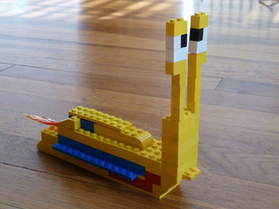
He also make this Lego version. Notice the flames coming out the back of the snail. Nice touch.
As this post seems to be turning into an inane rant about animation, I’ll leave you with the work of David Szakaly.

I think that Dreamworks or the deCordova need to get in touch with him. “Honey, I didn’t get any housework done today because I was in a hypnotic trance looking at swirling rainbows on tumblr. Sorry!!!”
Filed under: Drawing, Fleeting thoughts..., painting, sculpture | Tags: art, artist, decordova, deCordova Museum, drawing, museum, Orly Genger, painting, sculpture
This has been a rather rough week. A friend of mine, her two sons, and her husband died this week. I won’t go into the details, as those are even worse. I want to say something profound about the whole ordeal, and about her, but I’m at a bit of a loss. I feel as if my brain stopped working this week…my thoughts have been stuck like a needle skipping on a record, repeating the same awful refrain. Short periods of heartache and angst have been interspersed among longer periods of numbness.
I tried to find solace this week by going somewhere that I love: The deCordova Museum.
I have been coming here ever since I moved to the area in 1998. I find it to be peaceful and beautiful. It truly feels like an escape to me. This week, it helped provide me with fresh air and a necessary, albeit temporary, distraction. While I walked around like a bit of a zombie, there were things that made me smile and appreciate that there is still beauty in this world. I don’t mean beauty in a superficial sense, but beauty of thought and sensibility. I present to you what I saw at the museum…because I can’t talk or think about my sadness right now.
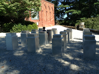
 Orly Genger, Red, Yellow and Blue, deCordova Museum
It was a cold and clear day. I aimlessly meandered through the grounds and was drawn to this new installation by Orly Genger. I first saw her work at Mass MOCA. This specific piece was originally commissioned for Madison Square Park in NYC.
 Orly Genger, Red, Yellow and Blue, deCordova Museum
I love to knit, so the loopy, monumental, yet somehow furtive, quality of this work appeals to me. I like that it becomes taller than a person at times, defying knitting’s typical scale and delicacy.
 Orly Genger, Red, Yellow and Blue, deCordova Museum
It winds its way around, changing from red, to yellow, to blue.
 Orly Genger, Red, Yellow and Blue, deCordova Museum
See how it winds around the grounds? Knitting is very meditative, and I looked at all of the silent stitches and wondered about each one.
Inside the museum is the biennial exhibition…
 Ethan Morrow, Flotilla (detail), ball point pen
Morrow’s work fills the main staircase at the museum. His drawings are amazing. Detail:
 Ethan Morrow, Flotilla (detail), ball point pen
Isn’t that breathtaking? He has drawn gorgeous, ethereal ships floating up the expanse of the stair wall. He included historical details and text along with his drawings. I bask in his drawing brilliance. You must go see this.
 Bahar Yurukoglu, Primodial Future, Mixed media installation with projection
Please take a look at Yurukoglu’s website…it’s very interesting. I like bright colors and transparency, so I liked where this was going. Everything was wall bound…and I kind of wished that there was even more, somehow. Look at his website…lots of beautiful images and stunning photographs.
 Laura Braciale, Rods and Cones, Mixed media installation
I liked this piece. I liked the translation of these odd objects into flat, 2D paintings. It looks like some kind of research project to me…an experiment in perception. I also like all of the white space (of course.) You’ll see that there are quite a few installation pieces in this biennial.
 Xylor Jane, Magic Square for finding missing people, Oil and colored pencil on panel
I really liked Jane’s work. It felt very different to me. At times, it almost seemed to be like a textile, with seams. Her work was very bold.
 Xylor Jane, Via Crucis XII, Oil on panel
There is something both dark and menacing, and happy and lighthearted about this piece. Overall, it’s chromatically dark…but you can see the sort of rainbow palette with almost heart shapes throughout. What you can’t see in this photo is the beautiful use of textures…the main background is a matte black, and the colors are glossy dots in a grid. So cool!
 Xylor Jane, 2,3,5,7, Oil, graphite, marker and colored pencil on panel
This was really fascinating. This painting in particular felt like a quilt/textile…and yet it had such depth and transparency at the same time.
 Xylor Jane, Nox Rex #26, Hypnos, Oil on panel
This is an amazingly detailed pointillist painting. I can’t help but think of The Matrix. (Perhaps, I shouldn’t admit that? Does that automatically make me a total philistine?) Again, the grid and precision are rigid, but the undulating colors brings some levity to the piece. I love how her four pieces worked together.
 Petrova Giberson, Tree Flowers, Mixed media installation
I really liked how this piece and its shadows interacted. It’s kind of like a sad, old comforter that somehow went to heaven. It’s hard to see, but there is a line of threads hanging from the ceiling to the right of the comforter, which created an interesting threshold. The whole piece had a very intriguing way of occupying the space.
Upstairs, there was more to see…
 Rachel Gross, woodblock print and acrylic
First off, I want to apologize to Rachel Gross because I did not keep track of what the title of this piece is. In any event, Gross’s work is stunning. Her woodblock prints are some of the most beautiful that I’ve seen. Please take a look at her blog. I love the layering, textures, color palette, composition…everything.
 Rachel Gross, Pink Box, Woodblock print with spray paint
I love the simplicity of this. I love the crinkled paper and flat texture of the wood grain. (I also love hot pink…)
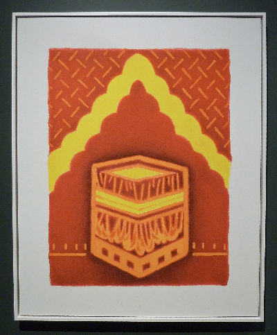
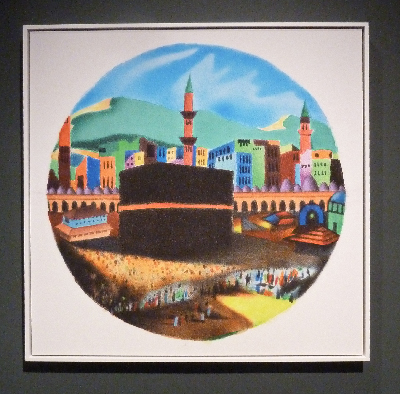
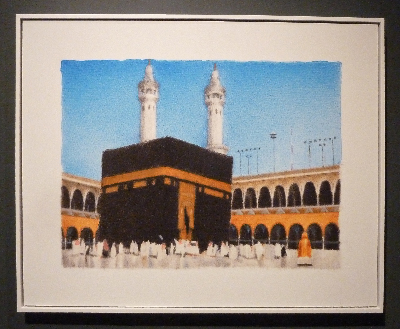 Hamra Abbas, Kaaba Pictures 1-7, archival pigment prints on dibond
Again, my apologies to Hamra Abbas, as I don’t know which number this work is in the series. Abbas does miniature paintings of the Kaaba, contemplating its historic, religious, and everyday influence. She then has the miniature paintings photographed and enlarged to form these prints. They have a mysterious and atmospheric feel to them.
 Hamra Abbas, Kaaba Pictures 1-7, archival pigment prints on dibond
This is so luminous…with both flatness and three dimensionality…
 Hamra Abbas, Kaaba Pictures 1-7, archival pigment prints on dibond
This has a fairytale feel to it…beautiful!
The final artist that I’m going to show is someone who’s work I love, and who I managed to meet at an open studio that he had.
 Anthony Palocci, Jr., Empty Fridge, oil on canvas
Don’t you love it? He just looks at everyday household objects and reinvents them. Brilliant.
 Anthony Palocci, Jr., T.V., oil on canvas
I love the cold glow of this T.V. So amazing…
 Anthony Palocci, Jr., Phone Call, oil on canvas
I love this too! It’s sort of humorous…but there is something “vacant” about all of his work. The viewer is looking at these objects distilled to pattern and value. They’re so ubiquitous, yet now they have a sort of uncanny feel to them…
 Anthony Palocci, Jr., Window Fan, oil on canvas
This is a large painting. Take a look at his website to get a sense how how large it is. It’s as if something that is normally forgotten and silent has somehow been given a voice.
 Anthony Palocci, Jr., A/C, oil on canvas
I took a photo of this painting with context, so that you can see some of what I perceive as the humor in this work. It doesn’t look odd to see an A/C unit sticking out of a wall…but this is a painting, of course. I thought this was a wry location for the work…

Well, I’m signing off. It’s been a long week.
On Tuesday, there will be a vigil held for my friend and her family. If you’re in the Arlington, MA area and would like the details…let me know.
Peace be with them…
Filed under: Fleeting thoughts..., sculpture | Tags: art, decordova, Jaume Plensa, Lincoln Massachusetts, Parks and Gardens, sculpture, Sol LeWitt, Tony Feher, turkeys, Visual Arts
This week, I took my five year old son to the DeCordova Sculpture Park and Museum in Lincoln, MA. I LOVE this museum. In spite of the fact that I had to keep saying, “AAAAAAA…DON’T CLIMB ON THAT,” I think he had a great time. He met some other kids and they spent a good amount of time climbing on some logs cut up from a fallen tree. I was wishing that I’d somehow brought a latte and a lawn chair, but no luck. They should rent those. (I mean the chairs, not the lattes…)

Okay Mountain, 4-Wheeler Rollover
This was the sculpture that I wanted my son to see. Hilarious, right? So awesome. The tire ruts in the ground are in a swirly/loopy path that noodles around until you reach the tipped over ATV. It just makes me laugh, for some reason. (I hope that doesn’t offend the artists…) It’s great to have this kind of thing in a place that’s rather highbrow…not that this art is lowbrow…(or Loenbrau…) but you know what I mean.

Tony Feher, The Nothing Before Something
Tony Feher currently has a solo exhibition at the DeCordova. I wrote about the show here. This is very striking…a brightly painted telephone pole. It’s like the Z axis…or a big stake in the ground…It makes me think of the astronauts putting a flag on the moon…kind of monumental.
Speaking of monumental…
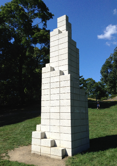
Sol LeWitt, Tower (DC)
I like how pure this is. I kind of wish it was enormous…building sized…except that you can’t go in. That would be cool, right?
The next three works are all busts…so different, though!

John Wilson, Eternal Presence
I am SUCH a fan of his work. Gorgeous. He had a solo show at the Danforth, which I wrote about here. He is supremely talented and brilliant.
I’m kind of pondering the base, though. I think that they need to fill in the dirt around it so that we don’t see the rough bottom edge of the concrete. Thoughts? It kind of makes it look like an afterthought, or as if it could be moved anywhere, and isn’t properly rooted to it’s ground. Just my two cents. It’s a stunning work of art, though.
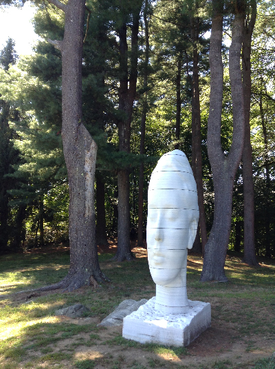
Jaume Plensa, Humming
I love how this is distorted and elongated. Don’t you love the title too? I think of the sound of Buddhist monks chanting a long “Om……” I like how this one is in the shade….seems right.

Joseph Wheelwright, Listening Stone
Fascinating, right? I don’t know whether to think his upper ear is listening, possibly to the sounds of nature or of my son’s yelling, or is he listening to the earth? Thoughts? Sometimes as a parent, I feel like my head’s made of stone and I’m not listening. Is that bad?
Aaron Stephan, Untitled (16 Cans)
You can see the silhouette of my son standing amongst this sculpture. It’s pretty minimal. It’s also kind of funny, because if you turn around…this is what you see:

No, that’s not part of the sculpture. That’s just a trash can. Don’t you love the DeCordova???
Besides this excursion, we also went to visit a friend who was renting a house on Plum Island. My son and my friend’s son had a blast generally running around and yelling. You know how it is, right? No? Well, you’re damn lucky, then.
Take a look at this RIDICULOUS dahlia we saw:

No joke.
Speaking of ridiculous, take a look at this turkey we saw at the same farm:

They are SO CRAZY looking. He really is like a big butterball. Sometimes, he would raise and fan out his scraggly tail feathers, like a moth eaten peacock. What an odd creature. I love the dark iridescent feathers on the main part of his body. I could do without the blobby snood. Look how freakish the domestic turkey is compared to the wild one:

Right???? If I was that wild turkey…I’d run, or rather fly, out of there STAT! It makes me think of these guys:

Run, Alice! RUUUUUNNNNNN!!!!!
Filed under: Fleeting thoughts..., painting | Tags: art, candy, decordova, gummi, installation, painting, sculpture
On Tuesday, it was 54 degrees outside. Today, it’s 19. I’m moving to Florida. (just kidding…not that there’s anything wrong with Florida…)
This has been one of those weeks where I have had no free time, and yet it’s unclear what I’ve accomplished. I’ve done very little drawing, and my house is still a mess. Hmm. I think that I’m also going through a slight phase of S.A.D. (seasonal affected disorder.) Maybe I need to up the wattage of our lightbulbs around the house? Or maybe I just need more chocolate? Does anyone else out there feel slightly blue right now?????
Sometimes, I think that keeping up with the news doesn’t help. I’m a worrier, and the news provides endless fodder for my neurotic brain to chew on. Did you know that more and more small children are developing anorexia? No joke. I listened to it on NPR. HOW IS THIS POSSIBLE???? And it’s not those scary pageant queen mommies that are causing it. Now, I’m analyzing what I say about food in front of my son. Apparently, we shouldn’t say that there is “bad” food or “good” food. WHAT??? Really???
WELL, pshaw…my mother recently bought THIS disturbing item for my son:

Now, I ask you…is this not the POSTER CHILD of “bad” food????? Actually, I’m not sure that it qualifies as food at all! Whew! (Thanks, mom…) Perhaps I don’t have to worry about childhood anorexia when my son happily chews on sour gummi french fries??? Beyond gross. So, here I am fretting about buying organic fruit and BPA free tupperware, and meanwhile my kid is eating a gummi hamburger, gummi pizza, and a side order of gummi fries. Thank God it’s at least peanut and fat free… (They forgot to add “nutrition free” as well. I might have to write and tell them that…)
The thing is, I would have TOTALLY wanted this as a kid too. Actually, I had a tendency to choose anything colored blue: blue frosting, blue gum, blue italian ices. Gross, right? Well, in spite of my deviant dietary desires, I turned out “normal”, right? Hmm. Actually, SCRATCH THAT. NO BLUE FOOD ALLOWED, lest my son become a neurotic worrier like his mom.
The gummi “lunch bag” is kind of beyond the pale…pure, dietary evil.
Okay enough about disgusting “food”…this week wasn’t a TOTAL waste. I did go to the Decordova Museum. That’s productive, right? Their current show is called, “PAINT THINGS: beyond the stretcher.” This was a pretty interesting show. All of the works are definitely “beyond the stretcher,” as there was a lot of paint…but a dearth of canvas. I really liked many things in the show.

Kate Gilmore, Like This, Before, 2013
This piece is the remains of a performance/painting/sculptural work by Kate Gilmore. In the performance (which you can see a video of adjacent to this piece), she is wearing a nondescript blouse, skirt and heels…typical office wear for women. She begins by ascending the ladder on the right while carrying a large vase filled with white paint. She walks across the top of the sculpture, sets down the vase, and climbs down a ladder on the left. She repeats this until the entire top has a row of paint filled vases on it. Then, one by one, she knocks over the vases (I think with her foot.) As each vase falls, it shatters and spills paint down the channels below. The paint runs through a hole at the bottom of each channel and fills another vase at the bottom. FASCINATING. I love that she’s wearing typical “office gal” clothes…and that she has to struggle to climb the ladder while carrying each vase…and that she has to carefully shimmy across the top without knocking down the other vases…and then she has to place her vase down and carefully climb down the other side. I love the struggle, the exertion, the care, and the destruction she conveys.

Steve Locke, Crossing Against, 2012
A very simple piece, but I loved what it does with form, light, and shadow. The palette is almost primary colors, but they are tweaked a bit. The face looks annoyed, but the leaning form implies a figure resting lazily against a wall. I love the reflected neon yellow in the shadow…it makes me think of inner heat or turmoil.

Mika Tajima, Furniture Art (series), 2011
These works are actually created with plexiglass box frames. BRILLIANT! I love how she has taken this totally mundane object and really played with it’s inherent characteristics and traditional role. Detail:

Mika Tajima, Furniture Art (detail), 2011
Aren’t the shadows amazing? You can see an interesting video of her here. I love how architectural a lot of her work is. Next:
Sarah Braman, In the Woods, 2012

Sarah, Braman, 8pm, 2011
These works were an interesting blend of materials, color and form. The lower piece, 8pm, actually has part of a camper in it. I like the mix of prefabricated elements with paint and other more “raw” materials, and the limited color palette. I also liked how she has painted In the Woods, as it almost has a three dimensional quality. Next:

Franklin Evans, paintthinks, 2013

Franklin Evans, paintthinks (detail), 2013
I love the excess of this installation. You can see in the detail photo the layer and layers of tape, colors, and photos. Next:

Katie Bell, Blind Impact, 2013
This was another interesting installation. It looks as if the materials found at a collapsed house have gathered together to be reborn as a new entity. Perhaps because of the geometry or how the piece creeps up the wall, there is a certain joy to this piece. Here is a view from the front:

Katie Bell, Blind Impact, 2013
No, the handrail at the bottom is not part of the piece. Don’t you love the composition? Next:

Claire Ashley, thing one / thing two, 2013
Amazing, right? I apologize to the artist as there are two works in this photo, and I don’t know which is which. The Decordova has this dramatically narrow and tall stairwell which often has incredible installation work. The ENORMOUS piece that runs up the wall is astounding. Claire Ashley seems to do these larger than life, bulging forms which both intimidate and excite.
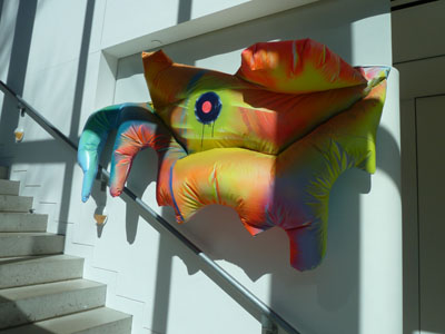
Claire Ashley, thing one / thing two, 2013
Isn’t that amazing? I love the colors. I love how these works have sort of infested the building, taking it over. I wish she had had a solo show, as I’d love to see a whole gallery full of her art. These pieces really do dwarf the viewer and gaze back with a disconcerting stare. Next:
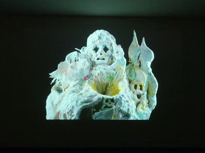
Allison Schulnik, Video still from Mound, 2011
This is a still from the amazing animation by Allison Schulnik. Her work is astounding. Please visit her website here, and go to the “video” heading to actually see these works. Plasticine figures erupt and morph into eerie creatures who are both engaging and disturbing. Look at that image! Don’t you love the starkness of the figure? Don’t you love how it’s both fascinating and unsettling? Please watch her videos. You must. I almost missed seeing them. If you go to the Decordova, they are on view in a room behind the desk at the entry. Go now. You must.
So, this was not a week of “minimalism”, unless you count how much tangible work I got done. Sigh. I may have to resign myself to gnawing on a gummy hot dog while I mope about looking for sunlight and something blue to nibble on. Send chocolate. Please.
Filed under: Drawing, Fleeting thoughts... | Tags: artist, decordova, drawing, Pencil
Yes, this was a shoddy production week. I didn’t even finish ONE DRAWING. I kid you not. I did, however, build a box for my drawings and mount them all:

Nice, right? Snazzy custom box! That’s just to distract you from harping on the fact that I did not finish a new drawing for this week. So sad.
I am digressing from my stuff to note that my son’s drawings have taken a new direction. He was “a scribbler” for the most part. Now, he’s doing these hilarious faces. Check it out:

He decided that the hair only on the top of the head wasn’t enough…it needed to go around the WHOLE head. Awesome. This next one, he told me, is a one-year old:

See all of the circles in his mouth? Those are apricots.
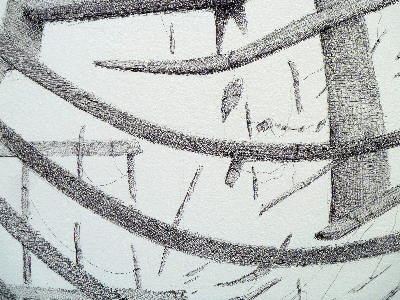
My own drawings, as a kid, were rather mundane:

I assume that I was older than 4 when I did this…my dad mowing the lawn. Nice beard stubble. Apparently, that was important. Next:

I’m not sure that my spelling is any better. Does anyone remember those Ed Emberley books???? They were these odd guides of how to draw stuff…these fish are CLEARLY from that book. In some ways, those books are really “anti-art”, as how to draw things is codified. BUT, I think that it’s an interesting take on abstraction, just using combinations of basic geometric forms. I know. No one is going to get into any MFA program with these drawings, but you gotta start somewhere.
This week, I went to the DeCordova museum to see their Biennial exhibit. It’s odd…I liked it generally, but I wasn’t really wow-ed by it. I’m not sure why, so maybe I’ll know by the end of this post.
Lately, there is a lot of work where something looks familiar, but it is made out of completely surprising materials. Take these, for example:

Antoniadis & Stone – Sculpture Park (Flipside)
This looked like two, green concrete block walls that have been stacked on their side. Hmm! Actually, it was made of particle board, plastic and paint. I kid you not. I liked their work, as it was taking the mundane of our landscape and not only reconfiguring these objects, but making them by hand with other materials. Next:

Chris Taylor – Untitled
This artist takes mundane objects, like styrofoam cups and bubblewrap…and makes them out of GLASS. Seriously. They look perfect. I guess that he’s sort of the “anti-Chihuly”. I liked these, but I didn’t like how they were shown. They were all sitting on a steel shelf, jumbled together. I would have liked them to be treated in a more precious way. How pedestrian of me. Next:

Lauren Kalman – Blooms, Efflorescence, and Other Dermatological Embellishments (Nevus Comedonicus)
HMMM! This artist studied skin conditions, and then rendered them with jeweled piercings. It makes beautiful what we would normally think of as “ugly”. She used herself as a model, I believe. I like where this is going…but is the final product actually “beautiful”? Or, now that it is body adornment…has it become ugly again because of it’s unorthodox nature? Either way…ouch. I’ll stay with pencil drawing, thankyouverymuch.
Tomorrow, I’m going to the “Artists’ Books: Books by Artists” exhibit at the Boston Athenaeum. I LOOOOVE this kind of stuff. I’ve now made several little books myself, which I think is super fun. I haven’t ever really focused on one seriously, as an attempted piece of art. Anyone out there know some favorite artists who create cool artists’ books????
For those who don’t know what the heck I’m talking about…artists’ books are basically a book as art. For example:

Merrill Shatzman
I discovered this artist online. Her (his?) stuff looks GORGEOUS! Check out her/his website. I seriously love her/his stuff…(sorry, Merrill! Maybe I’ll invent “hisser” as a word to replace her/his? Thoughts? Will Daniel Webster rise from his grave to strangle me?)
Any other book artist recommendations out there?????
Is ANYBODY out there???? (kidding…sort of…)
Filed under: Fleeting thoughts... | Tags: art, artist, decay, decordova, Exhibit, fragments, Leonardo Drew, museum, sculpture
So, this was the last day that the work of Leonardo Drew is at the DeCordova. I am SO lucky that I went. I seriously loved it. He’s brilliant.
His works are primarily sculpture…and his work is often a gridlike arrangement of decayed fragments. Think: rust, dirt, remnants, remains…gathered with beautiful sensitivity to texture, form, and pattern. I know…how can these things be “beautiful”? Trust me, they were. Jawdropping.
I believe that after a trip to Japan, he began to think about works of paper…but he initially struggled with how to convey his worldview with this pristine, flat medium. His idea became creating intricate paper castings of the debris that was once a part of his work…old shoes, a broken toy truck, a telephone. These were like light, fragile cocoons. I loved the transformation of these previously gritty, broken, discarded items to something so…delicate and ephemeral. Both the heavy/dark/decaying pieces and the pale/delicate/ephemeral pieces still had a similar sensibility, which was kind of amazing to me. I’m not sure how to describe it, but it was almost as if he captures a beauty that exists within death. I know. That makes no sense. But the individual objects all had a previous life…someone wore that shoe, some child played with that toy, and someone else used that phone. Now, this is their second life…where their uniqueness merges into the overall assemblage/texture/form.
I wish that I could post images of his work, but I think that would be wrong in the world of intellectual property/blogging. Am I right? Please follow this link to get to his webpage and see what I’m rambling about. [I also just found someone’s blog post on this exhibit]
I’m so bummed that I cannot demand that my friends and relatives go see this show TOMORROW. It’s gone. Moving on. I’m going to start saving up now to buy one of the teeny weeny pieces of his work. I settled for buying the book, in the meantime.

Filed under: Fleeting thoughts... | Tags: art, art classes, arts, boston, craft, crafts, decordova, printmaking, woodblock printing
So, this has been a week of ups and downs. I managed to work on Tuesday, which was great. It was one of those days where the stars felt like they were aligned. Things looked great, I was excited and happy. All good. Friday was the only other day this week that I could work. In contrast to Tuesday, Friday was slow and deflating. I’ve been working on a woodcut. It’s taking ages, and my arm/hands/brain ache from it. I’m hoping to use 4 colors, but I only managed to carve out 1.25 of the four colors. SIGH. Also, I was looking at some of my books, at the work that others do…and I was deflated. Everything was so beautiful! I felt a million miles away from it all. I’ve decided that the only solution to that is to take some more classes. Spending time with an artist, having him/her provide suggestions and feedback…is invaluable. I LOVE art classes. I mean…I REALLY LOVE art classes. I don’t love everything that I do, but there are always one or two things that make me happy. I am still taking printmaking now. It’s been great. We only have two classes left! Where does the time go? Now, I’m already scouring my class options for next semester. If only I had Mondays free! There is a fabulous class at the Decordova that I’d like to take. If anyone has taken any great local (metro-Boston) art classes, let me know!

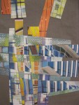
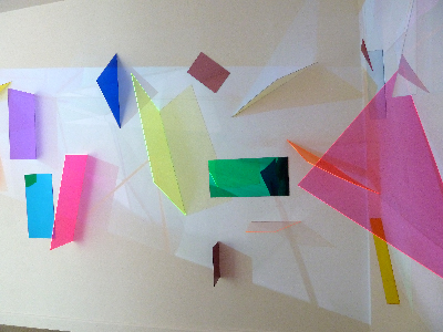
Filed under: textile forms | Tags: art, decordova, fabric, laura sapelly, sculpture, textile
Hello all! I’m just including some photos of my creations from my class, Textile Forms, at the Decordova. The teacher was Laura Sapelly. SUCH AN AMAZING CLASS! My classmates were an INCREDIBLE group of women…I hope that I can keep in touch with them somehow…they were all so inspiring.
I was the only one in the class that wasn’t an official “artist”. Everyone was so kind and supportive. SO different than architecture school…a place where they want to break you in, break you down, break your work. You can’t get too attached to your work in architecture school. Critics see no problem in scribbling on your drawings, ripping pieces off of models, and tearing your design to shreds, if they so desire. I kind of got used to that hyper-critical world. I found that in my first job, I sort of came on a bit too strong with my opinions. This is a result of being under attack for the past 7 years in school, and needing to constantly stand my ground. I know…it isn’t fair to compare architecture grad/undergrad to an art class. I’m sure that fine arts programs can be just as grueling. I just mean that it was SO wonderful to be in a supportive environment where experimentation was the goal…not perfection. It was amazing to just to let go and see where the material took me. No, I’m not necessarily thrilled with my work. However, I did learn a tremendous amount, just from the few classes that we had.
I’m kind of in recovery mode, from so many years as an architect. Every day was a battle of sorts…a struggle to make it all happen, make it all work, and make it all wonderful. I’m exhausted just thinking about it. Don’t get me wrong…I still love architecture. I just have to take a break from it for awhile…breathe a little…relax…make something messy and spontaneous…and try not to immediately criticize/hate everything that I do.
Hmmm…time for some tea and something sugary! I have such a sweet tooth…