Filed under: painting, printmaking | Tags: Acrylic paint, art, artist, gelatin printing, gouache, Ink, Paint, painting, portrait, print, printmaking
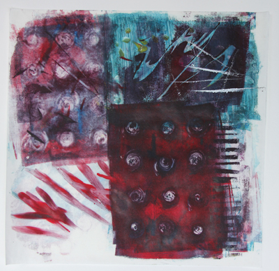
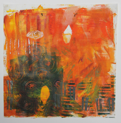
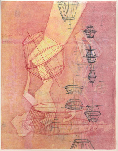
I spent the morning doing some gelatin printing. I’m not sure that I’m a huge fan of this type of printing. I was also testing out different inks and paints to see which worked best. I think that the Akua inks worked well, as they don’t dry until they are on paper. The acrylic paint and the speedball ink were both just so-so. The only problem with the Akua ink is that it does take an eternity to dry. I’ll probably still be wiping blue off of my hands every time I pick up one of these prints. Here’s one of the first ones:
Eh…feh…blech…some interesting aspects to it. I like how the silver ink turned out in the lower left corner. Next:
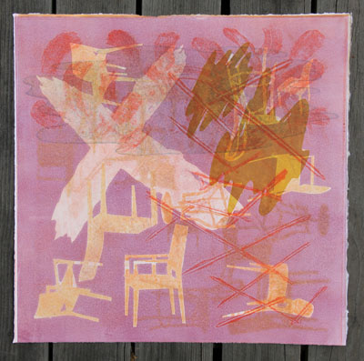
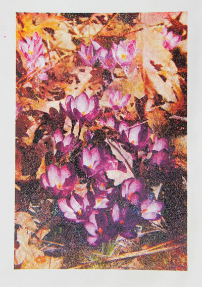
Also kind of interesting. These are printed on some very thin mystery Asian paper that I have. The art store in Cambridge had rolls of random paper for sale…10 sheets for $5. What a bargain! So, this is why I don’t know what the paper is. Next:
I experimented with a stencil a little. That’s where the leaf shape comes from. Next:
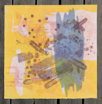
I liked the random stamped lines in the lower left area. Next:
I like the greenish yellowish color with the greenish blue color. Any comments? Does anyone out there also do gelatin printing? What inks do you like to use? Do you have any pointers for me?
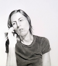
Last night, I kept myself up doing a gouache painting. Okay…It was VERY frustrating. I have seriously debated showing this at all, as it looks bizarre…but here it goes:
See how small I made the picture? Maybe it’s still too big. Anyway, I know that this looks really weird. He looks like he has a skin condition. DRAMATIC SIGH. I painted this based on a photo. Hmm…while I like the challenge of painting or drawing people…it also is rather daunting. I’m going to need A LOT more practice before I start doing this on the streets of New York…
I am the monitor for the print studio in Cambridge on Friday. As a result, I’ve needed to come up with what I’m going to do during that time. So, I have tried a little experiment. I painted gouache onto two 8″ x 10″ sheets of plexi. I’m going to see if they print onto damp paper. Here’s the first plate:
Kind of fun. The bubblegum pink is a bit much, but I’ll see how it prints. Here is the other one:
These are really an experiment. I hope that they print. If they don’t, I’m going to be disappointed.
So, where am I going with all of this? Who knows. I’m going in every direction at the same time. Let’s hope that some of this eventually leads somewhere!
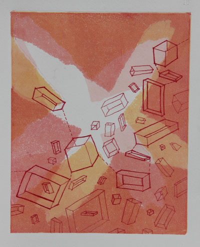
I’ve got some new prints. I’m working LONG on Japanese paper. I also did full bleed prints, which I like because you can be more loose about where the paper sits on the plate.
Yes, it’s another grey day outside, with not much light. Also, it was starting to rain as I took that photo, so I didn’t try to do a better job getting all of the sides to appear parallel. (details…details…) This one was somewhat successful. I wonder, though, if in the end…it’s just too much. Thoughts? Detail:
Yes, perhaps a bit much.
The next print was going along pretty well…but then I printed some orange marks (the big loops in the middle), which I didn’t like the look of afterward. I was trying to decide if this one is “done”. I probably should consider it done, lest it gets “too much”, like the previous print. My mother would say, “clarty”.
Detail:
On the subject of moms…not only is it Mother’s Day on Sunday…but it’s also my mom’s birthday today. Happy Birthday, Mom! She recently gave me a couple of photos of me when I was little. Does Photoshop have a “cute” filter? I thought not. Oh well. Look at the drool! Ech!
See that dazed expression? I still do that. Often. At least the drooling has stopped. Look at the double chin! That’s gone too, thankfully.
Now, check out these gams!
Yes…my legs haven’t improved much either. Sheesh. At least I’ve given up on all white outfits…and frills. No frills.
Happy Mom’s day to all! My son naturally asked when it was “children’s day”. I told him that it was his birthday. I’m sure that he felt gypped. Not to worry…he’s always scheming ways to get Grandma to buy him something. She’s like putty in his tiny hand…
Filed under: printmaking | Tags: art, artist, carborundum, collagraph, drypoint, Ink, print, printmaking, Relief print, visual art
This has been a blah week, work-wise. Most of what I’ve done, I’m not thrilled with. Last night, I had my carborundum collagraph class. I was NOT pleased with how things were turning out. Here is the result:
*insert big sigh here*
I’m NOT happy with that at all. It’s just a mess.
I made another tiny plate. I kind of like these tiny plates. This one is just 2″x3″. That’s a bit bigger than my other tiny plates, but still small. My first printing was over wiped:
So, I left more ink on it this time, and it was much better:
In general, I like these kind of plates, because I can work on them at home. I’m not very good at working in a busy studio. I know how ridiculous that sounds, but if I have to try to concentrate and think…then I need to be alone with time and space. So, if I prepare a decent looking plate in peace and quiet, I can be productive in the studio with printing. But if I don’t prepare, and try to work in the studio…I can’t do it well. I know that I have to work on this a bit, but it does made me feel pretty deflated at times. Like, right now.
I’m also working on a lino print. Here’s a little preview picture:
I’m happier with these, as they are very “graphic” and “punchy”.
I know…why so blue? Well, I wasn’t thrilled with this week’s output. At least there was some experimentation, with the woodblocks and trace monotypes.
So, back to the drawing board…*SIGH*
[UPDATE: I’ve decided to throw in a trace monotype at the last minute…here it is below…definitely a work in progress…]
Filed under: printmaking | Tags: art, artist, drawing, Ink, Monotyping, Paul Klee, print, printmaking, visual art
Today, I took a great class with Joyce Silverstone. We focused on trace monotypes, which is something that she incorporates into her work (which is outrageously beautiful). Apparently, Paul Klee often used this technique. You can see an example of his work here. How it’s done: you basically ink up a plate, gently lay a piece of either blank or previously printed paper on top, then use any sort of tool to make marks on the back of the paper. The paper is pushed against the inked plate, and will pick up the ink, where you apply pressure with a tool (pencil, finger, anything!). It seems that Klee would often watercolor these trace monotypes. We just printed other layers of color on our drawings.
Here is my first print…I was relatively happy with it:
I liked the little yellow boxes…This next print didn’t start out well, but I worked to improve it:
I am now more happy with it. It could probably do with more attention, but I stopped to work on other prints. Here’s the next one:
I think that I’m content with it. While I think that on it’s last pass through the press, I “equalized” the color more…which wasn’t so great…but I created the abstract yellow marks, which were what I intended. The last print:
I like this one too. I had some technical troubles with some of the white lines. If I had had more time, I would have worked on improving them. But, it was the last print that I was working on, so I think that it is complete enough for now. You may notice that elements of one print sort of show up in another print. I sort of worked on all four prints simultaneously, so they all influenced each other. It was also really great to see what other people in the class did…so inspiring.
All in all…it was a very fun day. Plus, I got a Happy Meal for dinner…what more could a person want? Well, one of those Takach presses would be nice, but a Happy Meal fits my budget more. (Anyone have a press that they are “tired” of? I can promise it a good home!) 🙂
Filed under: printmaking | Tags: art, artists, drypoint, Ink, print, printmaking, visual art
Today, I printed those tiny plates that I made. I had moderate success. It was amazing to me how difficult it was to wipe the plates well. How it works: you smear ink onto the plate, in order to push it into the grooves/scratches onto the plate. Then, you need to wipe off the excess in order to print it. This final stage of wiping the plate is so demanding, especially with these tiny plates. It was so hard to tell if I had taken off too much ink, and would end up with a pale print…or leave on too much, then end up with a dark print. I don’t think that I “hit the nail on the head” with any of them, but I think it’s really interesting to see how differently a plate can print, depending on how the plate is wiped. First, here is an image to give you a general sense of how small these plates are:
So, what is that…less than 2″ x 2″? Something like that…it’s TINY. So, here are the prints. My first test print was of a building in Montreal…I wasn’t so happy with this print. I took off too much ink:
 It just turned out too faded. Then, I printed this first “tractor” image:
I decided that the red was not good, so I printed it more monochromatically:
This was better, but I think that I overwiped the plate. So, I tried again:
This seemed better…but I still wanted to try again:
This one was too dark. Hmmm! I think that I try to print this plate yet again sometime. This plate is only around 1.5″ x 2.5″ big, so I’m holding this tiny thing in my hand…trying to be so careful as I wipe the ink off.
Here is the other plate that I worked on. I think that the best print was the first one:
I like how this turned out, even though his face is a little strange. But, I thought that it was perhaps a bit dark, so I tried again:
This was much too pale! Frustrating. So, I tried once more, and got this one:
That was a better balance of light/dark, but I think that I overwiped some of the details. I am using just the tip of my finger with a cloth on it to try to gently wipe away the ink. I look sort of like King Kong tickling a triscuit. Overall, I liked working with these.
Anyone else out there print drypoint plates? Suggestions? Comments?
Filed under: printmaking | Tags: art, artist, Ink, linoleum print, print, printmaking, pronto plate, Relief print, Visual Arts
Just want to extend a very grateful “thank you” to the Arlington Center for the Arts! They had a lovely reception at the “Images of Arlington” show opening, and a nice ceremony where…I received my award! It was great to see everyone’s work…such a diversity of media, ideas, viewpoints, etc… The show is up until mid June, I think, so stop by!
This morning, I finished up a TINY linoleum print, and the pronto print that I was working on. The tiny linoleum print is a mere 1″ x 3″ (approx). So small! The darkest color was actually a layer of transparent blue…but it becomes a deep reddish/purple on top of the other colors. This photo makes it seem a little darker than it really is:
What do you think? Kind of interesting…I think that the faces turned out well, considering how tiny they really are…This was a reduction linocut, so I can’t reprint this one! I’m going to do more of these with transparent ink…
This is the finished pronto print:
I like the “vintage” feel that these prints have. I think that printing on this new paper is also better. In addition, I bought some “anti-skin” spray for my inks. This stuff is AMAZING. Normally, this ink will dry and form a tough, chewy skin on it, which has to be removed. This is messy, frustrating, and wastes a ton of ink. This happens, even if you cover the ink with wax paper, etc., in the can. But this spray somehow works miracles, and keeps the ink soft. I love it! Everyone should go out and buy some!
I had my first carborundum class with Christiane Lippeveld. She does amazing work. We created some plates, which need to dry to print for next week. I think that I may try to get some more plexi and make some plates on my own.
Also, I have made several more TINY plates. I will try to print them tomorrow. If they turn out reasonably well…I’ll hopefully have photos to post. Bonne nuit!
