

Filed under: Fleeting thoughts..., painting | Tags: abstract, Adria Arch, art, Art Complex Museum, artist, flowers, painting
Is it Friday already? How did this happen?
Well, this is the FIRST week in a month that I’ve actually gotten a chance to DRAW. I almost forgot which end of the pencil to use! Just kidding…luckily, my friend got me a deranged pencil sharpener to help me out:

Yes. There it is. (except that mine is black.) Did I mention that the cat meows when you use it??? SICK. Actually, having this thing around pretty much ensures that all of my pencils will remain dull. I’m also keeping it away from my five-year-old, who will want some kind of explanation that I cannot possibly give him without him needing years of therapy, which I don’t want to start him on until he’s at least eight. I think that my friend would have preferred to have given me this in person, as my horrified reaction is really the priceless part of the gift. Thanks, TB. I’m going to have nightmares tonight…
Besides eating my weight in chocolate chip cookies this week, I also went to the The Art Complex Museum in Duxbury to see the work of my advisor, Adria Arch.

So exciting!!!! She has her work in the main room of the Art Complex. Her work is large and has a lot of impact, so it’s great to see it with the space that it needs.

The show is titled, “Iconic.” She plays with the subconscious markings of other people and magnifies and intensifies them into monumental glyphs. The forms, compositions and colors are very compelling. I can’t help but wonder who made each of these marks? I love the mysterious quality of them.
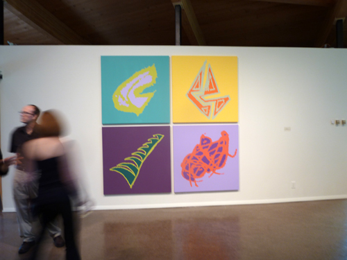
Adria Arch, I Love You More, 2013, Acrylic on canvas, 96″ x 96″
In her words, “These elements, spattered across and extending beyond the picture plane, bring to mind galaxies and explosions of energy. The compositions suggest randomness, belying an intentional painting process in which I project and then paint enlarged pencil lines onto canvas, wood panel, or walls. My practice grows out of the tradition of mark-making. I am drawn to the expressiveness found in unselfconscious pencil doodles – some I find and some I elicit from other people. The eccentric lines derived from these marginal marks are, for me, metaphors for boundless physical energy: floating, spinning, and falling through space.” So fascinating! Please go and see this show. It’s up from May 36 – August 18.
While I wish that I had a modicum of physical energy, I have managed to do SOME productive things this past month.

Look what I grew! Actually, I should say…”Look what I didn’t kill!” Yes…that’s an ORCHID. The flowers fell off a couple weeks after I bought it, which made me sad as I thought that was the kiss of death. BUT NO! I discovered that if you WATER it…more flowers will grow. Imagine that! I am convinced that plants hate me, so I am happy that this one didn’t get the memo. My other plants are probably blowing it raspberries in their own plant-like way.
Speaking of blowing raspberries, my son is back at school this week. SANITY. He was NOT happy about that, but I felt that I should not mislead him by thinking that school is “optional.” He says that he is besides himself with boredom. I nod.
Welcome to reality, kid!

This is what he would prefer to do all day, rather than “boring” activities, like making bumble bees out of construction paper. (can crafts EVER be boring????) He told me that this is a hotel. Perhaps my son will become the next Donald Trump? As his mother, though, I would not allow him to have the Donald’s hair, though. In reviewing his design, I feel that the penthouse unit has a catacomb-like quality to it. Thoughts? Perhaps a skylight would help? Maybe he’s catching onto the micro hotel thing in Japan?:

There must not be a word for, “claustrophobia” in Japanese. Those wouldn’t work in the States anyway, as they’d each need to be the size of a shipping container to work with our girth.
Speaking of…I’m going to go and look for more cookies. Let me know if you need me to sharpen any pencils for you.
Filed under: Drawing, painting | Tags: abstract, art, artist, drawing, painting, Pencil, still life
Okay. I know that I was going to TRY to focus only on black and white drawings, but I still have a couple of painting classes left…so the color is not dead yet. Here is the painting that I did today:

Talk about less is not more! I know. As soon as I get a paintbrush in my hand, I lose all sense of editing and moderation. Is there a color that I didn’t use? I don’t think so. The little “painting-within-a-painting” was my teacher’s idea. I kind of like it. It must be so hard to be a minimalist painter…the temptation to just go crazy with colors and marks is tough to ignore. Maybe minimalist painters get that out of their system by age 5 or so. Not me. Not yet!
I am still working on my drawings. I’m going to now try to slow down and spend more time on them. I’m also experimenting with new papers/surfaces. This drawing was on plate bristol:

I am happy with this. I really need an easel, though. I just try propping that whole drawing board up on either my knee, or the handle of my luggage cart for my acrylic paints. Clearly, this is not how Picasso probably worked. I also have decided that I need a little clip on light for my drawing board, as it’s sometimes difficult to see the first pencil lines that I put down. Here is a close up:

I have to work on my technique some more. I think getting an easel might help, as I won’t be wrestling to balance the silly drawing board while I’m trying to create poetic and ethereal cross hatching.
My son keeps asking for the little clock/CD player that I took out of his room after he kept squawking about the music that I put on. I have it at my desk in the basement. Now I don’t want to give it back! I keep listening to “A Charlie Brown Christmas”. It’s the only classical/jazz cd that I have that isn’t stashed away in the attic somewhere. It’s amazing how I can keep listening to that and not get tired of it. Maybe I won’t feel that way by Dec. 25, but right now…it’s music to work by. I just have to keep changing the subject whenever the topic of that little CD player comes up. I hope that this doesn’t make me a bad mom. Maybe I’ll have to get him his own little CD player for Christmas…along with some Lego monstrosity…because you can never have too much Lego, right?
Filed under: Fleeting thoughts..., painting, printmaking | Tags: abstract, art, artist, drypoint, painting, printmaking
So, this week’s portrait class was fun…we did drypoint prints of the model. A drypoint print is made by taking a plate (copper, plexi, etc.), and using a sharp steel tool to “draw”, or gouge, the lines into the plate. Then, the plate is wiped with ink so that the ink stays in the gouges…and then we print it! We were using plexiglass. The most difficult part of this is that you can’t really see your drawing very well. You have to keep tilting the plexi under the light to see where the lines are, as they are so faint and hard to see. Again, we have the model who looks like Alanis Morrisette:

She was reading her book. I was pretty happy with how this turned out. Here is the second one:

I’m not happy with that one. Sigh! We only have one more class, after Thanksgiving. I may take another stab at doing a drypoint (just a little printmaking humor…).
I’ve done more work on my vise drawing series. I haven’t photographed the drawings, so I’ll have to show you them later. As one of my infinite diversions, I was playing around with a few small, gouache paintings. Here is the first one:

I like doing these messy, crazy things. It started out somewhat realistic, with the blue sky…but then it took a turn for the weird at some point. The next one:

Garish, right? I like garish. Last one:

I don’t know where I’m going with these. I just like doing them.
Any comments? Helpful suggestions?
Does it matter that no one may like these, as long as I like to do them?
Does it matter that I clearly am not interested in “editing”?
Does it matter that I often like to use practically every color that is out there?
Metallics…I don’t have any metallic paint yet…
Filed under: painting, printmaking | Tags: abstract, acrylic, art, artist, painting, printmaker. visual arts, printmaking, woodblock print, woodcut print
Okay. Remember how I was complaining about the “dusting” of snow the other week? WELL. As those of you in the Northeast well know, now we had something to really cry about. Yes, snow…lots of it…before Halloween. I am lucky to be writing this email at all, as there are many people who are STILL without power. Can you imagine? Not good. Think, “The Shining” but with more, yet likely smaller, houses. Really not good. The scene of our backyard:

Looks worse than that last photo I posted, right? Now, I grew up in upstate New York for my elementary school years. Their snow makes our snow look plain silly. BUT…I do not recall EVER having snow in upstate New York before Halloween. It’s just not right.

I’ll stop whining now.
My son’s halloween costume, which he refused to wear trick or treating but was happy to wear at home in order to help dad with the mail:

No, I did not make that costume. I gave up for two reasons: 1. a crocodile was too complicated to make, and 2. I had a strong suspicion that he would not wear the costume in the first place. Don’t even get me started about the costume that I slaved over last year that he also did not wear. My child finds halloween too stressful. Hmm.
Art-wise…I think that this was a pretty successful week. I had a GREAT printmaking workshop with Catherine Kernan over the weekend. SOOOO GREAT. She does all sorts of crazy things with woodblock prints. I found her to be such a good teacher and very inspiring. Here are my prints from the weekend:

I like it! Next:

It’s odd how different the background paper looks, even though it was the same for all of the prints ( I mean the white area at the perimeter).

I saved that one above from being a muddy mess. Nice!

Catherine really liked that one above. It looks better in real life. Last print:

You can tell if you have a good teacher when the quality of your work really improves. I felt that this was true at this workshop. It was a lot of fun! All of those prints are made from just two blocks.
I also had some success with painting. Here it is:

My teacher really liked it. He had some helpful comments along the way. It also didn’t feel hard to do. I’m wondering if the fact that I was actually in a bit of pain at the time of doing it (think: big headache), somehow helped. Because of that, I wasn’t totally focused. My thoughts kept getting interrupted by my discomfort. This sort of quieted down any inner discussion about judging the work as it progressed, as my mind was preoccupied. Not that I’d like to be in pain when I paint, but I am wondering somehow if it actually was a help! Sound crazy? Perhaps so.
I like the painting anyway. Comments? Everyone have a good halloween? I think that I’ve consumed enough candy to last me until 2013 at least…not that I’m letting that stop me from munching on more “fun size” calorie bombs.
Filed under: Drawing, painting, printmaking | Tags: abstract, acrylic, art, artist, colored pencil, etching press, klimt, painting, portrait, profile, Stencil
Today, my car said it was 32 degrees. That’s cold. I know…talk to me in February…that will seem balmy. Still, I feel like I was wearing sandals just yesterday. Not only is it cold…but it SNOWED last night. Here’s what is left on our yard:

Look at that sad little water table in the background! It can be a skating rink for squirrels.
This week, I definitely made some odd stuff. I decided to dabble again with figurative work. I started by “copying” a face from a Klimt painting:

Klimt’s painting is, of course, stunning. I was just trying to study his way of rendering the face. Then, I did this one:

A little blurry…think of it as a “fuzzy filter” to improve the appearance. Hmm! Then the next one:

Strangely enough, that one looks a little like me. Not on a good day, of course. I showed these to my painting teacher. He said that they were “postmodern”. Hmm. I guess that means anything that isn’t “modern” pretty much. He likes modern painters, like Pollock and De Kooning. So…I think that he prefers much more loose and “painterly” paintings. That means more apparent brushstrokes, etc. As a result, I tried in his class to invent a figure painting that was more painterly:

I know. The red is a bit much. I think that I’ll try again, but with a more neutral color for the figure. It’s hard for me to paint a figure without one in front of me to look at! I know…practice, practice, practice. Detail:

He had some positive things to say…but this might have been to encourage me. He did not like the red, though. Hmm!
In my other painting class, we worked on an long 18″ x 48″ painting. We were told to pick three colors inspired by “regeneration”. Then, we had to mix the colors, and choose one for the background. The shapes were made with stencils that we cut out of paper which were insipred by shapes from green/red peppers. Interesting! The teacher, Adria Arch, is wonderful. I highly recommend taking one of her classes. The outcome:

It was fun to do. I’d flatter myself to think that it looked a bit Marimekko.
In my portrait class, we used colored pencils. I asked why colored pencils never seem to be in “high art”, only commercial art. Who knows??? Somehow, it’s just not seen as a fine art medium. Does anyone out there know of an artist who uses colored pencils? What do you think of his/her work? Here is my profile portrait:

I was really happy with how this turned out. This isn’t a great photo, but I think that I got a good resemblance and the coloring was decent. Maybe I should do portraiture? Only because I enjoy it so much…

Okay…the BIG surprise of this week is….
I have a small etching press!!!!!!!

CHECK. IT. OUT!!!!
Yes, it’s small. But it has a press bed of around 13″ w x 20″ l. This will take some typical sized plates and paper: 8×10 plate…9×12 plate. Ideally, I would have a bigger press. BUT…a bigger press is big $$$$. This little press was being sold by a lovely gentleman in Newburyport. It was his wife’s. I hope that he felt that it was going to a good home. I’m worried that the shoddy desk will collapse under it’s weight. I hope not. I haven’t printed with it yet…CAN’T WAIT!!!!
Filed under: painting | Tags: abstract, acrylics, art, artist, Paint, printmaking, Visual Arts
So, I’m happy to say that my portrait drawing was accepted in the show at the Belmont Gallery of Art. Yay! This is a show titled, “See you, See me”, and it’s only portraits. I saw some of the other works when I was dropping off my drawing. Should be interesting! (You can see what the drawing looks like in my September 8 blog post). The show opens on September 30 and runs through November 13. Please stop by!
This weekend, I went to the Hyde Park Open Studios. This was great, as my printmaking teacher, Selma Bromberg, has her studio there. Her work is really beautiful. She draws gorgeous flowers, then turns the drawings into prints. She was doing a woodblock demonstration when I arrived. I also saw Prilla Smith Brackett, whom I met at my woodblock print class. She’s primarily a painter, but is starting to work more with prints. Her work was also lovely. It was fun to see some of the completed woodblock prints that she began in class.
My painting class is still fun. My teacher did not like the big paintings that I brought in. He likened one of them to a “shower curtain”. I can tell you all of this as I’ve gone through many an architecture crit, and have heard it all. I really appreciate his honesty. I think that he’s a good teacher. Let’s see if I can learn something, though! He wants me to try figurative work, as that’s my background (as evidenced by the portrait drawing). Hmm…okay…we’ll see! I also did a few mini-paintings. These are only 6″ x 8″.

It was fun to work on these tiny canvases…

I may have to revisit all of these…we’ll see…

On another note…I’m horribly disappointed that the portrait class that I’m signed up for will likely be cancelled. It’s called “The Expressive Portrait”, and it’s at the Arlington Center for the Arts. We need THREE more people in order to have the class. I’m so sad, as it’s highly unlikely what we’ll get them in the time left. Having a class cancelled on you is so frustrating. I’ve had this happen several times. I’m always dumbfounded when it does happen. You mean…not EVERYONE wants to take this class??? WHY NOT???? I’ve tried to send out emails, etc. to other people who might be interested in signing up. No luck so far. If you’re interested…PLEASE sign up! Seriously. Do it now. No joke.
I wish that there wasn’t a minimum number for a class. I mean…don’t I count at all? Doesn’t my enthusiasm make up for the low enrollment???? I guess not…*DRAMATIC SIGH*
Filed under: painting, printmaking | Tags: abstract, acrylic, art, artist, monotype, painting, printmaking
So, I started a new class. It’s called “Supercharged Painting”. VERY fun so far. Lots of messy, gloppy stuff. This week, we were playing around with acrylic mediums to create texture in our work. So, I have two canvases that I started…but there is no color yet. I kind of like them plain…but they won’t stay that way! First one:

It’s hard to see in a photo, but these blobs are different textures…some gritty…some smooth…

In Christian Siriano’s words…it does look like a “hot mess”. That’s okay. It will get worse…trust me… :p
The other canvas:

I think that I upped the contrast on this image too much, but you get the idea. Big blobs! What fun!

Most of the other students in the class are “regulars”. There are only a few of us that are new. The “regulars” all know what they’re doing…and it was sooo great! It’s so amazing to be surrounded by so many talented artists! I loved watching them work. When I find out their names (beyond their first name), I can put some links in my posts so that you can see what they are doing.
Last week, I had a so-so time in the print studio. A motley array of prints:
 Hmmmm… Next one:

Hmmm…

I liked some of the color combinations in that one…
Here are others more on the theme of what I did last week:

And the other:

Those prints get a sustained, “hmmm”, from me. Comments? Thoughts? This week’s class will probably be my last one for the year. Let’s see what happens!
I had coffee with a local artist, Regina Valluzzi. Please check out her work. She is really having some great success, and was so kind in making suggestions for me. We weren’t discussing our artwork, specifically, but were just talking about the local art scene. She’ll be at the Arlington Open Studios (as will I) in October. Please stop by and see her work firsthand! She currently has a show at the Blue Glass Gallery in the lobby of the Hancock tower in Boston. Go see it!
Filed under: printmaking | Tags: abstract, art, artist, Jacob Hashimoto, print, printmaking, visual art
I was lucky enough to get to go to the print studio today, thanks to my mother who watched my son for me. There were only three of us there, so we REALLY spread out. When given the chance, printmakers are like molasses…oozing out in every direction, taking up more and more and more space. I guess in the “heat of the moment” while working on a print, you just grab any space you can get to put something down, or to work on. The more plates that you work with for a single print also means that you need more and more room. ANYWAY…it was a great luxury today to be there and to have so much room.
I felt that it was a productive day. Some days, I’m just off and the whole thing becomes so frustrating. This day was better…probably because the studio was quiet and roomy. It’s hard to think when it’s crowded, there is a line to use the press, and you have no space to work. Here is the first print that I did:

Not my favorite…it wasn’t going well, and then I added the thin, black layer. This helped. I may have to revisit this one…but I’m going to leave it alone for now. Next:

This one was also just okay…I like the bright colors, but the textures did not turn out as I had hoped. It was a bit of an experiment, so I learned a bit…well, a bit of what didn’t quite work. The black helped this one too. Next:

I like that one, and it was a bit of a happy accident. This was what was left on one of my plates from working the previous prints. Odd, right? The textures are delicate and interesting. Maybe I can get better at this, and fine tune it a bit more. Next:

So, I ran out of paper, and started to use these long scraps that I had. It was fun to do the full bleed printing and the vertical format. These three vertical ones work together well…a classmate suggested that I keep going with this series…

I like that one too.

I realize now that I should have taken a picture with all three together. So, I’ll mash them together in photoshop, instead:

Hmmm! Maybe I should keep going with these. They would also be fun to turn into an artist book. I’d love to do that. Maybe that’s what I’ll work on next time…
Comments? Artists that I should look at?
Here’s an artist that EVERYONE should look at. Check out Jacob Hashimoto. I WORSHIP his work. So stunning…I have yet to see it in person, but I hope to do so some day. Has anyone seen his work first hand? If so, tell me what you think!
So lovely…
Filed under: painting, Sewing | Tags: abstract, acrylic, art, artist, curtains, figurative, painting, sewing
Yes. I can’t believe it either. After a year from the date that we first pulled the building permit, we finally got it signed off today. The basement is DONE! I am so excited to move ALL of my art-stuff down there. FINALLY!!!!! No more stacking tupperware containers of inks, papers, tools, etc. in the dining room!!! Ahhh…I won’t know what to do with all of that space! I have a sinking feeling, though, that I will quickly fill it up. Hmm. But why dwell on that now? I may have to have a celebratory iced latte today.
I also FINALLY finished a house project that I have been planning on doing for practically a year as well. I finally made a little curtain for our front door. Yes, I know…not a big deal. What is a curtain, anyway? Just a rectangle of fabric, right? Well, yes it is…and I finally did it. Here it is:

I think that it looks great. I love this fabric. It’s kind of pricey…well, not Marimekko pricey, but a little expensive. It’s actually from Japan. I have some other fabric from this line as armrest covers on our hideous couches. Nice!
Not much going on art-wise. I took a stab at acrylic painting. Not so good. Luckily, I am taking a painting class this fall…so I should get some pointers! I know. Why have I spent the past year developing my printmaking knowledge, only to switch gears and start painting? Because it’s ALL so fun! So, I’m back to square one…learning how to paint. I did take painting in high school…and I have had a watercolor class and an oil painting class since then. Needless to say, I am at the bottom of the learning curve. I hope that there is no where to go other than up. Here they are on the wall:

I know. Stop laughing. Overall, they make me cringe…but there are ASPECTS of them that I like. Here is a part that I like of the first one:

That’s kind of appealing. I know…nothing earth-shattering. Hey, Rome wasn’t built in a day. Here is a closeup of the other one:

I’m happy with how the guy turned out. The woman bothers me and has some issues. This painting is based on an old photograph, so I can’t take any credit for the overall look to it…only the crude execution. So, I am facing this challenge head on…I hope that by the end of the year, my acrylic painting skills will have developed. If not…well…I don’t know what, if not. Drown my sorrows in lattes…
[I may have to work on that woman some more…she’s really bothering me…]
Filed under: painting, printmaking | Tags: abstract, art, artist, Center for Contemporary Printmaking, nature, painting, printmaking, watercolor
So, I finally visited the “8th Biennial International Minature Print Exhibition” at the Center for Contemporary Printmaking in Norwalk, CT. Why did I go? BECAUSE…I actually have a print there! Yes! My first juried exhibition…so I had to go and see it. I do not plan on doing that drive regularly, as it was around 3 hours each way. ANYWAY, here is what my print looked like on the wall:

Not bad, right? Notice the little red dot? THAT MEANS THAT SOMEONE BOUGHT ONE! I’m not kidding. My first sale! I’m very excited. Here is my print on the wall with other prints:

I think that mine is the 10th one from the left. Prints that were not “wall worthy” went in these binders in the foreground. So, there were so many amazing prints to look at! Here is another view of one of the rooms of the show:

Not bad, right? I have not entered another competition…so perhaps I should get on that and see what’s available.
My classes are over, so I have no more access to a press for printing. This was one of my last prints:

Hmmm. What do you think???? I was sort of blaise about it…but my printmaking teacher seemed to really like it. Comments?
I’ve also done some random watercolors (actually gouache)…but I think that it just isn’t my thing:

and:

Hmm. Just hmm.
I’m trying to decide on classes for the fall. This is always tough, as everything sounds great…but there is only so much time and money. BTW…I ALMOST have a workspace. The basement renovation is nearing completion! I can’t wait…
