

Brr. It’s cold. I’ve already started working on my winter layer of fat. Last night, I met with my “peer group” of artists to discuss our collective “art angst”. One person brought some holiday contraband…
TRADER JOE’S MINT JO JOE’S COOKIES!!!!

These are disgustingly good with crunchy bits of ground up candy cane in them.
NOM NOM. *wistful sigh*
I know. Why am I writing about cookies? This is not why you read my blog. You read it for my insightful art commentary. Hmm. That argument seems a bit weak. Actually, I don’t know why you’re here, but it’s nice to have you. Did you bring me cookies? No? Oh, okay…nevermind.
So, several weeks ago I went to the Art Complex in Duxbury. I’ll admit…it felt like it took an eternity to get there. It kind of stressed me out. ANYWAY, there was a fascinating show there called “Self/Fabricated“. This show was loosely “textile-centric” (kind of the way that I am loosely “cookie-centric”…but I digress…again), and about domestic life. I wasn’t sure what to expect, but I really enjoyed it. I’ll post some images of some of the pieces that I liked (although there were others…but I’m tired, so this is it):

Leslie Schomp, Group of Miniatures, 2012/2011
Okay…I wish that I had taken this picture with my hand nearby so that you could see how absolutely TINY these are. Pay attention: these look like drawings, right? They’re not. The materials are….(wait for it….)
“Hair on cloth in dollhouse frames”
YES!!!! She has SEWN these TINY portraits!!! These were pretty astounding and I totally loved them. I know that it isn’t possible, but I really wanted to hold one in my hand, for whatever reason. So brilliant. Sewing with hair??? Also brilliant. The way that they are displayed makes perfect sense, but now I want to know who these people are. Are these self portraits? Hmm. I might be inspired by her tiny creations…
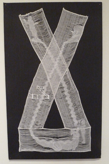
This is also by Leslie Schomp. I guess I really liked her work! This is made from “embroidery thread and pulled thread on found linens”. It’s hard to tell in this picture, but this piece is soooo delicate and amazing. Here is a close up:

Isn’t that amazing??? I love how wispy the background is. Her work was fascinating.
David Curcio, Happy House, 2008
This piece employs “woodcut, drypoint and stitching on Japanese paper”. I love the patterning, the mix of textures and mediums, and the lovely stitching. I especially like the “baby heads” (my quote) that are around the perimeter. Those are particularly delicate. Love it!

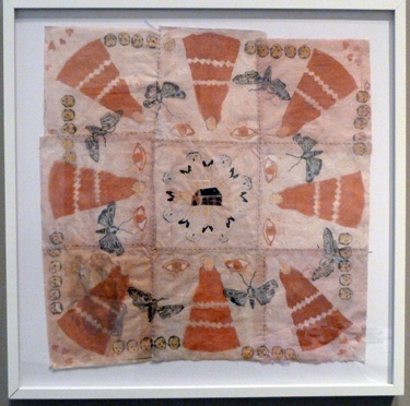
Candice Smith-Corby, Lost in My Chinoiserie Thoughts, 2012
Smith-Corby has many small, intimate gouache paintings on different surfaces in this exhibit. They are always vibrant, but often have an “isolated” feel to them. I loved this one especially because instead of painting on fabric, she painted on paper but detailed it as if it WAS fabric:

Isn’t that AMAZING??? She DREW that!!! So soo brilliant. I love that. She had quite a bit of work at this show, and it was all really interesting. Here is an installation that she made:

Candice Smith-Corby, Rearranged, 2009-2012
I loved how this domestic corner has slightly gone awry. Actually, my living room is not so different than this, except we have more junk and lego thrown around. (we’d no doubt get our money back if I bought a Roomba…we’re probably more in the market for something along these lines…)
I could tell that I was no longer in the Metro Boston area when I was leaving, as I saw THIS posted nearby:

HMMM! MEAT RAFFLE??? What, pray tell, could THIS be about? WHO RAFFLES OFF MEAT??? FASCINATING. I wonder what Girl Scouts sell in this area?
Speaking of meat…(hence the blog title)…my son drew this brilliant creation the other day:

Sigh. I have such love for this. In the upper right…we have a woolly mammoth. Standing on the right side of the excavation is a saber toothed tiger (note the sizable, saber-shaped teeth…nice!). The form on the left of the excavation is a huge digger/excavator working on the hole. Then, in the upper left, is another saber toothed tiger which is pouncing on said digger. BRILLIANT! I hope that he draws forever.
Speaking of…I better get back to my work. The sound of chainsaws and leaf blowers are sending me to the basement, much like daylight driving away Count Dracula…ARGGHHH! The NOISE!!!! The NOISE!!!!
Happy Thanksgiving, all! I had a lovely holiday with my husband’s family. We have plenty to be thankful for…friends, family, our health, our homes, and food on the table. We also made it though Sandy without much trouble, which can’t be said for a great many people on the East Coast. Not to be morose, but you can see an interactive map that the NY Times has made here of all of the fatalities. It’s unbelievable. So lucky, we are. (excuse the Yoda talk)
I also managed NOT to eat my weight in food on Thursday, which is a slight miracle…(although I think that peppermint Jo Joes cookies are now at Trader Joe’s…SAVE ME FROM THEM!!!) Not only was my restrained eating a miracle, but…
I ALSO GOT TO ESCAPE TO NYC/BROOKLYN ON TUES/WED!!! WOO HOO!!!!! I kid you NOT! I had to scramble to NYC for the LAST day that my friend had his show up at Agora Gallery in Chelsea. Here are some views:

And more:

OOOOO! I love those last three together. Here is a closeup of one of them:

These paintings are influenced by traditional sari fabric. George is from Kerala, and this inspires much of his work. (what inspires my work? How much I loathe Stop & Shop? But I digress…) Please check out his website, as my photography is shoddy. I was planning on attending the opening, but we had a snowy Nor’easter that day…so it wasn’t in the cards. This show was a big deal, as it’s not every day that one gets artwork in a NYC gallery…WOOT WOOT, George!!!
In my wanderings…here is another artist whom I also found in Agora Gallery:

I really liked her work as well. She was using watercolor on stretched canvas. Detail:

Dreamy! I love the areas of white in the painting. More:

Nice! Aren’t these amazing???
Apparently, lots of galleries in Chelsea are closed because of “super storm Sandy”. There was lots of flooding. Luckily, I did get to Pace Gallery to see the Chuck Close exhibit. A-MA-ZING! Check it out:

Okay. We’re ALL familiar with these works. But sometimes, we think that we know a work just by seeing it in print or on the web frequently. I felt that I had seen lots of Chuck Close’s works, so I wouldn’t be too surprised with what I saw. NOT SO. Seeing these works in person really blows your mind. GENIUS. PURE GENIUS. Just look at these series of self-portraits:

No, those aren’t digital manipulations of photographs. They are paintings. (I know that you know that.) But try to think that when painting these, he could only be at arm’s length to do it. So, he didn’t see this while working:

He saw THIS while working:

I know. Mind boggling, right???? My brain cannot process how he does this. He is totally a master of color mixing. Scroll up again to look at the paintings from a distance. Crazy, right??? I truly could have sat there all day staring at these (especially with a box of mint jo joes). I bask in his brilliance. I need to get out of the suburbs more often. Nothing like this is EVER at Stop & Shop. (and I’ve LOOKED, trust me…)
That evening…a friend’s restaurant was opening in Brooklyn: Root Hill Burger in Park Slope. If you live in the area, please go! I had the p01 burger…DELICIOUS! They also make yummy milkshakes too. Perhaps it was because we eat primarily vegan at home that the burger tasted other-worldly to me? Hmm. Nah. I am wondering if they deliver to Massachusetts, though…
Speaking of other worldly…my luck doesn’t end there! On Wednesday, I got to go to the BROOKLYN MUSEUM!

I had never been there before! I was going to see the work of Mickalene Thomas. But, before I GUSH about her work, I also saw some gorgeous work by Duron Jackson:

Duron Jackson at the Brooklyn Museum
Holy cow…this is GRAPHITE!!! Is it not the most GORGEOUS thing you’ve ever seen??? My photo is terrible. He’s also a genius. Can pencil on black be any more astounding? I think not. The shape is the outline of a jail, somewhere in the US. I apologize for not getting the title. He has a whole series of these drawings, and they are SPECTACULAR. Go. See. Now.
I’m just going to post some images of other cool stuff on exhibit (whilst I fantasize about mint jo joes):

Portrait by Alice Neel
Alice Neel is my portrait hero. I love her work. I was first introduced to her work by a drawing teacher of mine. Please look at her website to see more of what she does. Incredible. Next:

Jean-Michel Othoniel, Precious Stonewall, 2010
This is enormous and it’s made of GLASS. Othoniel had a wide variety of works in glass. Really astounding works. Look at these larger than life necklaces:

Jean-Michel Othoniel, Large Double Lacan’s Knot, 2011 (foreground) /
Lacan’s Knot, 2009 (background)
Also enormous…I can’t imagine how much they must weigh. They were pretty dramatic. I actually like this one better:

Jean-Michel Othoniel, Black is Beautiful, 2003
I like that better because I can really feel the weight of these beads. The previous ones feel odd to me, as they are clearly heavy beads, but the formation appears too weightless. So, my preference is the latter…it’s beautiful.
Okay, so NOW onto MICKALENE THOMAS!!!!!!!! Brace yourself…she rocks.

Mickalene Thomas, Interior: Blue Couch with Green Owl, 2012
LOVE IT!!!!! She has done a huge series of collages of what looks like trendy, 60s interiors. Then, she translates these collages into ENORMOUS paintings on panels with…(wait for it)…RHINESTONES. They are BEDAZZLED, and they are awesome.

Mickalene Thomas, Interor: Green and White Couch, 2012
Sooooo brilliant. She even outlines some of what must be the cut edges of the collage with rhinestones. These interiors are fractured, sometimes flat, sometimes appearing to have depth, with jarring color palettes. This is a detail:

Mickalene Thomas
And here is the original collage:

Mickalene Thomas
I’m so sad that my lousy pictures are NOT doing her works justice. BOO HOO!
Not only did she have paintings of interiors…she also CREATED interiors:

Mickalene Thomas
These “installations” were really amazing too. She creates so much cultural weight with these scenes. They are also collages, much like her paintings. I loved how her visions have become “real” in these works. My living room is just like that, except less hip and with Lego all over the floor…really similar.
Beyond her interiors, she has also done phenomenal paintings of women:

Mickalene Thomas, Le Dejeuner sur L’Herbe: Les Trois Femmes Noires, 2012
This work is enormous and astounding. I’m sorry that this tiny image can do it no justice. This painting is a “restaging” of Manet’s painting, Le Dejeuner sur L’herbe:

Manet, Le Dejeuner sur L’herbe, 1863
Brilliant! Here is a detail of Mickalene’s painting:

Mickalene Thomas
Here’s what I love about her work, and about art in general. I love that (in spite of her riff on Manet), I feel that I haven’t seen this before. I’m sure some of you are thinking…”duh, it looks like so-and-so”. Fine. But, for me, I was in AWE of the world that they created…a world that I CLEARLY am no part of. But her works allow me a glimpse into it…which I also love.
This is my thinking on her work (which may be wrong, as I am no art critic): All of her women appear simultaneously “powerful” and “feminine” to me. This is what feminine power can look like. Not to be misandric, but I love that no men appear in any of her works. Her work does not need to speak about women in reference/relation/contrast/comparison to men (see the Manet above). Her work exists in a world that eschews men. Men are only part of the diminutive audience that are fixed in the powerful gaze of her subjects. Somehow, I feel that a “YOU GO GIRL!” is in order. Is that too suburban of me???? Probably. (sigh)
I need to try to channel these powerful women as I go about my day…picking up legos…buying cheddar goldfish crackers at Stop & Shop…and cursing at myself for forgetting my grocery list.
She’s a genius. I bask in her glittery glory.
Filed under: Fleeting thoughts... | Tags: Boston Globe, Haim Steinbach, Sebastian Smee, Wheelock College
Yes, I did that. I sent a “press package” of my artwork to the ICA Boston. Don’t laugh…I know. WHAT WAS I THINKING??? This wasn’t my idea though. The woman who is the gallery director at Wheelock College suggested that I do this. BUT, I’m to blame for actually doing it.
To the ICA’s credit, they did mail me back my stuff with a nice rejection letter:

I thought that was quite kind of them! Right now, I have my artwork up in two locations. As a result, I have sent many harassing emails and press packets out to people. I have received a response, both negative, from only two individuals/institutions: 1. The ICA, 2. Cate McQuaid of the Boston Globe. On the plus side: even though they both had to say “no”, I do appreciate that they responded to me. On the negative side: now, the ICA may have some kind of restraining order on me…or have put me on the “watch” list of crazy local artists. No matter! I was just happy to have a response, albeit a total form letter. The ICA must know that crazy artists like attention.
I did go to the ICA this week, just to see what was going on there. LUCKILY, they had JUST put up a new show and I got to see it because it was MEMBER PREVIEW DAY. Brilliant! (you can see, though, the slippery slope that is created with such things…those that can afford a membership get treated differently and some may mistakenly think that this makes them more “special” or “important” than non-members…) I’m going to stop myself now from going on a political rant. Here’s the ICA, for those of you who haven’t been:

It’s a lovely building by Diller +Scofidio (now, Diller Scofido+Renfro). I realized that I wasn’t in the ‘burbs anymore when I saw this sign nearby:

Really? This practically warrants an entire blog post, but I’ll spare you THAT nonsense.
The big show that the ICA has now is called: This Will Have Been: Art & Politics in the 1980s. Sebastian Smee, of the Boston Globe, has written a really insightful review of the show here. Please read it. Now, in an artfully planned juxtaposition, if you are interested in a NON-INSIGHTFUL review, read on!
I’ll show some images first:

Jean-Michel Basquiat, Hollywood Africans, 1983
I love Basquiat. I love his work because I am interested in both how it looks and what I think that it’s telling me. I could stare at this all day (but the previously mentioned possible ICA restraining order may prevent that…) I love how this work seems to me to capture Basquiat’s ruminations…with doodles, overlapping marks, lofty and banal thoughts…LOVE.IT. Why can’t my doodles look this good? I’ll bet he could make my angst laden grocery list look awesome. Grocery lists aren’t edgy though, FYI. Maybe Basquiat’s lists were? I’ll bet that he didn’t go to Stop & Shop, though.
There is a lot of work on exhibit by many of the “heavy hitters” at that time: Richter, Koons, Mapplethorpe, etc. Overall, this is a pretty cerebral show. It seems to be capturing the spirit of that time, without trying to present the “highlights” of art during that period. It’s a culturally centered show, rather than art centered. (is that insulting? I hope not.) I enjoyed the show intellectually (if that’s possible for me to do considering my mild case of mommybrain,) but my general delight in the art itself wasn’t quite there. Probably my lack of cerebral-ness/cerebralosity was the cause. (see? case in point.) Here’s one that made me go, “hmm…”:

Haim Steinbach, Untitled (Cabbage, Pumpkin, Pitchers) #1, 1986
No, that is not one of my shelves at home. Any shelf of mine would have more stuff on it. Hmmm. Who is this making fun of? The art world? The audience? The bourgeoisie? (eh?) Our capitalist culture? Maybe it’s not making fun of anyone??? I kind of want that pumpkin. I wonder where he got it from? I actually like this piece better in retrospect. I guess he’s tying these disparate consumer goods together through form and palette and elevating it to “Art”? Hmm. I’d like it even more if I could take that pumpkin home with me. My take away from that piece of art is that I want that pumpkin.
From a drawing standpoint, I liked this:

Tim Rollins and K.O.S., Amerika VIII, 1986-87
I like the materials, the mix of flatness and depth, the weirdness… This somehow feels less “80s” to me, but that’s because I remember the 80s as an excess of neon, boxy clothing and acid washed jeans.

Kinda like that. What can you expect, though? I was a kid in the 80s. If I wasn’t cerebral then, I haven’t gotten any better on that account. I still love neon, though.
Another show that they had that I REALLY liked was the work of Os Gemeos.

Os Gemeos, Back in the Days, 2008
I love the feel of these paintings. I also love the space that is created inside that subway car. Next:

Os Gemeos, Untitled, 2008
Do you know who owns that one? Lance Armstrong!!! I kid you not. This could be the famous Lance Armstrong, or I suppose it could be some CPA in Hoboken. I’m voting for it being the doping bike guy.
They also have sculptural works:

closer:

Os Gemeos, Os Musicos, 2008
I love that too! Apparently this piece can make sounds, but they only do that on occasion. My membership did not also grant me a turn playing chopsticks on the keyboard.
I sometimes felt that the art looked like illustration to me, except that the content was usually a bit dark. Can someone please explain the difference between art and illustration? Perhaps that’s the difference? Intent? I like that the boundary between art and illustration isn’t clear to me in these works. Yet again, the ICA brings the unexpected to view, and I’m reminded again of how there are no rules, and how the ones that do exist keep changing. (how’s that for nonsense?)

WHEW! That’s enough thinking for one day! Now, I have to go to Stop & Shop and search for a vegan dinner that somehow makes itself…(if you answered PBJ sandwich, you’ve just qualified yourself to be a domestic slacker too! You are now a MEMBER of THIS most prestigious and venerable group of grocery store haters! Welcome! The receipt from your most recent pizza delivery constitutes your membership card, which, of course, has no expiration date.WOO HOO!!!!!!!!)
Yes, we survived Sandy. Unfortunately, NYC and NJ can’t quite say the same. It’s hard to believe what a disaster it is down there!!! The worst that we had up here some raging wind and rain…my parents were without power from Monday to Friday, and a tree fell on a friend’s car. So, we fared better than our hipper neighbors to the South. As if THAT wasn’t enough…we also had a Nor’easter a few days later:

No joke. That white stuff is the first snow of the season. That was last Thursday…it was 35 degrees with snow and sleet, and it was miserable. I was supposed to go to NYC that day for a friend’s gallery reception, but that seemed like a bad idea on account of both the weather and Sandy’s general chaos down there. BOO HOO!
Today, in contrast, it was almost 60 degrees with bright sunshine. Now, is that fair? Hardly. Well, that does mean that I can hold off on my incessant whining about the cold for at least a little bit longer! (Aren’t YOU lucky!) Speaking of cold…I was trapped in the house during Sandy with my sick 4 yr old son, and, naturally, my husband and I BOTH got his cold. Ech.
In a vain attempt to cope with cabin fever and an excess of phlegm, I made a batch of misshapen black & white cookies:

Umm…okay, I know that they look really sad, but they were delicious and I practically ate the batch myself. Aren’t I a good mommy? (I DID share SOME of them…) My stir crazy son drew this on that day:

THAT…I’ll have you know…is a scene with a tyrannosaurs rex, a mastodon, a fortress, and a helicopter with large grappling claw attempting to pick up said mastodon. BRILLIANT! Okay, my favorite part is how he drew the jaw of the T.Rex…sort of with a piranha-like underbite. I’m not sure if he drew this pre-cookie, or post-cookie. Maybe pre-cookie, as he was likely to be tearing the house apart from the sugar rush post-cookie. Joy! I was probably hiding under the sofa at that point with my tray of cookies…
SO, my excuses for this blog post being late (and potentially boring) are:
1. Sandy
2. My son’s gross cold
3. My subsequent gross cold
4. The election
5. The nor’easter
6. My black & white cookie induced coma.
I may be able to finally focus on something other than those six setbacks this week. (Unless, I bake another batch of those cookies, of course!!!!!!)
I did get a chance to go over to the Decordova today. This is a museum/sculpture park in Lincoln, MA. I usually head into the main building to see what the latest show is. Here’s what I saw:

Julianne Swartz, Loop, 2010
This sound/physical sculpture is part of Julianne Swartz’s current show, How Deep Is Your. This sculpture is a a mesh of mostly colorful wires and tiny speakers emitting some quiet sounds that encourage you to step closer to hear better. I am unfamiliar with her work, but I liked this. It’s intriguing how the inorganic became organic…I also liked having to get closer to hear the sounds…almost like putting a shell next to your ear…kind of intimate… Next:

Julianne Swartz, Obstacle, 2007
Okay, this…I loved too. What you can’t see is that the fine, steel wire that is coming from the top of the concrete block is actually rotating slowly. So, the small, paper form dangling from the wire slowly moves around the central blocks. At first glance, you may think, “wha?..” TRUST ME. It’s mesmerizing. I LOOOVE the contrast between the rough, heavy concrete blocks and the metal filament/fishing line/paper object. Watching the delicate paper form slowly meander around, drag itself over the rock obstruction, and continue on was really amazing. In many of her pieces, she has this tremendous ability to play with the feeling/pull of gravity…from the weighty concrete…to the delicate, dangling paper form…to the tenuous movement of this form slowly orbiting the blocks. I was not expecting to be so enthralled by this. Next:

Julianne Swarz, Stability Study (table), 2012
This was soooo beautiful too. Is it not the most elegant thing you’ve ever seen??? Notice the fine wire that appears to be barely held up against the wood by the rough surface of the stone. You can feel it’s tension as it bows either under the pull of gravity, or because it is being held in the bent curve by the rough stone’s surface. Either way, I LOVE IT. I love how powerful it makes these intangibles tangible. All of the pieces on this floor of the museum benefited by having lots of SPACE around them. The first example of her work that I show above I think would have benefited from this. It felt too confined in the small room where it was located.
Anyway, I recommend seeing her work. I think that you need space (and quiet) around you as well to appreciate what she’s doing. Try to go on a day when it’s QUIET. The day I went, there were tons of kids visiting the museum and I think that the staff were either going to flip out, have an aneurism, or pull out their tazers. I assume that the artist wasn’t there, or else she would have been on the brink of insanity with the number of near misses/”DON’T TOUCH THAT!”s/and “JUST LOOK!!!”s. It wasn’t very “zen” today.
This is NOT a kid friendly show. Nor is it a cat friendly show, but hopefully that wasn’t an issue. (Just sayin’.)
Upstairs, there were some other interesting works:

Jean Shin and Brian Ripel, Measuring the Depth of his own Nature, 2012
This was really beautiful. This is an interpretation of Henry David Thoreau’s 1846 survey of Walden Pond. The “pond” is drawn in graphite across these reclaimed wood planks. I know. I’m a sucker for graphite…but who isn’t? (you MUST agree). I love the depth created in this as well. It appears that they have located the pond in perspective from a certain point…perhaps Thoreau’s house? Not sure. Look at the graphite!!!!!

Jean Shin and Brian Ripel, Measuring the Depth of his own Nature (detail), 2012
DREAMY! Maybe this love of the monochromatic is somehow related to my black & white cookie obsession? Probably. Anyway, I loved this and thought that it was really beautiful and compelling. This = the artwork, not the cookies. Well, those cookies ARE pretty compelling…trust me.
There was also a photography exhibit, which was interesting. I’m going to show a few that I especially liked:

The title of the work is either: Untitled (Double Light Leaks 2), 2010, or Untitled (Double Light Leaks 1), 2010. This is a PHOTO! I have to confess…I am not usually too interested in photography. I know. That’s sooo ignorant. I love doing photography, but I am not usually drawn to seeing photography. Very strange. I think because I am so drawn to “mark making” and “texture”, which photography often lacks. ANYWAY, I think this photo is gorgeous. Take a look at his website above, as all of his work is amazing. Next!

Lucas Blalock, Scenario for Barter, 2011
I loved this as well. I love how it seems to be a painting or a collage. I love how it’s a mix of flatness and depth…of abstraction and realism. I love the palette too. Coincidentally, another one of his works also appealed to me:

Lucas Blalock, Brid/Grid, 2011
This is so simple, yet so amazing. It’s basically a photo of some gingham fabric with a clear, plastic sink protector on top of it. BUT IT IS GORGEOUS! He’s brilliant. I love how you can barely see the plastic grid on top…almost like a jellyfish washed ashore. These are mundane objects that have been so skillfully transformed.
Speaking of mundane objects skillfully transformed…GO AND SEE MY ART SHOWS THIS WEEK! Yes, this is the FINAL week that they are open. NO JOKE. RUN…don’t WALK over to:
Towne Gallery at Wheelock College / 180 The Riverway, Boston
Concord Art Association / 37 Lexington Road, Concord
Sorry for the shameless self promotion. The cookies made me do it…

Pencil drawing by the ever-brilliant/slightly unstable E. Kostojohn
