

Filed under: Fleeting thoughts..., printmaking | Tags: art, artist, costume, halloween, Mixed media, printmaking, tea
Halloween is nearly upon us, and I’m already exhausted by the whole thing. My son keeps telling me ways that we could make our house look MORE SCARY, with fake tombstones, etc. He doesn’t seem to realize that because of my poor housekeeping skills, the house already IS scary. WAAAAY scary. Case in point: a contractor was over yesterday installing new storm windows. When he came inside to do something, he asked, “Got several kids?” My response was, “No. One child, and one poor housekeeper.” Sheesh.
My skills lie elsewhere. I don’t yet have the map to that “elsewhere”, but I’ll let you know when I get there.
I spent gobs of time making my son’s costume this year. He wants to be a dragon. I balked. Why can’t he be something EASIER? So many kids are going as ninjas. What a simple costume! Just have them wear black clothes and wrap a black cloth around their head. Simple! Done! Or, better yet, a black ski mask! I kept trying to convince my son that a viking would be just as cool as a dragon, and infinitely easier to make. But, no. He’s spoiled by my craftiness, so he knows that a dragon costume is the better thing to push for. So, here it is:


If I thought that I could make these quickly, it would be smart to make some for my Etsy store. Perhaps I should start now, and I might have one or two made by next Halloween? Perhaps I need to start drinking caffeine again? No…that’s a bad idea, as mommy is already high-strung. Doesn’t this look like a dead bat on the floor, or is that just me? FYI…I may eat all of the Halloween candy before tomorrow…I am both filled with remorse…and chocolate.
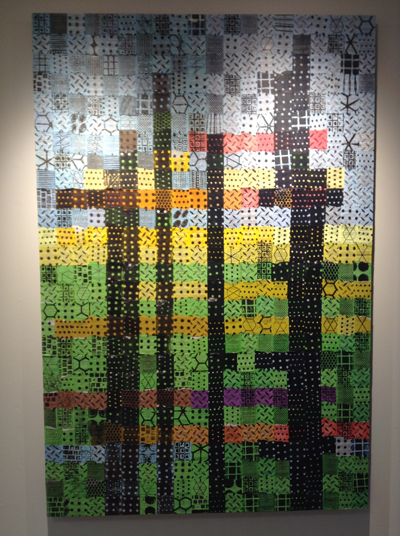
But enough about my ridiculous domestic chaos…my printmaking teacher and friend, Christiane Corcelle, has a solo show titled, “A Better Cup of Tea” at Artspace in Maynard, Ma. This show closes TOMORROW (Oct. 31) so you must go NOW to see it! It’s a great show, and I was really happy to see what great things she has been making. Here are some images from the show…

Christiane Corcelle, Choisissez Votre Chapeau!
and a detail:

Christiane Corcelle, Choisissez Votre Chapeau! (detail)
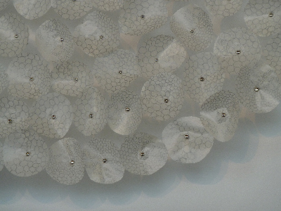
I love the image transfers of vintage illustrations on teabags. The texture is so fascinating! I think that it would be cool to make a garment/coat out of these layered teabags.
Christiane Corcelle, Going Green
This, believe it or not, these colored squares are teabag wrappers that Corcelle has printed on, then collaged. I love the simplicity of the black ink on the colored wrappers. This would also make a fantastic quilt.

Christiane Corcelle, Kaleidoscope

Christiane Corcelle, Kaleidoscope (detail)
Corcelle has collaged tea bag labels, including their strings. I especially liked this one in the center of the image…I think because some of the labels were tea stained. Don’t you love the effect of the hanging strings? You can imagine that each board is a different person, with their own tea drinking preference/personality.
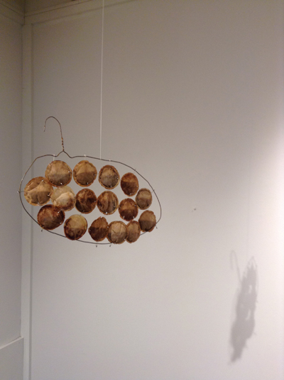
Christiane Corcelle, T-Duck
Okay, I LOVE this. This may be my favorite piece in the show. I love how simple, yet graphic the form is. I love the shadow that is cast by it. It makes me think of some kind of Duchamp readymade (although this is clearly not quite “ready made”.) Brilliant!

Christiane Corcelle, Melt Series (detail)
Can you guess what those blue blobs are? Yes, they are MELTED MILK BOTTLE CAPS. Amazing, right? I love how bold and irregular each one is. She has a whole series of these.
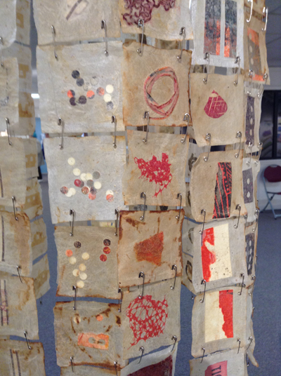
Christiane Corcelle, Red Ticket (detail)
I’m sorry that I only have a detail photo of this piece. The overall photo that I took is pretty blurry. Again, Corcelle has hidden little found treasures in these used teabags. I love that there is some organization to the arrangement of the items…and I love the unifying color scheme.
Great show. Overall, I tended to prefer the pieces that kept the teabags lose and flexible in some way, like in Red Ticket and T-duck, as opposed to where the items were more rigidly collaged, as in Kaleidoscope. Perhaps because the teabags seem to be almost a textile, I like when they maintain their soft/loose quality.
For those of you in the Boston area, some of my drawings are going to be included in a show, “Drawings Out of Lines and Marks” in the South End. The reception is November 13 from 6-8pm. I’m super excited, as the other artists are uber talented.

Now, to figure out what we should have for dinner tonight…does a mystery vegetable from the freezer sound appealing? What about just having Cheez-its and some Halloween candy?
If you’re thinking of calling DSS, my name is “Cindy” and I live in Omaha. Thank you for your concern.
Filed under: printmaking | Tags: art, boston, Carnivorous plant, drawing, parenting, printmaking, Venus flytrap
We would! No joke…I bought a VENUS FLYTRAP!!!
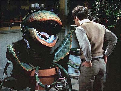
 Eww…right????? You’ll notice that some of the little “mouths” are closed. Why, you may ask? Well, because we were told to feed it little balls of HAMBURGER. I’m not kidding. So, it’s digesting hamburger blobs. I love how my husband is vegan, yet we have a carnivorous plant. I’m not sure how happy it is with the burger bits. I mean, are they going to dissolve? Or, does it spit it out when it’s done with it, like “plant poop?” No idea. It was kind of disturbing to watch it clamp down on the hamburger bit. It looks so coy, with it’s sassy green “lashes.” But don’t be fooled…it’s looking for MEAT. If you’re a product of the 80s, this is likely the first thing that came to mind…
 If this starts to happen, I’m stopping the hamburger balls (aka a mini-meatball) STAT.
Does anyone else out there completely ignore their landline when it rings? I do. 99.9% of the time, it isn’t someone that I want to speak to. Considering that I rarely check our voicemail, it’s a bit of a black hole, really. Why do we have it? Well, it’s kind of like a technological pacifier…it makes me feel “safe” that we can always make a phone call, even if our cellphones are lost/not charged/left in the car. Does that make sense? No? Well keep reading, if you find making sense boring…
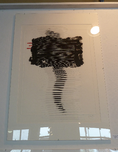
So, I’ve managed to tear myself away from staring suspiciously at the Venus flytrap in order to go out and see some art! (Or, “aht,” as this is a Boston ‘burb.) My advisor, Adria Arch, recently had a show at Bromfield Gallery:
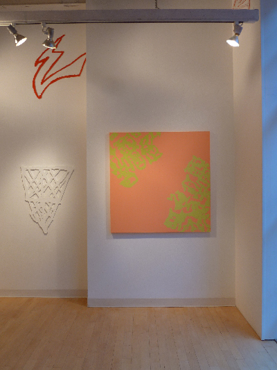


The show was fabulous and ran from October 27 – November 30. I was hoping to post about it earlier, but something awful happened recently (see my last post), so I got a bit sidetracked. Arch’s work explores the innocent, yet sometimes revealing, doodles or marks that people make. She magnifies these marks so that they command attention in a way that is unusual for something typically done without conscious thought. She captures every nuance of the mark, both in paintings…and now in plexiglass sculptural works. Arch has a great deal of experience in installations, so these newer plexiglass elements allow her pieces to be unfettered from their typical painted fields. Beautiful!
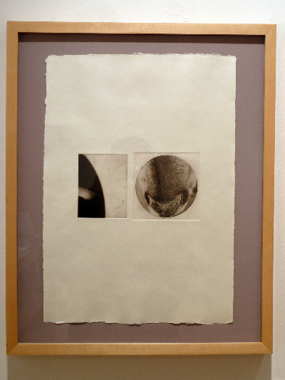
Nancy Diessner was also showing at the Bromfield. She is a printmaker who’s subject is often animals, both domestic and wild.
 Nancy Diessner, Bromfield Gallery
 Nancy Diessner, Bromfield Gallery
 Nancy Diessner, Bromfield Gallery
I love this new series with pairings of delicate images. I think that’s a nose on the right…amazing!
While I was wandering around the other galleries, look what I found at Carroll & Sons:
 Boston Drawing Project, Carroll & Sons
WOO HOO!!! You’ll notice my drawing folder featured on the middle shelf, second one from the right. I was SUPER EXCITED to see it on display like that. Having anything up at Carroll & Sons would pretty much be the apex of my career, so I think that this is as close as I’m going to get, realistically. Anyway, I’m happy.
I also went to the Boston Printmaker’s Biennial at 808 Gallery at B.U. I LOVE THIS SHOW. So much variety and so much talent. I love that gallery space, but it is kind of a pain if you are looking at works behind glass. The glare is pretty distracting:
 Cate Francis, Around The Tree
Now, that’s an amazing print. Unfortunately, it’s hard to see. I love the graphic quality of this paired with the warm, Japanese paper. So cool.
Because the glare was so difficult, I’ve selected images to show you of prints that didn’t have much of a glare problem. There were lots of beautiful prints, but I won’t bother with the ones that have too much of my silhouette ruining the image.
 Raluca Iancu, Corroded Mammoth
This is an enormous, and simply gorgeous print. It’s beautiful. I love the limited palette. She’s a virtuoso.
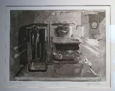 Naya Bricher, Mini Fridge
This is so amazing. I think it’s an aquatint. Doesn’t she capture the light and feel of the ubiquitous mini fridge? Look at the Pur water pitcher! Look at the Glad storage containers! Brilliant.
 Julia Talcott, Portable Color Trap
I am especially fond of this print, as we have one as well! I’m not sure how many she printed, but isn’t it amazing? The image looks tipped because it was above me when I took the photo. I love the bold, mechanized quality of it. It simultaneously has both flatness and depth. Fascinating.
 Louise Kohrman, …Forever on the Mind
 Louise Kohrman, …Forever on the Mind (detail)
Isn’t that so delicate and amazing? Kohrman’s work always seems to have a kind of etherial quality to it…lovely.
 Catherine Kernan, The Heart of the Matter
This is an incredible and enormous print. I’ve actually taken classes with Kernan. She is very skilled and knowledgeable. Her prints are obviously gorgeous.
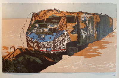
 David Mazure, Defeated/Amputees (WAR)
What you can’t see is that there is actually recycled rubber tire flocking on the black areas. Amazing! It looks like ornate wallpaper, yet there is something very dark about it.
 Christiane Corcelle, Boundless
I’m sorry that this photo isn’t great. Both the glare and the height which it was hung make it a challenge to see this well. This is the work of a printmaking teacher that I had for several months. She’s super talented, and works a lot with carborundum collagraphs. I believe that there are actually strips of paper collaged on, which you can sort of see here. I like the contrast between the delicate paper strips and the heavy inked area near the top. Lovely!
 Dan Welden, Fairly Squarely
Dan Welden actually invented solarplate printing (I believe.) This looks is a solarplate intaglio. I love the heavy black area with the gray, scribbly zones…it’s kind of crackling with energy…
 Ibrahim Maranda, Mapas
Oh. My. GOD. His works were GORGEOUS. I wanted to own all of them. ALL.
 Ibrahim Maranda, Mapas (detail)
His works are crazy, multicolored, multilayered smashups of marks and images with a “graffiti” sensibility. STUNNING. I could have put a chair down in front of these works and looked at them all day. I didn’t do that, as I had to get back to the Venus flytrap to be sure that it wasn’t eating the house. You know how it goes…
This is kind of a long post, so I’m feeling a bit worn out. I’ll finish with a hilarious drawing/installation by my son:
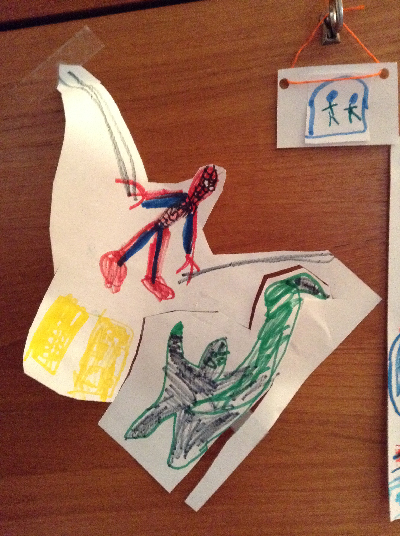 He stuck this on the front panel of a wood bookcase. LOOK AT SPIDERMAN! DON’T YOU LOVE IT??? WordPress actually provides a way to set up a “poll.” Part of me is tempted to set up a poll with the question, “Isn’t this AWESOME????” Of course, the only right answer would be “yes.” Those who answer “no” will get the stinkeye from me, his adoring yet slightly unstable mother.
I hear scratching sounds in the living room. Gotta go…it might be the Venus flytrap (soon to be…the Venus mommytrap.) At least I have a landline so that I can call for help from the depths of its jaws, right? The cord will come in handy as something for me to anchor myself to when the plant decides that I’m next on the menu. See? Landlines DO serve a purpose! Told ya so.
Filed under: Drawing, painting, printmaking | Tags: Arlington Center, art, Dinosaur, Lego, Mixed media, monotype, printmaking, sculpture
No, that’s not what I saw on the scale this morning! I mean: do you know that I’ve done 200 posts on this blog? No joke! Sometimes I scroll back to early posts just to see what’s been happening over the past couple of years. Hmmm. Not as much as one might hope for. No one has offered me a solo NYC show yet. Can you believe it? WHAT’S WRONG WITH THESE PEOPLE???? Clearly, I am the only one who basks in my artistic brilliance. (ummm…I’m kidding) I may have to shut off the “comments” feature with this post…the beauty of the internet is that I can’t see anyone rolling their eyes right now…
Perhaps instead of revealing my true struggles on this blog, I should create a faux online persona of artistic brilliance. I could create faux galleries that represent me and who gush over my faux creations. I could also imply that although I’m almost 40, I have no gray hairs and look like Zoey Deschanel.
None of this would be true, of course. My sham persona would soon be discovered. So, I’ve had to rely on the truth on this blog, and it’s often not so pretty, or exciting. Perhaps you’re relieved to know that your life isn’t so wrapped up in drivel and nonsense as mine? Perhaps you’re relieved to know that I keep a messy house, with Lego bits and dust bunnies brazenly staring me down every morning as I walk to the kitchen? Yes, I’ve heard of a mop, a broom, AND a vacuum. I just don’t choose to use them very often. Maybe if I think of housework as some kind of domestic performance art, I might get slightly more interested…
This week, I went to the Arlington Center for the Arts to see a show they have of faculty artwork. I’ve taken a drawing class there with a teacher who is funny and talented. Here is the work that she submitted:

Connie Thibaut, Memento Mori, Mixed Media
This looks to be a “trace monotype.” Can you see how amazing her drawings are? She tends to do surrealist subjects. I thought that this was really lovely. Look at the doll/person’s hand in the upper right! Beautiful. I couldn’t find a website for her. CONNIE, YOU NEED A WEBSITE. EVEN IF IT IS A FAKE PERSONA. I know. Some people have standards, and don’t feel like revealing their ineptitude online. Go figure. Next:

A. Kristina Goransson, Collection III & Collection IV, Felted & Dyed Wool
Isn’t that beautiful? These are two, separate works of art, but they do look so amazing together, don’t they? Her website is here. Check it out. All of these pieces are felted wool. SO interesting! I love how delicate they are. I wish that I knew her, as I’d ask her if I could touch one of them…(the inner preschooler in me.) Next:
Gloria Calderon-Saenz, Rivers and Nests #4, Acrylic on wood
Isn’t that gorgeous? It looks like she paints the surface of the wood, then carves it to create the image. I loved this. Check out her website here. She has another one:

Gloria Calderon-Saenz, Open Nests, Acrylic on wood
I love how graphic these are. The texture is also gorgeous, but you can’t see that from the photo. If you’re in the area, you should stop by this show in Arlington. The gallery is small, but these works (and others) are really worth it.
This week, my son’s artistic brilliance was to create this:

Do you know what that is? THAT’S THE STATUE OF LIBERTY! I thought that was pretty cool. Maybe he’ll be a sculptor when he grows up? Take a look at this:

Maybe I should suggest that he NOT become a sculptor? Isn’t that kind of deranged looking? This is the kind of stuff that I’m constantly tripping over around here. Creepy. You’d think that I’d clean up more often just so that this kind of stuff wasn’t glaring at me all day. I know…get the broom…yadda yadda yadda.
Well, it’s lunchtime. Time to go forage for something to eat…perhaps a rice crispy treat or two? (or three?).
If I sandwich two of them together with peanut butter, does that make them more nutritious? Discuss.

Filed under: Drawing, printmaking | Tags: art, artist, drawing, Jim Dine, Pencil, printmaking
Yes, you heard me…Jim Dine! I went to the MFA for a lecture by Jim Dine, revered artist/printmaker. SO FASCINATING! Isn’t it always better to hear the artist talk about their work? He was funny and “down to earth”. The lecture went through the progression of his work…from his early lithographs of “crash”, through the tools (yes! the tools!), to the bathrobe self portrait…etc etc. Here are some images:

Jim Dine
Look at those fantastic tools! His grandfather owned a hardware store, so he grew up playing with tools…next:

Jim Dine
The bathrobe. This became a sort of “self portrait”, he said. Next:

Jim Dine
Hearts. This whole series is interesting, as I think that most of us think about drawing hearts as something that a kid would do. They always have such exhuberance…
Jim spent a lot of time talking about the need to have his “hand” in what he made. He didn’t like silkscreen, because it was too removed. He often made a black and white print, but then added color afterwards with a brush.
There were some questions at the end of the lecture. One person asked (I’m paraphrasing): “How do you feel about the use of technology in contemporary art?”
Jim’s response: [significant pause]…”It’s fine.”
Sooo funny…we all laughed. His pause and his listless/sarcastic response said it all. I bought a book of his works:

OOOOO…lovely! Plus…lookit:

That’s a signature!!! I know…how nerdy.
This week, I got a first chemistry set for my son. Don’t get all excited…it was really basic…but fun. It’s perfect for a 4 year old, as nothing was toxic…and the outcome was always colorful/bubbly/erupting. Perfect! I was going to take a photo, but I didn’t want to leave him in the room with all of the stuff, lest he decide to just dump it all together at once. Our experiments sort of looked like one of his recent drawings…
My son is a bit of a scribbler:

I love it! However, I do notice that his friends at school seem to be a bit more “controlled” in what they produce. I don’t know what that means…does he just “like” to scribble? Or, is this what he does because he doesn’t have the motor skills to do anything else? This is what a neurotic mother like me thinks about. I look at these as “preschool rorschach tests”. Today, though…he did something a bit more controlled:

THAT, I’ll have you know…is an xray. This xray detects bloodcells, as that’s what all of the spots on the lower right are. I’m not sure if I have the orientation right…as I’m not a radiologist, so whatever. I would have guessed that it was some kind of machine, so I’m glad he told me what it was. Otherwise, I’d get an angry scowl at my dumb comment.
This week…I am trying to be more productive than LAST week. It’s going okay:

Notice the dappled, winter sunlight. I need some training on how to photograph “art”.
It’s so interesting…when I start one of these drawings…I actually feel a little bit of dread. My “art cop”, as Rhoda Rosenberg would say, starts to nag…”what if it turns out horribly?” “what if it sucks?” “is this all just a waste of time?” I know. Just keep working. Rhoda Rosenberg has a great John Cage quote about this:
When you start working, everybody is in your studio – the past, your friends, enemies, the art world, and above all, your own ideas – all are there. But as you continue painting, they start leaving, one by one, and you are left completely alone. Then, if you’re lucky, even you leave. [John Cage]
Hmm! I wish that I had such profound thoughts. Instead, I’m trying to remember if I put detergent in the laundry or not…
Filed under: Fleeting thoughts..., printmaking | Tags: abtract, art, artist, drypoint, portrait, printmaking, Rosenberg
This week, I went to the Danforth Museum in Framingham (which I love) to see Rhoda Rosenberg’s works:

GO. SEE. THIS. SHOW. I loved it. Her work is so beautiful. Most of the works were some form of printmaking…woodblock, carborundum, etching, drypoint, chine colle, etc. etc. She has an amazing ability to juxtapose colors and textures. Many of her works referenced either her mother or father. She did a really stunning carborundum print titled, “Bubbie’s Bag”. It’s so simple…just an inky, abstract silhouette that you recognize as someone’s handbag. But the depth of the color is amazing for something so minimal. The richness of the dark bag almost makes it some kind of emotional black hole that you feel the heavy density of. Beautiful.
My own work this week was varied. I had my last portrait class, where I did this drypoint:

It’s such a caricature of the model, but I was happy with it anyway. I love drypoint, but it’s difficult, as you can’t erase and it’s hard to see the “drawing” as you’re doing it. I’m sad that this class is finished, as I loved it!
I also did more on this series of abstract woodblock prints:

and:

and:

and:

and:

and:

I haven’t had time to carve more blocks for this series. I was only working with three colors to start, but you can see the amount of variations possible. I added the red ink towards the end of the class. Some of the prints needed something more, and so this was an attempt at that “more”. I definitely like some more than others. That’s the surprise of printmaking…sometimes it’s a good surprise…sometimes not! At least you can keep running prints, as long as you have paper and time!
The holidays are coming up, and I have yet to catch the “spirit” of the season. Maybe if I bake some xmas cookies today, that will change. There’s nothing like sugar cookies with a thick and colorful crust of sugar from my son’s heavy handed application to get one in the spirit! In spite of many sweepings, I invariably hear that crunching sound under my feet from the sugar explosion for at least a month. Don’t get me started on the whole pine needle extravaganza. I feel like those things don’t go away until sometime in mid-June.
This year, we’re getting a real tree. Last year, it was my fake aluminum tree…so this year we do a real one. I must admit, my fake tree doesn’t have the lovely pine aroma…but what it lacks in smell it makes up for in exuberance. When we get our tree, I’ll post a picture…(you can vote on whether you prefer the shiny tree or the real one). Kidding! Actually, I really don’t want to know if you prefer the real one.
Filed under: Fleeting thoughts..., painting, printmaking | Tags: abstract, art, artist, drypoint, painting, printmaking
So, this week’s portrait class was fun…we did drypoint prints of the model. A drypoint print is made by taking a plate (copper, plexi, etc.), and using a sharp steel tool to “draw”, or gouge, the lines into the plate. Then, the plate is wiped with ink so that the ink stays in the gouges…and then we print it! We were using plexiglass. The most difficult part of this is that you can’t really see your drawing very well. You have to keep tilting the plexi under the light to see where the lines are, as they are so faint and hard to see. Again, we have the model who looks like Alanis Morrisette:

She was reading her book. I was pretty happy with how this turned out. Here is the second one:

I’m not happy with that one. Sigh! We only have one more class, after Thanksgiving. I may take another stab at doing a drypoint (just a little printmaking humor…).
I’ve done more work on my vise drawing series. I haven’t photographed the drawings, so I’ll have to show you them later. As one of my infinite diversions, I was playing around with a few small, gouache paintings. Here is the first one:

I like doing these messy, crazy things. It started out somewhat realistic, with the blue sky…but then it took a turn for the weird at some point. The next one:

Garish, right? I like garish. Last one:

I don’t know where I’m going with these. I just like doing them.
Any comments? Helpful suggestions?
Does it matter that no one may like these, as long as I like to do them?
Does it matter that I clearly am not interested in “editing”?
Does it matter that I often like to use practically every color that is out there?
Metallics…I don’t have any metallic paint yet…
Filed under: painting, printmaking | Tags: abstract, acrylic, art, artist, painting, printmaker. visual arts, printmaking, woodblock print, woodcut print
Okay. Remember how I was complaining about the “dusting” of snow the other week? WELL. As those of you in the Northeast well know, now we had something to really cry about. Yes, snow…lots of it…before Halloween. I am lucky to be writing this email at all, as there are many people who are STILL without power. Can you imagine? Not good. Think, “The Shining” but with more, yet likely smaller, houses. Really not good. The scene of our backyard:

Looks worse than that last photo I posted, right? Now, I grew up in upstate New York for my elementary school years. Their snow makes our snow look plain silly. BUT…I do not recall EVER having snow in upstate New York before Halloween. It’s just not right.

I’ll stop whining now.
My son’s halloween costume, which he refused to wear trick or treating but was happy to wear at home in order to help dad with the mail:

No, I did not make that costume. I gave up for two reasons: 1. a crocodile was too complicated to make, and 2. I had a strong suspicion that he would not wear the costume in the first place. Don’t even get me started about the costume that I slaved over last year that he also did not wear. My child finds halloween too stressful. Hmm.
Art-wise…I think that this was a pretty successful week. I had a GREAT printmaking workshop with Catherine Kernan over the weekend. SOOOO GREAT. She does all sorts of crazy things with woodblock prints. I found her to be such a good teacher and very inspiring. Here are my prints from the weekend:

I like it! Next:

It’s odd how different the background paper looks, even though it was the same for all of the prints ( I mean the white area at the perimeter).

I saved that one above from being a muddy mess. Nice!

Catherine really liked that one above. It looks better in real life. Last print:

You can tell if you have a good teacher when the quality of your work really improves. I felt that this was true at this workshop. It was a lot of fun! All of those prints are made from just two blocks.
I also had some success with painting. Here it is:

My teacher really liked it. He had some helpful comments along the way. It also didn’t feel hard to do. I’m wondering if the fact that I was actually in a bit of pain at the time of doing it (think: big headache), somehow helped. Because of that, I wasn’t totally focused. My thoughts kept getting interrupted by my discomfort. This sort of quieted down any inner discussion about judging the work as it progressed, as my mind was preoccupied. Not that I’d like to be in pain when I paint, but I am wondering somehow if it actually was a help! Sound crazy? Perhaps so.
I like the painting anyway. Comments? Everyone have a good halloween? I think that I’ve consumed enough candy to last me until 2013 at least…not that I’m letting that stop me from munching on more “fun size” calorie bombs.
Filed under: Drawing, printmaking | Tags: art, artist, Center for Contemporary Printmaking, drawing, portrait, printmaking, visual art, woodblock printing
So, this past Friday evening was the opening to the portrait show that I have a drawing in! It’s really VERY low key…but I was excited nonetheless. The show is titled, “See You, See Me: The Art of the Portrait”, and it’s at the Belmont Gallery of Art until November 13, 2011. Here is what some of the works looked like in the first room:

See the two women standing in front of a large painting? The woman on the right is the artist of that painting, and it was so amazing. It appears to be a portrait of her daughter looking at picture books in a sunny, but dark, room. It’s an oil painting, and she’s clearly a talented painter. Her name is Noriko Fox, and here is her website.
This is the room where my drawing was…you can see it on the back wall…just to the left of the guy in black:

closer…

Here it is!

Here is the funniest thing…So, I had to put a title on this drawing. I did not know the name of the model, nor did I know any possible way to find out his name. So, I made up a name…”Michael”. He just looked like a Michael to me. I just didn’t want to call him “Man”, or “Portrait”. WELL…would you believe that there was someone else who had also done a portrait of him? I am not kidding! Of course, she had his correct name, which is “Dan”. My friend, Janet, came to see the show and recognized him and confirmed that his name is really Dan. Sigh. If only I knew that! At least we both did a good job creating a likeness of him, as pretty much everyone recognized that it was the same person!
Some other good news this week is that I sold three prints from the show at the Center for Contemporary Printmaking in Norwalk, CT! I was really happy. Only one of my prints was selected for the official show, but the other two prints were in binders with all of the other prints that didn’t make the cut. However, someone bought not only the one officially in the show, but the other two as well! Not the same person, I’m sure.
My last bit of good news is that my basement workspace is finally furnished, and I’ve moved in! I will show you a photo at some point, but it’s a bit messy right now. I’m preparing for the Arlington Open Studios, so I haven’t had much time to really organize it. I’ve been trying to make progress on packaging all of the prints that I plan to bring to the open studios. Mark it on your calendar! October 15 & 16 from 12-5pm at the Arlington Center for the Arts. I’ll be in the big auditorium space.
Here is part of a woodblock that I have been working on. This was printed by hand, but I’m hoping to print it with a press on Monday. I’ll update you on how it turned out!

Filed under: painting | Tags: abstract, acrylics, art, artist, Paint, printmaking, Visual Arts
So, I’m happy to say that my portrait drawing was accepted in the show at the Belmont Gallery of Art. Yay! This is a show titled, “See you, See me”, and it’s only portraits. I saw some of the other works when I was dropping off my drawing. Should be interesting! (You can see what the drawing looks like in my September 8 blog post). The show opens on September 30 and runs through November 13. Please stop by!
This weekend, I went to the Hyde Park Open Studios. This was great, as my printmaking teacher, Selma Bromberg, has her studio there. Her work is really beautiful. She draws gorgeous flowers, then turns the drawings into prints. She was doing a woodblock demonstration when I arrived. I also saw Prilla Smith Brackett, whom I met at my woodblock print class. She’s primarily a painter, but is starting to work more with prints. Her work was also lovely. It was fun to see some of the completed woodblock prints that she began in class.
My painting class is still fun. My teacher did not like the big paintings that I brought in. He likened one of them to a “shower curtain”. I can tell you all of this as I’ve gone through many an architecture crit, and have heard it all. I really appreciate his honesty. I think that he’s a good teacher. Let’s see if I can learn something, though! He wants me to try figurative work, as that’s my background (as evidenced by the portrait drawing). Hmm…okay…we’ll see! I also did a few mini-paintings. These are only 6″ x 8″.

It was fun to work on these tiny canvases…

I may have to revisit all of these…we’ll see…

On another note…I’m horribly disappointed that the portrait class that I’m signed up for will likely be cancelled. It’s called “The Expressive Portrait”, and it’s at the Arlington Center for the Arts. We need THREE more people in order to have the class. I’m so sad, as it’s highly unlikely what we’ll get them in the time left. Having a class cancelled on you is so frustrating. I’ve had this happen several times. I’m always dumbfounded when it does happen. You mean…not EVERYONE wants to take this class??? WHY NOT???? I’ve tried to send out emails, etc. to other people who might be interested in signing up. No luck so far. If you’re interested…PLEASE sign up! Seriously. Do it now. No joke.
I wish that there wasn’t a minimum number for a class. I mean…don’t I count at all? Doesn’t my enthusiasm make up for the low enrollment???? I guess not…*DRAMATIC SIGH*
Filed under: painting, printmaking | Tags: absract, art, artist, Paint, painting, printmaking, visual art
So, today was my last open print studio at Cambridge Adult Ed. It was great to spend time with Paula and Cindy (hello, if you’re reading this!!!). They are both accomplished artists, so I look to them for advice and suggestions. Today, Paula suggested that I try to incorporate my drawing skills (limited), with the abstract work that I am so interested in. As I struggled to think of something to “draw” today, I just looked around the studio for inspiration. We share the printmaking studio with clay, jewelry, and…woodworking! So, my subject today turned to the drill press. Yes…inspiration can truly be found anywhere. Here was my first print:

That’s slightly wonky, right? Anyway, when I did it in studio…I was not impressed. But now that I look at it again, it’s kind of interesting. Cindy remarked how one’s frame of mind really affects how we view our artwork. Old watercolor paintings that she had previously set aside were better than she remembered when looked at anew. Distance makes the heart grow fonder? Maybe. The second one:

I can’t really make a series about drill presses…as those are the only two that they have! Maybe a power tools series in general would be interesting…not sure what that’s all about.
I also worked on some VERY messy paintings. These were very fun…albeit a big mess. Here is the first one:

I know. Garish colors. I kind of like garish colors, though. I feel like that person on the current season of Project Runway who feels compelled to “BEDAZZLE” everything. If only I’d had some glitter… a detail:

Messy fun! Then, I did ANOTHER messy one. Seriously. You’ll see…blobs of paint everywhere…

I know…right? Another “hot mess”. Another Project Runway reference…I need to get a life. Detail:

Then I decided that less is definitely not more, so I did ANOTHER super chaotic one:

I know that if I was at school, a teacher would have taken away my paints by now. Boo!
Detail:

Doesn’t it look like the melted ice cream in the bottom of your bowl when you have slathered on a grotesque quantity of colored sprinkles? By the way…what ARE sprinkles anyway? Have you ever eaten them straight? They’re disgusting. Like little wax chips…and the chocolate ones are no better.
Okay…so tell me the truth about the messy “paintings”. (notice that “paintings” is in quotes). What do you think? Keep the messy stuff for when I’m eating ice cream only? Should I put away my paints permanently? Should I have my artistic license revoked? Hmpfh.
Wish me luck on that portrait show. I’ll break the good/bad news to you when I find out myself!
