

Filed under: Drawing, Fleeting thoughts..., painting, Photography | Tags: art, artist, drawing, Fitchburg Art Museum, Georgia O'Keeffe, museum, painting, still life, visual art
I know…I know…it’s been TWO WEEKS since I last posted. Sigh. Things are just so busy. Hopefully, to make up for missing the past two Fridays, this post is an image-filled extravaganza, so hang onto your triple espresso…(and get me one while you’re at it! Make it a decaf though…I have plenty of self-induced stress, so I don’t need to rely on caffeine to put me in a state of hysterics…)
So, my big news is that the group show that I’m participating in (Still Life Lives!) opened last week at the Fitchburg Art Museum. WOO HOO! I was thrilled to see some of you come out to see it. Thank you!!! I totally appreciate the time and energy it took to head out there. I hope that everyone found it worthwhile, as I think it’s a very interesting show.
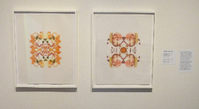
Elizabeth Kostojohn, Nameless Problem #2 & #1, 2013
Here are two drawings from my new series! (Yes, that’s food.) I think that they looked pretty good. It’s hard not to panic when your work is on the wall. But, as I wasn’t wearing a name tag, I managed to calm down a bit…

Elizabeth Kostojohn, 6 drawings from Hurt & Damage series
These are more of my drawings! I’m happy to see them up. This show is kind of a big deal for me, as I’ve got two bodies of work up…never mind being amongst the super talented people that are also participating. I kind of wish that we had name tags, as I would have liked to have met some of the uber talented artists!
But enough about me…here is some of the AMAZING work that is up…

Emily Eveleth, Snake Eyes, 2000, Oil on Canvas
I wish I had a wall in my house big enough for this painting. It is stunningly beautiful. Eveleth’s mastery of oil painting captures the soft and sticky essence of her subject in an intense gaze. This painting alone is reason enough to come to the show. This painting is breathtaking and mesmerizing. It’s gorgeous even on this lousy computer screen. It will blow your mind in real life…
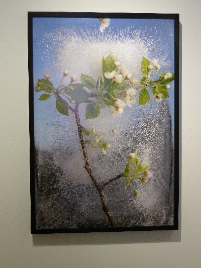
Mary Kocol, White Crabapple Blooming Branch, 2011, photograph
Kocol had several photographs from her Ice Garden series. These are AMAZING. In spite of being frozen, there is something very dynamic about these images. I think that’s particularly true of the images where you can clearly see the sky beyond. I keep thinking, “POW!” in my head. (Please don’t ask me to explain myself…I am neither a writer, nor an art critic…) So beautiful. I love it.

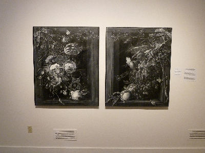
Georgia O’Keeffe, Untitled (Pink Camellia), 1935, Pastel
Oh yes…I forgot to mention that this show also features work from FAM’s permanent collection! Amazing, right? This work by O’Keeffe is in the same room as the Kocol photos…brilliant! It’s like rubbing elbows with celebrities!

Elisa H. Hamilton, An Apple a Day, 2013, Mixed media on paper
Hamilton has an amazing talent with color. Each of these drawings really pop with vitality. Please take a look at her website!!! I also love her drawings of domestic interiors and objects, especially “Vermont Studio Portrait.” Very impressive.

Cynthia Greig, Nature Morte no. 18, 2010, chromogenic development photograph
Okay. This is a PHOTOGRAPH. I kid you not. I believe that the artist paints everything white, and then actually outlines the objects with charcoal…THEN photographs it. My brain still can’t wrap itself around this. It’s so clean and beautiful! I’m amazed at her analog virtuosity.

Victor Schrager, Untitled #7 and #472, 2011, Pigment print
These gorgeous, saturated, soft focus still life photos are the work of Victor Schrager. I love the vivid colors and in focus/out of focus combinations. Amazing, right?
Kathleen Volp, Wan-Li RUMBLE and Still Life with Impostor and Wan-li, 2008, Mixed media, oil and aluminum on panel.
These pieces are enormous, glossy, and embossed METAL. No joke. Volp’s work always amazes me…it is always compelling, masterful in technique, and truly impressive. Please take a look at her website so that you can appreciate the range of work that she does. Mind-boggling…
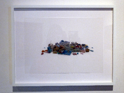
Evelyn Rydz, Gulf Pile I, 2012, Pencil and Colored Pencil on Drafting Film
This is an AMAZING and delicate drawing. Rydz is my “drafting film god.” She and I both use pencil/colored pencil on drafting film. I bask in her drawing brilliance. Her work is so delicate and GORGEOUS. She often draws piles of objects that have washed ashore. I’m sorry that this is not a good photo…it does not do her work justice. I just checked her website, and it says that she is having a SOLO show at the MFA in 2014. So impressive!!! That is MUST SEE show. (I’m not kidding. Check her website. Mark your calendar.)

Mary O’Malley, Altar #4, 2010, Gold Metallic Ink on Paper
Ahhh…this drawing is SO beautiful. I am in such awe of O’Malley’s work. I was lucky enough to meet her at the reception. She is a lovely person. I hope I conveyed to her how much I love what she does. Her work is so timeless…it feels both historic and yet so contemporary.
Shelley Reed, Ribboned Flowers, Ribboned Fruit (after Mignon), 2010, Oil on Canvas
These paintings were really breathtaking. I love how dark and intense they are. I believe that she looks at historic works and then interprets them in her own artwork. Please check out her website. I pretty much want to own all of her work. Maybe if I eat ramen noodles exclusively for a year, I could swing it? Hmm. I’ll still need that fantasy house with enough wallspace, though…more noodles for me, I guess…

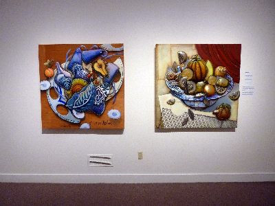
Janet Rickus, A Bird Painting, 2012, oil on canvas
Yes, that’s a painting…not a photo. Rickus’s work is hyper-real and beautiful. Beautiful composition…color…light…realism…I love it. Her work will definitely make your jaw drop. I feel almost like they are views into a gorgeous world that I WISH I could be a part of. The elements in the images are unpretentious, yet they are so perfect that they are still awe inspiring. I might have to get this for my house so that I can meditate upon it, and somehow be inspired to make my disaster-area home be marginally more lovely.
On this note, my son (5 yr old) has decided that we should make our house a museum. He doesn’t seem daunted by the fact that we have nothing museum-like in our house. I’ve told him that no one is going to want to come to see our “junk.” We joke about this. He’s still determined to do it, somehow. In fact, he’s trying to entice passersby with this “advertising” at the front of our house:
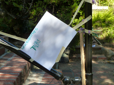
Yes. That says, “MUSEUMOPNEG TADAY.” Yes, I allow him to do this to our house. Yes, those are little purple flowers stuck to the tape for aesthetic effect. Oh but wait…there’s more:

He wants to make sure people understand that they are “WALCAM” to come in. And:

Just in case there was any doubt that we were “OPEN” or not…
If you do stop by to check out our “Museum”…please note that the mess inside is what this museum is actually all about. Imagine taking a Joseph Cornell box and shaking it vigorously…it kind of looks like that, but with more Lego. Just try not to trip on it all whilst taking the tour. Currently, we’re working out the “gift shop.” Brace yourself…
Filed under: Drawing, Fleeting thoughts..., painting, Sewing | Tags: 13 Forest, arlington, art, artist, boston, graduation, Massachusetts, preschool, visual art
So, I recently started exercising. I know. Don’t laugh. I truly forgot what sore muscles feel like. Actually, I forgot what muscles feel like altogether, so the whole thing is pretty shocking, to say the least. I haven’t succumbed to the lure of Ben Gay, though. When I was in high school, the heady aroma of Ben Gay would waft throughout the school in the week of “sports camp” leading up to the start of the Fall season. I’d rather hobble than smell that stuff again. (God forbid you rub your eye with some of that on your hand….YEEOUCH.) In order to nurse myself back to health, I’ve decided to just lie on the couch whilst eating an ice cream sandwich. You know…just like the pros do.
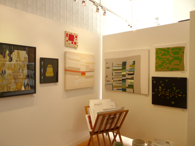
Besides moaning about my aching, yet seemingly nonexistent muscles, I did get out to see some art. This is lucky, as my own artwork continues to plod along at a glacial pace. I didn’t venture far, mind you. My hobbling limited the scope of my search. I decided that I would FINALLY go to 13 Forest Gallery here in Arlington, MA. (It’s kind of ridiculous/embarrassing that I had not been in before.) I met Marc Gurton, the owner, who was super friendly and has selected some really amazing artists to represent. Right now, they have a show titled, “Tangent,” which features the work of Mary O’Malley and Rebecca Roberts. Here are some views of the show:

13 Forest Gallery featuring Mary O’Malley and Rebecca Roberts
And another view:
13 Forest Gallery featuring Mary O’Malley and Rebecca Roberts
O’Malley creates intricate drawings with metallic ink and gouache typically on black paper. They are beautiful. The repetitive and abstract qualities makes me think of Islamic art, while the gilded palette makes me think of an illuminated manuscript. They have an opulent, yet understated quality about them. Very impressive.
Roberts creates gorgeous abstract fabric paintings in a mix of both bold and subtle hues. She not only plays with beautiful color palettes, but the texture of the fabric also varies. My favorite pieces were those with a color field surrounded by an unsymmetrical white background. Two of those pieces are in the photo above on the right side.
Here are some better shots of their work:
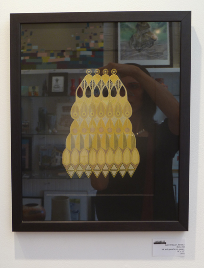
Mary O’Malley, Relic #10, Ink and Gouache on Paper, 16″ x 13″
The reflection is obviously not doing the work justice. But you can see the gorgeous palette and beautiful detail.

Rebecca Roberts, Pfeiffer Falls, Sewn Cotton Fabric, 18″ x 20″
This is one where an irregularly shaped field of color sits within a minimal, white background. I love it!
Anyone local to Arlington, MA should stop by to see the show. IN FACT, TONIGHT (June 21) BOTH ARTISTS ARE GOING TO BE SPEAKING AT THE GALLERY. There is a reception from 7-9pm. Go see what they have to say! (And please tell me what they say, as I don’t think that I can make it.)

Today is my son’s LAST DAY at preschool. He has gone to that school since he was four months old. (No joke.) So, we’re taking him out for a “graduation dinner.” to celebrate. This is also to ease the fact that he is NOT happy about leaving. Actually, he’s not happy about change of any sort, unless you mean adding a new toy to his collection. THEN, he embraces change completely and with zeal. Also, he’ll “embrace” the change in my purse, and add it to his ever expanding piggybank if I’m not paying attention. Naturally, if I ask him where the money is from…he’ll tell me that he “found it.” I guess that’s sort of true…
Actually, the whole concept of “truth” still does not register with him. He’s only 5, so I hope that there’s time to learn. Sometimes, he’ll blatantly lie about something. I’ll ask him, “Did you and Grandma get some ice cream today?” His response is an emphatic, “NO!” However, when I say that I’m going to call Grandma just to check, he changes his response to, “Wellllll, at least I don’t THINK that I had any ice cream…I don’t reaaaally remember.” He even scratches his chin quizzically for effect.
Hmmm.
I’m hoping that this does not indicate some future life of crime for him, but just a phase of development that he hasn’t quite reached yet…kind of like facial hair. Now, if the facial hair comes in BEFORE his understanding of “the truth”, THEN I will be concerned. Actually, there’s probably some correlation between the onset of facial hair and a regressive trend to actually forget what it means to tell the truth. Like, “No Mom, I didn’t take your ironing board and use it as a skateboard ramp. I don’t know where those wheel marks came from.”
HMMMMM.
I’ve decided to stop worrying about all of that now and just go ice my sore muscles with another ice cream sandwich…
Filed under: Drawing, printmaking | Tags: art, artist, Center for Contemporary Printmaking, drawing, portrait, printmaking, visual art, woodblock printing
So, this past Friday evening was the opening to the portrait show that I have a drawing in! It’s really VERY low key…but I was excited nonetheless. The show is titled, “See You, See Me: The Art of the Portrait”, and it’s at the Belmont Gallery of Art until November 13, 2011. Here is what some of the works looked like in the first room:

See the two women standing in front of a large painting? The woman on the right is the artist of that painting, and it was so amazing. It appears to be a portrait of her daughter looking at picture books in a sunny, but dark, room. It’s an oil painting, and she’s clearly a talented painter. Her name is Noriko Fox, and here is her website.
This is the room where my drawing was…you can see it on the back wall…just to the left of the guy in black:

closer…

Here it is!

Here is the funniest thing…So, I had to put a title on this drawing. I did not know the name of the model, nor did I know any possible way to find out his name. So, I made up a name…”Michael”. He just looked like a Michael to me. I just didn’t want to call him “Man”, or “Portrait”. WELL…would you believe that there was someone else who had also done a portrait of him? I am not kidding! Of course, she had his correct name, which is “Dan”. My friend, Janet, came to see the show and recognized him and confirmed that his name is really Dan. Sigh. If only I knew that! At least we both did a good job creating a likeness of him, as pretty much everyone recognized that it was the same person!
Some other good news this week is that I sold three prints from the show at the Center for Contemporary Printmaking in Norwalk, CT! I was really happy. Only one of my prints was selected for the official show, but the other two prints were in binders with all of the other prints that didn’t make the cut. However, someone bought not only the one officially in the show, but the other two as well! Not the same person, I’m sure.
My last bit of good news is that my basement workspace is finally furnished, and I’ve moved in! I will show you a photo at some point, but it’s a bit messy right now. I’m preparing for the Arlington Open Studios, so I haven’t had much time to really organize it. I’ve been trying to make progress on packaging all of the prints that I plan to bring to the open studios. Mark it on your calendar! October 15 & 16 from 12-5pm at the Arlington Center for the Arts. I’ll be in the big auditorium space.
Here is part of a woodblock that I have been working on. This was printed by hand, but I’m hoping to print it with a press on Monday. I’ll update you on how it turned out!

Filed under: painting | Tags: acrylic, art, artist, Paint, painting, portrait, self portrait, still life, visual art
My painting teacher asked us to bring in an object to paint, or “present”, in his words. I didn’t know what that meant, but it sounded intimidating. He brought over a Rauchenberg book to show me an example of what he meant when I asked him about it. Hmmm. No pressure. Setting the bar astronomically high…okay. Have I already mentioned that I love Rauchenberg’s work? I probably should have just crawled under my easel at that point, but I didn’t. Maybe if I had a stuffed goat and a tire, I might be able to sort of get within the same solar system as Rauchenberg’s work. Maybe not.
Anyway, I picked a small elephant toy that I’ve had since I was a kid. My childhood friend, Anita, gave it to me. Her dad was from India, and they went there on vacation. So, here is my little elephant…in pretty good shape if you consider how old it is…

Cute, right? He doesn’t stand up well, and tends to tip forward. I think that either his trunk puts him off balance, or his front legs are a little too short. I empathize.
So, here is my painting of this little guy:

I’m happy with it. I mean…it’s no Rauchenberg. I know. Trust me. This is what happens when you don’t crawl under your easel. I’ve always thought that still life painting was kind of…ummm…not so exciting. I gravitate towards abstract and messy art, so still lifes are so…well, still. Maybe I need to try it again? My teacher said nice things about it. Again, I know. He has to walk that delicate line of being somewhat frank, but not completely squelching me with reality. It’s only my third class, so I think that he’s still trying not to scare/offend anyone. He mentioned that three people left one of the other classes that he teaches, so perhaps he was worried about making the beginners in the class, like myself, run as well. Comments?
So, I’m still not done with this odd/icky self portrait. I know. Just paint over the whole thing and start again. My teacher suggested some abstract colored blobs to break it up a bit:

I don’t know. I’d like to help it somehow, but it might bother me too much to keep working on it. This is one of those painful confrontations with reality. I need to go out and buy a lot more titanium white to fix this thing. Maybe just getting a large tub of gesso and a paint gun would do the trick…I think that I get points for even posting it though, right? Maybe not. Sigh.
Filed under: painting | Tags: acrylic, art, artist, Canvas, charcoal, figurative, Paint, painting, portrait, visual art
For one weekend every year, my husband and I go back to where we were married…sans enfants. Thanks to the generosity of my mom who is willing to watch my son, we can have a weekend escape! I know. How lucky! We go to the place where we were married in the Berkshires. It’s SO lovely…so quiet…just the noise of the wind moving through the trees. Ahhhh. I wish that I could bottle that and bring it home. Perhaps that’s what those Bose noise cancelling headphones are like…sounds appealing.
So, I’m thinking about my next painting class coming up. My teacher suggested figurative work. I like drawing people, so perhaps I’ll like painting them too! I made an effort not to “draw” the paintings. Don’t get me wrong…I love the way that drawn lines look in a painting. I just thought that I’d try to keep my paintings truer to the medium. I basically reworked the two canvases that I had started in class. This proved to be a challenge, as both canvases were VERY textured. I mean…REALLY textured. So, it was tough to do something on top that wasn’t abstract. Here was the first one, based upon a suggestion by my teacher:

I think that you can see what I’m talking about with the “extreme” texture. Here is a close up:

Okay, it wasn’t an assemblage, but still. It was really tough to paint over that goopy surface. Anyhoo…this was kind of fun. I liked using the odd colors too. I decided to do another one:

Hmm. I layered this one a bit more, as I felt that it needed something to tie the abstract background with the portrait. Perhaps I need to be a bit more abstract with the portraits. Hmmm…
I’ve started another one, but this time…I began with a charcoal drawing on the canvas. I have also added some texture to the canvas, but it actually relates to the image, as opposed to the two paintings above. We’ll see how this one goes!

I found that the charcoal sort of smeared when I went over it with the acrylic medium, so I actually put most of the medium on the background.
I’ve also got a woodblock that I have to make some progress on. I’m not using the gourmet shina plywood, but some other plywood from Woodcraft, a store in Woburn. This is a royal pain. I’m so spoiled with the shina plywood. This other plywood splinters, is hard to cut, and is a general pain. It’s made me sort of drag my feet about carving it. I need to finish it up though! Hopefully, I’ll have some prints next week to show of it.
The opening reception for the portrait show that I have a drawing in is this Friday! So, if you are in the area…please stop by the Belmont Gallery of Art between 6-8pm on Friday. I’ll be there!
Filed under: painting, printmaking | Tags: absract, art, artist, Paint, painting, printmaking, visual art
So, today was my last open print studio at Cambridge Adult Ed. It was great to spend time with Paula and Cindy (hello, if you’re reading this!!!). They are both accomplished artists, so I look to them for advice and suggestions. Today, Paula suggested that I try to incorporate my drawing skills (limited), with the abstract work that I am so interested in. As I struggled to think of something to “draw” today, I just looked around the studio for inspiration. We share the printmaking studio with clay, jewelry, and…woodworking! So, my subject today turned to the drill press. Yes…inspiration can truly be found anywhere. Here was my first print:

That’s slightly wonky, right? Anyway, when I did it in studio…I was not impressed. But now that I look at it again, it’s kind of interesting. Cindy remarked how one’s frame of mind really affects how we view our artwork. Old watercolor paintings that she had previously set aside were better than she remembered when looked at anew. Distance makes the heart grow fonder? Maybe. The second one:

I can’t really make a series about drill presses…as those are the only two that they have! Maybe a power tools series in general would be interesting…not sure what that’s all about.
I also worked on some VERY messy paintings. These were very fun…albeit a big mess. Here is the first one:

I know. Garish colors. I kind of like garish colors, though. I feel like that person on the current season of Project Runway who feels compelled to “BEDAZZLE” everything. If only I’d had some glitter… a detail:

Messy fun! Then, I did ANOTHER messy one. Seriously. You’ll see…blobs of paint everywhere…

I know…right? Another “hot mess”. Another Project Runway reference…I need to get a life. Detail:

Then I decided that less is definitely not more, so I did ANOTHER super chaotic one:

I know that if I was at school, a teacher would have taken away my paints by now. Boo!
Detail:

Doesn’t it look like the melted ice cream in the bottom of your bowl when you have slathered on a grotesque quantity of colored sprinkles? By the way…what ARE sprinkles anyway? Have you ever eaten them straight? They’re disgusting. Like little wax chips…and the chocolate ones are no better.
Okay…so tell me the truth about the messy “paintings”. (notice that “paintings” is in quotes). What do you think? Keep the messy stuff for when I’m eating ice cream only? Should I put away my paints permanently? Should I have my artistic license revoked? Hmpfh.
Wish me luck on that portrait show. I’ll break the good/bad news to you when I find out myself!
Filed under: printmaking | Tags: abstract, art, artist, Jacob Hashimoto, print, printmaking, visual art
I was lucky enough to get to go to the print studio today, thanks to my mother who watched my son for me. There were only three of us there, so we REALLY spread out. When given the chance, printmakers are like molasses…oozing out in every direction, taking up more and more and more space. I guess in the “heat of the moment” while working on a print, you just grab any space you can get to put something down, or to work on. The more plates that you work with for a single print also means that you need more and more room. ANYWAY…it was a great luxury today to be there and to have so much room.
I felt that it was a productive day. Some days, I’m just off and the whole thing becomes so frustrating. This day was better…probably because the studio was quiet and roomy. It’s hard to think when it’s crowded, there is a line to use the press, and you have no space to work. Here is the first print that I did:

Not my favorite…it wasn’t going well, and then I added the thin, black layer. This helped. I may have to revisit this one…but I’m going to leave it alone for now. Next:

This one was also just okay…I like the bright colors, but the textures did not turn out as I had hoped. It was a bit of an experiment, so I learned a bit…well, a bit of what didn’t quite work. The black helped this one too. Next:

I like that one, and it was a bit of a happy accident. This was what was left on one of my plates from working the previous prints. Odd, right? The textures are delicate and interesting. Maybe I can get better at this, and fine tune it a bit more. Next:

So, I ran out of paper, and started to use these long scraps that I had. It was fun to do the full bleed printing and the vertical format. These three vertical ones work together well…a classmate suggested that I keep going with this series…

I like that one too.

I realize now that I should have taken a picture with all three together. So, I’ll mash them together in photoshop, instead:

Hmmm! Maybe I should keep going with these. They would also be fun to turn into an artist book. I’d love to do that. Maybe that’s what I’ll work on next time…
Comments? Artists that I should look at?
Here’s an artist that EVERYONE should look at. Check out Jacob Hashimoto. I WORSHIP his work. So stunning…I have yet to see it in person, but I hope to do so some day. Has anyone seen his work first hand? If so, tell me what you think!
So lovely…
Filed under: printmaking | Tags: art, artist, collagraph, print, printmaking, visual art
More collagraphs! I’m continuing to work on collagraphs, which I find to be very fun. This time, I decided that i would make prints with a full bleed. What does that mean? It means that the print runs to the edge of the paper, instead of floating like a rectangle within a larger sheet of paper. I don’t often do full bleed prints…I’m not sure why. They can be a bit messy, so perhaps that’s it. (if you want to know more about collagraph, see an earler post this month)
Here is the first print:

I’m not sure why I’ve called it “clouds”. I mean…it’s slightly obvious, but that wasn’t my intent while making the plate. I think that there is something serene about these black and white prints. They’re sort of cartoonish, in a way. Comments?
In the next print, I incorporated some colored paper:

This feels very incomplete. I will work on this more, but I’m leaving it for now. It’s always good to leave something to ponder a bit before working on it more. Two people in studio suggested, “red”. Hmmm.
The last one is a bit odd! Also very incomplete:

I layered in a very interesting paper that I have. It’s very textured…almost like bark. The texture does get flattened quite a bit in the press, but you can see the interesting edge to this paper in the detail:

See those curls at the edge? So interesting! I think that the rust colored paper is too long on top, and needs to be trimmed back a bit. I like the overlap, but it may be a bit much. Anyone out there have an opinion?
I am going to the MFA today to see the Chihuly exibit. I’ve heard mixed reviews. Because it’s so extreme, it seems that people either like it or hate it. I’m not sure where I stand on it…as I’ve yet to see it in person! Because his work often has “practical” applications…I been wondering if it doesn’t somewhat edge close to the world of “craft”. I don’t mean gluestick and hello kitty scissors “craft”, of course…I mean Craft, with a capital “C”. For example, there is a lovely museum called the Fuller Craft Museum in Massachusetts. I’ve only been a couple of times, and I’ve really loved the exhibits. Anyway…it’s interesting that they had the work of a glass artist there, Josh Simpson. His work is much more restrained than Chihuly’s…but I suppose that isn’t saying much. Anyway, Simpson’s work is at the Craft Museum, not the MFA. Why is that? I wonder if that is purely a function of Chihuly’s international fame? When does something move from “craft” to “art”? I know…such a broad and hairy question. Chihuly got me thinking about it…has anyone seen the exhibit? Comments?
Filed under: Collage | Tags: art, artist, Collage, Kurt Schwitters, Robert Rauschenberg, visual art
Okay. I know that many of you appear to be lukewarm at best towards collage. This makes me sad! I guess because I like doing collages…I’d like everyone to think that they are as super fascinating as I think that they are. What about Kurt Schwitters? Who’s that? Well…only a super talented artist who did COLLAGES. Take a look. See? No? It doesn’t grab you? What about this one?
I also love Robert Rauschenberg. A lot. If anyone has one of his works that they are tired of, I would happily swap almost anything that I have for one. So, take a look at this. Or what about this? I really love that last one. If you happen to own it, email me to see if we would work out some kind of swap.
I think that most people think of collage as just stuff that one’s kid does in school. Here is a collage that my son did:

Very cute, right???? I love it. I also love how the kite is “upside down”. But why not? This often happens when flying a kite, right? But I think that most of us would have oriented it differently. I love that it’s upside down.
So, while I love looove this collage by my son…I do think that there is a difference between his collage, and the collages of Rauschenberg and Schwitters. No? I remember that Picasso has that famous saying, “I used to draw like Raphael, but it has taken me a whole lifetime to learn to draw like a child.” Isn’t that brilliant? Sigh.
Anyhoo, I have a woodblock class tonight. Luckily, I have a new block to print! I also did a collage today, which got me started on this whole topic again. Comments anyone? Thoughts? Suggestions? Likes? Dislikes? Are there any collage artists out there to add to this one-sided discussion?

Filed under: Fleeting thoughts..., printmaking | Tags: art, artist, collagraph, intaglio, Mixed media, print, printmaking, visual art
I made a new collagraph plate this week. What is a collagraph, you may ask? I’ll give you the description provided by the book that I’m also going to review.
“Collagraph is essentially an experimental form of printmaking which involves adding layers of adhesive or solid material to the surface of a printing plate, making it possible to incorporate both relief and intaglio printmaking methods on a single plate.” – Brenda Harthill & Richard Clarke
While some types of printmaking, like engraving, require pricey copper plates…collagraph is about using whatever you’ve got to make a plate. It is like making a collage. In fact, the word “collagraph” is based on the Greek word “kollo”, which means “to glue”.
For my birthday, I asked for a couple of books, one of them being, Collagraphs and Mixed Media Printmaking by Brenda Harthill and Richard Clarke. It is such a fascinating book. It is not an in-depth, how-to guide. There are only a few places where any steps to making and inking a collagraph plate are shown. There are, however, many images of collagraph prints by various artists. One thing that is particularly interesting about collagraphs is that it is often unclear how a print was made. For example, a drypoint print is somewhat self-explanatory. A hard plate (copper or plexi typically) is scratched with a sharp tool, and this is how the image is created. But for a collagraph…who knows how the artist got the shapes and textures that they did on their print! It’s suprising how very mundane things can be wonderful printing surfaces. This is a great book if you already like collagraphs, but should not be your introductory book, as it mostly shows final products, not process. Has anyone else out there read it? Comments to add?
Here is my collagraph print this week:

and a detail:

I like this print. It has a sort of surreal, Miro-esque quality to it. What do you think? This is a 9″x12″ plate. Maybe I’ll make an even larger one! I thinking about doing a large, full bleed print in this “series”. Why not, right? It’s just time, energy, sweat and tears, right? Okay, that’s a little dramatic. Maybe.
