Filed under: printmaking | Tags: art, artist, collagraph, print, printmaking, Relief print, visual art
I received a phonecall this week, telling me that the class that I had been SO looking forward to is going to be cancelled for low enrollment. WHAT? Am I the only person who was interested in doing huge woodcuts? I highly doubt that. Needless to say, I am really disappointed. This has happened to me before, and it’s always a big bummer. I suggested that perhaps the artist could do a one day workshop. I was told that I needed to speak to someone else about that. Sigh.
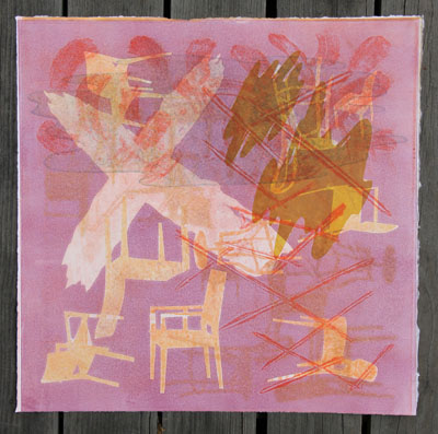
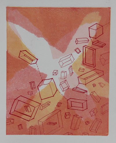
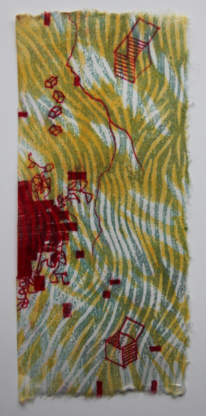
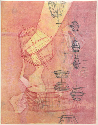
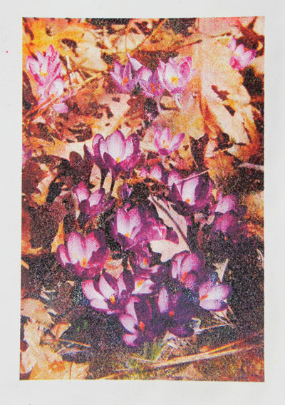
I don’t have class tonight, as it’s vacation week. So instead, I tried to work on carborundum collagraphs in the spirit of the work that my teacher does. Hmm. It’s much harder than it looks (of course). One of the challenges of printmaking with transparent inks is that you have to have a good sense of what the print will look like with each layer that you add. Layers of printing on top of another can bring depth and interest into the print. It can also make your print a muddy mess. My teacher makes this layering look easy. My work today seemed to only be marginally successful. I worked on these next two prints simultaneously:
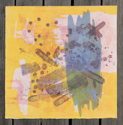
and this one:
You can see that they have many similar elements. I’m fairly content with the first one, but the second one still makes me think that it needs something. The risk, of course, is that I do another layer and say, “nooooo! It was better BEFORE!!!!” This is typically why you should sort of leave your prints alone, and get back to them again with fresh eyes.
Here are other ones that I did:
The background is actually slightly “greenish”, which I don’t think comes through with this photo. Can you tell that I liked that blob? It keeps appearing…
This one is another that is borderline for me…add another layer? Keep it as is?
Then, I tried doing two plates together. This is harder to do (for me):
I like how this one turned out. I’m not sure if each print individually would have been interesting, but together I’m happy with it. Apparently, there are new colors for these inks coming out. Exciting!!!
And now for something completely different…I’ve also been working on a lino print. This has taken ages. I have done it in a few color schemes. This is the “green” scheme:
Kind of odd, I know. I like it, though. I like the boldness of relief printing. THUS, my serious disappointment with my cancelled class. Yes, I’m whining about that again. Yes, I’ll give it a rest. So, any comments? No…not about my CLASS…about the prints! (I can hear you playing your tiny violin for me…stop it!) :p
Filed under: Drawing | Tags: artist, arts, drawing, sketch, sketchbook, Visual Arts
So today, I’ve taken the rare opportunity to scribble in my sketchbook as my son naps. His napping is rare, kind of like the Yeti. Come to think of it…my son is much like a diminutive, yet angry, Yeti when he HASN’T had his nap…but I digress…
I recently purchased the book, The Creative License by Danny Gregory. At first, I thought that it would be a ho hum book on being “creative” or “artsy”. Well…I suppose it is that on a fundamental level, but it’s actually a very good book (so far). His premise, which is not unusual, is that we can all be creative…and should be. As a vehicle for creativity, he focuses on drawing. For most people who don’t draw, the idea of drawing sounds as much fun as sitting at the RMV. But it doesn’t have to be! He starts of with various exercises to get your brain working differently. I know, this isn’t original either, but I like his enthusiasm for just doing SOMETHING, and not making the whole thing too precious. For me, doing this blog is similar to this. If I had to wait until I was thrilled with something that I did in order to have a blog and post it, you would not be reading this now. BUT, I had to just roll with it, and accept the good, bad and ugly. This applies to sketching as well…but sketching has added benefits of quieting your left brain, and engaging your right brain. Sketching also produces this zen-like calm. You have quiet focus on your subject matter, whether it be your breakfast bagel, or your medicine cabinet.
So, I’ve picked up my pen and sketchbook again, after too long a hiatus. Okay, so these are NOT great sketches. But, they’re where I am right now. The first sketch was one of those, “draw without looking at your paper”, exercises. So, needless to say, as I was trying to capture the “negative space” surrounding my desk chair, the sketch turned out a bit wonky:
I know. Far from perfect…but there is something about it that I like, nonetheless. I looked over at my snoozing son, and thought that I should get him into my sketchbook as well:
This only SORT OF looks like him. The nose is too wide. Anyway…the I decided to do one of the exercises in the book that I mentioned before: draw the contents of your medicine cabinet. This seemed intimidating, but I thought that it was a fun idea:
Again, not great, but okay. I know that with time, I should get better at this! I also know that I have too many contact lens cases, and that I should give the inside of the cabinet a once-over, to get rid of the junk we aren’t using. A spritz of windex would also help.
So, for those of you just dabbling with the idea of getting more creativity in your life, I would suggest looking over The Creative License. I don’t want to hear, “but, I CAAAN’T”. Just do it.
Filed under: printmaking | Tags: art, artist, carborundum, collagraph, drypoint, Ink, print, printmaking, Relief print, visual art
This has been a blah week, work-wise. Most of what I’ve done, I’m not thrilled with. Last night, I had my carborundum collagraph class. I was NOT pleased with how things were turning out. Here is the result:
*insert big sigh here*
I’m NOT happy with that at all. It’s just a mess.
I made another tiny plate. I kind of like these tiny plates. This one is just 2″x3″. That’s a bit bigger than my other tiny plates, but still small. My first printing was over wiped:
So, I left more ink on it this time, and it was much better:
In general, I like these kind of plates, because I can work on them at home. I’m not very good at working in a busy studio. I know how ridiculous that sounds, but if I have to try to concentrate and think…then I need to be alone with time and space. So, if I prepare a decent looking plate in peace and quiet, I can be productive in the studio with printing. But if I don’t prepare, and try to work in the studio…I can’t do it well. I know that I have to work on this a bit, but it does made me feel pretty deflated at times. Like, right now.
I’m also working on a lino print. Here’s a little preview picture:
I’m happier with these, as they are very “graphic” and “punchy”.
I know…why so blue? Well, I wasn’t thrilled with this week’s output. At least there was some experimentation, with the woodblocks and trace monotypes.
So, back to the drawing board…*SIGH*
[UPDATE: I’ve decided to throw in a trace monotype at the last minute…here it is below…definitely a work in progress…]
Filed under: printmaking | Tags: art, artist, Monotyping, print, printmaking, Relief print, visual art, Woodcut
It’s a dreary day here…lots of rain. I am experimenting with some woodcuts with trace monotypes. I had fun with this…I can see trying it again. I layered transparent woodcut prints together, then added the sketchy doodles on top. Here is the first one (sorry it’s so dark…):
I know. It’s awful. But, it’s a start! As you can see, I was also playing around with full bleed prints. Messy! Then, I made this triptych:
This has some potential, I think. I’ll have to mount these onto another paper. I’d really have to do that anyway, as this is thin, mulberry paper. Here is the last one…a bit of a mess:
Again, it’s so dark! Not much light here…I started drawing the scribbly blobs. I didn’t like them, so I switched over to the boxes. I like those better. Next time, I’ll try that type of doodle first.
I always get a bit deflated when I have visions of grandeur, only to be squashed by reality. I still don’t have the hang of relief printing at home. Actually, in general, my prints at home are not as good. There is no comparison when you use a press. I will hopefully be taking a class on relief printing, so I hope to get my questions on all of this answered. It doesn’t start for a few weeks, but I’m definitely looking forward to it.
Any helpful suggestions from any relief printers out there? I think that I needed to seal the woodblocks better, as the impressions were “grainy”, instead of uniform. grrrr.
Filed under: printmaking | Tags: art, artist, drawing, Ink, Monotyping, Paul Klee, print, printmaking, visual art
Today, I took a great class with Joyce Silverstone. We focused on trace monotypes, which is something that she incorporates into her work (which is outrageously beautiful). Apparently, Paul Klee often used this technique. You can see an example of his work here. How it’s done: you basically ink up a plate, gently lay a piece of either blank or previously printed paper on top, then use any sort of tool to make marks on the back of the paper. The paper is pushed against the inked plate, and will pick up the ink, where you apply pressure with a tool (pencil, finger, anything!). It seems that Klee would often watercolor these trace monotypes. We just printed other layers of color on our drawings.
Here is my first print…I was relatively happy with it:
I liked the little yellow boxes…This next print didn’t start out well, but I worked to improve it:
I am now more happy with it. It could probably do with more attention, but I stopped to work on other prints. Here’s the next one:
I think that I’m content with it. While I think that on it’s last pass through the press, I “equalized” the color more…which wasn’t so great…but I created the abstract yellow marks, which were what I intended. The last print:
I like this one too. I had some technical troubles with some of the white lines. If I had had more time, I would have worked on improving them. But, it was the last print that I was working on, so I think that it is complete enough for now. You may notice that elements of one print sort of show up in another print. I sort of worked on all four prints simultaneously, so they all influenced each other. It was also really great to see what other people in the class did…so inspiring.
All in all…it was a very fun day. Plus, I got a Happy Meal for dinner…what more could a person want? Well, one of those Takach presses would be nice, but a Happy Meal fits my budget more. (Anyone have a press that they are “tired” of? I can promise it a good home!) 🙂
Filed under: printmaking | Tags: art, artists, drypoint, Ink, print, printmaking, visual art
Today, I printed those tiny plates that I made. I had moderate success. It was amazing to me how difficult it was to wipe the plates well. How it works: you smear ink onto the plate, in order to push it into the grooves/scratches onto the plate. Then, you need to wipe off the excess in order to print it. This final stage of wiping the plate is so demanding, especially with these tiny plates. It was so hard to tell if I had taken off too much ink, and would end up with a pale print…or leave on too much, then end up with a dark print. I don’t think that I “hit the nail on the head” with any of them, but I think it’s really interesting to see how differently a plate can print, depending on how the plate is wiped. First, here is an image to give you a general sense of how small these plates are:
So, what is that…less than 2″ x 2″? Something like that…it’s TINY. So, here are the prints. My first test print was of a building in Montreal…I wasn’t so happy with this print. I took off too much ink:
 It just turned out too faded. Then, I printed this first “tractor” image:
I decided that the red was not good, so I printed it more monochromatically:
This was better, but I think that I overwiped the plate. So, I tried again:
This seemed better…but I still wanted to try again:
This one was too dark. Hmmm! I think that I try to print this plate yet again sometime. This plate is only around 1.5″ x 2.5″ big, so I’m holding this tiny thing in my hand…trying to be so careful as I wipe the ink off.
Here is the other plate that I worked on. I think that the best print was the first one:
I like how this turned out, even though his face is a little strange. But, I thought that it was perhaps a bit dark, so I tried again:
This was much too pale! Frustrating. So, I tried once more, and got this one:
That was a better balance of light/dark, but I think that I overwiped some of the details. I am using just the tip of my finger with a cloth on it to try to gently wipe away the ink. I look sort of like King Kong tickling a triscuit. Overall, I liked working with these.
Anyone else out there print drypoint plates? Suggestions? Comments?
Filed under: printmaking | Tags: art, artist, Ink, linoleum print, print, printmaking, pronto plate, Relief print, Visual Arts
Just want to extend a very grateful “thank you” to the Arlington Center for the Arts! They had a lovely reception at the “Images of Arlington” show opening, and a nice ceremony where…I received my award! It was great to see everyone’s work…such a diversity of media, ideas, viewpoints, etc… The show is up until mid June, I think, so stop by!
This morning, I finished up a TINY linoleum print, and the pronto print that I was working on. The tiny linoleum print is a mere 1″ x 3″ (approx). So small! The darkest color was actually a layer of transparent blue…but it becomes a deep reddish/purple on top of the other colors. This photo makes it seem a little darker than it really is:
What do you think? Kind of interesting…I think that the faces turned out well, considering how tiny they really are…This was a reduction linocut, so I can’t reprint this one! I’m going to do more of these with transparent ink…
This is the finished pronto print:
I like the “vintage” feel that these prints have. I think that printing on this new paper is also better. In addition, I bought some “anti-skin” spray for my inks. This stuff is AMAZING. Normally, this ink will dry and form a tough, chewy skin on it, which has to be removed. This is messy, frustrating, and wastes a ton of ink. This happens, even if you cover the ink with wax paper, etc., in the can. But this spray somehow works miracles, and keeps the ink soft. I love it! Everyone should go out and buy some!
I had my first carborundum class with Christiane Lippeveld. She does amazing work. We created some plates, which need to dry to print for next week. I think that I may try to get some more plexi and make some plates on my own.
Also, I have made several more TINY plates. I will try to print them tomorrow. If they turn out reasonably well…I’ll hopefully have photos to post. Bonne nuit!
