Filed under: Drawing, Fleeting thoughts... | Tags: Boston College, Germany, Paul Klee
Yes! PAUL KLEE! There is currently an exhibit of his drawings at Boston College. Here is the link. If you are in the Boston area, it’s a MUST see. No pressure.
He was truly a fascinating person. Here is a Boston Globe article, which reviews the show. (I hope that you don’t need a subscription to read it.) Here’s a familiar quote of one of his main philosophies:
Art does not reproduce the visible; it makes visible. – Paul Klee
Brilliant! I wish I said that. Unfortunately, I’m not a genius. My normal insights are: “Oh, was that dirty?”, or “We’re out of floss”, or “Why is there a wadded up kleenex taped to the wall?” You know. Normal stuff.
Klee was obsessed with the natural world…the order of it, the purity of it. Here was a drawing that I saw:
Paul Klee, Insekten
OF COURSE, this image does it no justice. Please go see it in person. He draws with the most delicate lines, and captures the prickly, leggy, fragile quality of insects. I especially love that larva-esque creature in the lower right hand corner. If I was a bug, that’s what I would look like. Prickly and curled up in ball. But, I digress…
Paul Klee, Der Selbstmorder auf der Bruke
(Suicide on the Bridge)
He draws almost with a “stained glass” effect, where all things are interconnected and part of a larger order. The man on the bridge contemplating death is drawn with menacing figures and a looming clock face around him. Notice also the starburst of lines below…is it beckoning him to jump? Is he seeing what will happen in the future if he does jump? I feel for him. FASCINATING! Last image:
Paul Klee, Eidola – Erswhile Philospher
Ok, brilliant right? Did he not capture the feeling and form in such an amazing way????? That’s what I look like in the grocery store when I’m trying to figure out what to make for dinner. Except, I have hair. More about hair later…
I hope that I’ve convinced some of you to go. I’ve only selected black & white drawings, but there was mostly works with color…so don’t think that you’re just getting strictly drawing. Ohhhh no…there’s more.
This made me think about my son’s recent work:
Apparently, there are ships flying around a Tyrannosaurus Rex trying to capture it.
I first thought that he had drawn THIS:
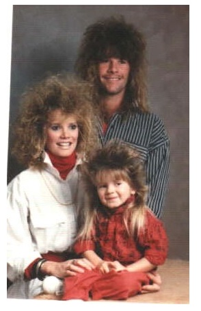
Look familiar? Ahh…I’m such a product of he 80’s. Speaking of 80’s product (thus begins the slide into nonsense):
Now, THAT’S a lot of product.
GOOD LORD! Are these photos even REAL???? This is the sort of thing that would make Paul Klee roll over in his grave. He pondered the order of the universe, and I’m looking up big haired people from the 80s on the internet. WHAT HAS BECOME OF SOCIETY????
Is it just me, or are you also wondering how long it took them to get ready for this photo? How do they know if they’re having a “bad hair day?” Are they all in therapy now because their family photo was posted on the internet???
Again, I ponder the mediocre and insane.
Maybe those images were before the dawn of the beloved flat iron:
I think that I need to stop this post now both because it’s getting more inane, and because my hands are so cold…I can no longer type. Perhaps we need to remove the air conditioners from our windows, now that it’s in the 40s?
Ok. Must go warm hands by the 400 degree heat from my beloved flat iron whilst I wax nostalgic about Aqua Net and AT-ATs…
Filed under: printmaking | Tags: art, artist, drawing, Ink, Monotyping, Paul Klee, print, printmaking, visual art
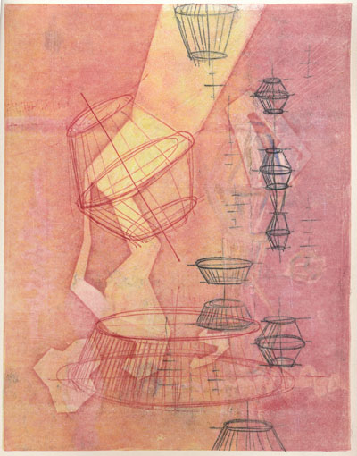
Today, I took a great class with Joyce Silverstone. We focused on trace monotypes, which is something that she incorporates into her work (which is outrageously beautiful). Apparently, Paul Klee often used this technique. You can see an example of his work here. How it’s done: you basically ink up a plate, gently lay a piece of either blank or previously printed paper on top, then use any sort of tool to make marks on the back of the paper. The paper is pushed against the inked plate, and will pick up the ink, where you apply pressure with a tool (pencil, finger, anything!). It seems that Klee would often watercolor these trace monotypes. We just printed other layers of color on our drawings.
Here is my first print…I was relatively happy with it:
I liked the little yellow boxes…This next print didn’t start out well, but I worked to improve it:
I am now more happy with it. It could probably do with more attention, but I stopped to work on other prints. Here’s the next one:
I think that I’m content with it. While I think that on it’s last pass through the press, I “equalized” the color more…which wasn’t so great…but I created the abstract yellow marks, which were what I intended. The last print:
I like this one too. I had some technical troubles with some of the white lines. If I had had more time, I would have worked on improving them. But, it was the last print that I was working on, so I think that it is complete enough for now. You may notice that elements of one print sort of show up in another print. I sort of worked on all four prints simultaneously, so they all influenced each other. It was also really great to see what other people in the class did…so inspiring.
All in all…it was a very fun day. Plus, I got a Happy Meal for dinner…what more could a person want? Well, one of those Takach presses would be nice, but a Happy Meal fits my budget more. (Anyone have a press that they are “tired” of? I can promise it a good home!) 🙂
