


Filed under: printmaking | Tags: art, chine colle, drypoint, Ink, Monotyping, Paper, printmaking, Prints, visual art
So, the past few days were a bit productive. I did lots of drypoint prints on Thursday, and some more solarplate prints today. Last night, we had an amazing class with Catherine Kernan, who showed us viscosity monotypes. This is where you work with both very thin ink, and very stiff ink simultaneously. The two inks react to one another in very interesting ways. I don’t have any images to show this week, though! Our class worked collectively on five prints. It was fun, as we just experimented with making marks, and were amazed at our results. Hopefully, I will be able to show you one next week!
These are the drypoint prints that I made. I incorporated a little of that carborundum technique. This is where there are areas of dense color. I’m not sure that it was so successful, so I’ll have to try again.

Hmmm…I also tried rotating one of the plates:

Hmmmm. Then, I tried some chine colle…

Also just “hmmm”…then I tried one of the plates in isolation…I liked this one the best:

Any thoughts?
Here are the solarplate prints. I managed to print the relief plate this time. This means that as opposed to smooshing the ink into the grooves, and wiping away the rest…a relief plate has the ink just rolled on the surface. I liked this, as it created an emboss, and gave the prints more character. I’m not so fond of the “flatness” of the smooth solarplate prints. Here is what the emboss looks like:


Can you see how the paper is raised?
Here are the actual prints:

The greenish in the photo above is from the relief plate, so it is not just ink on the paper…it also has indented the paper as well (as shown above).

I’m showing these in the order in which they were made…

My teacher thought that this one above looked “complete”. So…I have to “complete” the others at some point…

And another:

I generally like these. I agree that there is something “missing” in most of them. I need another layer. It’s always hard to add another layer later. When these are printed, the paper has been soaked. When paper dries…it shrinks, so you can’t put the same sized plate on unless you resoak it. Unfortunately, sometimes the paper still won’t expand up to it’s previous size when you resoak it, then the plate marks at the perimeter won’t line up with the previous marks. You can be VERY VERRRRY fussy in printmaking. Actually, I should say…you are supposed to be VERY VERRRY fussy. The only people who can thumb their nose at these rules are established, celebrity artists. So…not me. Not by a long shot.
Any comments? Feedback? Helpful suggestions? Random thoughts? Favorite place to get coffee?
Filed under: printmaking | Tags: art, chine colle, collagraph, drypoint, Ink, printmaking, Prints, visual art
This week, we printed our carborundum collagraphs! Very exciting. Carborundum is a very fine grit, smaller than sand. You mix it with an acrylic medium, to create a grainy gel. Then, you put the grainy gel on your plate how you’d like. The grains will hold ink, so that wherever you put this gel is what will be inked on your plate. An added bonus to this process is that the carborundum is bumpy, and leaves a cool emboss on the paper. It also allows one to get very dense, saturated color. Here is how the two plates that I made looked on their own:


You can see the dense color on the print…this is where I applied carborundum to the plate. I have also included a close up, so that you might be able to see the textured emboss:

Okay, maybe that’s too hard to see. Here are other prints that I made with these plates:


So, I used black ink for these prints, but those black areas could be any color. Of course, now that the plates have been printed with black ink…it’s kind of hard to change that.
I also printed again with the drypoint plates that I made earler. You will likely recognize that from my previous posts where I used these drypoint plates:

another:

Then, I printed the two plates together, with no other layers of ink:

I liked how they turned out…generally. The two previous ones may be a bit “flat”, because of the textured/colorful background. Hmmm…comments? Perhaps they need some carborundum!
Here are two random prints with chine colle:


The first plate of the two began with a ghost print of the second print. (a ghost print is when you reprint a plate, without adding new ink).
I also made more solarplate prints. I was tired of using photographic images…they were a little flat, so I went back to directly marking on acetate to make the “negative” for these plates. Please forgive my color choices…as I mentioned in a previous post, there was a serious shortage of red. I know…that’s no excuse really. I’m not fond of the all green one, but I like the one with purple:


I like those, and so I’ll keep trying to print them, to see how I can improve the layering. Next time, I’m going to try to get the colors to be more transparent.
And…last but not least…I did another color scheme of the Regent theater print. I am going to submit this print with the other one to the local show. Yes, I’m not sure if the ink will totally be dry by tomorrow am! I wonder if I could speed up the drying with…a hairdryer? A tanning bed? Probably not.

What do you think? Thumbs up? Thumbs down? I like how this Regent one turned out…even thought it may look as if it should have been a screenprint!
Filed under: printmaking | Tags: art, etching, printmaking, Prints, solar plate, Visual Arts
So, I had better luck this time printing with my new solarplates. In the past, I found that my images were really “flat” and boring. I think that layering the prints helps a bit. I went into the studio today, which is atypical, so this is why I have a fresh batch.
I may work on some of them more…I may make more plates Friday…who knows. We’re running low on red ink in the studio, so you may see my next prints with more cooler colors. I’m going to be in my “blue” period, much like Picasso, but because there is no red ink, much unlike Picasso.

(I should have cropped the picture above…)

A bit pale, right?

That one needs help too…

I like that one above…even though it’s not got much going on…

I also like that one…just drawings, no images…

I like this one too. It was the last one I did. I also dropped it on the floor, and had to try to remove the mark of my FOOTPRINT on the edge of it. I know. It was past noon, and I was feeling my low blood-sugar clumsy. I knew at that point that I should just clean up and call it a day.
Any comments? suggestions? Don’t tell me that I need more red, because it isn’t going to happen. 🙂
Filed under: printmaking | Tags: art, chine colle, Ink, printmaking, Prints, Visual Arts
So, I’m getting ready to try to submit this print of the Regent Theater to the “Images of Arlington” show coming up. I’ve been experiementing with different papers and inks. The first prints look “blotchy” to me. I’m not sure if that’s my own hang up…or if that would be something that a real printmaker would also dislike. Hmmm. So, I switched inks and tried printing a new paper. Here it is:

I know…why bother? Well, I’m trying to improve my printing techniques, so that I don’t have to get as frustrated as I do. As you may notice, the colors are slightly different from the last printing, as I didn’t mix the colors EXACTLY the same. That might be a challenge for anyone, as the inks were different.
I also printed one with just the final block. Here it is:

Yes, this is on yet another type of paper. I may add watercolors to this one…or I may just leave it alone. I think that this could also look nice on colored paper. Or some chine colle! My new favorite technique…(refer to previous posts).
I’m also going to TRY to make another print of this, but in a different color palette. (did I spell that correctly?) I am slightly concerned that the ink won’t be dry by the time that I need to frame it and submit it. Maybe I can frame a print with wet/tacky ink? No? Bad printmaking etiquette? See! There is so much benefit to being a novice…we don’t know any better!

I went to the Boston Prinmaker’s Bienniale at the Danforth Museum this weekend. SO AMAZING. Seriously…anyone in the metro-Boston area should go. The work was so stunning. So much talent. I wanted to own all of the prints. There was also a student exhibition of prints, which was also phenomenal. Please go see it!
It did “fire me up” to go home and do stuff. However, I am somewhat blue that my stuff is so remedial in comparison to all of the work that I saw. I know…you’ve got to start somewhere…but it would have been so convenient to have been a “prodigy” at something, right? Instead of starting at the bottom, you start at the top! Oh well.
It has been lovely and sunny all day…which puts me in a good mood, even though I’m scowling at my prints. Has anyone else seen the printmaking show at the Danforth? Thoughts?
Filed under: printmaking | Tags: art, chine colle, drypoint, Ink, Linoleum, printmaking, Prints, Visual Arts
So, I FINALLY finished carving the linoleum. I printed it! It turned out okay…I think that I’m going to try printing it again, to get the ink to not look as blotchy. This blotchy ink might be because: 1. I printed wet ink onto wet ink 2. of the type of ink that i used 3. I had large expanses of uncarved areas. If anyone out there is an experienced linoleum block printer…PLEASE give me some feedback! Any helpful suggestions for printing would be SO helpful. So here is the print:

Not bad…needs some work. I am also going to try printing it on different paper. I need to get more of that paper, though, so I’ll be heading to Utrecht at some point.
I also did a drypoint as well. I really like drypoint now. I didn’t at first. I’m not sure why I like it again. Perhaps because it is somewhat similar to just drawing. I am looking forward to layering my drypoints. The first print is the drypoint as is:

I know…boring/blech…I added chine colle, and it’s much better:

The blotches on the print are actually shadows from stuff on our windows. Yes, we need our windows washed, but it needs to get above freezing first. This morning, it was 17 degrees. Brrr. I’ll have to come up with a new excuse in the summer why I still can’t wash the windows. Right now, the temperature outside is to blame.
I made four solarplates, to be printed next week. I also made two carborundum collagraphs. This is a kind of sandy grit that you put onto a plate with acrylic medium. When it’s dry, you can ink the plate and the grit will hold ink. So, instead of etching texture into a plate, I’m adding it on the surface. Here are the plates:

I know. Hard to see because of the clear plate. Here is another one made on foamcore:

This should be neat. I’ll print it next week, and hopefully post the images. Unless, of course, they’re horrendous. Actually, I generally would post that anyway!
We did a group crit at one of my printmaking classes. It was the first time that I’ve had actual printmakers look at my work. It was great to hear their comments and feedback. As I’m a complete amateur, I don’t have an overall aesthetic to my work…so it’s kind of chaotic. My printmaking teacher used the word, “exuberant”, instead of chaotic. Perhaps I’ll stick with that for now.
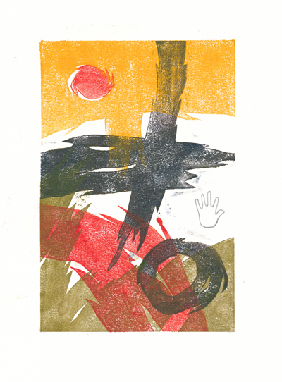
Filed under: Drawing, painting, printmaking | Tags: abstract, art, drawing, image, printmaking, Prints, visual art, watercolor
Yesterday was a fabulously warm day. My son and I took several walks to soak up some sun and work on our vitamin D levels. It felt amazing to be out in the warm air. I was tempted to open all the windows in the house, but then I thought that might be premature.
Everything feels like it’s slow going. Every day, I hope for something I do to be “the thing”. By this I mean, “MY thing”. So far, what I’ve done puts a furrow in my brow. Sigh. Just the reality of where I am, and where I am not in my creative endeavours. I love seeing inspiring works by other people. On the other hand, it often leaves me with a bit of a pit in my stomach…knowing that I couldn’t possibly do what they do. I know. It’s supposed to be that way. I have to do what I do. BUT WHAT IS THAT? I wish that I knew…
Here are some odds and ends from the past week. Any comments?


I know. My search to figure out what to do will be a lifelong one. At the same time, so many people have figured out “what” their art is all about. I’m not there yet. It feels like it’s taking forever to figure out.


