Filed under: printmaking | Tags: art, chine colle, collagraph, drypoint, Ink, printmaking, Prints, visual art
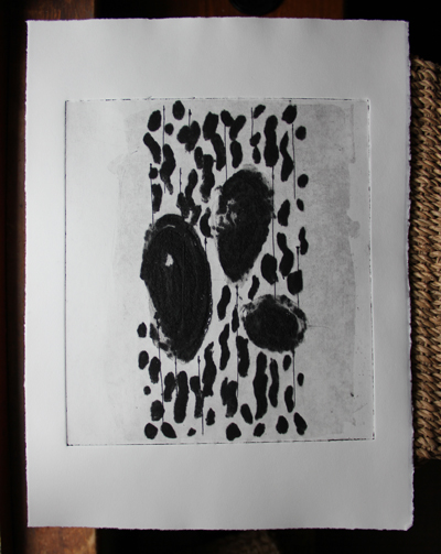
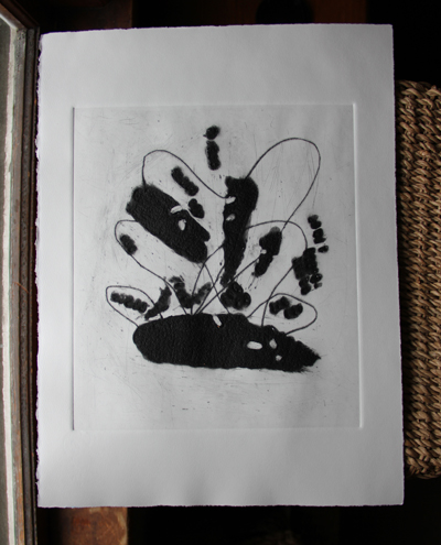
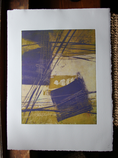
This week, we printed our carborundum collagraphs! Very exciting. Carborundum is a very fine grit, smaller than sand. You mix it with an acrylic medium, to create a grainy gel. Then, you put the grainy gel on your plate how you’d like. The grains will hold ink, so that wherever you put this gel is what will be inked on your plate. An added bonus to this process is that the carborundum is bumpy, and leaves a cool emboss on the paper. It also allows one to get very dense, saturated color. Here is how the two plates that I made looked on their own:
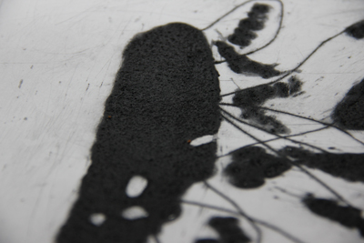
You can see the dense color on the print…this is where I applied carborundum to the plate. I have also included a close up, so that you might be able to see the textured emboss:
Okay, maybe that’s too hard to see. Here are other prints that I made with these plates:
So, I used black ink for these prints, but those black areas could be any color. Of course, now that the plates have been printed with black ink…it’s kind of hard to change that.
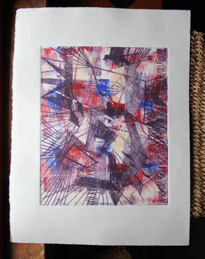
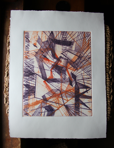
I also printed again with the drypoint plates that I made earler. You will likely recognize that from my previous posts where I used these drypoint plates:
another:
Then, I printed the two plates together, with no other layers of ink:
I liked how they turned out…generally. The two previous ones may be a bit “flat”, because of the textured/colorful background. Hmmm…comments? Perhaps they need some carborundum!
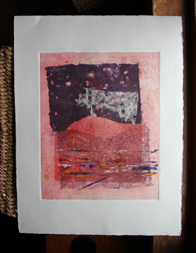
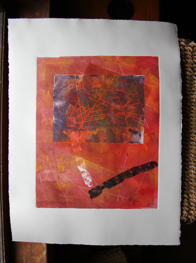
Here are two random prints with chine colle:
The first plate of the two began with a ghost print of the second print. (a ghost print is when you reprint a plate, without adding new ink).
I also made more solarplate prints. I was tired of using photographic images…they were a little flat, so I went back to directly marking on acetate to make the “negative” for these plates. Please forgive my color choices…as I mentioned in a previous post, there was a serious shortage of red. I know…that’s no excuse really. I’m not fond of the all green one, but I like the one with purple:
I like those, and so I’ll keep trying to print them, to see how I can improve the layering. Next time, I’m going to try to get the colors to be more transparent.
And…last but not least…I did another color scheme of the Regent theater print. I am going to submit this print with the other one to the local show. Yes, I’m not sure if the ink will totally be dry by tomorrow am! I wonder if I could speed up the drying with…a hairdryer? A tanning bed? Probably not.
What do you think? Thumbs up? Thumbs down? I like how this Regent one turned out…even thought it may look as if it should have been a screenprint!
Leave a Comment so far
Leave a comment

