Filed under: Collage, printmaking | Tags: art, artist, carborundum, Collage, collagraph, drypoint, monoprint, print, printmaking, Visual Arts
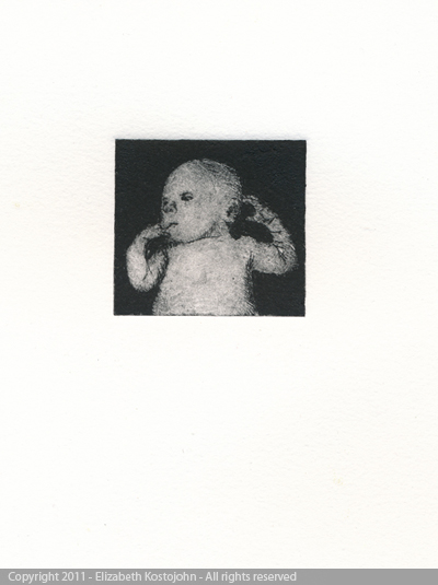
GREAT NEWS!!!! The print titled, “Iain” was accepted at the 8th Biennial International Miniature Print Exhibition at the Center for Contemporary Prinmaking in Norwalk, CT!!!! The show will be up from June 2 through September 4. Go see it!
That bit of news definitely makes my month.
The OTHER bit of good news is…I have a website up and running! Check it out here! What do you think? I have some comments from friends about it…I’m looking into making some edits. As is the case with this blog, it’s a work in progress. I’m really happy to have a tiny bit of internet real estate out there.
I also completed another long print. Here it is:
Once again…there is a lot more going on in the dark areas than this picture shows. The camera (or my use of the camera) doesn’t seem to capture the layers in those areas. Here is a detail, but that doesn’t quite show the background layer well either:
This was inspired by Hokusai’s, The Wave. It’s such an amazing print. I bask in it’s brilliance.
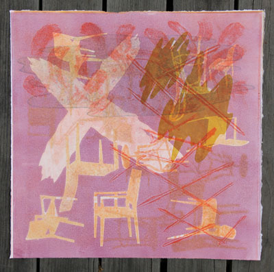
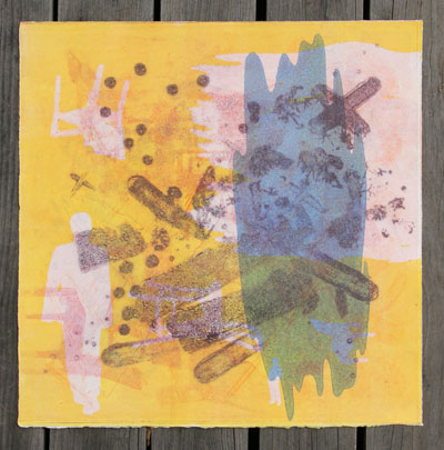
My collage class was interesting. Last week, we were supposed to make a double sided collage. I had a hard time doing that…so I mainly focused on one side, and just left the other side to chance. Here is the side that I worked on:
Interesting, right? Okay, here’s the back:
Hmm…a bit random. Our teacher was showing us, however, that you can use a viewfinder (cardboard with rectangular hole cut out) to isolate areas that ARE interesting. I might look at that.
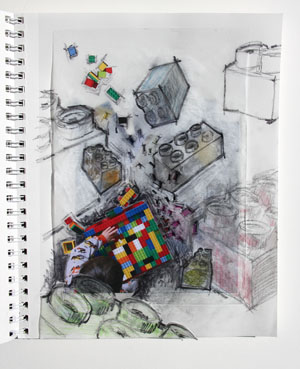
Our assignment in class was to take copies of these collages, and create a new collage that also incorporates a photo. Here’s mine:
I was really struggling with it for a while. Then, I decided to get messy and sketch all over it. I think that it got much better! Here’s a detail:
I like it!
I’m going to my 20th high school reunion this weekend. I know. Egads. Where does the time go? I think that it will be fun, but a bit overwhelming. It was such an intense time.
I am also a bit self conscious of the purple ink at the edges of my fingernails…hopefully no one will be horrified. I should just carry around a bar of Lava soap with me at all times. And a nailbrush.
I hope that the sunshine that’s outside right now is here to stay! WOO HOO!
Filed under: Fleeting thoughts..., printmaking | Tags: art, artist, drypoint, Ink, monoprint, print, printmaking
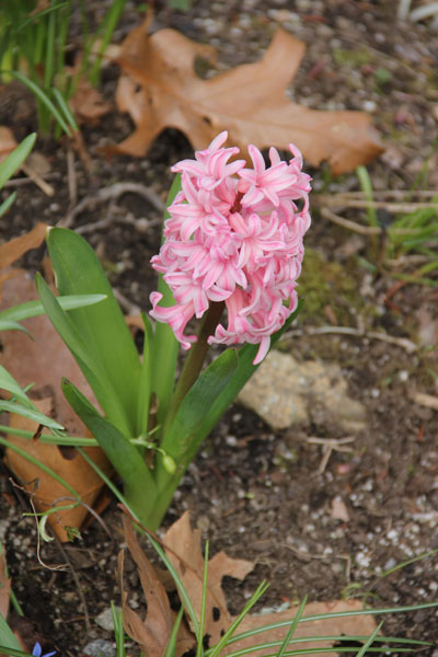
Look at what’s popping up in our garden!
I wish that I could take any kind of credit for those. The previous owner planted them. BUT…I have so lovingly ignored them…and LOOK how nice they are! Well, I also recently bought a watering can, which my son loves to use. He may need to take all the credit.
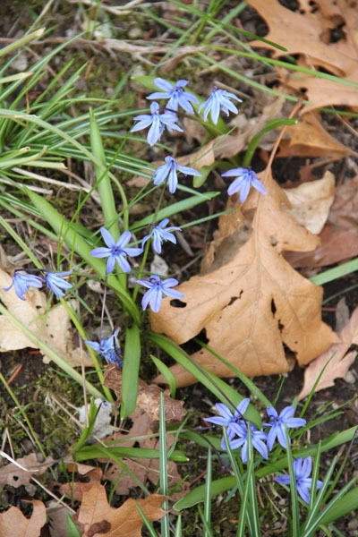
And this one!
Snazzy! One more:
Maybe I was channeling these colors when I was printing last night. Okay. I must admit. I was not thrilled with these prints…take a look:
And this one:
I know. Not good…SIGH. I’m not sure whether to abandon them…or try to fix them…somehow. There is no such thing as an “eraser” in printmaking. *DRAMATIC SIGH* I was a bit down after that frustrating evening of printmaking “yuck”.
BUT…today’s printing was much better! I wonder if it’s because I went back to something that I know better: drypoint.
That was the first one…kind of interesting. So, I tried it on silver paper:
Not great…the ink doesn’t stick to the shiny paper. Then, I added a monoprint element:
This, I liked much better…so I kept at it:
Also interesting! Then in blue:
I like this one also! And then, just simple drypoint layers:
It was interesting how different wiping techniques resulted in such different line quality between the blue and the red. Hmmm…oh, and I almost forgot:
Moody! I also like it a bit. These prints are a bit small…3.5″W x 8″H. I think this makes them more appealing as well. So, luckily, these prints improved my outlook on life, in comparison to the ones from last night. A bad day at the print studio makes me blue. A good day at the print studio makes me hopeful.
I JUST looked at pictures of the royal wedding. So amazing! I was about to write, “good lookin’ couple”, but then I stopped myself. WHY, you ask????
I’ve been reading a book on fostering self-esteem in children. Well…appearance is the number one thing that can seriously affect not only the child’s feeling of self worth, but also how society treats the child. It is an awful truth that attractive children/adults get: special treatment, more sympathy, more affection, more “breaks” in life, more praise, etc. etc. etc. This is really heartbreaking. So, I’m trying to make a point of noticing my judgmental thoughts on appearance and curb them. This primarily affects my view of myself (we’re our worst critic), but I am paying attention to it on all counts. We should focus on kindness, generosity, and character…rather than height, eye color, and dress size. The world would be a better place…
Filed under: printmaking | Tags: art, artist, collagraph, Easter, Easter egg, Egg hunt, Ink, monoprint, new england, printmaking, Prints, somerville open studios
Yes, the weather is always a topic of discussion in New England. Can you imagine someone from San Diego commenting on how it’s seventy degrees and sunny? Of course not. New England’s weather is a constant soap opera…lots of drama, often ridiculous, and completely unpredictable. Today, it’s actually hot outside…65 degrees in the shade.
We had a lovely Easter lunch on Sunday. My son ate gobs of candy. While the sugar did not put him over the edge into hysterics, it did give him boundless energy to want to hide, and re-hide, his plastic eggs endlessly.
Admittedly…the hiding places weren’t really covert, but we pretended to have to search for them…
We, I mean, I also made Easter eggs. My son was too preoccupied with the plastic eggs, to bother with the real ones:
My mom made her yummy chocolate nests:
I have eaten many maaany of these. I may have to tell my son about “The Easter Pig”, who eats up all of the candy after the Bunny is finished delivering it. The secret identity of the Easter Pig will not be revealed.
Studio was good today. It was quiet and calm. I had plenty of room to work. Here is today’s stuff:
I’m getting a lot of mileage out of this carborundum plate. I should make more, but I just keep playing with this one.
These prints are all a “full bleed”, which means that the plate is at least as big as the paper…so there is no paper border around the print. I like this kind of printing, as it is a bit less fussy.
This last one was my attempt to save a horrible print. I think that it is still not great, but improving slowly:
The blue was a bit more intense than I had intended. Sigh. I may do something else to this…opinions?
One last note: Somerville open studios are this weekend!!!!! Please check out the great stuff by a few people that I know…
Irene Ramirez at #65 on the map, 29 Berkeley Street…Super cool custom beer labels & kick butt graphic design…
Aparna Agrawal at #58 on the map, 20 Vernon Street, sixth floor…New sculpture installation
Catherine Kernan and Boriana Kantcheva at #29, Mixit Print Studio, 32 Clifton Street…Amazing printmakers…
Debra Olin at #85, Mad Oyster Studios, 2 Bradley Street…another amazing printmaker…
Hope to see you there!!!!
Filed under: printmaking | Tags: art, artist, Flower, Forsythia, Garden, Ink, monoprint, print, printmaking, spring
I felt that I needed to channel my “inner Bostonian”. Today is an amazing spring day here. Yes, it started out below 40 degrees this morning, but it’s gotten MUCH warmer. Everyone is mooning around in the sunshine.
Our “garden” is actually doing something too. Notice that “garden” is in quotes. Our dirt patch with scraggly flowers, bordered by stones, could be considered a “garden” if flowers were considered optional. Here are a few of the scragglers that we have:
What is this? A hyacinth?:
What about this? What is it?
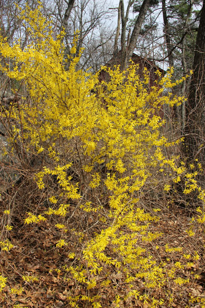
I know. That last one was probably just a weed. Oh well. But, check out our forsythia!
This is the only time of the year that this stuff looks good…otherwise it’s a brown, scraggly mess. I do love it though…we have it bordering three sides of our lawn.
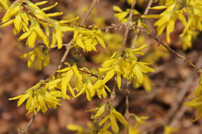
and super close:
I really love that plant. AND, I know what it’s called! A minor miracle.
Studio was okay today. I have gotten myself a pair of clogs, as I’m standing all the time and my feet are killing me. No more silly shoes. At my last class, my right big toe fell asleep. That feels terrible, trust me. So, now I’ve got PRACTICAL shoes. I happily stood for 4+ hours today with no problem. Here’s a look:
Snazzy, huh? They’re actually a bit sparkly, which I like. Very comfy. I know…the next step is a velour lesiure suit, or a snuggie.
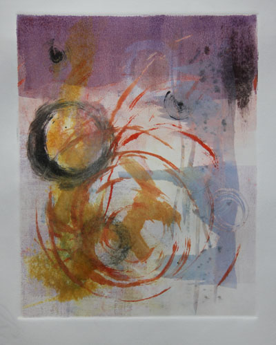
So, here are the prints from today. I’m on the fence about them.
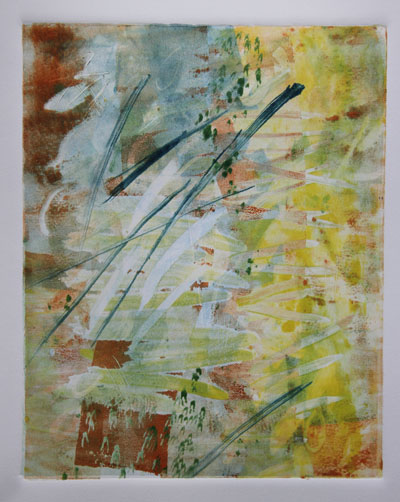
And its fraternal twin:
I’m trying to decide now if they are “done”. Hmm…maybe I’ll wait to talk to one of my printmaking teachers to get some feedback. Luckily today, the studio wasn’t too crowded, so I could work fairly well and in a calm/sane manner. I struggle when it’s really crowded and busy. It’s hard to think, and you can only really do simple things with the press, as everyone is waiting in line to use it. So, my stuff today would have been a real pain if the studio was crowded.
Have a good weekend! Hoppy Eastah! I’m off to get some peeps!
Filed under: printmaking | Tags: art, artist, Ink, monoprint, Monotyping, print, Printing, printmaker, printmaking, Silicon carbide, visual art
It’s the end of winter semester! Boo hoo! Last night, I had my final class with a wonderful group of women. We all have different backgrounds (artist, art journalist, photographer, etc.), but we were all there as beginner printmakers. I will miss them…the running commentary…the oohs when a print was first peeled off of the press…the jokes about our shoddy skills. For you local people, Somerville Open Studios is coming up in a month, and one of my classmates will have her work on display then…I hope that I can go and see it! I wonder if she’ll include any of the prints that she made…I’ll give more details when it gets closer to the date.
Here are the prints from last night. I was working again with viscosity monotypes, as shown in the first two prints. But I also incorporated a carborundum plate into the mix, as shown in the third and fourth prints:
That was just one pass through the press…I liked how it turned out.
This one went through the press a few times:
The carborundum element in this next print are the lavender brushmarks. So, I printed that lavender carborundum plate on top of a monotype (thus creating a monoprint):
In this print, the dark purple areas are from a separate carborundum plate:
You’ll see this plate again in some of the following plates.
My teacher last night looked over my bevvy of prints, and tried to give me a little critique on a direction that I might pursue (as I am fairly all over the map, as you may have noticed). She noted that I typically either use a very linear/drawn/crisp language or a swirly/organic language. Why not combine them? Well…okay! I think that this may sound obvious, but if you see others’ work in the class, then you’d see how different all of our work was. I also felt that this was kind of a true assessment of me as a person…my left brain and right brain are fairly evenly balanced. I’m not saying that either half is brilliant, not so…but I think the balanced relationship between the two has been true for me. As an example, I got nearly identical scores in the SATs/GREs between my math and verbal (umm…not a perfect 800 on both, sheesh). So…instead of trying to be either one or the other, I’ll try to combine them. This is kind of hard, as I don’t really shift well between the two. But, I guess that’s part of the challenge.
Here are my prints from today. Again, I started with a monoprint:
Then, I started to layer in the carborundum plate:
and again:
And then, my printmaking teacher wanted to see the carborundum plate by itself. I think that she didn’t like all of my colorful craziness. So, here is the plate the first time…I didn’t do a good job wiping it:
Here is the second time that I inked and printed it:
See the difference? Then, here is the ghost of this print:
She really liked these. Hmmm! Shows how little I know! I thought that perhaps they were too simple. Next time, she wants me to layer in a very thin transparent layer…nothing too crazy, as I was doing above. She said that the previous ones were “just experiments”, and “now you need to focus.” Hmmm! I take it that she is not keen on the crazier ones. Well, good to know…less is more, perhaps! Any comments/suggestions???? Random thoughts? Artists that I should take a look at? 🙂
