Filed under: printmaking | Tags: art, artist, Monotyping, print, printmaking, Relief print, visual art, Woodcut
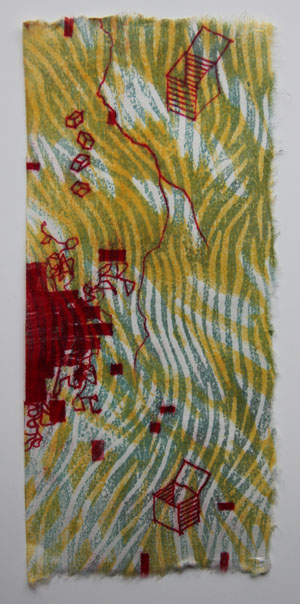
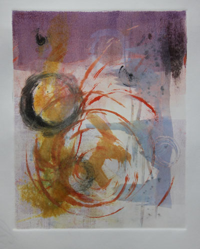
It’s a dreary day here…lots of rain. I am experimenting with some woodcuts with trace monotypes. I had fun with this…I can see trying it again. I layered transparent woodcut prints together, then added the sketchy doodles on top. Here is the first one (sorry it’s so dark…):
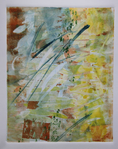
I know. It’s awful. But, it’s a start! As you can see, I was also playing around with full bleed prints. Messy! Then, I made this triptych:
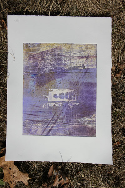
This has some potential, I think. I’ll have to mount these onto another paper. I’d really have to do that anyway, as this is thin, mulberry paper. Here is the last one…a bit of a mess:
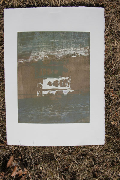
Again, it’s so dark! Not much light here…I started drawing the scribbly blobs. I didn’t like them, so I switched over to the boxes. I like those better. Next time, I’ll try that type of doodle first.
I always get a bit deflated when I have visions of grandeur, only to be squashed by reality. I still don’t have the hang of relief printing at home. Actually, in general, my prints at home are not as good. There is no comparison when you use a press. I will hopefully be taking a class on relief printing, so I hope to get my questions on all of this answered. It doesn’t start for a few weeks, but I’m definitely looking forward to it.
Any helpful suggestions from any relief printers out there? I think that I needed to seal the woodblocks better, as the impressions were “grainy”, instead of uniform. grrrr.
Filed under: printmaking | Tags: art, artist, drawing, Ink, Monotyping, Paul Klee, print, printmaking, visual art
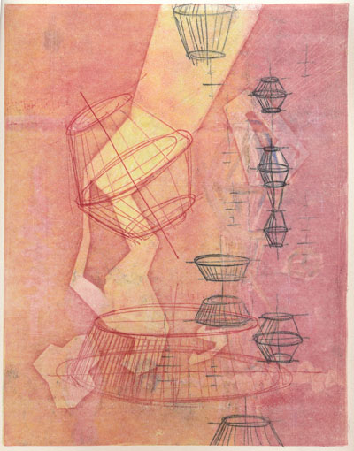
Today, I took a great class with Joyce Silverstone. We focused on trace monotypes, which is something that she incorporates into her work (which is outrageously beautiful). Apparently, Paul Klee often used this technique. You can see an example of his work here. How it’s done: you basically ink up a plate, gently lay a piece of either blank or previously printed paper on top, then use any sort of tool to make marks on the back of the paper. The paper is pushed against the inked plate, and will pick up the ink, where you apply pressure with a tool (pencil, finger, anything!). It seems that Klee would often watercolor these trace monotypes. We just printed other layers of color on our drawings.
Here is my first print…I was relatively happy with it:
I liked the little yellow boxes…This next print didn’t start out well, but I worked to improve it:
I am now more happy with it. It could probably do with more attention, but I stopped to work on other prints. Here’s the next one:
I think that I’m content with it. While I think that on it’s last pass through the press, I “equalized” the color more…which wasn’t so great…but I created the abstract yellow marks, which were what I intended. The last print:
I like this one too. I had some technical troubles with some of the white lines. If I had had more time, I would have worked on improving them. But, it was the last print that I was working on, so I think that it is complete enough for now. You may notice that elements of one print sort of show up in another print. I sort of worked on all four prints simultaneously, so they all influenced each other. It was also really great to see what other people in the class did…so inspiring.
All in all…it was a very fun day. Plus, I got a Happy Meal for dinner…what more could a person want? Well, one of those Takach presses would be nice, but a Happy Meal fits my budget more. (Anyone have a press that they are “tired” of? I can promise it a good home!) 🙂
Filed under: printmaking | Tags: art, chine colle, drypoint, Ink, Monotyping, Paper, printmaking, Prints, visual art
So, the past few days were a bit productive. I did lots of drypoint prints on Thursday, and some more solarplate prints today. Last night, we had an amazing class with Catherine Kernan, who showed us viscosity monotypes. This is where you work with both very thin ink, and very stiff ink simultaneously. The two inks react to one another in very interesting ways. I don’t have any images to show this week, though! Our class worked collectively on five prints. It was fun, as we just experimented with making marks, and were amazed at our results. Hopefully, I will be able to show you one next week!
These are the drypoint prints that I made. I incorporated a little of that carborundum technique. This is where there are areas of dense color. I’m not sure that it was so successful, so I’ll have to try again.
Hmmm…I also tried rotating one of the plates:
Hmmmm. Then, I tried some chine colle…
Also just “hmmm”…then I tried one of the plates in isolation…I liked this one the best:
Any thoughts?
Here are the solarplate prints. I managed to print the relief plate this time. This means that as opposed to smooshing the ink into the grooves, and wiping away the rest…a relief plate has the ink just rolled on the surface. I liked this, as it created an emboss, and gave the prints more character. I’m not so fond of the “flatness” of the smooth solarplate prints. Here is what the emboss looks like:
Can you see how the paper is raised?
Here are the actual prints:
The greenish in the photo above is from the relief plate, so it is not just ink on the paper…it also has indented the paper as well (as shown above).
I’m showing these in the order in which they were made…
My teacher thought that this one above looked “complete”. So…I have to “complete” the others at some point…
And another:
I generally like these. I agree that there is something “missing” in most of them. I need another layer. It’s always hard to add another layer later. When these are printed, the paper has been soaked. When paper dries…it shrinks, so you can’t put the same sized plate on unless you resoak it. Unfortunately, sometimes the paper still won’t expand up to it’s previous size when you resoak it, then the plate marks at the perimeter won’t line up with the previous marks. You can be VERY VERRRRY fussy in printmaking. Actually, I should say…you are supposed to be VERY VERRRY fussy. The only people who can thumb their nose at these rules are established, celebrity artists. So…not me. Not by a long shot.
Any comments? Feedback? Helpful suggestions? Random thoughts? Favorite place to get coffee?
