

Filed under: Drawing, Fleeting thoughts..., Sewing | Tags: art, arts, boston, colored pencil, crafts, Donald Trump, drawing, Machine quilting, quilt
My current excuse for not having seen any new art is that it’s sweltering hot here. I guess it’s going to be 97 deg F tomorrow with tons of humidity.
I know…
It gets hotter in Texas…the Sahara Desert…the surface of the sun, etc. But does it get hotter than the dark interior of my dark blue car???? Nooooo…I think not. I’ve been feeling too lethargic to cook lately, and I’m wondering if there is some way that I can prepare dinner by cooking it IN MY CAR??? Fried eggs on the dashboard? No, those aren’t vegan…damn! Tofu pups instead? What IS seitan anyway? It looks like a wet, sweatsock turned inside out. No? Well, I hope that it doesn’t TASTE like that. Anyhoo…as I can’t afford a real convection oven, or at least one that doesn’t have four wheels and an engine, I was thinking of possibly doing a lasagna. Do you think that it would cook faster in the glove compartment, or on the dash? Tough call.
So, I recently finished a drawing. FINALLY. I’ll show it to you in a minute, but before I do, I had to celebrate it’s completion by making a baby quilt. My FIRST quilt…mind you. Needless to say, the quilt is done, but the sewing machine is in the shop. I think that I scared it half to death with my shoddy sewing skills. The feed dogs won’t go up anymore. I think that they’re either hiding, or on strike.
So, here’s the quilt!

I know. It’s sooooo basic. Hey, at least it’s a friggin’ rectangle. This is machine quilted entirely. I’m much too impatient to even remotely consider hand sewing. Besides…the binding was hand sewn, and I nearly made a pincushion out of my left thumb with my incompetent needle handling (yes, I’ve heard of a thimble). I can’t imagine doing a whole quilt. (Patty, I bask in your quilting glory.) I feel itchy to do another quilt! Is that normal? (Don’t answer that.) Actually, as I am a mosquito and poison ivy magnet, I tend to be itchy in general.
The back:

Super simple!
While I was working away on this thing, my son brought home one of HIS creations from camp. Here it is:

Do you know what that is? No, it’s not vermin. It’s a PET ROCK!!! He proudly told me that it will require no feeding and care. He also explained that after adding the first piece of brown fur, he felt that his rock was cold and needed the black fur as well. It’s like a bad toupee…or if Donald Trump somehow found himself in the story of Sylvester and the Magic Pebble. Anyway, I love it and think that it’s hilarious. I’m also a sucker for anything with googly eyes.
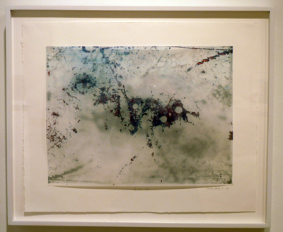
Speaking of googly eyes, after months of slaving over the minutiae of my drawing, it’s finished.

Nameless Problem #2, Elizabeth Kostojohn, 2013, colored pencil on mylar
Sorry for the glare…photography is not one of my strong suits…
No, I have not gone off the deep end. I’m just expressing my domestic angst. I’ve already started another one in this series, and I am seriously hoping that it does NOT take me months to complete. I’m also hoping that I don’t decide to ever draw Doritos again. Don’t get me wrong…they’re delicious and I love orange, but really…
Okay, I will make a SERIOUS effort to see some art next week. Until then, I’ll just have to wander around the yard in a heat induced stupor. The hydrangeas are about the only things that haven’t completely shriveled up and died in this heat.

Speaking of withering neglect, my son correctly used the word “languish” in a sentence this week. He’s five! Well, he only get’s half credit…as after he commented on how our unused British pound coin will “languish”, he said, “What does ‘languish’ even mean?” What does “languish” mean??? Just look at mommy trying to bake lasagna in the Toyota!!! I’m glad that my culinary failings can prove useful by enriching my son’s developing vocabulary. Next, I’m going to teach him, “exasperate”, “lethargy”, and “ennui…”
Filed under: Drawing, Fleeting thoughts... | Tags: 80's, art, artist, artwork, colored pencil, drawing, Gastroesophageal reflux disease, Jelly shoes, Lisa Sigal, neon
I know that I normally post on Fridays…but seeing as I missed last week and I’m wanting to get this published, I’m doing it TODAY. CARPE DIEM.
So, tomorrow night…I’m going to an 80’s prom. No, I’m not kidding. This is the brainchild of a friend, who feels that we need to revisit this era on Friday. In all honesty, my fashion sense is probably stuck in the 80’s, so I should have no problem with an outfit. Did hot pink ever go out of style???? If so…WHO CARES??? It’s one of my favorite colors. I’ve been scrounging around my closet to come up with some kind of 80’s outfit:


WHOA.
No thank you. This is what I have to aspire to for this event?????? Egads. Does anyone else have the sudden sensation of acid reflux?
Or is that just from the ice cream sandwich I decided to have for breakfast?
(KIDDING! I’m testing to see if you’re still paying attention. No? Oh well…)
One thing that I DO love from the 80’s is jelly shoes. I am sad to say that I don’t own a pair of jelly shoes anymore.
 Mine were pink, of course. There is an urban legend that if you stand on a hot sidewalk for too long, they’ll melt. Pshaw.
Besides wasting time planning for this 80s outfit, I also went to check out what’s at the galleries in the South End. I know that you’re relieved to hear that this post is moving on to more compelling topics than acid green and/or acid reflux…
 Lisa Sigal at Samson Gallery, Boston
This is the work of Lisa Sigal at Samson. Okay. Let me just say that I LOVED all of her work. Her pieces for this show were sooo fascinating. In the piece above, she has a digital print of what appears to be housing. I believe that she also paints on this print. In front of the print, leaning on the wall, is a typical window screen that she has also painted. Her sense of color is amazing, and I love the mix of pattern, flatness, layering, depth, and translucency. So inventive! I really could have stared at these all day. (Maybe it’s just the architect in me? Who knows…)

Robert Richfield at Gallery Kayafas, Boston
Robert Richfield has photographed eclectic, exotic, and intimate Mexican burial sites. I loved the intense colors and exuberance in spite of the morose subject matter. The photos are surreal, and you really forget what it is that you are looking at as your eyes take in the explosive colors and the dizzying array of objects. They are very beautiful in their composition and content.
 Laurie Alpert at Bromfield Gallery, Boston
Laurie Alpert has a great show at Bromfield Gallery. Her show it titled, “Milori Blue,” and is based on a series of photos that she took of her studio floor. I love how inventive her printmaking is. The rich, saturated blues are inky (for lack of a better word) and deep. These images are both abstract and intimate. This photo really doesn’t do her work justice, so you’ll have to see if for yourself. I was obviously drawn to the mylar, as that’s what I use for my drawings.
I also had a great time chatting with Lesley Cohen, who is an artist at Bromfield, and was “on duty” at the gallery. We talked about drawing, why we draw what we do, how we got to were we were, etc. She is a LOVELY person…warm, creative and engaging. She is having a show in June, so I’ll be sure to stop by and see it.
 Ann Pibal at Steven Zevitas Gallery, Boston
This is the work of Ann Pibal at Steven Zevitas Gallery. I love the sparseness of her work. There is so much space, and the elements are always balanced, albeit asymmetrical. I’m not sure why I keep thinking that her work is very minimal? Perhaps it’s the clarity of each piece, or the “quiet” world that they seem to create? Really impressive. Go see! Now!
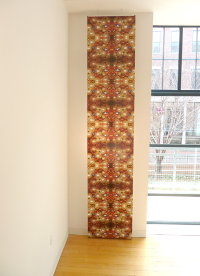
Karen Meninno at Kingston Gallery, Boston
Karen is a sculptor, but she has created these astounding wallpaper designs that hang floor to ceiling. This one was one of my favorites. See the detail here:
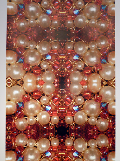
Karen Meninno at Kingston Gallery, Boston
Her work was filled with jewel tones and rich materials. Her sculptures (which were present as manipulated images) are almost like artifacts of some forgotten dynasty. I wonder how different the images are from the sculptures that they are created from? I wonder how Meninno feels about this transformation that she’s made? The nice thing about these images and the wallpaper is that she almost creates a environment which the viewer is immersed in, as opposed to an object that the viewer looks at. Please go see her work…amazing!!!
I am intrigued by her image manipulation, as I have been doing some similar things in my own work. I am embarking on a new series generated by my existence as a housefrau/parent/chef/chauffeur/family cruise director:

Elizabeth Kostojohn, Nameless Problem #1, 2013, colored pencil on mylar
Perhaps I should have cropped the image? Anyway, I’ve started making these compositions…AND I’m starting to work in color. You’re looking at pickles, ham slices, raw chicken legs, a can of chickpeas, and ketchup. Comments? Questions? I don’t really have a working artist statement yet…so you’ll just have to wonder. I know that my family does…
My son is obsessed with drawing, much like his mommy. I love all of his creations. He tends to draw lots of dinosaurs, as he’s five and that’s just what five year olds are into:

Okay. I love this. He wanted to show an ENORMOUS sauropod dinosaur towering above a T.Rex. I love that it is so big that the neck disappears and reappears at the edge of the paper to show how HUGE it is. He even drew a tiny person for scale. DON’T YOU LOVE IT??? Or, is this a picture that only a mother could love? The T.Rex looks as if it is pouncing on the person, and the whateverasaurus looks like it’s going to stomp on both of them. Brilliant! I wish that he hadn’t drawn on the back, as it distracts from the awesomeness of this drawing. Just my two cents…
Well, wish me luck with my 80’s prom. We’re going out to dinner beforehand, so I’ve got to go out in “public” with my bizarre, fluorescent ensemble of coolness. Should be…interesting?
I’ll let you know how many sad looks I get from people who see my appearance as a pitiful and creepy “time capsule” that should be put back underground…STAT!
Filed under: Drawing, painting, printmaking | Tags: abstract, acrylic, art, artist, colored pencil, etching press, klimt, painting, portrait, profile, Stencil
Today, my car said it was 32 degrees. That’s cold. I know…talk to me in February…that will seem balmy. Still, I feel like I was wearing sandals just yesterday. Not only is it cold…but it SNOWED last night. Here’s what is left on our yard:

Look at that sad little water table in the background! It can be a skating rink for squirrels.
This week, I definitely made some odd stuff. I decided to dabble again with figurative work. I started by “copying” a face from a Klimt painting:

Klimt’s painting is, of course, stunning. I was just trying to study his way of rendering the face. Then, I did this one:

A little blurry…think of it as a “fuzzy filter” to improve the appearance. Hmm! Then the next one:

Strangely enough, that one looks a little like me. Not on a good day, of course. I showed these to my painting teacher. He said that they were “postmodern”. Hmm. I guess that means anything that isn’t “modern” pretty much. He likes modern painters, like Pollock and De Kooning. So…I think that he prefers much more loose and “painterly” paintings. That means more apparent brushstrokes, etc. As a result, I tried in his class to invent a figure painting that was more painterly:

I know. The red is a bit much. I think that I’ll try again, but with a more neutral color for the figure. It’s hard for me to paint a figure without one in front of me to look at! I know…practice, practice, practice. Detail:

He had some positive things to say…but this might have been to encourage me. He did not like the red, though. Hmm!
In my other painting class, we worked on an long 18″ x 48″ painting. We were told to pick three colors inspired by “regeneration”. Then, we had to mix the colors, and choose one for the background. The shapes were made with stencils that we cut out of paper which were insipred by shapes from green/red peppers. Interesting! The teacher, Adria Arch, is wonderful. I highly recommend taking one of her classes. The outcome:

It was fun to do. I’d flatter myself to think that it looked a bit Marimekko.
In my portrait class, we used colored pencils. I asked why colored pencils never seem to be in “high art”, only commercial art. Who knows??? Somehow, it’s just not seen as a fine art medium. Does anyone out there know of an artist who uses colored pencils? What do you think of his/her work? Here is my profile portrait:

I was really happy with how this turned out. This isn’t a great photo, but I think that I got a good resemblance and the coloring was decent. Maybe I should do portraiture? Only because I enjoy it so much…

Okay…the BIG surprise of this week is….
I have a small etching press!!!!!!!

CHECK. IT. OUT!!!!
Yes, it’s small. But it has a press bed of around 13″ w x 20″ l. This will take some typical sized plates and paper: 8×10 plate…9×12 plate. Ideally, I would have a bigger press. BUT…a bigger press is big $$$$. This little press was being sold by a lovely gentleman in Newburyport. It was his wife’s. I hope that he felt that it was going to a good home. I’m worried that the shoddy desk will collapse under it’s weight. I hope not. I haven’t printed with it yet…CAN’T WAIT!!!!
