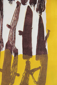
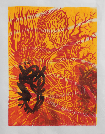
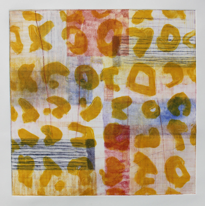
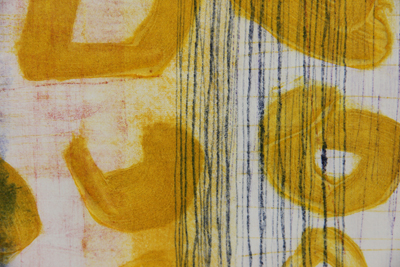
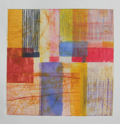
Filed under: printmaking | Tags: abstract, art, artist, Jacob Hashimoto, print, printmaking, visual art
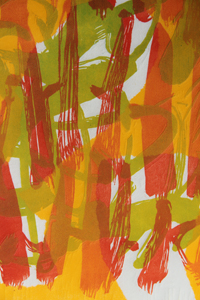
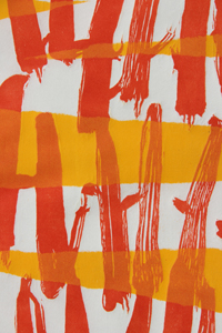
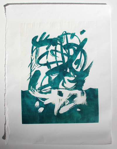
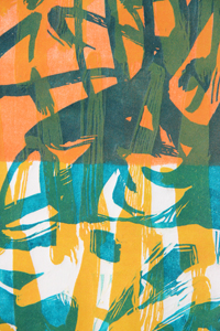
I was lucky enough to get to go to the print studio today, thanks to my mother who watched my son for me. There were only three of us there, so we REALLY spread out. When given the chance, printmakers are like molasses…oozing out in every direction, taking up more and more and more space. I guess in the “heat of the moment” while working on a print, you just grab any space you can get to put something down, or to work on. The more plates that you work with for a single print also means that you need more and more room. ANYWAY…it was a great luxury today to be there and to have so much room.
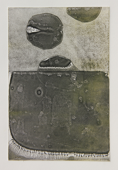
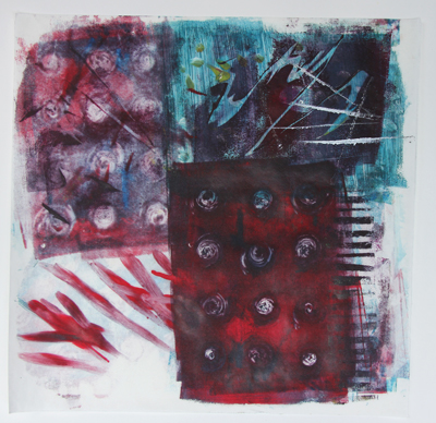
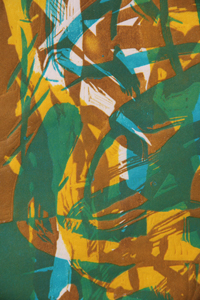
I felt that it was a productive day. Some days, I’m just off and the whole thing becomes so frustrating. This day was better…probably because the studio was quiet and roomy. It’s hard to think when it’s crowded, there is a line to use the press, and you have no space to work. Here is the first print that I did:
Not my favorite…it wasn’t going well, and then I added the thin, black layer. This helped. I may have to revisit this one…but I’m going to leave it alone for now. Next:
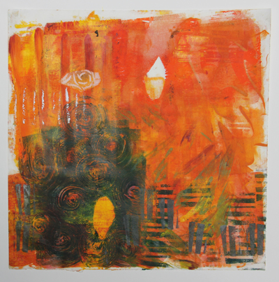
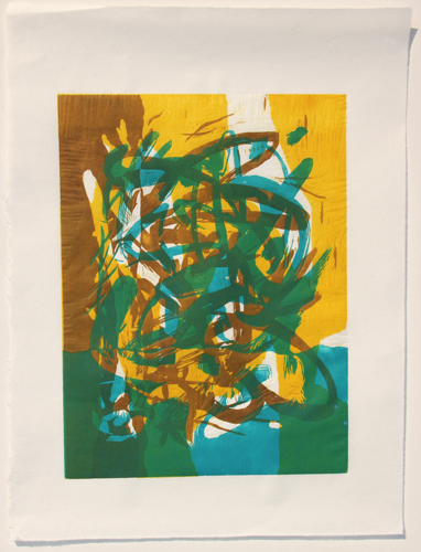
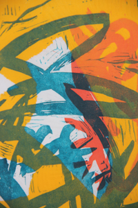
This one was also just okay…I like the bright colors, but the textures did not turn out as I had hoped. It was a bit of an experiment, so I learned a bit…well, a bit of what didn’t quite work. The black helped this one too. Next:
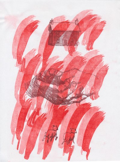
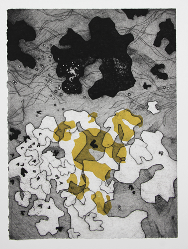
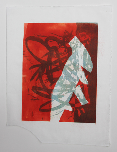
I like that one, and it was a bit of a happy accident. This was what was left on one of my plates from working the previous prints. Odd, right? The textures are delicate and interesting. Maybe I can get better at this, and fine tune it a bit more. Next:
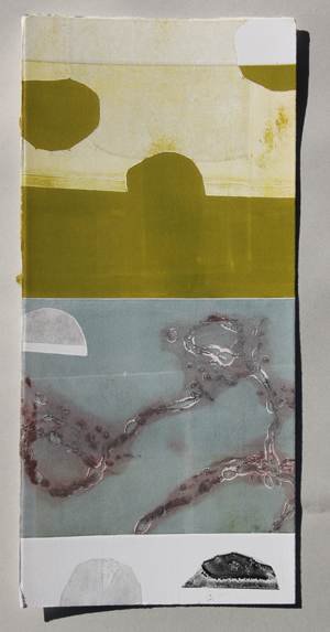
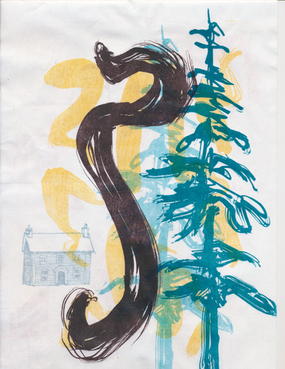
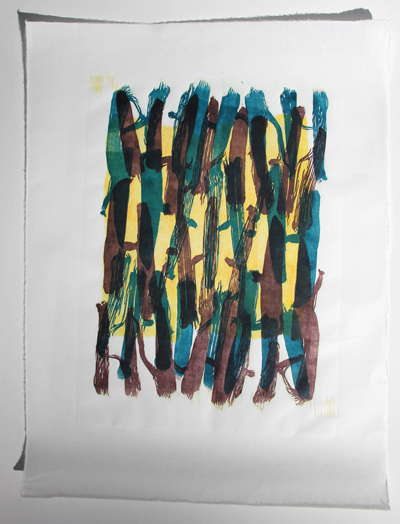
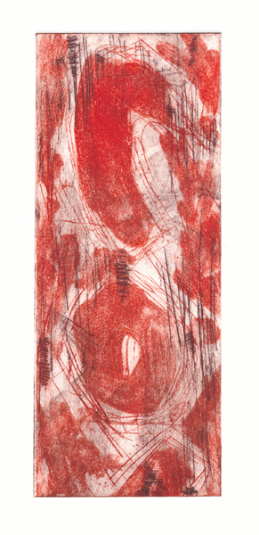
So, I ran out of paper, and started to use these long scraps that I had. It was fun to do the full bleed printing and the vertical format. These three vertical ones work together well…a classmate suggested that I keep going with this series…
I like that one too.
I realize now that I should have taken a picture with all three together. So, I’ll mash them together in photoshop, instead:
Hmmm! Maybe I should keep going with these. They would also be fun to turn into an artist book. I’d love to do that. Maybe that’s what I’ll work on next time…
Comments? Artists that I should look at?
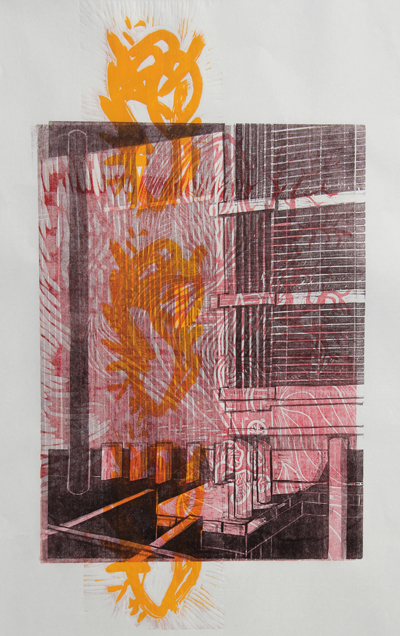
Here’s an artist that EVERYONE should look at. Check out Jacob Hashimoto. I WORSHIP his work. So stunning…I have yet to see it in person, but I hope to do so some day. Has anyone seen his work first hand? If so, tell me what you think!
So lovely…
Filed under: painting, printmaking | Tags: Acrylic paint, art, artist, gelatin printing, gouache, Ink, Paint, painting, portrait, print, printmaking
I spent the morning doing some gelatin printing. I’m not sure that I’m a huge fan of this type of printing. I was also testing out different inks and paints to see which worked best. I think that the Akua inks worked well, as they don’t dry until they are on paper. The acrylic paint and the speedball ink were both just so-so. The only problem with the Akua ink is that it does take an eternity to dry. I’ll probably still be wiping blue off of my hands every time I pick up one of these prints. Here’s one of the first ones:
Eh…feh…blech…some interesting aspects to it. I like how the silver ink turned out in the lower left corner. Next:
Also kind of interesting. These are printed on some very thin mystery Asian paper that I have. The art store in Cambridge had rolls of random paper for sale…10 sheets for $5. What a bargain! So, this is why I don’t know what the paper is. Next:
I experimented with a stencil a little. That’s where the leaf shape comes from. Next:
I liked the random stamped lines in the lower left area. Next:
I like the greenish yellowish color with the greenish blue color. Any comments? Does anyone out there also do gelatin printing? What inks do you like to use? Do you have any pointers for me?
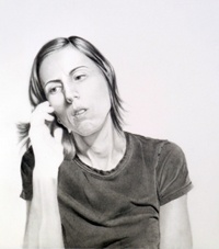
Last night, I kept myself up doing a gouache painting. Okay…It was VERY frustrating. I have seriously debated showing this at all, as it looks bizarre…but here it goes:
See how small I made the picture? Maybe it’s still too big. Anyway, I know that this looks really weird. He looks like he has a skin condition. DRAMATIC SIGH. I painted this based on a photo. Hmm…while I like the challenge of painting or drawing people…it also is rather daunting. I’m going to need A LOT more practice before I start doing this on the streets of New York…
I am the monitor for the print studio in Cambridge on Friday. As a result, I’ve needed to come up with what I’m going to do during that time. So, I have tried a little experiment. I painted gouache onto two 8″ x 10″ sheets of plexi. I’m going to see if they print onto damp paper. Here’s the first plate:
Kind of fun. The bubblegum pink is a bit much, but I’ll see how it prints. Here is the other one:
These are really an experiment. I hope that they print. If they don’t, I’m going to be disappointed.
So, where am I going with all of this? Who knows. I’m going in every direction at the same time. Let’s hope that some of this eventually leads somewhere!
Filed under: printmaking | Tags: art, artist, lithography, print, printmaking, pronto plates
So, I just finished up a one-day visit with Annie Silverman, a printmaker in Somerville. She is holding a four-day intensive, but I could only attend for one! Anyway, she sometimes uses pronto plates in her printmaking. I had a tutorial last year in using pronto plates for printing, but I still felt that it was somehow more difficult than it was supposed to be. So, I was really excited to take Annie’s class, and to get another try at learning this type of printing.
Pronto plates, or “polyester plate lithography”, is a sort of poor man’s lithography. Real lithography uses a massive stone…marks are made on the stone, the stone is wet, ink is rolled on the stone, then paper is laid on top and the whole thing is run through a litho press. Pronto plates are thin, plastic-like sheets of paper that you can mark on in the same way as you’d mark a litho stone, but you can easily run these thin plates through a typical etching press. I have also printed them by hand at home, but this is obviously less successful than with a press.
ANYWAY, this type of printing can be fun and “collage-like”. You can keep layering on the images. Here are some of my things from this tutorial:
You’ll see a repeat of the imagery throughout these prints:
This next one needs more:
Next:
Next:
Next:
Next:
Last:
My teacher liked the last one. I tried to be a bit restrained, and I think that it turned out well. Some of the marks were made from an ink drawing that I scanned…some were from floor wax…some were from a pen drawing…and some were from a ballpoint pen. Interesting, right?
This is actually the second time that I am writing this post, as wordpress decided to throw out 75% of the post the first time that I wrote it. Grrr. Technology…grrr.
So, what do you think of these prints? Thumbs up? Down? More sheep needed????
Filed under: Fleeting thoughts..., painting, printmaking | Tags: art, Chihuly, gouache, painting, print, printmaking, still life, woodblock printing
Before I start rambling on about woodblock printing…I bought my son some big containers of tempera paint, and a long roll of paper this past week. This is one of those purchases that is mostly for my son, but partly for me too. I love the idea of splotching big blobs of paint on a huge paper. Here is part of our creation:
I think that he had a good time with it. He seems to like to just mix colors together to make “outer space”. He’s not so concerned about making marks. He also found large stones and a brick, which he brought over to paint. So, even when you think you can imagine how a play activity is going to go…kids always surprise you. It just might be that my son is not as into making art as I am. Or maybe he is…but in less obvious ways. Either way, it was messy and fun.
So, last night I had my last woodblock printing class! It was such a fun class. I love the bold, graphic quality of woodblocks. Yes, some people can do subtle things with woodblock…but not me! Here is my last block in process:
I realized, while carving this block, that I’m not such a fan of carving. My teacher mentioned that she often listens to books on tape while she carves. Good idea!!! That might help. Also, I think that the pressure of having to design and carve a block on a schedule makes it a little stressful and less fun for me. I mean, I like to have a new block for each class. But if I wasn’t constrained by my weekly class, perhaps carving would be more meditative, and less like a chore. I’m wondering if I’m not destined to be a relief printer, because I don’t LOVE to carve. Hmmm. BUT…I do like how woodblock prints turn out…so this is a bit of a conundrum for me.
Here are the prints from yesterday:
 I was somewhat happy with this print. It may need something dark in it. I’m not sure. Once again, I decided to just leave it and think about it more before doing anything else. Here is a detail:
I love those colors together, and I’m happy with my new block. The new block is the red part of the image. Here is the second print:
A bit simple, but nice. The orange looks more yellowish in reality. Detail:
It’s always an exercise in restraint for me to not add MORE. Here is just a print of the block that I made last week:
This took A LOT of restraint for me not to add more “stuff”. Sorry about the odd lighting in the photos. It’s the morning, and I don’t have great light to take pictures with. Here is the detail:
Brace yourself…there’s more!
I couldn’t leave that one alone, obviously…
I like this next one a lot:
It’s hard to tell, but the dark ink is a sort of plum color. Very cool. Detail:
The last one:
detail:
What do you think? I’m happy with how this latest block came out. It seems that no matter how many blocks one has…you need more! That puts me back in the condundrum of carving…
So, I had a free hour yesterday, so I did a little gouache still life. Now, bear with me…I don’t paint often. BUT, I really enjoyed it. So here is my bigger dilemma: I love the way woodblock prints look…but I am not keen on carving. I am not fond of my painting (see below)…but I enjoyed doing it! So odd. I’m not sure what to make of that. I think that typially, people like to do what they are good at. But in this case, I enjoyed doing what I wasn’t good at. Very strange. Here is the still life:
Yes, I know. It needs help. I am happy with how the silver rattle turned out…the other parts are so-so. I think that if I had a nicer brush (one that didn’t have a fat, multipointed/ragged end), then I might have been able to do a bit more. I know…excuses, excuses!
Woodblock printing = process:not fun / product:interesting
Gouache painting = process:fun / product:not interesting
What a dilemma! Does anyone out there have thoughts on this???
I’ve been reminded by a friend that I never followed up with comments on the Chihuly show at the MFA. WELL…his work is pretty over the top and remarkable. He’s definitely not of the “less is more” school of thought. The pieces were really stunning. I didn’t really like when they are all put together in a big, jumbled mass…like in his piece, Mille fiori. It gets too chaotic for me, and the beauty in each piece gets lost to me. It’s like a symphony where every musician is playing a difference piece. Cacophony. The individual pieces, however, are stunning. The chandeliers that everyone knows well are really stunning. He tends to use a single color for these, so while they are a bit chaotic looking, they have a unity that does not turn into cacophony, in my opinion. My favorite part of the exhibit was the room with beautiful woven baskets, bright handmade blankets, and an enormous slab of wood. The pieces in this room were subtle, delicate, and amazing. I preferred these pieces over all of the others. He had large, hollow glass blobs, almost like bubbles bursting, on that huge slab of wood. They looked gorgeous. So, I did like the Chihuly exhibit, and I think that his work is extraordinary. I do feel that it can be a chaotic mess at times, and I prefer when it’s more subtle or unified in presentation. Has anyone else seen it? Thoughts?
Filed under: printmaking | Tags: art, artist, collagraph, print, printmaking, visual art
More collagraphs! I’m continuing to work on collagraphs, which I find to be very fun. This time, I decided that i would make prints with a full bleed. What does that mean? It means that the print runs to the edge of the paper, instead of floating like a rectangle within a larger sheet of paper. I don’t often do full bleed prints…I’m not sure why. They can be a bit messy, so perhaps that’s it. (if you want to know more about collagraph, see an earler post this month)
Here is the first print:
I’m not sure why I’ve called it “clouds”. I mean…it’s slightly obvious, but that wasn’t my intent while making the plate. I think that there is something serene about these black and white prints. They’re sort of cartoonish, in a way. Comments?
In the next print, I incorporated some colored paper:
This feels very incomplete. I will work on this more, but I’m leaving it for now. It’s always good to leave something to ponder a bit before working on it more. Two people in studio suggested, “red”. Hmmm.
The last one is a bit odd! Also very incomplete:
I layered in a very interesting paper that I have. It’s very textured…almost like bark. The texture does get flattened quite a bit in the press, but you can see the interesting edge to this paper in the detail:
See those curls at the edge? So interesting! I think that the rust colored paper is too long on top, and needs to be trimmed back a bit. I like the overlap, but it may be a bit much. Anyone out there have an opinion?
I am going to the MFA today to see the Chihuly exibit. I’ve heard mixed reviews. Because it’s so extreme, it seems that people either like it or hate it. I’m not sure where I stand on it…as I’ve yet to see it in person! Because his work often has “practical” applications…I been wondering if it doesn’t somewhat edge close to the world of “craft”. I don’t mean gluestick and hello kitty scissors “craft”, of course…I mean Craft, with a capital “C”. For example, there is a lovely museum called the Fuller Craft Museum in Massachusetts. I’ve only been a couple of times, and I’ve really loved the exhibits. Anyway…it’s interesting that they had the work of a glass artist there, Josh Simpson. His work is much more restrained than Chihuly’s…but I suppose that isn’t saying much. Anyway, Simpson’s work is at the Craft Museum, not the MFA. Why is that? I wonder if that is purely a function of Chihuly’s international fame? When does something move from “craft” to “art”? I know…such a broad and hairy question. Chihuly got me thinking about it…has anyone seen the exhibit? Comments?
Filed under: printmaking | Tags: art, artist, chine colle, print, printmaking, woodblock printing
Last night’s woodblock class was pretty good. I had a new block to incorporate into the mix, luckily. I also spent the whole time printing, which is what I like to do. I ALSO got to choose the colors, which is good. Sometimes, I just use the colors that have been put out. Last night, however, I selected the colors, which made a big difference for me. I prefer when the colors are more transparent. It seems that many of the colors that we use (which are previously mixed colors) have some white in them, which makes them a bit opaque. This isn’t the effect that I want. Perhaps next week, I’ll ask to mix in some transparent medium.
Here is the first one that I did:
I have no idea why the picture has such an orange cast to it. Anyway…this print started with the yellow layer, then I printed the dark brown block, and last I printed the teal block. I was moderately happy with it. I felt that the white was too constrained, though, so I tried again:
I’m happier with the white in this print. Here is a detail of it:
As I only have two carved blocks in this series and of this size, I sort of ran out of ideas of what to do (besides mixing more colors). I tried to experiement a little, but I wasn’t happy with the outcome:
Ech. Needs work. In mulling over ideas with my super helpful teacher, I felt that adding some “chine colle” or collage would help. So, I took another piece of paper, and just started randomly printing on it. I plan to rip up this paper and layer it onto the print above, in an attempt to help it along. Here is the sacrificial page:
Kind of interesting, in an off-kilter sort of way. I ran out of time, and couldn’t do more layering. I also ran out of the bright ochre color. Too bad! I’ll see if I can mix up more next week. I do like these colors together, though. I also hope that I can carve another block.
It’s going to be another sweltering day. I can already feel my brain dulling with the pending heat.
Can anyone out there recommend some interesting woodblock artists to look at?
Anyone out there also doing printmaking? (Do you have a website that I can look at?)
If any of you out there have either an ipad or an iphone…there is an app that I would LOVE to have. It’s “Wreck this App” by Keri Smith. She is that super cool, highly unconventional author. It’s basically an app for making crazy, messy art. So fun!!!! If anyone out there gets it, let me know how it is. I want it…but alas…no iphone! Here is the link to her blog which has a video on it. What do you think???? So fun, right????? I want it!
Filed under: Fleeting thoughts..., printmaking | Tags: art, artist, collagraph, intaglio, Mixed media, print, printmaking, visual art
I made a new collagraph plate this week. What is a collagraph, you may ask? I’ll give you the description provided by the book that I’m also going to review.
“Collagraph is essentially an experimental form of printmaking which involves adding layers of adhesive or solid material to the surface of a printing plate, making it possible to incorporate both relief and intaglio printmaking methods on a single plate.” – Brenda Harthill & Richard Clarke
While some types of printmaking, like engraving, require pricey copper plates…collagraph is about using whatever you’ve got to make a plate. It is like making a collage. In fact, the word “collagraph” is based on the Greek word “kollo”, which means “to glue”.
For my birthday, I asked for a couple of books, one of them being, Collagraphs and Mixed Media Printmaking by Brenda Harthill and Richard Clarke. It is such a fascinating book. It is not an in-depth, how-to guide. There are only a few places where any steps to making and inking a collagraph plate are shown. There are, however, many images of collagraph prints by various artists. One thing that is particularly interesting about collagraphs is that it is often unclear how a print was made. For example, a drypoint print is somewhat self-explanatory. A hard plate (copper or plexi typically) is scratched with a sharp tool, and this is how the image is created. But for a collagraph…who knows how the artist got the shapes and textures that they did on their print! It’s suprising how very mundane things can be wonderful printing surfaces. This is a great book if you already like collagraphs, but should not be your introductory book, as it mostly shows final products, not process. Has anyone else out there read it? Comments to add?
Here is my collagraph print this week:
and a detail:
I like this print. It has a sort of surreal, Miro-esque quality to it. What do you think? This is a 9″x12″ plate. Maybe I’ll make an even larger one! I thinking about doing a large, full bleed print in this “series”. Why not, right? It’s just time, energy, sweat and tears, right? Okay, that’s a little dramatic. Maybe.
Filed under: printmaking | Tags: art, artist, chine colle, croissants, print, printmaking, woodblock printing
Last night, I had my woodblock printing class. I managed to get my act together and finish a block for printing. I was initially sort of lukewarm about the block, as it seemed sort of flat and 2D to me. But, after printing it, I think that it is interesting. The first printing was with some chine colle, or additional handmade papers collaged into it. My teacher provided the colored papers. Here is that print:
 It’s a bit of an overcast day, so it’s hard to get the colors right. This image seems a little dark to me, even after I lightened it a bit! The red paper is a scrap of beautiful handmade paper that my teacher had. The small green piece is a scrap of paper that had been used in previous prints. I’m really happy with this.
Then, I started layering this block with a small block. I printed this small block at the last class. It needed a lot of “cleaning up”, which means that there were parts of the block that were printing that I did not want to print. So, I had to carve more to get rid of those stray marks. Here it is:
I may try to print this one again, as I think that it would be better without the black, and with more white in it. Here is a detail:
This last print begain with a ghost print of the large, blue block. Then, I layered on some red with ripped paper stencils:
I think that my teacher liked this one. I tend to overwork things, so I decided to just leave this one alone and not do anything further. Here is a detail:
I like woodblock printing. I think that having a class once a week is good, but it does add stress to the process. I mean, you have to have something finished each week, or else you will waste your time at class carving. I try to use class time to print, as that is a rare opportunity to use the press. I can carve at home, but I can’t print with a press at home. I think that the carving would be more meditative for me, if I wasn’t rushing to finish a block for class! So, I can imagine that having one’s own press would help, even when carving.
Someone recently sent me this fabulous link to watch someone baking croissants. Please watch, as it’s fascinating! It’s kind of scary how much butter in involved. Anyway, I thought that if I ever get a press…and if I ever decide to stop printmaking, I could use my press for flattening out dough for pastries…who needs a rolling pin when you have a piece of precision equipment, right?
Hmmm…a pain du chocolat would be perfect right now.
Filed under: printmaking | Tags: art, artist, print, printmaking, woodblock printing
Last night, I had another woodblock class. It was good…but I had not done much prep work. I only had one small block that was new, so I just focused on printing more. I tried printing the mutant plant again. Unfortunately, I didn’t really get to pick the colors, as she had these ones out. The yellow had some white in it, which kind of makes it a bit flat. (right now, my preschooler is yelling/singing…so I may go postal in the middle of this post)
So, here are the woodblock prints from last night:
I am happier with the printing of the purplish building. The ink was drier, and didn’t fill in all of the small detail lines. At first, I was not sure, but now I do like it. Here’s a bit of a weird mess:
I started by just printing the “ghosts” from the first print. Then, I decided that it all looked too washed out, so I started doing more layering. I like the new block (the yellow shape). I need to clean up the block more, so that other areas which aren’t supposed to print actually don’t print. Last:
This time, I just used the crazy plant block with the new, small block. Hmm…
Here are some continuations of other prints that I posted previously. They weren’t finished when I first showed them. I think that they’re getting better, as the layering and contrast is better. All of these pictures are a bit dark, as the sun keeps hiding behind a cloud…
That one is probably mostly done. This next one may need some more:
It’s a bit Paul Klee…but I just wanted something non-orthagonal to go crazy across the whole thing. Next:
My printmaking teacher said that I should add more to that one. I’ll have to work on it another time. She felt that the yellow field feels a bit flat. Detail:
Last one:
I like that one. I may add some more, though. Any comments? Thumbs up? Thumbs down?
I hope that I somehow get time to work on another large woodblock. I want to have more blocks to layer. It takes quite a bit of time to carve them, so I’m not sure how far I’ll get. We don’t have class this next week, so I won’t be there until the following week. I love the way woodblock prints look. I hope to get better at it! I’m still going to keep on doing collage as well, as I had such a great time doing it.
Have a happy 4th everyone! I plan to pig out on hot dogs…
Filed under: printmaking | Tags: art, drypoint, intaglio, print, printmaking, visual art
I have a few new, drypoint prints to show. These are a bit different that the woodcuts that I just posted. I got some positive feedback on the woodcuts…so, what do you think about these prints? Comments? Do you like the woodcuts better, or are these interesting in their own way? Feedback, please!
I’m going to post them in the order that I made them. I really liked how this one above turned out. The odd, prickly image is a magazine clipping of a strange sea creature. I loved how it looked, so I thought that it would look cool incorporated into a print. This odd sea creature is making me think of my odd plant woodcut. Maybe there is actually a theme here. Next print:
I also like this one. I like the punchy, graphic quality with the scratchy marks. I may do more like this one. Next:
You can see the red plate printed again here on another magazine scrap. I thought that the vertical arrangement in the photo of the people worked well with the long plate. I think that this one initially looks abstract, until you notice that there are figures in the print. Next:
I was on the fence about this print above. I wondered if it was too “even”, without any focus. Someone in my print class thought that it was nice, but does anyone else have a comment? As this is not a big print, perhaps it doesn’t need much more. The print size is only 3″ wide x 7.5″ tall…thoughts?
It’s so hard to decide what kind of printmaking to do. I loved the woodcuts, but I also like doing these intaglio prints. I feel that I should have a certain aesthetic that I build on, but you can see that my aesthetic thus far is rather varied. I suppose only time will tell, right?
Any artist out there have a suggestion on how you narrowed down your focus to get a unified body of work?
Any non-artist have thoughts on this as well?
