Filed under: printmaking | Tags: art, artist, Ink, linoleum print, print, printmaking, pronto plate, Relief print, Visual Arts
Just want to extend a very grateful “thank you” to the Arlington Center for the Arts! They had a lovely reception at the “Images of Arlington” show opening, and a nice ceremony where…I received my award! It was great to see everyone’s work…such a diversity of media, ideas, viewpoints, etc… The show is up until mid June, I think, so stop by!
This morning, I finished up a TINY linoleum print, and the pronto print that I was working on. The tiny linoleum print is a mere 1″ x 3″ (approx). So small! The darkest color was actually a layer of transparent blue…but it becomes a deep reddish/purple on top of the other colors. This photo makes it seem a little darker than it really is:
What do you think? Kind of interesting…I think that the faces turned out well, considering how tiny they really are…This was a reduction linocut, so I can’t reprint this one! I’m going to do more of these with transparent ink…
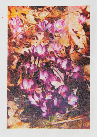
This is the finished pronto print:
I like the “vintage” feel that these prints have. I think that printing on this new paper is also better. In addition, I bought some “anti-skin” spray for my inks. This stuff is AMAZING. Normally, this ink will dry and form a tough, chewy skin on it, which has to be removed. This is messy, frustrating, and wastes a ton of ink. This happens, even if you cover the ink with wax paper, etc., in the can. But this spray somehow works miracles, and keeps the ink soft. I love it! Everyone should go out and buy some!
I had my first carborundum class with Christiane Lippeveld. She does amazing work. We created some plates, which need to dry to print for next week. I think that I may try to get some more plexi and make some plates on my own.
Also, I have made several more TINY plates. I will try to print them tomorrow. If they turn out reasonably well…I’ll hopefully have photos to post. Bonne nuit!
2 Comments so far
Leave a comment


I can’t say I love the colors in the first print but I love the message! Non-profit fundrasing offices and church stewardship personnel would clamor for this one.
Comment by growingmuses April 10, 2011 @ 9:34 pmI was thinking of doing other virtue/vices…but I’ll definitely try other colors…more yellow next time? 🙂
Comment by slightlywonky April 10, 2011 @ 9:54 pm