Filed under: printmaking | Tags: art, artist, Brayer, cmyk, lithography, Paper, photo, print, printmaking, visual art
Okay, my internet connection hiccuped, and I’m writing this for the second time. Grr.
So, I finished the pronto prints that I started last week. I had to print each CMYK on a different day, to let the ink dry. I also tried out three types of paper, to see which I liked best. After doing all of this, I thought of a fourth type of paper that I think will work great, but too late! Next time…
This is printed on paper #1 (Rives lightweight):
This paper worked fairly well, but it’s wrinkled. I’ll have to experiment to see if I can flatten it.
Here is paper #2 (Arches 88):
This paper is smooth, and picks up the ink well. Unfortunately, the paper isn’t sized, so it doesn’t react well with the wet pronto plate. Oh well.
Here is paper #3 (Rives BFK):
Not great, as this paper has too much tooth.
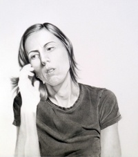
Also, I just ordered a larger brayer, which should help enormously. Right now, I’m working with the tiny speedball brayers. As a result, there are always lots of brayer marks on the prints, as I can’t roll over the image in one motion completely. I have to go over it twice, and the circumference of the brayer is also too small. SO! We’ll see what happens when I get the bigger brayer, and try on a different paper. One other thing that I think: this image has only part of it in focus, the rest is out of focus. This looks cool as a photo, but I’m not sure if it works with this type of printing, as it just ends up looking too blurry. Next time, I’m going to use an image that is all in focus, to see if that looks better. These aren’t supposed to be exactly photographic. (If I wanted that, I would just print it on my inkjet!)
This weekend, I went to the Craft Fair held by the Boston Society of Arts & Crafts. So amazing! So much gorgeous stuff. Lots of beautiful pottery, clothes, jewelry. Needless to say…I got a sandwich there, that’s about it. Maybe I’ll start to save up, and get something spectacular in 2015.
Filed under: Fleeting thoughts..., printmaking | Tags: abstract, art, Brayer, colorful, Ink, monotype, printmaking, red, Visual Arts
I was about to write, “it’s amazing how much frozen water can disrupt everything”, but then I thought of the Titanic. Hmm. Makes our perpetual cocoon of snow seem less formidable.
It’s hard to keep a schedule now. Snow days abound. Our thermometer read -6 degrees one morning this week. 15 degrees is starting to feel pretty good, and 32 is positively balmy.
I hope that in spite of the snow, I can make it to my two classes this week. I can see why taking classes in the winter can be a bit of a challenge. But, the light outside can be so great! When the sun is setting…all of those mounds of snow glow with a pinkish light, while the shadows remain a purplish-blue. Throw in some black, jagged branches, and you have quite a scene! I’ll try to remember to take a picture.
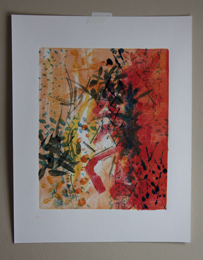
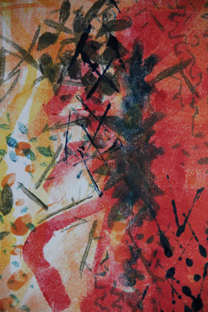
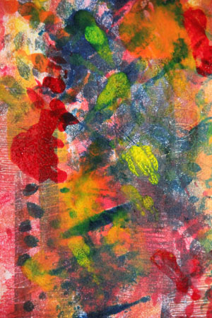
I’m continuing with my printmaking. I worked with the new brayer technique that I was shown in my last class. The teacher actually paints/draws like this. In fact, during class she “drew” a remarkable hummingbird with her brayer. (A brayer is a hard, rubber roller used to apply ink). Pretty amazing. I like working with lots of layers of ink.
I would LOVE to own a press someday. I know…dream on. They are $$$$. The images are just so much more saturated and crisp when you use a press, instead of hand burnishing/rubbing the back of the paper. If you know of someone who is somehow TIRED of their exquisite press, and would like to see it go to a good home…let me know.
Here’s my recent work…stay warm!
It feels like such a relief for me to be taking a break from straight lines, clean drawings, neat everything…In architecture, drawings are legal documents, or instructions. No extraneous or unclear information should be provided. CLARITY. Well, obviously…these kinds of drawings/prints have an entirely different purpose. How refreshing!
