

Filed under: printmaking | Tags: art, artist, CMYK color model, Halftone, printmaking, visual art
It has been brought to my attention that I might want to describe the process for the pronto prints of my previous post. Makes sense! So, here it goes:
1. Pronto plates work by having ink stick only to the marks on the plate (not the blank parts of the plate). The ink only wants to stick to distinctly black marks on the plate…no greys. So, think of a black and white photo…there is a lot of gray in there, right? Well, you can’t use that black and white photo as a basis for a pronto plate. The ink will not adhere to the grey areas.
2. In order to create the illusion of greys, one has to convert the photo to a halftone. In a halftone, the entire image is composed of dots. In darker areas, the dots are more dense, in lighter areas, the dots are smaller and fewer. So, the dot itself is not grey…it’s black, and the ink will stick to it. It’s the density of these dots that creates the shading. Think of a newspaper image…
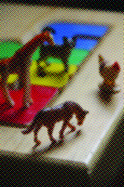
3. As I was not doing a black and white image, but a color image, I needed to create a halftone of each process color used to make the image. For printing, the process colors are cyan, magenta, yellow and black (K). This is different than the colors for your monitor, which are RGB (red, green, blue). So, I created a halftone image for each color…and when you layer them all together, it creates the illusion of a shaded image. Here is a closeup of the horse:

You need to have photo editing software to both create the halftone image, and to separate the original color photo into each of the four “channels”, CMYK. So, for this image above, you can see the cyan dots, magenta dots, yellow dots, and black dots. The patterning of these dots creates the image below:

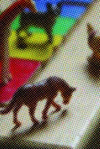
You can control how large the dots are. The larger the dots, the easier time that the ink will have sticking to the dots…but the more abstract the image will be. Here is how the image would look if the dots were big…

This is a digital image, not an actual print from a pronto plate. So…you have to decide what look you’re after. Also, you have to see what works best with the pronto print process. You might like very fine dots, but perhaps the ink won’t stick well to tiny dots. I’m still figuring out what I think looks best. Clear as mud? 🙂
Filed under: printmaking | Tags: art, artist, Brayer, cmyk, lithography, Paper, photo, print, printmaking, visual art
Okay, my internet connection hiccuped, and I’m writing this for the second time. Grr.
So, I finished the pronto prints that I started last week. I had to print each CMYK on a different day, to let the ink dry. I also tried out three types of paper, to see which I liked best. After doing all of this, I thought of a fourth type of paper that I think will work great, but too late! Next time…
This is printed on paper #1 (Rives lightweight):

This paper worked fairly well, but it’s wrinkled. I’ll have to experiment to see if I can flatten it.
Here is paper #2 (Arches 88):

This paper is smooth, and picks up the ink well. Unfortunately, the paper isn’t sized, so it doesn’t react well with the wet pronto plate. Oh well.
Here is paper #3 (Rives BFK):

Not great, as this paper has too much tooth.
Also, I just ordered a larger brayer, which should help enormously. Right now, I’m working with the tiny speedball brayers. As a result, there are always lots of brayer marks on the prints, as I can’t roll over the image in one motion completely. I have to go over it twice, and the circumference of the brayer is also too small. SO! We’ll see what happens when I get the bigger brayer, and try on a different paper. One other thing that I think: this image has only part of it in focus, the rest is out of focus. This looks cool as a photo, but I’m not sure if it works with this type of printing, as it just ends up looking too blurry. Next time, I’m going to use an image that is all in focus, to see if that looks better. These aren’t supposed to be exactly photographic. (If I wanted that, I would just print it on my inkjet!)
This weekend, I went to the Craft Fair held by the Boston Society of Arts & Crafts. So amazing! So much gorgeous stuff. Lots of beautiful pottery, clothes, jewelry. Needless to say…I got a sandwich there, that’s about it. Maybe I’ll start to save up, and get something spectacular in 2015.


Filed under: printmaking | Tags: art, artist, CMYK color model, Ink, Paper, print, printmaking, visual art, Woodcut
I’m working again with pronto prints and my previous woodcut. I’ve been scheming ways to make registration for the CMYK pronto prints work better. My latest attempt may be good. I managed to register the yellow and magenta layers. Here they are:

I’m also experimenting with three types of paper. The paper on the right is Arches 88, an unsized paper…very absorptive. This isn’t such a great quality with the way that I’m doing these prints, as the area around the print gets wet from the plate, and this causes the surface of the paper to deform from the moisture. Hmmm. The other two papers are better in this regard, but I think that because they are sized and have more of a texture, they don’t take the ink as well. Here’s a close up:

I also changed the halftone lines per inch, to make it less fine grain. I have to balance clarity of printing (as pronto plates like distinct black/white), and clarity of image (fewer/larger dots=more abstract/blurry print). Hmmm! I think that the cyan layer, which I hope to do this weekend, will be revealing…
I am printing the woodcut on grey paper. This is a heavy paper, unlike the fine Japanese papers in my previous post. I have to let the first layer dry before putting on the second layer…I also switched inks again. I know…I keep changing all of the variables! I am quickly running out of space for all of these prints. I need to devise some safe storage system.

There are some sparse snowflakes blowing around outside right now. I really hope that they don’t amount to anything. Maybe I should make some prints about snow angst? The flakes are almost like white gnats bumping around…shoo! Go away! I’m tired of my boots/hat/gloves/scarf ensemble! 🙂
Filed under: printmaking | Tags: art, Ink, lithography, printmaking, pronto print, regent theater, visual art, Wood block, Woodcut
So, I’ve decided to try again with the woodcut and the pronto plate print. I have sealed the carved wood block, and it did print much easier. I also bought some Japanese papers, which are strong yet absorptive. I tried out some other colors, and also experimented with the layering of the image.

This one above was on a very nice paper, called sekishu. Kind of pricey…but light in color and very fine. I also printed this on another paper, called kitakata, which is slightly thicker and a warm, straw color:

Does it look different? It would be obvious if you were here! Here is red color scheme with one color rotated 180 degrees:

Hmmm… and here is the other color scheme:

and rotated:

What do you think? I’m sort of thinking that the black geometric object should have been a different color for the prints. I’m not thrilled with how these turned out. Any suggestions? I think that the colors turned out a bit icky.
I tried the pronto print again. Here it is:

I can’t compare it to the first one, as it’s going to be in that local art show. This is blurry, so I must have misaligned one of the colors by a hair. SO frustrating. I think that the ink application went better this time…so perhaps practice makes perfect.
I stopped by the Arlington Center for the Arts to drop off that previous pronto print. I was lucky to get a sneak preview of the show. Not big…but nice to see all the work of local artists. The education director was there, and thought that I should take my Regent prints to the owner to see if he would want to buy one. Hmm! Worth a thought. There is all sorts of protocol on selling art that is being shown somewhere else. Also, you may not be aware…but galleries take a hefty percentage of the sale. So, once you factor in the cost of paying the gallery, the frame cost, the materials cost, the labor cost…you can see why art is expensive, and hard to make a good profit from. I know…having an Etsy account would likely help!
By the way…the art show opens on March 28 in the Gibbs Gallery at the ACA, for you locals to Arlington. The reception is Thursday, April 7 from 6-9 pm. Come see! (I will hopefully be there on the later side, as I have a class that night.)
Filed under: printmaking | Tags: art, chine colle, drypoint, Ink, Monotyping, Paper, printmaking, Prints, visual art
So, the past few days were a bit productive. I did lots of drypoint prints on Thursday, and some more solarplate prints today. Last night, we had an amazing class with Catherine Kernan, who showed us viscosity monotypes. This is where you work with both very thin ink, and very stiff ink simultaneously. The two inks react to one another in very interesting ways. I don’t have any images to show this week, though! Our class worked collectively on five prints. It was fun, as we just experimented with making marks, and were amazed at our results. Hopefully, I will be able to show you one next week!
These are the drypoint prints that I made. I incorporated a little of that carborundum technique. This is where there are areas of dense color. I’m not sure that it was so successful, so I’ll have to try again.

Hmmm…I also tried rotating one of the plates:

Hmmmm. Then, I tried some chine colle…

Also just “hmmm”…then I tried one of the plates in isolation…I liked this one the best:

Any thoughts?
Here are the solarplate prints. I managed to print the relief plate this time. This means that as opposed to smooshing the ink into the grooves, and wiping away the rest…a relief plate has the ink just rolled on the surface. I liked this, as it created an emboss, and gave the prints more character. I’m not so fond of the “flatness” of the smooth solarplate prints. Here is what the emboss looks like:


Can you see how the paper is raised?
Here are the actual prints:

The greenish in the photo above is from the relief plate, so it is not just ink on the paper…it also has indented the paper as well (as shown above).

I’m showing these in the order in which they were made…

My teacher thought that this one above looked “complete”. So…I have to “complete” the others at some point…

And another:

I generally like these. I agree that there is something “missing” in most of them. I need another layer. It’s always hard to add another layer later. When these are printed, the paper has been soaked. When paper dries…it shrinks, so you can’t put the same sized plate on unless you resoak it. Unfortunately, sometimes the paper still won’t expand up to it’s previous size when you resoak it, then the plate marks at the perimeter won’t line up with the previous marks. You can be VERY VERRRRY fussy in printmaking. Actually, I should say…you are supposed to be VERY VERRRY fussy. The only people who can thumb their nose at these rules are established, celebrity artists. So…not me. Not by a long shot.
Any comments? Feedback? Helpful suggestions? Random thoughts? Favorite place to get coffee?
Filed under: printmaking | Tags: art, chine colle, collagraph, drypoint, Ink, printmaking, Prints, visual art
This week, we printed our carborundum collagraphs! Very exciting. Carborundum is a very fine grit, smaller than sand. You mix it with an acrylic medium, to create a grainy gel. Then, you put the grainy gel on your plate how you’d like. The grains will hold ink, so that wherever you put this gel is what will be inked on your plate. An added bonus to this process is that the carborundum is bumpy, and leaves a cool emboss on the paper. It also allows one to get very dense, saturated color. Here is how the two plates that I made looked on their own:


You can see the dense color on the print…this is where I applied carborundum to the plate. I have also included a close up, so that you might be able to see the textured emboss:

Okay, maybe that’s too hard to see. Here are other prints that I made with these plates:


So, I used black ink for these prints, but those black areas could be any color. Of course, now that the plates have been printed with black ink…it’s kind of hard to change that.
I also printed again with the drypoint plates that I made earler. You will likely recognize that from my previous posts where I used these drypoint plates:

another:

Then, I printed the two plates together, with no other layers of ink:

I liked how they turned out…generally. The two previous ones may be a bit “flat”, because of the textured/colorful background. Hmmm…comments? Perhaps they need some carborundum!
Here are two random prints with chine colle:


The first plate of the two began with a ghost print of the second print. (a ghost print is when you reprint a plate, without adding new ink).
I also made more solarplate prints. I was tired of using photographic images…they were a little flat, so I went back to directly marking on acetate to make the “negative” for these plates. Please forgive my color choices…as I mentioned in a previous post, there was a serious shortage of red. I know…that’s no excuse really. I’m not fond of the all green one, but I like the one with purple:


I like those, and so I’ll keep trying to print them, to see how I can improve the layering. Next time, I’m going to try to get the colors to be more transparent.
And…last but not least…I did another color scheme of the Regent theater print. I am going to submit this print with the other one to the local show. Yes, I’m not sure if the ink will totally be dry by tomorrow am! I wonder if I could speed up the drying with…a hairdryer? A tanning bed? Probably not.

What do you think? Thumbs up? Thumbs down? I like how this Regent one turned out…even thought it may look as if it should have been a screenprint!
Filed under: Drawing, painting, printmaking | Tags: abstract, art, drawing, image, printmaking, Prints, visual art, watercolor
Yesterday was a fabulously warm day. My son and I took several walks to soak up some sun and work on our vitamin D levels. It felt amazing to be out in the warm air. I was tempted to open all the windows in the house, but then I thought that might be premature.
Everything feels like it’s slow going. Every day, I hope for something I do to be “the thing”. By this I mean, “MY thing”. So far, what I’ve done puts a furrow in my brow. Sigh. Just the reality of where I am, and where I am not in my creative endeavours. I love seeing inspiring works by other people. On the other hand, it often leaves me with a bit of a pit in my stomach…knowing that I couldn’t possibly do what they do. I know. It’s supposed to be that way. I have to do what I do. BUT WHAT IS THAT? I wish that I knew…
Here are some odds and ends from the past week. Any comments?


I know. My search to figure out what to do will be a lifelong one. At the same time, so many people have figured out “what” their art is all about. I’m not there yet. It feels like it’s taking forever to figure out.

