

Okay. Today, I’m not liking how anything is turning out. Sigh. I have visions of grandeur, only to be squashed by reality. I’m still working with these new, water-based inks. I only have three colors, so I’m finding the palette to be a bit limited. I know…I should be able to mix ANY color from yellow, red and blue. This is probably true, but I can’t seem to do that. So, if you wonder why the color palette with all of these is similar, this is why. I can’t tell if I should list the images from bad to worse? Perhaps not. Maybe I’ll put the worst one somewhere in the middle, in an attempt to “bury” it. I’m putting this ink away for the time being…until I feel that I can muster the strength to possibly produce more ugly things.
This one is a composite of the previous prints…I just started looking the shapes, and decided to make a “collage” of them.

and a detail:

Now, some of the more recent (icky) prints:

And the “ghost” print:

I know. Blech. Here the WORST one:

I know. Why bother? SERIOUSLY. It’s hard to bounce back from some of these prints. At least the next ones are kind of punchy/fun:

detail:

And the other one:

detail:

Lucky for me, I’m taking some printmaking classes next year. Thank goodness!!! Do I need help, or WHAT? Not that these teachers can be miracle workers, but I have high hopes.
Tomorrow is going to be Christmas Eve craziness around the house. Makes me want to hide somewhere…with a latte. Okay. That sounds rather scrooge-y. I’ll think positively, and hope that I can somehow get a nap in tomorrow…AFTER my latte.
I’m going to check out Keri Smith’s blog now, as her stuff always is funny and inspiring. You should look at it too! Especially those of you who feel that you may be in some kind of rut…she’ll give you lots of ideas to try something different. YOU KNOW WHO YOU ARE OUT THERE! 😛
Okay, so here is another one in this series. I like this, as I both changed the paper, and I tried to have more ink. These are reductive prints, meaning: I start out with the plate fully covered with ink, and then I wipe away the areas that I don’t want to have color. Messy! So, this last time, I tried to leave more ink on the plate. Better.


So, I’ve got some new ink. I like it! It’s this non-toxic stuff that cleans up pretty easily. Which is good, as I tend to get it all over my hands. I’m pretty good about wearing gloves for awhile…but then I always end up throwing them on the table and just getting my hands inky. So, as I’ve mentioned previously, I have a hard time keeping my hands looking somewhat reasonable.
This is sort of an odd, cartoonish series. Not sure where I’m going here. I was thinking of children’s drawings, but then with an adult mind and the heaviness that it brings. I may try a different paper, as this one is quite bumpy (toothy?) Hmm…I was initially thinking that these were neat, but now I’m not so sure…


Filed under: Fleeting thoughts..., printmaking | Tags: Art book, book, linoleum print, printmaking
Okay, so I started another lino print. This one was less abstract…and I like it much less. The ink is a dark blue/black. I intend to color in the white areas, when the ink dries. Sigh. I’m trying not to let this get me down.

Then, as I was inspired by yesterday’s mini books…I decided to make another! Yes, this one is totally handmade, so it looks…well, less polished. I had fun doing it. I may be on a book making binge, as this one was fun too! I like being able to work as I go along, and not have to plan too much along the way. Unlike the linoleum print, where one has to plan out a little…this book had no plan at all! MUCH more fun.

Now, inside:


And the cover:

And some close ups:


I’m happy with it. I know…WHAT is it, really? Who knows. Like I need more books in the house? Hmm…like I need more of anything in the house? I’ll have to purge some of someone else’s books to make room for these. JUST kidding!
Filed under: Felting, printmaking | Tags: book, craft, felt, Fiber Arts, sewing, Shopping, Supplies, textile
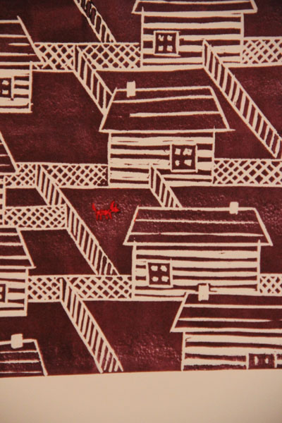
So, I finished the lino prints last night. I added the third color. You can see it below:


I think that it turned out pretty well. I did manage to jab my thumb with the tool used to cut the linoleum. I know…cut AWAY from yourself. My thumb didn’t seem to be anywhere near where I was working, but my hand slipped. I need to get some of those oyster shucking gloves. Or, I just need to pay more attention.
I also worked on a fabric composition:

and a detail:

This is a bunch of different fabrics/yarns, etc merged into one fabric through needle felting. You basically use a barbed needle to poke through the layers, and fuse them together. It’s pretty interesting how different fabrics behave when felted like this. I have no idea what I’m doing with this thing, but I’m just going to keep adding to it.
I also made two tiny little books! Here they are:

Aren’t they so cute? There are only twelve pages in each book. I got this little kit from the local art store to make them. I’ve never made/bound a book before, but it was surprisingly fun! Somehow, it never seemed very interesting to me. Okay…a blank book…yawn. But, when you make it yourself, It’s so fascinating how it all comes together in such an intelligent manner. This wasn’t even any type of fancy binding, but they still turned out well. Hmm… I may make more of these. I have no idea why I would need a collection of tiny books with only twelve blank pages, but I’ll find some purpose. Grocery lists? Profound thoughts? (hmm…no, I want to USE these books) Maybe I’ll just keep them as mini sketchbooks, to draw tiny things in. Any other suggestions? 🙂
Filed under: printmaking | Tags: art, Equipment and Supplies, Ink, linoleum block, Printing, printmaking
Okay. So, I tried a new ink & technique for printing today. I was hoping that it was going to be fabulous. Unfortunately, it turned out horribly. Big fail…waaah! I like the layered colors, but for the life of me, I could not get the middle part to print as dark as the edges. I have NO idea what I was doing wrong. I would love to blame the press, or the ink, but it was surely my fault. sigh. It’s always frustrating to spend time on something that does not turn out well. I tried to revive it along the way, but no luck. I may email my printmaking teacher to ask her for suggestions. [update: I think that I needed to add “retarder” to my ink. This modifier slows down the rate of drying. So, my ink was drying out before I had a chance to print it. I’ve used that modifier for other inks, but I somehow thought that this ink didn’t need it. I was wrong. SIGH. The inspiration (if that’s what I should call it) for the print came from seeing my recently planted bulbs dug up out of the garden by some critter. The sad bulbs were lying on the soil, pale and bare. I wanted to replant them, but I thought that this would just be futile. So, no springtime flowers for me! DRAMATIC SIGH]

I also have a lino print (one of four copies) in process. I used some oil based ink, which was so much better for printing than the water based. Unfortunately, I have been waiting AGES for it to dry. I could probably keep printing, even though it is still tacky, but I’m worried that I’ll mess it up somehow.

I haven’t gotten much done lately. Holiday stuff…trying to purge excess stuff (primarily toys and clothes)…etc. The basement renovation is progressing. I’m looking forward to having some space to work and leave things in process.
Comments welcome! Or if any of you are into printmaking, please feel free to give me some pointers.
I’m going to go and eat a cookie now…
Filed under: Fleeting thoughts..., printmaking | Tags: arts, Bazaar Bizarre, craft, Screen-printing
So, I finally finished my blob serigraphs (screenprints). Here is the step right before completion:

And here is how they turned out:

A single print:

And a detail:

So, what do you think? Thumbs up, down, or no comment?
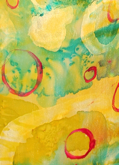
I also worked on some monoprints today. I forget if they are “monoprints” or “monotypes“. Clearly, a novice printer. See my color theme?:


And a detail:

Are you bored yet? I get tired of putting in these photos. Well, I had fun doing these! I also have a picture of something that I got at Boston’s Bazaar Bizarre, made by Raeburn Ink:

Isn’t it so neat? I love hot pink, and this squishy scarf had hot pink puffy clouds silkscreened onto it. MINE! (hmm…should have used the fuzzy filter in photoshop elements…need to hide the scar on my chin…)
Needless to say, I went to the craft show today for the Society of Arts and Crafts in Boston. SO RIDICULOUS. The stuff was INCREDIBLE. I cannot emphasize that enough. SUCH beautiful things. All the ladies that lunch were there buying $600 shawls. I was envious, needless to say. I walked out with a book. You know that you can’t afford anything when each booth has small signs in a corner showing you the meager “UNDER $100” items. Sigh. Seriously, this show is at the cyclorama in Boston through the weekend. Really REALLY amazing stuff. Just take out a loan, if you plan on purchasing anything…but the prices were completely justified. The works were so beautiful. Anyone planning on going?
Filed under: Fleeting thoughts..., printmaking, Sewing | Tags: Charlie Brown, Chicago, Christmas, Christmas tree, crafts, hand made, Holidays, ornaments, Real tree, Shopping, Tree
Hello all! I’ve been asked to try to provide progress images of what I’m up to. Here’s a serigraph (screen print), that is in progress:


Here some images of my holiday cards…relief print:


And here is something in progress…tree ornaments! This is a good segue to my next topic: tree debate!

Okay. When I was growing up, our family would sometimes get a real tree at Christmas time…and sometimes not. When we didn’t get a real tree, we used my mom’s FABULOUS silver aluminum tree. I believe that she and a girlfriend bought the tree when they had a tiny apartment in Chicago. Anyway, I loved that tree. Much to my horror, she threw it out one year WITHOUT ASKING ME FIRST. I know…get a life. Whatever. So, I’ve wanted one of those trees for ages. I got a vintage one from ebay last year, and I was SO excited. I think that my mom’s tree was better.., but this one is pretty cool. Okay, so the debate is: the rest of my family is not fond of the idea of a fake tree, never mind a silver one. So, I’m posting photos to get more opinions. Am I crazy, or is this thing kind of cool? Be honest. The first photo is just the plain tree…bare bones:

I know…it has a sort of Charlie Brown sparseness to it. But wait! What if I add some lights?

What if I go crazy, and add some PINK lights? (as we had in my childhood…should explain a lot about me)

I know. My husband is NOT going to go for this. But whyyyyyyyy??? Isn’t it COOL? No? Hmm…okay, I also made some silly, pillow ornaments for the tree. You may hate these as well, but give me your opinions on them:


And now, in the silver tree:


So, what do you think? Creepy? Cute? Blah? Yucky?
I like them! I know. Mies van der Rohe would throw up.
My son, inspecting the tree:


Filed under: printmaking
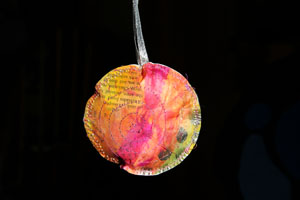
This rabbit print was SUCH a struggle. For some reason (I think that the press needed to be tighter), the lines weren’t printing. I must have printed this six times. This is the only decent one. It’s a bit dark. I have a new camera, and I have to learn where the adjusment is for that. My old camera was so simple! I’m also including a picture of my sun print again…but this time in blue! You can see it printed in oranges in my flickr account. Neat, right? The last picture is a surprise for someone…so I’ll write more about it later…


