Another one
7 Comments so far
Leave a comment
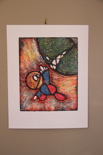
Okay, so here is another one in this series. I like this, as I both changed the paper, and I tried to have more ink. These are reductive prints, meaning: I start out with the plate fully covered with ink, and then I wipe away the areas that I don’t want to have color. Messy! So, this last time, I tried to leave more ink on the plate. Better.
7 Comments so far
Leave a comment


Does this little guy have a name? He is so appealing. The colors are much brighter in this series but the subtle colors were also beautiful.
Comment by Jean Kostojohn December 21, 2010 @ 5:37 pmWell, the first one I called “Atlas”, for obvious reasons. Then, I just kept making more prints with him in it. Perhaps it’s getting a bit silly now. Yes, the colors are bold. I’m just working with the primaries, no color mixing. The other colors come from the layers of printing.
Comment by slightlywonky December 21, 2010 @ 7:35 pmnaturally, because the colors are bold I LOVE IT! So now that you’re creating all of these fabulous pieces of art…what pray tell, are you going to do with all of them? ‘Cause I was thinking, that unused garage you have, that could make for a great gallery…(or guest room)
Comment by Growing Muses December 26, 2010 @ 9:52 pmUmm…next time you come over, I’ll take you into our unused cave, I mean, garage. You might need to get some kind of haz-mat suit to go in there…
Comment by slightlywonky December 26, 2010 @ 10:24 pmum. love it. love everything about it really. the colors. the guy. the inconsistency. you should aim to do a ‘show’ before your unemployment expires. nice goal for you and a cool way to showcase the fruits of your labor.
Comment by irene December 29, 2010 @ 7:21 pmThank you!!! I really appreciate it.
Comment by slightlywonky December 29, 2010 @ 9:06 pmwhat unemployment? did I miss something? I thought you ditched them?
Comment by growingmuses January 2, 2011 @ 3:56 pm