

Filed under: Fleeting thoughts... | Tags: art, boston, cabin fever, Ori Gersht, poster art, vacation
For those of you only interested in art…please scroll down…
For the rest of you…HAPPY NEW YEAR!!! YES, I made it through what seemed like an endless school vacation. SO EXHAUSTING. I think that what made it more exhausting is that for some odd reason I also decided that it was time to paint the kitchen cabinets:
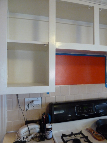
No joke. Do you realize how many square inches of surface area cabinets have??? BAJILLIONS. All the doors and hinges have to come off…holes patched & sanded…prime EVERYTHING (at least once), and paint everything (at least once). Because this project is such a royal pain in the tush, I decided that there was no way that I could afford to hire someone else to do it. BAH! Merry Christmas to me! (not)
(FYI…blue tape is an a tool of the devil which is only used by non-professionals in the hope that paint won’t get everywhere, but that’s a total lie. Did I mention that I also managed to dip the end of my hair in the paint can? Yeah, I know…that’s not the fault of blue tape, but whatever…)
It also snowed here:
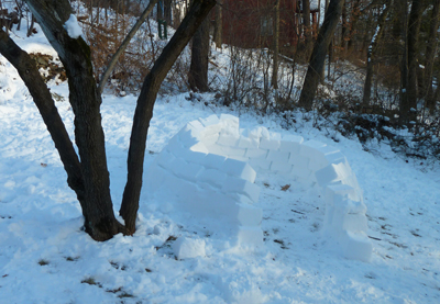
That’s the igloo that my son and husband started. Yes, they were so stir crazy, that they started an igloo. It was four degrees here this week…FOUR DEGREES! (that’s Fahrenheit, FYI) Needless to say, the igloo is unfinished. Also:
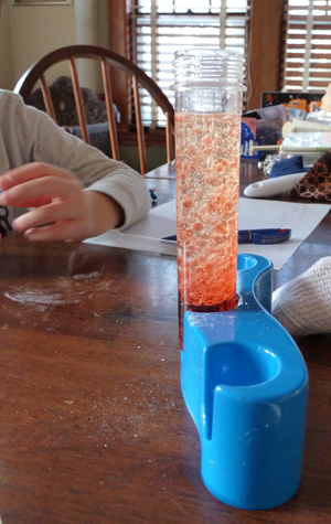
Yes, I was so stir crazy that I was willing for my son to play with the science experiment kit that we have. This basically involves making a big mess with things like vegetable oil, baking soda, and food coloring. I’m kind of a high strung person, so giving my kid a large eyedropper filled with ANYTHING makes me nervous. It was okay. Nothing really bad happened, other than me having to clean up a big mess and vowing to mysteriously lose the science kit somehow. At least it gave me a break from our imaginative play with Lego, where I’m always the Lego astronaut who falls to earth, lands in the middle of a dinosaur trapping station, and somehow can’t see anything until one of the dinosaur-trapper Lego guys tells my astronaut Lego guy to take his helmet off.
Yes, I am totally serious…and no, like my cabinet project, that’s not a joke. In fact, I may have to run to the fridge right now to get a second soy ice cream sandwich just to have the strength to finish this post.
It’s been a long eleven days.
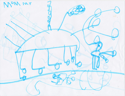
My son drew this. Do you think that he wrote my name on it because he was making the drawing FOR me…or do you think that he was making it OF me? I’m assuming that I’d be the large creature in the center with the tiny head and sharp teeth. Thoughts? Comments? Reassuring remarks? Why do I have so many legs and why is steam coming out of my shoulder? And what’s up with that back hair???? Discuss.
Okay, so one of the highlights of the week, besides me eating two, soy ice cream sandwiches in a row (FYI…husband is vegan, and no, that doesn’t explain why I ate more than one…), was going to the MFA to see the Ori Gersht show. If you are in the Boston area and are not in the middle of overindulging, as I am…then RUN to the museum to see this show.

His work…is…stunning.
I mean…SOOOO stunning.
Please take a look at the numerous links for him here, and here, and here, and here, and here.
In the photo above, he has frozen these flowers in liquid nitrogen, then blown them up with dynamite. A-MA-ZING. His work comments on beauty, life, death, destruction, violence, fragility, humanity, history…I could go on. His photos and videos are mesmerizing and painterly. He is thinking of the most heartbreaking subjects (Hiroshima…WWII…) and tapping into the agony of these events through his slow, videos and photography of beauty coming to an end. I wish that I could do his work justice with a poetic description, but I am lacking in both poetry and writing skills (and yet you’re still here!) Seriously, though…his work is breathtaking. The show at the MFA closes on Sunday. GO NOW. WAIT OUTSIDE, IF YOU MUST. DON’T WHINE…IT ISN’T FOUR DEGREES ANYMORE, IT’S THIRTY-TWO. DEAL WITH IT. IT’S WORTH IT.
Okay, enough ranting. Perhaps that faux ice cream is having an odd affect on me? Maybe that’s why vegans are grouchy all the time. (just kidding, honey!!!!)
There was also a postcard exhibit, and a poster exhibit as well:
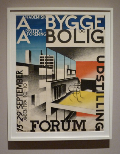
Ib Andersen
I had to take a picture of this, as it made me reminisce about being an architect. Ah…the sectional perspective…classic. But, naturally, the non-architecture poster of a toothbrush was my favorite:
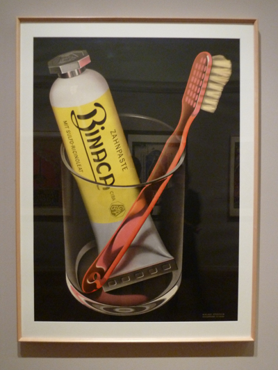
Niklaus Stoecklin
Isn’t that so fantastic??? I’m not sure which is my favorite part…the change in the toothbrush’s appearance as it exits the glass, or the look of the toothpaste tube through the toothbrush handle, or the pink reflection of light on the toothpaste cap. Either way…this is pretty amazing. It’s like Mario Testino decided to take a picture of his bathroom sink, or something. His toothbrush would look like Giselle Bundchen, while mine typically looks like someone who just ate two ice cream sandwiches. Hmmm. Maybe I should get a third??? Okay, maybe not…
Filed under: Drawing, Fleeting thoughts... | Tags: boston, First Friday, galleries
So, tonight is “First Friday” in Boston. As you likely know, this is when the galleries are all open late for people to come, look, socialize, and feel inadequate…(kidding, sort of…I may need to do some laundry today and locate a hairbrush…). Most people head to 450 Harrison Avenue, where there is a glut of good galleries. It’s kind of a fun and festive atmosphere…but it’s actually not great for seeing the art, as it tends to be crowded. Because I spend too much time in the ‘burbs, I’m going to go ANYWAY. I’ll try to conceal my suburban housewife-ness by NOT having any loud discussions about how my four-year old could do that, or how expensive Pepperidge Farm Goldfish crackers have become at Stop & Shop. Are you depressed yet? I just had to share the wealth…anyhoo, here’s what’s happening:
Bromfield Gallery is having works by Linda Klein and large scale prints by artists from Zea Mays. I have taken a couple of printmaking workshops at Zea Mays (print studio in MA), so I’m definitely looking forward to seeing this show.

Linda Klein
Howard Yezersky Gallery has an interesting show titled, Material Abstraction. This is a group of “paintings” that hardly use any paint at all. Hmm! Sounds cool.

Carter Potter
Samson Projects is having a show of Steve Locke’s work. These works seem interesting…almost like broken people scattered about a room…

Steve Locke
I’ll hopefully give you an update on what I liked…stay tuned!
As a side project, I’ve been helping a friend with some graphic design work. Yes, I have some knowledge of Adobe InDesign. No, I’m not helping you with your graphic design project…I’m pooped! Here is the postcard that we made for his upcoming show in NYC:

And the back:

Yes, I know that his name is not centered on the grey rectangle…the card needed a bleed, and will be cropped slightly. Sheesh! Or, maybe you didn’t even notice that? If so, I like you and need to have you over to my house more often. You would likely be able to overlook the general chaos and disorder. I suppose as long as you didn’t trip on anything /injure yourself /get a rash, my messiness could go unnoticed! AND…I could put you to work by forcing you to wear THESE:

How did I manage to get that image into TWO blog posts? I’m amazing, that’s how. I plan to sew my son some pajamas made of Swiffer sheets, as a means to get more lazy housekeeping done.
ANYWAY, George’s show will be at Agora Gallery in NYC, with the reception on November 8. I’ll post this again when it’s closer to the date. (George, be thankful that I’m not doing your PR). You’ll recognize me at the opening because I’ll be the one wearing the plaid duster/slippers and sporting a Swiffer maxi dress.
My own work is chugging along. I still can’t seem to take a decent photo of my drawings. Either my head is casting a shadow on the drawing, or there is a glare from the light on the graphite. Hmph!

Hmm…do you think that I need to make it generally darker? Perhaps so. Or, is it just a lighting issue? (I think it’s the glare on the pear that puts me in despair…yuk…yuk…yuk… clearly, too much My Fair Lady or Dr. Seuss on the brain.) Actually, I think that I’ve just eaten too many wasabi peas today. The drawing looks better in person, so I’m going to assign blame to the camera, and not my drawing. I know. I should run for politics. But, who would vote for a suburban mom? Wait…OTHER SUBURBAN MOMS! I might be onto something here…I’ll start collecting signatures at Stop & Shop, shaking hands, and giving out bags of Goldfish crackers (which, will hopefully be on sale…score!)
Now, if I can just dig my “mom jeans” out of the closet, I’ll be all set for First Friday…
Filed under: Drawing, Fleeting thoughts... | Tags: boston, Dick Blick Art Materials, drawing, Wheelock College
I have no new drawings to show. But, what I am missing in my own work…I plan to make up by my entertaining photos. Guess what I bought this week???? Only the coolest thing on the planet:

Do you know what that is? (besides the obvious…) IT’S A PURSE! I kid you not. Can you see the two zippers? Whoever came up with this idea…truly spoke to my soul. Here it is OPEN:

Come on. You love it, right? It doesn’t NEED to open…but it does. BRILLIANT! Where did I get this fabulous item, you may ask? From Dick Blick. Seriously! My kind brother and sister-in-law got me a gift certificate. I’m sure that this is not what they imagined I would buy…but, in addition to some art supplies, I felt that this item was calling my name. No, I’m not really hearing voices, but hasn’t a hamburger ever spoke to you? Did I mention that I’m trying to be vegan? Hmm. Actually, it is kind of making me hungry looking at it…
Yesterday, I met with Erica Licea-Kane. Besides being an accomplished artist, she is ALSO the director of the Towne Art Gallery at Wheelock College in Boston. Do you know WHY I met with her? BECAUSE I am going to be in a TWO person show this fall AT this gallery! I kid you not. I’m very excited. Here is what the space looks like:

Pretty cool, right??? I’ll get the wall on the left. I need thirteen drawings for this show. Although I currently have twenty…the Concord Art Association is going to have ten of them at the time of the Towne Gallery Show. SO…I need three more…PANIC. I literally could not sleep last night stressing about this. Why am I writing this post instead of drawing? Who knows. Screwed up priorities, I guess.
Speaking of drawings…this is the creation I made this week with my son:

He is obsessed with building demolition. Every drawing that he makes is a building being demolished. How did he get this idea, you ask? Because, like the brilliant mom that I am…I show him videos of building demolition on You Tube. This is one of his favorites. Did you watch it? I have seen that probably forty million times. Anyway, it kind of leaves an impression, right? So, those images are burned in my son’s mind. Hence, this is what he draws:

Let me describe to you some of the objects that are falling off the side of the building: a square table, a round table, four table legs, plates, a pizza cutter, a mattress. My son doesn’t know that people usually EMPTY a building before taking it down. He imagines all of the contents falling out. One drawback to this subject matter is that he tends to scribble all over the drawing to show the “dust” from the crumbling building. I feel that too much “dust” on a drawing covers up all of the other brilliant things, so sometimes I have to try to distract him so that he won’t scribble all over the drawing before I can get my hands on it.
Here’s something that I keep thinking about. I look at this drawing, and realize that his drawing ability (compared to other 4.5 yr olds) is not conventially “good.” BUT…he loves drawing, and I think that his drawings are GREAT in their non-conventional way. I fear that he will someday have an “art teacher” at school who will crush his enthusiasm by pointing out how is drawings aren’t “good” (i.e. realistic). There are SOOOO many people who have had that experience. I will have to have a heated parent/teacher conference if that happens to my son. Heaven forbid. Let’s hope that antiquated way of thinking has gone the way of the tsquare. (btw…they still sell those at Dick Blick, just not in the same aisle as the hamburger purses…)
Just so you know…for the next two weeks, I’ll be in Seattle. I can’t guarantee a blog post…but MAYBE if you’re LUCKY…i’ll post some Seattle pics. That is IF I remember my camera…and IF my son does not smear saliva all over the lens again. (btw…did I mention that it’s my birthday today? Hence, I treated myself to that hamburger purse. You know you want one.) Happy 4th!
Filed under: Drawing, Fleeting thoughts... | Tags: boston, Boston Public Library, drawing, Mixit Print Studio, Somerville

So, today was another oppressively hot day in Boston. Yesterday, it was 104…today, a mere 98. I know. The Sahara Desert is hotter. BUT…do they get 48″ of snow in the winter? Noooooo. (Remind me again why I live here???)
ANYHOO…I went to see the “ReThink INK” exhibit at the Boston Public Library. This exhibit showcased the work of printmakers who have been a part of Mixit Print Studio in Somerville over the past 25 yrs. WELL…the work was so great to see. I have actually had classes with many of the printmakers who were included, such as Catherine Kernan, Jan Arabas, Deb Olin, Annie Silverman, and the list goes on. It was also a treat to see people that I am not familiar with. I’ve got photos of some of the prints from artists that I was not familiar with:

This work by Nona Hershey is titled, “Branches, Spring.” I love the soft green areas behind the strong tree boughs. My photo does this print no justice, but I loved the texture of the bark, and the three-dimensional quality of the interlaced branches. I also love all of the scratchy black lines in the background. It is soft, yet hard. Here is her website. (please look) Next:

Mongezi Ncapheyi
This print is titled, “Migrant Workers’ Hostels.” I loved the repetition. The lines were so delicate. Here is a closeup:

I thought that this was really beautiful. I’m a sucker for lovely lines. Isn’t it so simple, yet so beautiful??? I can’t seem to find his/her website, though. (You’ll just have to see the show in person to take a look at the work…hee hee!) Next:

I loved this as well. This print is titled, “Compressed Crawling.” The rhythmic texture and subtle greys…ahhh. Dreamy. Doesn’t it almost look three-dimensional? Love it. Makes me want to run my sweaty hand across it. (Don’t worry! I didn’t.) Next:

Valda Zalkalns
I can’t find a website for her, either. This print is titled, “Corn Print #1.” There is actually corn embedded in the print. Fascinating! Here is a closeup:

Isn’t that cool??? Maybe I’m seeing a theme here…I guess I like work with TEXTURE. I realize that’s so odd, when my own work is so “clean”. I know someone who always jokes about the fact that I love Cy Twombly, and yet my stuff is nothing like his. I think that this same person was surprised to find out that I’m a messy person. I guess that my clean drawings imply a certain amount of fastidiousness. That’s sort of true…but that’s about as far as it goes with me. Martha Stewart would sob into her monogrammed handkerchief if she stepped into my house…actually, she’d probably keep her face covered like that the whole time! (but no matter) I just make friends with the dust bunnies.
In spite of the fact that my son has created numerous drawings this week, I have decided to show his collection of “rusting iron thingys”, which are sitting in front of the house:

This type of thing typically migrates into the house somehow, but then I have to migrate it back out again (the dust bunnies get scared). That enormous “nail” on the right is about as long as my forearm. Why can’t he collect pebbles, instead? Sigh. I’m hoping that the family’s tetanus shots are up to date…
My own work continues at a snail’s pace. As you have seen with previous posts, I’m experimenting with what direction my work should now go in. Here is my latest drawing:

I’ve drawn the hammer as blurred, or “pixelated”. I’m wanting to have the tool blurred, as if to create anonymity. I also had the hammer beginning to slip off of the edge of the drawing. I was pretty happy with it. My advisor suggested that I reconsider the negative space. HMM! Well, as a result…I’ve been pondering and pondering. I haven’t even STARTED another drawing. Hey, at least I did the laundry, (finally!) Everyone at my house is less grumpy when they have clean clothes to wear. Such fusspots. Go figure.
So, your homework assignment is to go and see ReThink INK at the BPL. If you wanted to…you could also GUSH about my brilliant drawing, but I won’t put that as homework. Think of this blog as OpenCourseWear, much like that of MIT’s…except that I have nothing intelligent to teach you, and I won’t email you a certificate either. Hmm. Maybe I should get back to my art cave in the basement…I think that the heat is getting to me…
Filed under: printmaking | Tags: art, boston, Ink, Mexico, Paris, printmaking, Relief print, Visual Arts, Woodcut
Today was a day of mild frustration. I have finished carving a woodblock to print. It will have two colors. I was kind of excited about it. I couldn’t decide what ink to use. Unforturnately, I am out of the fine, mulberry paper. I only have Arches 88, which is thick, but absorbent. I ended up deciding to try using my oil based relief inks with a lot of transparent medium. WELL. It did NOT print well at all! Here are the hideous prints:

See how blotchy the prints are? Here is a closeup:

Depressing, isn’t it? I’m not sure if I needed to sand the wood before printing, just to remove any possible residue on the surface, and to make the surface slightly rougher to accept the ink. Well, I didn’t do that. IF ANYONE OUT THERE IS A WOODCUT PRINTER, COULD YOU OFFER ANY SUGGESTIONS? I have now cleaned the block, and have put on a thin layer of shellac. I’m not sure if this will help. This is odd and frustrating, as I never had any problem in the past printing with those inks on wood. Granted, I typically use a shina plywood, not this solid piece of wood. Hmmm.
I also did another drypoint to print, hopefully on Thursday evening. It’s impossible to see, as it’s on plexiglass, but here it is:

The grainy white area is where I’ve added some pumice medium. I am hoping to get the carborundum effect here. I am also hoping that this medium doesn’t wash off when I try to print it! Seriously. As if it isn’t hard enough creating an image that one is happy with…then one has to contend with technical struggles. I know. Most printmakers get help with this in school. Well…I’m here with no one to ask! I may try to bring those ugly prints in to one of my classes, to see if the teachers can provide any insights.
Lastly, I am going to try to do a larger relief print. Who knows how it will turn out…I’ve only sketched on the surface…no carving yet:

On Saturday, I dropped off my two Regent Theater prints to the Arlington Center for the Arts, to submit them for an upcoming show. I asked the person who took them from me about the open studios in the fall. She said something to the effect of: “Oh, it would be great for you to participate. We need more printmakers. Do you know so-and-so?” Me? A printmaker! REALLY?!!! I know how silly this is, but it felt very good to be treated like I WAS something that I WISH I was. A printmaker. Coincidentally, I discovered that one of my teachers used to be a landscape architect in Paris. Seriously!
I also went to a printmaking exhibit at Laconia Gallery in Boston. The show is titled, ” Guanajuato: Boston Printmakers collaborative workshop in Mexico.” It was SO amazing. Beautiful, vibrant colors…tons of relief prints. All of the artists collaborated on a long, accordian fold book. They all worked within the pages in such a way that one could tell which artist did which parts, but the whole was still very integrated. I was also so lucky that one of the artists was there monitoring the gallery. She was so nice, and answered my multitude of questions.
It might just be Spring here…I don’t want to speak too soon, as it has snowed in April before…but I’m seeing little flowers coming up! YESSSSS!
Filed under: Fleeting thoughts..., printmaking | Tags: boston, New Year, New Year's resolution, Project 365
Happy New Year! We had a LOVELY 50 degree day here in the Boston ‘burbs. Yummy! Why can’t winter be like this all the time? Oh yeah, then there would be no snow, ever. Bummer.
So, I’m wondering if I should jump on this “make-some-kind-of-thing-every-day” bandwagon. Here is a link to a blog about this kind of thing. I know. It’s a good thing to do. Basically, you commit to creating something every day for a year. In fact, I believe that my brother is going to do this…by creating at least one photograph per day. I’m interested in this whole idea, as I hope that it would push me to make something every day, and not be so precious about what I do. Some days, I hardly get any time to myself. I use that as an excuse as to why I haven’t created anything. But, maybe that’s kind of lazy! Maybe I just need to make something…ANYTHING, regardless of how much time I’ve had to make it. In the spirit of this, I made a print, which took less than an hour. I know. It LOOKS like it took less than an hour. Who cares. Here it is:

I know. Not so good. But, considering that I would probably have not bothered with it at all, as I had so little free time today…I think that it’s okay. Not great, but okay. Just THINK how much “stuff” I’ll have if I can keep this up! I may even learn something! Hopefully, some of these creations will be reasonable. I originally thought that I could make several things in one day…and then keep some to use on those days where I don’t actually do anything. BUT, now I see that this is really defeating the purpose. I really do need to push myself to make something every day. Even if it turns out lousy.
Is this my New Year’s Resolution? I guess so. I originally thought that I would try to be “less grouchy”, but perhaps I should work on that anyway.
Okay…signing off here. Here are some photos I took this week when we had heaps of snow and sunshine. Doesn’t it look lovely out?


[okay. I couldn’t leave well enough alone. I messed with that print again. Here it is again:

I think that it looks worse in the photo, but better in reality…okay, I’m cleaning up now…]
Filed under: Fleeting thoughts... | Tags: bazaar bizaare, boston, craft shows, crafts
So, this past Sunday, I went to the Bazaar Bizarre at the Cyclorama in Boston. SO MUCH FUN! I naturally wanted to buy everything, but I had to restrain myself. Here were some talented people! My favorite booths / people were:
The Spun Monkey – fabulous FELT! Amazing roving! Very nice people. Here is their blog: http://thespunmonkey.wordpress.com/
Raeburn Ink – amazing screenprinting apparel and sewn items. The designer has just written a book! I had to get a super cool cotton scarf with a hot pink screenprinted pattern on it. The t-shirts were amazing too. Here is her website: www.raeburnink.com
I wonder if I will ever make it to a venue like that? I’m sure that it’s super competitive to get in. Most everything was top notch…and unique. No boring Amy Butler baby bibs or anything. Very cool calendars, jewelry, ceramics…ahhh. I was in heaven. Did anyone else go? I think that there is a Bazaar Bizarre twice a year, so definitely go to the summer one!
http://bazaarbizarre.org/boston/


Filed under: Fleeting thoughts... | Tags: art, art classes, arts, boston, craft, crafts, decordova, printmaking, woodblock printing
So, this has been a week of ups and downs. I managed to work on Tuesday, which was great. It was one of those days where the stars felt like they were aligned. Things looked great, I was excited and happy. All good. Friday was the only other day this week that I could work. In contrast to Tuesday, Friday was slow and deflating. I’ve been working on a woodcut. It’s taking ages, and my arm/hands/brain ache from it. I’m hoping to use 4 colors, but I only managed to carve out 1.25 of the four colors. SIGH. Also, I was looking at some of my books, at the work that others do…and I was deflated. Everything was so beautiful! I felt a million miles away from it all. I’ve decided that the only solution to that is to take some more classes. Spending time with an artist, having him/her provide suggestions and feedback…is invaluable. I LOVE art classes. I mean…I REALLY LOVE art classes. I don’t love everything that I do, but there are always one or two things that make me happy. I am still taking printmaking now. It’s been great. We only have two classes left! Where does the time go? Now, I’m already scouring my class options for next semester. If only I had Mondays free! There is a fabulous class at the Decordova that I’d like to take. If anyone has taken any great local (metro-Boston) art classes, let me know!

