

Filed under: Fleeting thoughts..., painting | Tags: art, artist, gallery, Nemo, ninja, painting, snow, Somerville
Sorry for no post last week! I was adversely affected by Nemo: i.e. trapped indoors with nothing to do other than try to entertain a housebound 5 yr old whilst not destroying the house or my sanity. So, we did survive Nemo. It wasn’t pretty. Gobs of snow. This is the view of my husband’s excavation from the basement door…

Hmm. That’s kind of a lot of snow for one storm. This is our back deck:
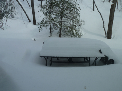
That’s our deck furniture…a table and a tipped over chair (blown over by the wind). That looks like AT LEAST two feet, doesn’t it???? The neighbors across the street:
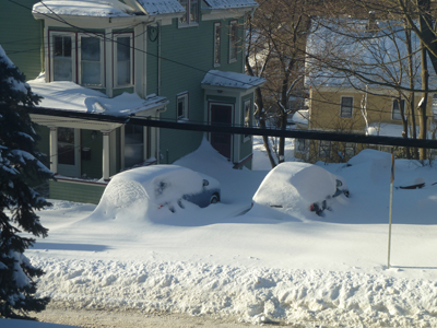
Don’t pity them too much. They hire a service to come and clear out the driveway and the sidewalks, etc. Our service was my husband, who unburied us…maybe we’ll hire someone to do it next time? (eh, honey?) Pshaw! What’s the fun of being a New Englander if you can’t gripe about the weather whilst heaving wet heavy snow over a five foot wall of ice? Needless to say, I was going postal with cabin fever. At least we didn’t lose power…I would have just stayed in bed all day if we had! (just kidding, honeeey!!!)
The following weekend, my son and I walked through the blustering cold to a nearby friend’s house for his birthday party. It was so fun, albeit total chaos: twenty kids tearing around the house screaming while shoving cheese and crackers into their mouths. My son, so practical, gave me his half eaten crackers/cheese to hold so that he could run around more easily. Everytime someone introduced themselves and shook my hand, they ended up with a palmful of crumbs. I had a glass of sangria to get me through it.
One of the activities for the kids was to make paper bag puppets. You know…like the ones that advertise Fandango:

Notice that his nose is a croissant. You can see the ad here. Ridiculous right? Anyway, the kids made paper bag puppets. Can you guess what the theme of the party was?

No, that’s NOT a woman in a niqab. It’s a NINJA! Isn’t that hilarious and adorable????? Like THIS:

But not like THIS:

Luckily, our kids haven’t gotten into this level of commercialism yet. Coincidentally, NPR did a segment recently on the history of ninjas. You can listen to it here. I learned that ninjas were meant to be spies, not so much warriors. And definitely not turtles. There is no mention of turtles being ninjas in Japan in the 15th century. You have to wait until the 20th century in the U.S.A. Well, AT LEAST the kids learned the names of famous artists: Leonardo, Raphael, Donatello, and Michelangelo! Too bad that they think they’re turtles with nunchucks (or “nunchuku” for you purists out there…)
With every day that passes, I’m more convinced that we’re all going to hell in a handbasket.
As I managed to get out of the house this week, I went to Brickbottom Gallery in Somerville to see a show that my advisor is participating in. The show is, “Surface Matters: Exploring the Sense and Substance of Paint.” It features the works of: Adria Arch (my advisor), Ron Brunelle, Jessie Morgan, and Diane Novetsky. I have some images from the show:
Adria Arch, Exhale 2, Acrylic on panel
This is the work of my advisor! She works with other people’s doodles, manipulating and arranging them into new colors and configurations. It’s like a graphic language of the subconscious. Fascinating! More:

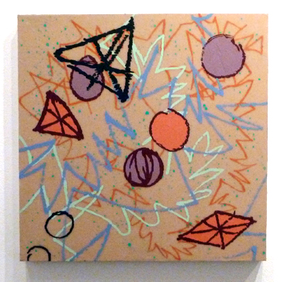
Adria Arch, Triangle Tangle, Acrylic on panel
This is a very large diptych. I LOVED the colors in this one and the repetition of the shapes at different scales, colors, and layers. These panels are built up a bit, almost like the layers of encaustic, but with acrylics.
Next:

Jessie Morgan, Night Tide #925, Mixed media on plexi
This artist had a really interesting process of somehow squeegeeing large swaths of color on slick plexi. The ridges of paint are visible, and it seems that she uses both sides of the plexi. The colors in this piece are gorgeous. You can’t tell from the photo, but there are subtle horizontal bands of a pale green that are embedded behind the dark vertical layers. This is a rather large piece…maybe 48″x48″?
Next:

Ron Brunelle, You Speak My Language, Acrylic on wood panel
This work also had the look of encaustic. He gets and amazing amount of layering and color in his work. His work also made me think of the rich and saturated hues of ceramic glazes.
All of the artists have visual depth/layering in their works, without necessarily building up a lot on the panel surface. I think that they’ve all honed some interesting techniques. I really enjoyed this show…so go see it if you’re in Somerville!
Ahh…Somerville. How I miss your grittiness. This was nearby the gallery. You might want to bring a ninja with you if you go after dark. If you don’t have an actual ninja to bring (who does?), you’ll have to channel your “inner ninja,” whatever that is…
Just sayin’.
Filed under: Drawing, Fleeting thoughts... | Tags: boston, Boston Public Library, drawing, Mixit Print Studio, Somerville

So, today was another oppressively hot day in Boston. Yesterday, it was 104…today, a mere 98. I know. The Sahara Desert is hotter. BUT…do they get 48″ of snow in the winter? Noooooo. (Remind me again why I live here???)
ANYHOO…I went to see the “ReThink INK” exhibit at the Boston Public Library. This exhibit showcased the work of printmakers who have been a part of Mixit Print Studio in Somerville over the past 25 yrs. WELL…the work was so great to see. I have actually had classes with many of the printmakers who were included, such as Catherine Kernan, Jan Arabas, Deb Olin, Annie Silverman, and the list goes on. It was also a treat to see people that I am not familiar with. I’ve got photos of some of the prints from artists that I was not familiar with:

This work by Nona Hershey is titled, “Branches, Spring.” I love the soft green areas behind the strong tree boughs. My photo does this print no justice, but I loved the texture of the bark, and the three-dimensional quality of the interlaced branches. I also love all of the scratchy black lines in the background. It is soft, yet hard. Here is her website. (please look) Next:

Mongezi Ncapheyi
This print is titled, “Migrant Workers’ Hostels.” I loved the repetition. The lines were so delicate. Here is a closeup:

I thought that this was really beautiful. I’m a sucker for lovely lines. Isn’t it so simple, yet so beautiful??? I can’t seem to find his/her website, though. (You’ll just have to see the show in person to take a look at the work…hee hee!) Next:

I loved this as well. This print is titled, “Compressed Crawling.” The rhythmic texture and subtle greys…ahhh. Dreamy. Doesn’t it almost look three-dimensional? Love it. Makes me want to run my sweaty hand across it. (Don’t worry! I didn’t.) Next:

Valda Zalkalns
I can’t find a website for her, either. This print is titled, “Corn Print #1.” There is actually corn embedded in the print. Fascinating! Here is a closeup:

Isn’t that cool??? Maybe I’m seeing a theme here…I guess I like work with TEXTURE. I realize that’s so odd, when my own work is so “clean”. I know someone who always jokes about the fact that I love Cy Twombly, and yet my stuff is nothing like his. I think that this same person was surprised to find out that I’m a messy person. I guess that my clean drawings imply a certain amount of fastidiousness. That’s sort of true…but that’s about as far as it goes with me. Martha Stewart would sob into her monogrammed handkerchief if she stepped into my house…actually, she’d probably keep her face covered like that the whole time! (but no matter) I just make friends with the dust bunnies.
In spite of the fact that my son has created numerous drawings this week, I have decided to show his collection of “rusting iron thingys”, which are sitting in front of the house:

This type of thing typically migrates into the house somehow, but then I have to migrate it back out again (the dust bunnies get scared). That enormous “nail” on the right is about as long as my forearm. Why can’t he collect pebbles, instead? Sigh. I’m hoping that the family’s tetanus shots are up to date…
My own work continues at a snail’s pace. As you have seen with previous posts, I’m experimenting with what direction my work should now go in. Here is my latest drawing:

I’ve drawn the hammer as blurred, or “pixelated”. I’m wanting to have the tool blurred, as if to create anonymity. I also had the hammer beginning to slip off of the edge of the drawing. I was pretty happy with it. My advisor suggested that I reconsider the negative space. HMM! Well, as a result…I’ve been pondering and pondering. I haven’t even STARTED another drawing. Hey, at least I did the laundry, (finally!) Everyone at my house is less grumpy when they have clean clothes to wear. Such fusspots. Go figure.
So, your homework assignment is to go and see ReThink INK at the BPL. If you wanted to…you could also GUSH about my brilliant drawing, but I won’t put that as homework. Think of this blog as OpenCourseWear, much like that of MIT’s…except that I have nothing intelligent to teach you, and I won’t email you a certificate either. Hmm. Maybe I should get back to my art cave in the basement…I think that the heat is getting to me…
