

Filed under: Fleeting thoughts..., painting | Tags: abstract, Adria Arch, art, Art Complex Museum, artist, flowers, painting
Is it Friday already? How did this happen?
Well, this is the FIRST week in a month that I’ve actually gotten a chance to DRAW. I almost forgot which end of the pencil to use! Just kidding…luckily, my friend got me a deranged pencil sharpener to help me out:

Yes. There it is. (except that mine is black.) Did I mention that the cat meows when you use it??? SICK. Actually, having this thing around pretty much ensures that all of my pencils will remain dull. I’m also keeping it away from my five-year-old, who will want some kind of explanation that I cannot possibly give him without him needing years of therapy, which I don’t want to start him on until he’s at least eight. I think that my friend would have preferred to have given me this in person, as my horrified reaction is really the priceless part of the gift. Thanks, TB. I’m going to have nightmares tonight…
Besides eating my weight in chocolate chip cookies this week, I also went to the The Art Complex Museum in Duxbury to see the work of my advisor, Adria Arch.

So exciting!!!! She has her work in the main room of the Art Complex. Her work is large and has a lot of impact, so it’s great to see it with the space that it needs.

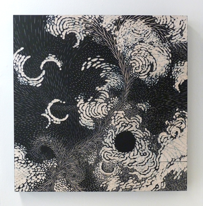
The show is titled, “Iconic.” She plays with the subconscious markings of other people and magnifies and intensifies them into monumental glyphs. The forms, compositions and colors are very compelling. I can’t help but wonder who made each of these marks? I love the mysterious quality of them.
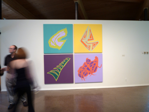
Adria Arch, I Love You More, 2013, Acrylic on canvas, 96″ x 96″
In her words, “These elements, spattered across and extending beyond the picture plane, bring to mind galaxies and explosions of energy. The compositions suggest randomness, belying an intentional painting process in which I project and then paint enlarged pencil lines onto canvas, wood panel, or walls. My practice grows out of the tradition of mark-making. I am drawn to the expressiveness found in unselfconscious pencil doodles – some I find and some I elicit from other people. The eccentric lines derived from these marginal marks are, for me, metaphors for boundless physical energy: floating, spinning, and falling through space.” So fascinating! Please go and see this show. It’s up from May 36 – August 18.
While I wish that I had a modicum of physical energy, I have managed to do SOME productive things this past month.

Look what I grew! Actually, I should say…”Look what I didn’t kill!” Yes…that’s an ORCHID. The flowers fell off a couple weeks after I bought it, which made me sad as I thought that was the kiss of death. BUT NO! I discovered that if you WATER it…more flowers will grow. Imagine that! I am convinced that plants hate me, so I am happy that this one didn’t get the memo. My other plants are probably blowing it raspberries in their own plant-like way.
Speaking of blowing raspberries, my son is back at school this week. SANITY. He was NOT happy about that, but I felt that I should not mislead him by thinking that school is “optional.” He says that he is besides himself with boredom. I nod.
Welcome to reality, kid!

This is what he would prefer to do all day, rather than “boring” activities, like making bumble bees out of construction paper. (can crafts EVER be boring????) He told me that this is a hotel. Perhaps my son will become the next Donald Trump? As his mother, though, I would not allow him to have the Donald’s hair, though. In reviewing his design, I feel that the penthouse unit has a catacomb-like quality to it. Thoughts? Perhaps a skylight would help? Maybe he’s catching onto the micro hotel thing in Japan?:

There must not be a word for, “claustrophobia” in Japanese. Those wouldn’t work in the States anyway, as they’d each need to be the size of a shipping container to work with our girth.
Speaking of…I’m going to go and look for more cookies. Let me know if you need me to sharpen any pencils for you.
Filed under: Fleeting thoughts..., painting | Tags: art, candy, decordova, gummi, installation, painting, sculpture
On Tuesday, it was 54 degrees outside. Today, it’s 19. I’m moving to Florida. (just kidding…not that there’s anything wrong with Florida…)
This has been one of those weeks where I have had no free time, and yet it’s unclear what I’ve accomplished. I’ve done very little drawing, and my house is still a mess. Hmm. I think that I’m also going through a slight phase of S.A.D. (seasonal affected disorder.) Maybe I need to up the wattage of our lightbulbs around the house? Or maybe I just need more chocolate? Does anyone else out there feel slightly blue right now?????
Sometimes, I think that keeping up with the news doesn’t help. I’m a worrier, and the news provides endless fodder for my neurotic brain to chew on. Did you know that more and more small children are developing anorexia? No joke. I listened to it on NPR. HOW IS THIS POSSIBLE???? And it’s not those scary pageant queen mommies that are causing it. Now, I’m analyzing what I say about food in front of my son. Apparently, we shouldn’t say that there is “bad” food or “good” food. WHAT??? Really???
WELL, pshaw…my mother recently bought THIS disturbing item for my son:

Now, I ask you…is this not the POSTER CHILD of “bad” food????? Actually, I’m not sure that it qualifies as food at all! Whew! (Thanks, mom…) Perhaps I don’t have to worry about childhood anorexia when my son happily chews on sour gummi french fries??? Beyond gross. So, here I am fretting about buying organic fruit and BPA free tupperware, and meanwhile my kid is eating a gummi hamburger, gummi pizza, and a side order of gummi fries. Thank God it’s at least peanut and fat free… (They forgot to add “nutrition free” as well. I might have to write and tell them that…)
The thing is, I would have TOTALLY wanted this as a kid too. Actually, I had a tendency to choose anything colored blue: blue frosting, blue gum, blue italian ices. Gross, right? Well, in spite of my deviant dietary desires, I turned out “normal”, right? Hmm. Actually, SCRATCH THAT. NO BLUE FOOD ALLOWED, lest my son become a neurotic worrier like his mom.
The gummi “lunch bag” is kind of beyond the pale…pure, dietary evil.
Okay enough about disgusting “food”…this week wasn’t a TOTAL waste. I did go to the Decordova Museum. That’s productive, right? Their current show is called, “PAINT THINGS: beyond the stretcher.” This was a pretty interesting show. All of the works are definitely “beyond the stretcher,” as there was a lot of paint…but a dearth of canvas. I really liked many things in the show.

Kate Gilmore, Like This, Before, 2013
This piece is the remains of a performance/painting/sculptural work by Kate Gilmore. In the performance (which you can see a video of adjacent to this piece), she is wearing a nondescript blouse, skirt and heels…typical office wear for women. She begins by ascending the ladder on the right while carrying a large vase filled with white paint. She walks across the top of the sculpture, sets down the vase, and climbs down a ladder on the left. She repeats this until the entire top has a row of paint filled vases on it. Then, one by one, she knocks over the vases (I think with her foot.) As each vase falls, it shatters and spills paint down the channels below. The paint runs through a hole at the bottom of each channel and fills another vase at the bottom. FASCINATING. I love that she’s wearing typical “office gal” clothes…and that she has to struggle to climb the ladder while carrying each vase…and that she has to carefully shimmy across the top without knocking down the other vases…and then she has to place her vase down and carefully climb down the other side. I love the struggle, the exertion, the care, and the destruction she conveys.

Steve Locke, Crossing Against, 2012
A very simple piece, but I loved what it does with form, light, and shadow. The palette is almost primary colors, but they are tweaked a bit. The face looks annoyed, but the leaning form implies a figure resting lazily against a wall. I love the reflected neon yellow in the shadow…it makes me think of inner heat or turmoil.

Mika Tajima, Furniture Art (series), 2011
These works are actually created with plexiglass box frames. BRILLIANT! I love how she has taken this totally mundane object and really played with it’s inherent characteristics and traditional role. Detail:

Mika Tajima, Furniture Art (detail), 2011
Aren’t the shadows amazing? You can see an interesting video of her here. I love how architectural a lot of her work is. Next:
Sarah Braman, In the Woods, 2012

Sarah, Braman, 8pm, 2011
These works were an interesting blend of materials, color and form. The lower piece, 8pm, actually has part of a camper in it. I like the mix of prefabricated elements with paint and other more “raw” materials, and the limited color palette. I also liked how she has painted In the Woods, as it almost has a three dimensional quality. Next:

Franklin Evans, paintthinks, 2013

Franklin Evans, paintthinks (detail), 2013
I love the excess of this installation. You can see in the detail photo the layer and layers of tape, colors, and photos. Next:

Katie Bell, Blind Impact, 2013
This was another interesting installation. It looks as if the materials found at a collapsed house have gathered together to be reborn as a new entity. Perhaps because of the geometry or how the piece creeps up the wall, there is a certain joy to this piece. Here is a view from the front:

Katie Bell, Blind Impact, 2013
No, the handrail at the bottom is not part of the piece. Don’t you love the composition? Next:

Claire Ashley, thing one / thing two, 2013
Amazing, right? I apologize to the artist as there are two works in this photo, and I don’t know which is which. The Decordova has this dramatically narrow and tall stairwell which often has incredible installation work. The ENORMOUS piece that runs up the wall is astounding. Claire Ashley seems to do these larger than life, bulging forms which both intimidate and excite.
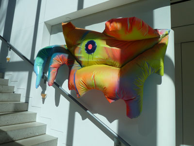
Claire Ashley, thing one / thing two, 2013
Isn’t that amazing? I love the colors. I love how these works have sort of infested the building, taking it over. I wish she had had a solo show, as I’d love to see a whole gallery full of her art. These pieces really do dwarf the viewer and gaze back with a disconcerting stare. Next:
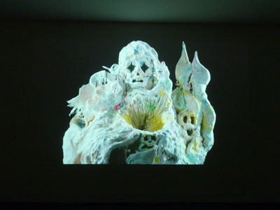
Allison Schulnik, Video still from Mound, 2011
This is a still from the amazing animation by Allison Schulnik. Her work is astounding. Please visit her website here, and go to the “video” heading to actually see these works. Plasticine figures erupt and morph into eerie creatures who are both engaging and disturbing. Look at that image! Don’t you love the starkness of the figure? Don’t you love how it’s both fascinating and unsettling? Please watch her videos. You must. I almost missed seeing them. If you go to the Decordova, they are on view in a room behind the desk at the entry. Go now. You must.
So, this was not a week of “minimalism”, unless you count how much tangible work I got done. Sigh. I may have to resign myself to gnawing on a gummy hot dog while I mope about looking for sunlight and something blue to nibble on. Send chocolate. Please.
Filed under: Drawing, painting, Photography | Tags: art, Dinosaur Train, Groundhog Day, Toyota Matrix
Dear Town of Arlington, MA,
The next time that you decide not to declare a snow day, would you please also plow the roads?
Thank you.

So, today is NOT a snow day…but my son is home with me because our road was impossible for me to drive on. I got 25′ from the house, turned the car around (carefully), and headed back. BAH! So much for some sanity today. The only reason I can even write this is because he’s watching Dinosaur Train right now. Bad mommy!
I think that I just heard a plow go by. Maybe it’s not to late to go to school? Sigh. Maybe it’s not too late to trade in my little Toyota Matrix for a dog sled team? I’d even settle for a cat sled team today…ech…forget it.
[update: 3+ hours have gone by and the roads are still a mess…helllooooo???]
Luckily, yesterday was clear weather, so I managed to go down to the South End to check out what’s in the galleries now. Lucky me! I’m going to try to go more regularly…SO MUCH GOOD STUFF!

This GORGEOUS pencil drawing is by Sandra Allen at Carroll and Sons Gallery. I have seen her work online, and I think that I even featured her once before in an earlier post. Well…as is with most things, seeing the work in person was 1000 times better than seeing it on the internet. I was pretty much awestruck by how absolutely beautiful her work is. Look at that texture! Look at the amazing range of values! Once again, if you are in the Boston area….GO SEE THIS SHOW. NOW. (how do I convey a stern look and wagging finger?) The art gods have spoken.
Next:

These drawings are enormous, and they aren’t even her largest work, which is also flabbergasting.
Tree trunks! What a beautiful and simple subject! I really could have stared at them all day.
Here is the look of the gallery:

Carroll and Sons recently renovated their space. This room is unchanged (I think), but beyond the wall on the right are two new spaces. They used to have their office back there, so I’m not sure where the offices went! Anyway, the renovation looks great too. Don’t you love how the wood flooring is on the diagonal? I love that. That wasn’t part of the renovation, but I still love it.
Bromfield Gallery is showing the work of Kathleen Volp:

Kathleen Volp, White Madonna, 40″x35″
I wasn’t familiar with her work, even though I’d heard her name quite often. I liked the overall palette. All of the materials that she used had a strong character.
Kathleen Volp, I am My Father’s Daughter, 54″x54″
This one felt so “architectural”, and not just because of the Lincoln Logs…

Kathleen Volp, I am My Father’s Daughter (detail), 54″x54″
Yes, that’s a vintage box of painted pink Lincoln Logs! I found this piece to be poignant as some kind of communication with her father. I wonder if he’s seen it? I almost feel that the box of pink Lincoln Logs is enough of a piece itself. But the big 2D portion of the piece is pretty impressive as well.
Gallery Kayafas has photographs by Guillermo Srodek-Hart:
I LOVED these photos. The series is titled, “Interiors.” Each was a photo of an interior filled with objects…the inside of a little shop…the inside of a deli, etc. The colors and the images were mesmerizing. I am actually not often as interested in photography (see how ignorant I am?). THESE photographs, however, were amazing. Look at the color palette! This is another must see show. I wish that I had time to look at each photo one for an hour. Unfortunately, the meters in Boston are expensive and fiendishly monitored by the parking evildoers. It’s 12 minutes for one quarter. Sheesh! Also, after two hours, you have to move your car. By move your car, they don’t just mean move it to another spot right near the one you already have. OH NO. You have to move the car off of that ENTIRE BLOCK. (Fat chance!) But I digress…
Kingston Gallery is showing the work of Rose Olson:

Her series, Light Moves, works with translucent layers of paint washed over cradled plywood, with intermittent opaque bands of color. What I liked about these was that her work made you feel as if the pieces were being lit up by a colored light source or dichroic glass.
La Defense offices by UN Studio
Similar palette? I found that optical effect to be pretty interesting. I think that she also uses some interference paint.
Howard Yezerski Gallery has the work of Barbara Grad:
This series is titled, “Lost Horizons.” While these paintings are abstract, the collage-like areas of stripes made me think of fields of grain, or bodies of water. The piece above was one of my favorites. This may not be the correct analysis of the work, but I feel that they have a “quilt-like” quality to them. Sort of like Gee’s Bend on hallucinogens.

No? Or maybe I just need to get out of the house and get some fresh air? Oh wait…I forgot that we’re still in the middle of a BLIZZARD. Did that useless groundhog see its shadow??? Perhaps it was just the lights from the news cameras that created the fraudulent shadow.
Right now, my stir crazy child is upside-down on the couch screaming and laughing maniacally. No, he’s not 30. He’s 5. I think that this post will have to end early as I can barely keep my sanity, never mind form a complete sentence. I was supposed to create a “marketing plan” for my class tomorrow. Oh well! I keep having to look up what a marketing plan IS. At least I have identified my main challenge to getting any work done: being a parent of a crazy child who is acts as if he just ate the frosting section of the grocery store.
I can’t wait for Easter.
I may have to build myself an igloo today just to get some peace and quiet. Or maybe I’ll just lie down outside for 10 minutes and get buried under a foot of snow? Maybe if I wrap my puffy robe around my head, instead of my body, this will muffle the sound of preschool insanity emanating from my slightly unstable, yet loveable, child?

Maybe not…
Filed under: Drawing, painting, printmaking | Tags: Arlington Center, art, Dinosaur, Lego, Mixed media, monotype, printmaking, sculpture
No, that’s not what I saw on the scale this morning! I mean: do you know that I’ve done 200 posts on this blog? No joke! Sometimes I scroll back to early posts just to see what’s been happening over the past couple of years. Hmmm. Not as much as one might hope for. No one has offered me a solo NYC show yet. Can you believe it? WHAT’S WRONG WITH THESE PEOPLE???? Clearly, I am the only one who basks in my artistic brilliance. (ummm…I’m kidding) I may have to shut off the “comments” feature with this post…the beauty of the internet is that I can’t see anyone rolling their eyes right now…
Perhaps instead of revealing my true struggles on this blog, I should create a faux online persona of artistic brilliance. I could create faux galleries that represent me and who gush over my faux creations. I could also imply that although I’m almost 40, I have no gray hairs and look like Zoey Deschanel.
None of this would be true, of course. My sham persona would soon be discovered. So, I’ve had to rely on the truth on this blog, and it’s often not so pretty, or exciting. Perhaps you’re relieved to know that your life isn’t so wrapped up in drivel and nonsense as mine? Perhaps you’re relieved to know that I keep a messy house, with Lego bits and dust bunnies brazenly staring me down every morning as I walk to the kitchen? Yes, I’ve heard of a mop, a broom, AND a vacuum. I just don’t choose to use them very often. Maybe if I think of housework as some kind of domestic performance art, I might get slightly more interested…
This week, I went to the Arlington Center for the Arts to see a show they have of faculty artwork. I’ve taken a drawing class there with a teacher who is funny and talented. Here is the work that she submitted:

Connie Thibaut, Memento Mori, Mixed Media
This looks to be a “trace monotype.” Can you see how amazing her drawings are? She tends to do surrealist subjects. I thought that this was really lovely. Look at the doll/person’s hand in the upper right! Beautiful. I couldn’t find a website for her. CONNIE, YOU NEED A WEBSITE. EVEN IF IT IS A FAKE PERSONA. I know. Some people have standards, and don’t feel like revealing their ineptitude online. Go figure. Next:

A. Kristina Goransson, Collection III & Collection IV, Felted & Dyed Wool
Isn’t that beautiful? These are two, separate works of art, but they do look so amazing together, don’t they? Her website is here. Check it out. All of these pieces are felted wool. SO interesting! I love how delicate they are. I wish that I knew her, as I’d ask her if I could touch one of them…(the inner preschooler in me.) Next:
Gloria Calderon-Saenz, Rivers and Nests #4, Acrylic on wood
Isn’t that gorgeous? It looks like she paints the surface of the wood, then carves it to create the image. I loved this. Check out her website here. She has another one:

Gloria Calderon-Saenz, Open Nests, Acrylic on wood
I love how graphic these are. The texture is also gorgeous, but you can’t see that from the photo. If you’re in the area, you should stop by this show in Arlington. The gallery is small, but these works (and others) are really worth it.
This week, my son’s artistic brilliance was to create this:

Do you know what that is? THAT’S THE STATUE OF LIBERTY! I thought that was pretty cool. Maybe he’ll be a sculptor when he grows up? Take a look at this:

Maybe I should suggest that he NOT become a sculptor? Isn’t that kind of deranged looking? This is the kind of stuff that I’m constantly tripping over around here. Creepy. You’d think that I’d clean up more often just so that this kind of stuff wasn’t glaring at me all day. I know…get the broom…yadda yadda yadda.
Well, it’s lunchtime. Time to go forage for something to eat…perhaps a rice crispy treat or two? (or three?).
If I sandwich two of them together with peanut butter, does that make them more nutritious? Discuss.

Filed under: Fleeting thoughts..., painting | Tags: art, artist, gallery, Nemo, ninja, painting, snow, Somerville
Sorry for no post last week! I was adversely affected by Nemo: i.e. trapped indoors with nothing to do other than try to entertain a housebound 5 yr old whilst not destroying the house or my sanity. So, we did survive Nemo. It wasn’t pretty. Gobs of snow. This is the view of my husband’s excavation from the basement door…

Hmm. That’s kind of a lot of snow for one storm. This is our back deck:
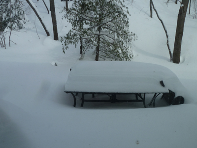
That’s our deck furniture…a table and a tipped over chair (blown over by the wind). That looks like AT LEAST two feet, doesn’t it???? The neighbors across the street:

Don’t pity them too much. They hire a service to come and clear out the driveway and the sidewalks, etc. Our service was my husband, who unburied us…maybe we’ll hire someone to do it next time? (eh, honey?) Pshaw! What’s the fun of being a New Englander if you can’t gripe about the weather whilst heaving wet heavy snow over a five foot wall of ice? Needless to say, I was going postal with cabin fever. At least we didn’t lose power…I would have just stayed in bed all day if we had! (just kidding, honeeey!!!)
The following weekend, my son and I walked through the blustering cold to a nearby friend’s house for his birthday party. It was so fun, albeit total chaos: twenty kids tearing around the house screaming while shoving cheese and crackers into their mouths. My son, so practical, gave me his half eaten crackers/cheese to hold so that he could run around more easily. Everytime someone introduced themselves and shook my hand, they ended up with a palmful of crumbs. I had a glass of sangria to get me through it.
One of the activities for the kids was to make paper bag puppets. You know…like the ones that advertise Fandango:

Notice that his nose is a croissant. You can see the ad here. Ridiculous right? Anyway, the kids made paper bag puppets. Can you guess what the theme of the party was?

No, that’s NOT a woman in a niqab. It’s a NINJA! Isn’t that hilarious and adorable????? Like THIS:

But not like THIS:

Luckily, our kids haven’t gotten into this level of commercialism yet. Coincidentally, NPR did a segment recently on the history of ninjas. You can listen to it here. I learned that ninjas were meant to be spies, not so much warriors. And definitely not turtles. There is no mention of turtles being ninjas in Japan in the 15th century. You have to wait until the 20th century in the U.S.A. Well, AT LEAST the kids learned the names of famous artists: Leonardo, Raphael, Donatello, and Michelangelo! Too bad that they think they’re turtles with nunchucks (or “nunchuku” for you purists out there…)
With every day that passes, I’m more convinced that we’re all going to hell in a handbasket.
As I managed to get out of the house this week, I went to Brickbottom Gallery in Somerville to see a show that my advisor is participating in. The show is, “Surface Matters: Exploring the Sense and Substance of Paint.” It features the works of: Adria Arch (my advisor), Ron Brunelle, Jessie Morgan, and Diane Novetsky. I have some images from the show:
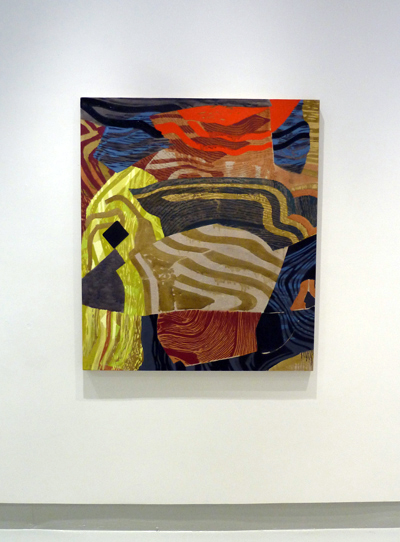
Adria Arch, Exhale 2, Acrylic on panel
This is the work of my advisor! She works with other people’s doodles, manipulating and arranging them into new colors and configurations. It’s like a graphic language of the subconscious. Fascinating! More:

Adria Arch, Triangle Tangle, Acrylic on panel
This is a very large diptych. I LOVED the colors in this one and the repetition of the shapes at different scales, colors, and layers. These panels are built up a bit, almost like the layers of encaustic, but with acrylics.
Next:

Jessie Morgan, Night Tide #925, Mixed media on plexi
This artist had a really interesting process of somehow squeegeeing large swaths of color on slick plexi. The ridges of paint are visible, and it seems that she uses both sides of the plexi. The colors in this piece are gorgeous. You can’t tell from the photo, but there are subtle horizontal bands of a pale green that are embedded behind the dark vertical layers. This is a rather large piece…maybe 48″x48″?
Next:

Ron Brunelle, You Speak My Language, Acrylic on wood panel
This work also had the look of encaustic. He gets and amazing amount of layering and color in his work. His work also made me think of the rich and saturated hues of ceramic glazes.
All of the artists have visual depth/layering in their works, without necessarily building up a lot on the panel surface. I think that they’ve all honed some interesting techniques. I really enjoyed this show…so go see it if you’re in Somerville!

Ahh…Somerville. How I miss your grittiness. This was nearby the gallery. You might want to bring a ninja with you if you go after dark. If you don’t have an actual ninja to bring (who does?), you’ll have to channel your “inner ninja,” whatever that is…
Just sayin’.
Happy Thanksgiving, all! I had a lovely holiday with my husband’s family. We have plenty to be thankful for…friends, family, our health, our homes, and food on the table. We also made it though Sandy without much trouble, which can’t be said for a great many people on the East Coast. Not to be morose, but you can see an interactive map that the NY Times has made here of all of the fatalities. It’s unbelievable. So lucky, we are. (excuse the Yoda talk)
I also managed NOT to eat my weight in food on Thursday, which is a slight miracle…(although I think that peppermint Jo Joes cookies are now at Trader Joe’s…SAVE ME FROM THEM!!!) Not only was my restrained eating a miracle, but…
I ALSO GOT TO ESCAPE TO NYC/BROOKLYN ON TUES/WED!!! WOO HOO!!!!! I kid you NOT! I had to scramble to NYC for the LAST day that my friend had his show up at Agora Gallery in Chelsea. Here are some views:

And more:

OOOOO! I love those last three together. Here is a closeup of one of them:

These paintings are influenced by traditional sari fabric. George is from Kerala, and this inspires much of his work. (what inspires my work? How much I loathe Stop & Shop? But I digress…) Please check out his website, as my photography is shoddy. I was planning on attending the opening, but we had a snowy Nor’easter that day…so it wasn’t in the cards. This show was a big deal, as it’s not every day that one gets artwork in a NYC gallery…WOOT WOOT, George!!!
In my wanderings…here is another artist whom I also found in Agora Gallery:

I really liked her work as well. She was using watercolor on stretched canvas. Detail:

Dreamy! I love the areas of white in the painting. More:

Nice! Aren’t these amazing???
Apparently, lots of galleries in Chelsea are closed because of “super storm Sandy”. There was lots of flooding. Luckily, I did get to Pace Gallery to see the Chuck Close exhibit. A-MA-ZING! Check it out:

Okay. We’re ALL familiar with these works. But sometimes, we think that we know a work just by seeing it in print or on the web frequently. I felt that I had seen lots of Chuck Close’s works, so I wouldn’t be too surprised with what I saw. NOT SO. Seeing these works in person really blows your mind. GENIUS. PURE GENIUS. Just look at these series of self-portraits:

No, those aren’t digital manipulations of photographs. They are paintings. (I know that you know that.) But try to think that when painting these, he could only be at arm’s length to do it. So, he didn’t see this while working:

He saw THIS while working:

I know. Mind boggling, right???? My brain cannot process how he does this. He is totally a master of color mixing. Scroll up again to look at the paintings from a distance. Crazy, right??? I truly could have sat there all day staring at these (especially with a box of mint jo joes). I bask in his brilliance. I need to get out of the suburbs more often. Nothing like this is EVER at Stop & Shop. (and I’ve LOOKED, trust me…)
That evening…a friend’s restaurant was opening in Brooklyn: Root Hill Burger in Park Slope. If you live in the area, please go! I had the p01 burger…DELICIOUS! They also make yummy milkshakes too. Perhaps it was because we eat primarily vegan at home that the burger tasted other-worldly to me? Hmm. Nah. I am wondering if they deliver to Massachusetts, though…
Speaking of other worldly…my luck doesn’t end there! On Wednesday, I got to go to the BROOKLYN MUSEUM!

I had never been there before! I was going to see the work of Mickalene Thomas. But, before I GUSH about her work, I also saw some gorgeous work by Duron Jackson:

Duron Jackson at the Brooklyn Museum
Holy cow…this is GRAPHITE!!! Is it not the most GORGEOUS thing you’ve ever seen??? My photo is terrible. He’s also a genius. Can pencil on black be any more astounding? I think not. The shape is the outline of a jail, somewhere in the US. I apologize for not getting the title. He has a whole series of these drawings, and they are SPECTACULAR. Go. See. Now.
I’m just going to post some images of other cool stuff on exhibit (whilst I fantasize about mint jo joes):

Portrait by Alice Neel
Alice Neel is my portrait hero. I love her work. I was first introduced to her work by a drawing teacher of mine. Please look at her website to see more of what she does. Incredible. Next:

Jean-Michel Othoniel, Precious Stonewall, 2010
This is enormous and it’s made of GLASS. Othoniel had a wide variety of works in glass. Really astounding works. Look at these larger than life necklaces:

Jean-Michel Othoniel, Large Double Lacan’s Knot, 2011 (foreground) /
Lacan’s Knot, 2009 (background)
Also enormous…I can’t imagine how much they must weigh. They were pretty dramatic. I actually like this one better:

Jean-Michel Othoniel, Black is Beautiful, 2003
I like that better because I can really feel the weight of these beads. The previous ones feel odd to me, as they are clearly heavy beads, but the formation appears too weightless. So, my preference is the latter…it’s beautiful.
Okay, so NOW onto MICKALENE THOMAS!!!!!!!! Brace yourself…she rocks.

Mickalene Thomas, Interior: Blue Couch with Green Owl, 2012
LOVE IT!!!!! She has done a huge series of collages of what looks like trendy, 60s interiors. Then, she translates these collages into ENORMOUS paintings on panels with…(wait for it)…RHINESTONES. They are BEDAZZLED, and they are awesome.

Mickalene Thomas, Interor: Green and White Couch, 2012
Sooooo brilliant. She even outlines some of what must be the cut edges of the collage with rhinestones. These interiors are fractured, sometimes flat, sometimes appearing to have depth, with jarring color palettes. This is a detail:

Mickalene Thomas
And here is the original collage:

Mickalene Thomas
I’m so sad that my lousy pictures are NOT doing her works justice. BOO HOO!
Not only did she have paintings of interiors…she also CREATED interiors:

Mickalene Thomas
These “installations” were really amazing too. She creates so much cultural weight with these scenes. They are also collages, much like her paintings. I loved how her visions have become “real” in these works. My living room is just like that, except less hip and with Lego all over the floor…really similar.
Beyond her interiors, she has also done phenomenal paintings of women:

Mickalene Thomas, Le Dejeuner sur L’Herbe: Les Trois Femmes Noires, 2012
This work is enormous and astounding. I’m sorry that this tiny image can do it no justice. This painting is a “restaging” of Manet’s painting, Le Dejeuner sur L’herbe:

Manet, Le Dejeuner sur L’herbe, 1863
Brilliant! Here is a detail of Mickalene’s painting:

Mickalene Thomas
Here’s what I love about her work, and about art in general. I love that (in spite of her riff on Manet), I feel that I haven’t seen this before. I’m sure some of you are thinking…”duh, it looks like so-and-so”. Fine. But, for me, I was in AWE of the world that they created…a world that I CLEARLY am no part of. But her works allow me a glimpse into it…which I also love.
This is my thinking on her work (which may be wrong, as I am no art critic): All of her women appear simultaneously “powerful” and “feminine” to me. This is what feminine power can look like. Not to be misandric, but I love that no men appear in any of her works. Her work does not need to speak about women in reference/relation/contrast/comparison to men (see the Manet above). Her work exists in a world that eschews men. Men are only part of the diminutive audience that are fixed in the powerful gaze of her subjects. Somehow, I feel that a “YOU GO GIRL!” is in order. Is that too suburban of me???? Probably. (sigh)
I need to try to channel these powerful women as I go about my day…picking up legos…buying cheddar goldfish crackers at Stop & Shop…and cursing at myself for forgetting my grocery list.
She’s a genius. I bask in her glittery glory.
Filed under: Drawing, Fleeting thoughts..., painting, travel | Tags: art, berkshires
Yes, we’re bracing ourselves for hurricane Sandy. She’s a-comin’, and no one is looking forward to her arrival. How have I prepared? Umm…I bought a couple of cans of soup? It turns out there are no more D batteries for sale in the entire state. Considering that my 4 yr old son LOVES to play with our ONLY flashlight, we may be in for some lighting “challenges” here when we lose power. I’m also thinking of the general domestic challenge to be locked in the house all day with my 4 yr old. I may have to be like Odysseus and lash myself to the bannister outside the house just to get some “me” time in the midst of this “epic” storm. Did I mention that my son also has a raging cold? Ah yes…there’s a storm of viruses swirling around in the house from his hacking and sneezing. Blech. I can practically FEEL my white blood cells reeling from the onslaught of germs. I think that if there ever is “germ warfare” against our country, it will be the parents and teachers of preschoolers that have a chance of survival from our “special forces” immune system. My throat does feel scratchy. I’m not sure if that’s because I’m getting sick, or if it’s because I just ate a gross quantity of Trader Joe’s “pirate’s booty.” (puffed corn blobs covered with powdered white cheddar….YUMMY!) But I digress…actually, I haven’t really even gotten started yet. Sigh.
ANYHOO, this weekend…my husband and I took our yearly pilgrimage to the Berkshires to the Lodge where we were married. I love going there…it’s so laid back and idyllic. Did I mention that my mother watched my son for the weekend? Yes, we were kid-free for 48 hrs. Did I also mention that my son decided to sleep in until 8am this morning? His normal time to wake up is 5:30. WHY does he sleep in ONLY for Grandma??? But I digress, again.

Doesn’t that look peaceful and dreamy? I love the Berkshires.
One of the decadent things about going to the Berkshires is going to Mass MOCA. This is a large contemporary art museum in a renovated complex of factory buildings. I have to say, I really loved quite a bit of what I saw there on this visit. I’ve got photos of the highlights to share with you. The current exhibition is focused on Canadian contemporary art.

Bloodie is Born, and Born Again, 2009
Angel Trumpet Flower of Death, 2008
Wow. I LOVED these paintings. They are ink and gouache on paper, and they are GORGEOUS. I know that the imagery is disturbing, but I thought that her work was stunning. They have the look of historic book illustrations, but the scenes are bizarre. Her minimal use of color in the predominantly B&W paintings was amazing. I’m a big fan. (Hint. Hint. Just in case any of you have started your holiday shopping early!)
Joking, of course.

Etienne Zack, Silent Frames, 2011, Oil on Linen
This painting was over 8’x12′ in size. It was stunning. I really could have looked at it all day. I love the scene, the color palette, the space she creates, the odd moonlit feeling of it…so gorgeous. It’s hard to tell from this photo, but she also had elements like the wood posts with transparent reddish ghosts of the forms nearby, which almost made the image look like a manipulated photograph in a way. So incredibly brilliant.

Clay slab, 2007, watercolor on paper
Paper #2, 2007, watercolor on paper.
Yes, read that again. Those are WATERCOLORS… and they are BIG. Each one is around 3’x4′. I especially love “Clay Slab.” It’s gorgeous. You can almost feel the cold, wetness of the clay, right? These were outrageously stunning. His technical skill was also mind boggling. I love the limited palette and hyper-real quality. I’m telling you…GO. SEE. THIS. SHOW. NOW. Next:

Chris Millar, 370H55V, 2011, mixed media
This was fantastic. Here is a detail:

Chris Millar, 370H55V, 2011, mixed media (detail)
This was outrageous and amazing. I used to have a fascination with miniature things, and this sculpture was the EPITOME of the kind of miniscule things that I used to love. Here, though, it’s a freestanding agglomeration of childhood curiosities and total excess. I LOVED it. It’s hard for me to know what to say, but it seriously held both nostalgia and joy for me…as if I was stepping into some forgotten recess of my childhood. It’s made so much more perfect with that galaxy background that he created. Sheer genius. Here is another of his works:

Chris Millar, Uncharted Galvanized Hut, 2008, acrylic on canvas
This was also amazing. Again, I loved the density of it. The other thing was that it had almost a 3D/embossed look to it, where different elements were raised and layered upon other elements. It was almost like a painting decoupage. This artist just oozes brilliance.

Uncharted 4 (2011), Uncharted 2 (2011-12), Uncharted 1 (2011-12)
Uncharted 5 (2011-12), Uncharted 3 (2011-12), Uncharted 6 (2011-12)
All are acrylic on panel
Okay. I love her work. It’s SO architectural, but not stuffy or static. I’ve seen her works before at the DeCordova Museum, but this work is even better (IMHO). I love the collage-feel, the layering, and the enormous depth and dimensionality that she creates. These crazy constructs float in a field of color, like some kind of vignettes of part of a building or part of an experience. Gorgeous.

I included this photo just so that you can get a sense of the scale of some of the rooms at Mass MOCA. This room is enormous. See that blurry thing floating halfway up the wall at the end? This is what it is:

Hmm. No comment.
I must admit, I have been to Mass Moca many times, but there has only been one time when I truly loved what an artist did with that huge space. Ann Hamilton is an installation artist whose work was titled, Corpus. Here is the exhibition catalog. She truly made the space into a work of art. She had several tall reams of 8 1/2″ x 11″ paper up at the rafters in different locations. Then, a robot/machine would move along some tracks to a stack of paper, pick up the top paper with suction, then drive back over to a random point on the tracks and then with a “puff” sound…drop the paper to the ground. The entire floor was covered with the paper, and random pieces would be falling intermittently around you. In addition, she had a grid of megaphone shaped speakers which would descend in unison to the floor, then raise again. I can’t remember the sound coming from the speakers, but I remember the “puff” sound when the robot would release the paper. Oh yeah..the windows were all tinted pink. It was brilliant.
Mass MOCA has other amazing spaces:

This sliver of space separates is also amazing. Look at the brickwork! Crazy. The grand finale is, of course, Sol LeWitt.

His work is located on three floors, with the early works on the lowest floors, and then you progress upwards to more recent work. This man could do anything with geometry. I love that triangle wall.

While I loved the walls with the eye-pain inducing colors, I was really drawn to the walls of graphite drawing:

Yes, those are graphite drawings. On the walls. Closer:

Mindblowing, right? These drawings (or whatever I should call them) are stunning. Such beauty in their chaos and order! More:

I know that I’m obviously enamored with graphite, as it’s the medium that I’ve chosen to grapple with. These works really elevate graphite to stratospheric levels. It makes me want to grab a pencil and start scribbling on the walls (at home, of course.) But, as I can’t do that while telling my son that he’s not allowed to, I’ll just have to restrain myself. If you feel that this whole post has been a parade of superlatives, check out the last work that was in an alcove next to these LeWitt masterpieces:

I can’t remember if the title of this was, “Bucket and Mop, Alone at Last“, or “I Thought You Loved Me?“, or “Everything Filthy Must be Mine.” JUST KIDDING! This really was just a mop and bucket in the corner. Fooled ya, right? Just keeping you on your toes…seeing if you were paying attention or daydreaming about all of the better things that you could be doing with your time besides actually READING this blog.
I’m going to post this now before we lose power from raging SANDY. Feel free to send me care packages. I’m partial to cookies and pirate’s booty.
Filed under: Drawing, Fleeting thoughts..., painting | Tags: architecture, art, drawing, Pencil
You know that it’s going to be a snoozefest if I can’t even come up with a title for this post. Why bother with a title, you ask? Or, why bother with this post? WELL…if I asked myself THAT question too often, I wouldn’t get out of bed in the morning. So…why not? (has anyone out there been to “Perche No” in Florence, Italy? two words: bacio gelato…but i digress)
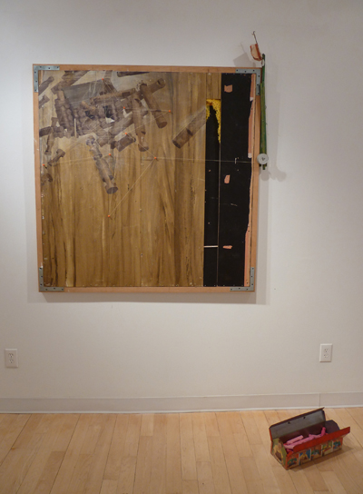
So, this week, I’ve been slaving over a drawing that I’m not sure is really turning out too well. I’m trying to use a different medium. Normally, I use graphite on Duralar. THIS WEEK, however, my advisor suggested that I coat some cradled plywood with absorbent ground, and draw on that. WELL. I think that if I was better at PAINTING…and could have applied a SMOOTH layer of absorbent ground…then this might have been more successful. (notice how I deflect the cause of the problem to the board, and not me) Here it is:

Okay…it’s NOT done yet. Still…I think that it still may be a bit off. I’ve changed the vantage of my usual still life subject so that you can better see the impact of the hammer on the pear. Do you think that it’s effective? Or, is it just weird? Actually, don’t answer that. Nevermind. Perhaps when I finish it, it will feel ok. Here is a side view, so you can see the board that I’m drawing on:

HMM! It’s so different than the thin and translucent Duralar…
We visited some friends over the long weekend who have a fantabulous house on Cape Cod. Yes, it’s true. Not only do they have a HOUSE there…but it’s dreamy as well. In all honesty…after just three days in that house/with those friends/at the Cape, I felt so refreshed. That’s amazing when you consider that my 4 yr old son and their 4 yr old son played the entire time. In other words: shrieking laughter whilst the boys throw things at mating horseshoe crabs, etc. Luckily, we weren’t thrown out by the Audubon “crab copulation” police. If there are fewer horseshoe crabs next year, it’s because our kids distrupted their love-fest. It’s so refreshing to take a break from helicopter parenting, and just say “who cares?”
ANYWAY…that weekend made me fantasize about my own dreamy house. Here is what our house looks like:

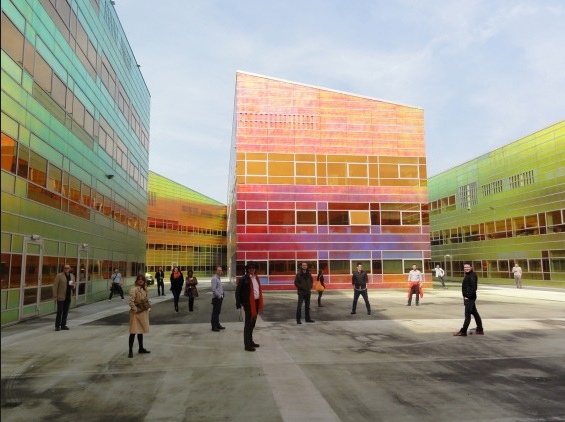
Pretty typical, huh? It has painted white shingles…a stone foundation…brick steps…original, dilapidated windows…you know, the norm. It’s a very sweet house. (“sweet” is a euphemism for “tiny”) But, I’m NOT complaining…it’s really lovely. We’re sooo lucky to have it. BUT…wouldn’t it be NEATO to live in a more modern house, like THIS one???

Servie Boetzkes and Jeroen Helder
Isn’t it GREAT???? No, I don’t think that it’s Darth Vader’s European hideout, thankyouverymuch. This house is designed by Boetzkes and Helder. OF COURSE, it’s in the Netherlands…not the ‘burbs of Boston. Here is a closeup of the metal panel exterior:

DREAMY! Or, as I used to say when I was working as an architect: BUTTERY! (that’s not a technical term, fyi)
I have no artwork completed by my son to show you. I know. That’s why you read this blog, isn’t it? If that’s not why, then I’m not sure what’s left, honestly. ANYHOO, here is the work of an uber-talented artist you should look at:

This is the work of German street artist, EVOL. Umm…that’s a painting…on a piece of scrap cardboard. SCRAP CARDBOARD…for Lord’s sake. Here I am, whining about working on cradled plywood…and he’s making crazy paintings out of cardboard. Here’s another:

Are. You. Kidding. Me.
Sigh. I’d love to have that on the wall of my Darth Vader house at the Cape.
This week, I had a fun evening of cocktails AND painting with my best friend. IT WAS SO MUCH FUN! I’m not kidding. We went to Palettes in Natick. Here’s how it works: You sign up to take “a class,” where an instructor leads the group in doing a painting…step-by-step. I know. You art snobs out there have already clicked “close” on this window, right? BUT WAIT!!! How much fun is it to MINDLESSLY work on a painting, and just enjoy the act of blobbing on bright colors (with a caipirinha in hand, mind you)??? SO much fun. Here’s the painting that a roomful of people painted simultaneously:

(I will explain why it’s so blurry in a minute)
Now, I would NEVER have painted this if left to my own devices. BUT, I found it really freeing to let go of all expectations, and just paint. One other thing that made it interesting was walking around the room to see each person’s version of this SAME painting. Notice how narrow my boat is…in comparison, my friend’s boat was wide. I found this to be a metaphor for our personalities…she is warm and open, and I am crabby and sullen. No? Well, I think that I’m onto something…
Okay, now why the image is so blurry:
I have a four-year old son.
Need I say more? I walked by the dining room table this week, noticed my camera sitting unusually close to him. He also had a rather guilty expression on his face. The camera looked fine, so I didn’t say anything. Well…now, as you can see, my Leica lens is now coated with one or all of the following: 1.maple syrup, 2. saliva, 3. rice milk, 4. chewed up waffle. While I think that the lens may be pretty much ruined, I think that I now have a “fuzzy filter” lens, which can likely take very flattering portraits. I may have a career opporunity in either taking fuzzy photos, or letting my son ruin other people’s cameras so that they too can have “soft focus” photos. Sigh.
I think that my motto as a parent is just that: “sigh”
We made a miniature living room set out of playdoh this week:

I tried to convince him to do a “low arm” sofa, but he insisted on “english arms.” Go figure.
I think that I finished that drawing from last week:

Looks better, right? (you must agree with me, lest I be offended) I was toying around with the idea of drawing these in charcoal, but do you know what?
CHARCOAL IS MESSY.
I’m sure that’s my lack of skill with charcoal, but jeez…that sooty black dust gets EVERYWHERE. I am already a messy person, so I’m not sure that using a messy medium is the way to go. I’m kind of asking for trouble, I think. People will see me coated with black dust in the grocery store and wonder if I am a chimney sweep. “Oh no,” I’ll say, “I’m an ah-tist!” Weird looks will abound. I still getting used to the odd looks that I get from the employees in either hardware stores, or Home Depot. I’m not sure that I want to add odd looks from grocery store clerks as well…especially as they can be a rather odd lot themselves. (I apologize if anyone reading this is a grocery store clerk…perhaps that’s true just in our town.)
I am also sorry for any of you looking for a somewhat serious discussion about art this week. I got nuthin’. Check out this blog, for thoughtful insights and discussions about the art world:
http://joannemattera.blogspot.com/
Joanne Mattera is an uber-talented encaustic artist. She does beautiful work, and she generously writes a fabulous art blog. READ IT! NOW! While her blog would be likened to a gourmet meal, mine is more similar to a bag of Cheetos.
Sigh.
Filed under: Fleeting thoughts..., painting | Tags: Institute of Contemporary Art Boston
So, this week was NOT productive for my drawings. So be it. It was kind of an R & D, lateral exploration week. I stole away on Sunday afternoon to the ICA…a blustery, grey day. BUT, I was thrilled with what I found within:

This is the amazing work of Charline von Heyl. I LOVED IT. If you’re in the Boston area…please go see it. I found her work to be really “new” to me. I absolutely love the layering of different textures…bright, flat color vs. scratched dull color vs. drips vs. “objects”, etc etc. The other astounding thing was her layering. Her layers weren’t flat stratas at all. Elements slipped behind one another so that the overall effect was woven, rather than stacked. I loved the feeling of this push/pull in the work. Her fearless color sensibilities were also thrilling. This is not a show that you will walk through quickly. I feel as if each work could be pondered for hours. I may have to go back again when I have more time, so that I can just sit there and let each work steep a bit in my mind…too bad they don’t have barcaloungers over there…
After finishing that last drawing, I jumped back to sewing in order to finish up the dress that I started ages ago. So…here it is:

Cute, right? Look at the angled hem…Back:

I’m so happy with it! I love how it turned out…and I don’t think that I look too much like a hippie, which is good. I thought that this was a very “modern” type of tie dye fabric…and see how I got the spots to match around the dress! Not bad, eh! The back is actually three separate pieces of fabric. Anyhoo…I’m using the success of this dress to make up for the fact that I’ve drawn nothing this week. Did I mention that I went to Stop & Shop TWICE in one day? Yes. I am in total domestic hell.
Speaking of drawing…here is the latest creation by my son:

He tells me that these are microscopic views of either a CD or a microchip…I can’t remember. So cute! It reminds me of this sun chart thingy that we had to use in grad school:

This is so you can track the movement of the sun through the sky at different times of the year. I guess that might come in handy when siting a building…I didn’t use it ever again. That was back when we actually had drafting tables. CAN YOU IMAGINE??? No, we didn’t have to mine our own pencils, or pluck a goose feather to do our ink drawings…but it feels THAT ancient to me now. And look…I’ve come “full circle”, and I am back drawing with a pencil again. Should that realization make me happy, or depressed? A little bit of both, actually. Okay, so here’s a happy thought to end this post:
![]()
This fuzzy photo is my son’s fuzzy blanket, which he adores. We were playing tea party / picnic with it. He told me that he plans to have this blanket when he is 45, and he’ll use it as a tablecloth. SERIOUSLY. Hmm…I’m actually not sure if that idea is happy after all! Hmm! I suppose as long as he isn’t living in our basement, I’ll forgive him for having the blanket at 45? Ok, forget it. The blanket at 45 IS depressing…
