Filed under: Fleeting thoughts..., printmaking | Tags: art, Collage, painting, printmaking, Visual Arts
So, I didn’t hear from many on you on my question regarding posting EVERY DAY. Perhaps I should interpret your silence as polite pleading not to innundate you with posts.
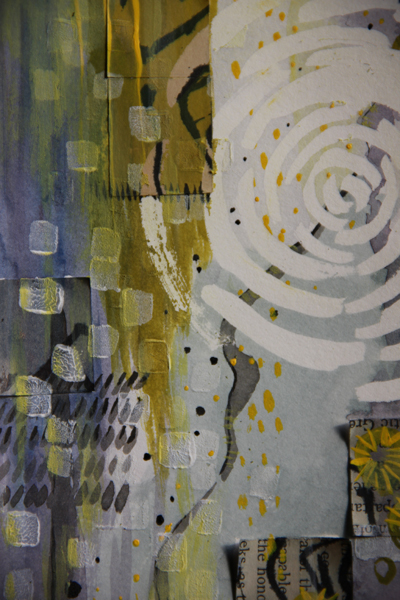
Clearly, I’m ignoring this for now. The first image is my 365 creation from yesterday. It’s so much better to photograph with sunlight.
detail:
This was obviously a departure from the printmaking stuff. Well, I take that back…as that isn’t really obvious. This was a collage/painting.
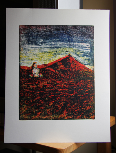
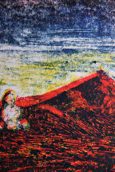
I also took another stab at another print in the series of the cartoonish guy. It turned out so-so…I took away too much red ink.
detail:
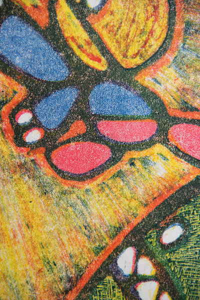
I’m not sure that I have much more to say with him. We’ll see. Here is a print using yet ANOTHER type of ink…oil based:
detail:
I wasn’t too thrilled with it. I think that the general technique has some interesting possibilities (if I was Picasso), but I’m going to have to try again.
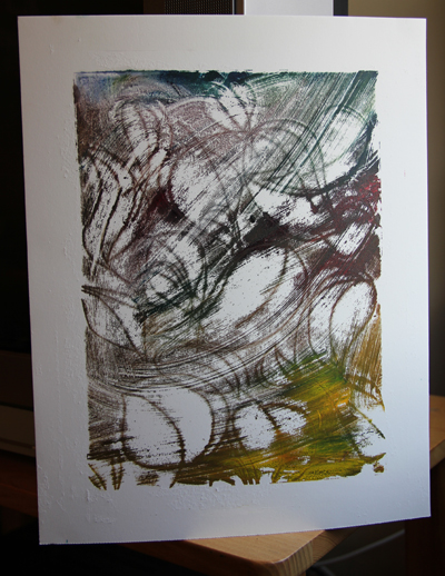
Here are a couple of experiments:
I photoshopped out two big smudges in the margins of this last one. I know. That’s kind of cheating. If I wasn’t so sloppy, I wouldn’t have to do that!
Thumbs up? Down? No comment? I am so looking forward to my classes, as I feel that I am fumbling around with a lot of these printmaking materials. Also, feedback from my teacher/classmates will be good (or OTHERS…hint..hint).
🙂
5 Comments so far
Leave a comment




The first two prints are very beautiful, especially the first one. They make you stare and stare at them and they get richer. Glad to see the Little Guy is still on the agenda!!! He has a lot of potential, I think.
Comment by Jean Kostojohn January 4, 2011 @ 7:16 pmOh, thanks! The second image is just a detail of the first image. It’s a small painting with some collage elements. It was fun. Yes, the little guy continues on…
Comment by slightlywonky January 4, 2011 @ 10:01 pmI LOVE the collage, very you. The yellows and gentle grays are soothing yet invigorating. The soft, circular patterns juxtapose nicely with the geometric, harder squares of newsprint. I also love Atlas, he’s my pal. I feel like him (and the big green ball with angry teeth gets a different name each day, today it’s Smithsonian Writing Deadline). I find the third print very heavy, dark and foreboding. What a contrast to the first. The ghostly hand with bunsen burner reminds me of something from Westover, I dig it!
Comment by growingmuses January 4, 2011 @ 10:39 pmThank you! Yes, the third one was using this new oil-based ink that was really heavy/dense/thick/challenging. I was surprised at how dark it was too! Back to the drawing board, or printing plate, or whatever…
Good luck on your deadline…kick some writing butt! 😛
Comment by slightlywonky January 4, 2011 @ 10:53 pmI love your idea of 365, be be a copycat(ish), would,nt want a posting every day, perhaps 3/4 a week.
Comment by Amanda J Wells January 5, 2011 @ 5:08 amThanks for the inspiration
Amanda