Filed under: printmaking | Tags: art, artist, Brayer, cmyk, lithography, Paper, photo, print, printmaking, visual art
Okay, my internet connection hiccuped, and I’m writing this for the second time. Grr.
So, I finished the pronto prints that I started last week. I had to print each CMYK on a different day, to let the ink dry. I also tried out three types of paper, to see which I liked best. After doing all of this, I thought of a fourth type of paper that I think will work great, but too late! Next time…
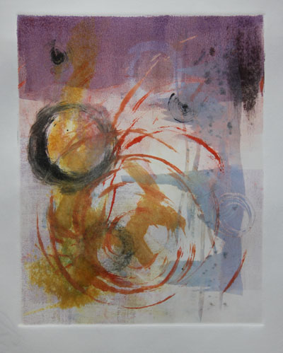
This is printed on paper #1 (Rives lightweight):
This paper worked fairly well, but it’s wrinkled. I’ll have to experiment to see if I can flatten it.
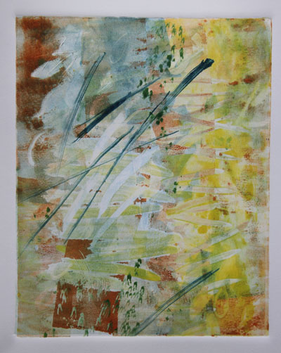
Here is paper #2 (Arches 88):
This paper is smooth, and picks up the ink well. Unfortunately, the paper isn’t sized, so it doesn’t react well with the wet pronto plate. Oh well.
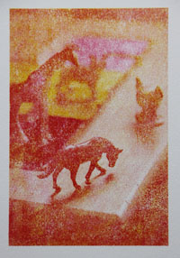
Here is paper #3 (Rives BFK):
Not great, as this paper has too much tooth.
Also, I just ordered a larger brayer, which should help enormously. Right now, I’m working with the tiny speedball brayers. As a result, there are always lots of brayer marks on the prints, as I can’t roll over the image in one motion completely. I have to go over it twice, and the circumference of the brayer is also too small. SO! We’ll see what happens when I get the bigger brayer, and try on a different paper. One other thing that I think: this image has only part of it in focus, the rest is out of focus. This looks cool as a photo, but I’m not sure if it works with this type of printing, as it just ends up looking too blurry. Next time, I’m going to use an image that is all in focus, to see if that looks better. These aren’t supposed to be exactly photographic. (If I wanted that, I would just print it on my inkjet!)
This weekend, I went to the Craft Fair held by the Boston Society of Arts & Crafts. So amazing! So much gorgeous stuff. Lots of beautiful pottery, clothes, jewelry. Needless to say…I got a sandwich there, that’s about it. Maybe I’ll start to save up, and get something spectacular in 2015.
Filed under: printmaking | Tags: art, artist, CMYK color model, Ink, Paper, print, printmaking, visual art, Woodcut
I’m working again with pronto prints and my previous woodcut. I’ve been scheming ways to make registration for the CMYK pronto prints work better. My latest attempt may be good. I managed to register the yellow and magenta layers. Here they are:
I’m also experimenting with three types of paper. The paper on the right is Arches 88, an unsized paper…very absorptive. This isn’t such a great quality with the way that I’m doing these prints, as the area around the print gets wet from the plate, and this causes the surface of the paper to deform from the moisture. Hmmm. The other two papers are better in this regard, but I think that because they are sized and have more of a texture, they don’t take the ink as well. Here’s a close up:
I also changed the halftone lines per inch, to make it less fine grain. I have to balance clarity of printing (as pronto plates like distinct black/white), and clarity of image (fewer/larger dots=more abstract/blurry print). Hmmm! I think that the cyan layer, which I hope to do this weekend, will be revealing…
I am printing the woodcut on grey paper. This is a heavy paper, unlike the fine Japanese papers in my previous post. I have to let the first layer dry before putting on the second layer…I also switched inks again. I know…I keep changing all of the variables! I am quickly running out of space for all of these prints. I need to devise some safe storage system.
There are some sparse snowflakes blowing around outside right now. I really hope that they don’t amount to anything. Maybe I should make some prints about snow angst? The flakes are almost like white gnats bumping around…shoo! Go away! I’m tired of my boots/hat/gloves/scarf ensemble! 🙂
Filed under: printmaking | Tags: art, artist, Ink, lithography, print, printmaking, pronto print
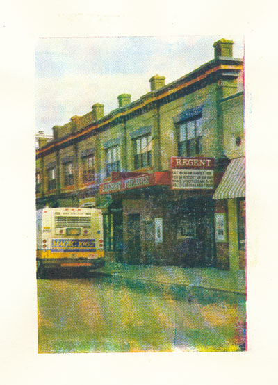
So, I printed a pronto print this evening. This is a type of lithography, where one uses a polyester sheet as a plate. Then, an image is put on the plate, either by laser printer/copier, or by hand. THEN, when this plate is wet with a solution of gum arabic and water… the oil based ink sticks only where the marks are. Confused yet? It’s very finicky. It takes some serious practice. It would also work a million times better if I had a press, but no luck. I had to hand burnish, which adds to the “wonky” character of the print. On a similar theme to my linocuts, this is an image of the local Regent Theater.
I know. You’re wondering why the colors are all bizarre. Well…the ink is happiest on clean, high contrast images. When you have some subtlety…then things get dicey. I printed each process color separately…CMYK. So, this is an attempt. I will try again another time…but it took around two hours to print this thing…just one print. SIGH. I kind of like it, though.
It actually snowed today. I know. Horrors. Big, fat snowflakes covered the yard…probably only 1/2″ or so. Still, it was distressing. I really thought that we were done with that for the season. It has been known to snow in April though…
Filed under: printmaking | Tags: art, craft, print, printmaking, Wood block, Woodcraft, woodcut print
This is turning out to be one of those somewhat unproductive days. I AM getting stuff done…but my brain is a bit scattered. If only my head had a restart button…
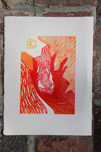
I did manage to get a print from the wood block. I’m not thrilled with it, so I’m going to bring it to class tonight, to ask how to make a better print. The ink is very blotchy, and not as transparent as I had hoped. Any feedback would be appreciated!
It’s a lovely day out, as you can see in the bright photo. I’m going to try to go to studio early, to print the new drypoint plates that I made. Wish me luck!

