

Filed under: Fleeting thoughts..., painting | Tags: art, candy, decordova, gummi, installation, painting, sculpture
On Tuesday, it was 54 degrees outside. Today, it’s 19. I’m moving to Florida. (just kidding…not that there’s anything wrong with Florida…)
This has been one of those weeks where I have had no free time, and yet it’s unclear what I’ve accomplished. I’ve done very little drawing, and my house is still a mess. Hmm. I think that I’m also going through a slight phase of S.A.D. (seasonal affected disorder.) Maybe I need to up the wattage of our lightbulbs around the house? Or maybe I just need more chocolate? Does anyone else out there feel slightly blue right now?????
Sometimes, I think that keeping up with the news doesn’t help. I’m a worrier, and the news provides endless fodder for my neurotic brain to chew on. Did you know that more and more small children are developing anorexia? No joke. I listened to it on NPR. HOW IS THIS POSSIBLE???? And it’s not those scary pageant queen mommies that are causing it. Now, I’m analyzing what I say about food in front of my son. Apparently, we shouldn’t say that there is “bad” food or “good” food. WHAT??? Really???
WELL, pshaw…my mother recently bought THIS disturbing item for my son:

Now, I ask you…is this not the POSTER CHILD of “bad” food????? Actually, I’m not sure that it qualifies as food at all! Whew! (Thanks, mom…) Perhaps I don’t have to worry about childhood anorexia when my son happily chews on sour gummi french fries??? Beyond gross. So, here I am fretting about buying organic fruit and BPA free tupperware, and meanwhile my kid is eating a gummi hamburger, gummi pizza, and a side order of gummi fries. Thank God it’s at least peanut and fat free… (They forgot to add “nutrition free” as well. I might have to write and tell them that…)
The thing is, I would have TOTALLY wanted this as a kid too. Actually, I had a tendency to choose anything colored blue: blue frosting, blue gum, blue italian ices. Gross, right? Well, in spite of my deviant dietary desires, I turned out “normal”, right? Hmm. Actually, SCRATCH THAT. NO BLUE FOOD ALLOWED, lest my son become a neurotic worrier like his mom.
The gummi “lunch bag” is kind of beyond the pale…pure, dietary evil.
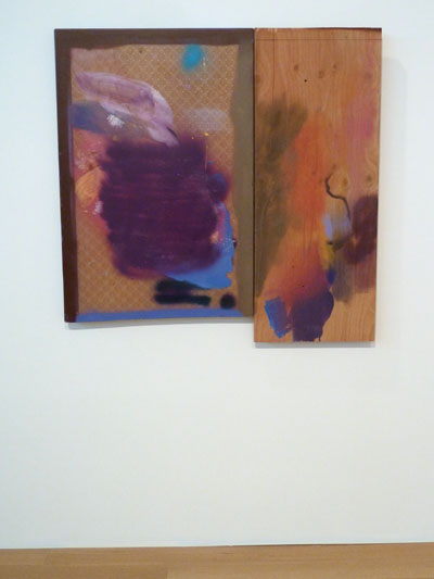
Okay enough about disgusting “food”…this week wasn’t a TOTAL waste. I did go to the Decordova Museum. That’s productive, right? Their current show is called, “PAINT THINGS: beyond the stretcher.” This was a pretty interesting show. All of the works are definitely “beyond the stretcher,” as there was a lot of paint…but a dearth of canvas. I really liked many things in the show.

Kate Gilmore, Like This, Before, 2013
This piece is the remains of a performance/painting/sculptural work by Kate Gilmore. In the performance (which you can see a video of adjacent to this piece), she is wearing a nondescript blouse, skirt and heels…typical office wear for women. She begins by ascending the ladder on the right while carrying a large vase filled with white paint. She walks across the top of the sculpture, sets down the vase, and climbs down a ladder on the left. She repeats this until the entire top has a row of paint filled vases on it. Then, one by one, she knocks over the vases (I think with her foot.) As each vase falls, it shatters and spills paint down the channels below. The paint runs through a hole at the bottom of each channel and fills another vase at the bottom. FASCINATING. I love that she’s wearing typical “office gal” clothes…and that she has to struggle to climb the ladder while carrying each vase…and that she has to carefully shimmy across the top without knocking down the other vases…and then she has to place her vase down and carefully climb down the other side. I love the struggle, the exertion, the care, and the destruction she conveys.

Steve Locke, Crossing Against, 2012
A very simple piece, but I loved what it does with form, light, and shadow. The palette is almost primary colors, but they are tweaked a bit. The face looks annoyed, but the leaning form implies a figure resting lazily against a wall. I love the reflected neon yellow in the shadow…it makes me think of inner heat or turmoil.

Mika Tajima, Furniture Art (series), 2011
These works are actually created with plexiglass box frames. BRILLIANT! I love how she has taken this totally mundane object and really played with it’s inherent characteristics and traditional role. Detail:

Mika Tajima, Furniture Art (detail), 2011
Aren’t the shadows amazing? You can see an interesting video of her here. I love how architectural a lot of her work is. Next:
Sarah Braman, In the Woods, 2012

Sarah, Braman, 8pm, 2011
These works were an interesting blend of materials, color and form. The lower piece, 8pm, actually has part of a camper in it. I like the mix of prefabricated elements with paint and other more “raw” materials, and the limited color palette. I also liked how she has painted In the Woods, as it almost has a three dimensional quality. Next:

Franklin Evans, paintthinks, 2013

Franklin Evans, paintthinks (detail), 2013
I love the excess of this installation. You can see in the detail photo the layer and layers of tape, colors, and photos. Next:

Katie Bell, Blind Impact, 2013
This was another interesting installation. It looks as if the materials found at a collapsed house have gathered together to be reborn as a new entity. Perhaps because of the geometry or how the piece creeps up the wall, there is a certain joy to this piece. Here is a view from the front:

Katie Bell, Blind Impact, 2013
No, the handrail at the bottom is not part of the piece. Don’t you love the composition? Next:

Claire Ashley, thing one / thing two, 2013
Amazing, right? I apologize to the artist as there are two works in this photo, and I don’t know which is which. The Decordova has this dramatically narrow and tall stairwell which often has incredible installation work. The ENORMOUS piece that runs up the wall is astounding. Claire Ashley seems to do these larger than life, bulging forms which both intimidate and excite.
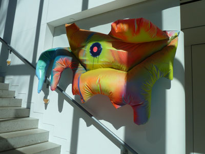
Claire Ashley, thing one / thing two, 2013
Isn’t that amazing? I love the colors. I love how these works have sort of infested the building, taking it over. I wish she had had a solo show, as I’d love to see a whole gallery full of her art. These pieces really do dwarf the viewer and gaze back with a disconcerting stare. Next:
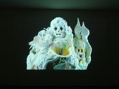
Allison Schulnik, Video still from Mound, 2011
This is a still from the amazing animation by Allison Schulnik. Her work is astounding. Please visit her website here, and go to the “video” heading to actually see these works. Plasticine figures erupt and morph into eerie creatures who are both engaging and disturbing. Look at that image! Don’t you love the starkness of the figure? Don’t you love how it’s both fascinating and unsettling? Please watch her videos. You must. I almost missed seeing them. If you go to the Decordova, they are on view in a room behind the desk at the entry. Go now. You must.
So, this was not a week of “minimalism”, unless you count how much tangible work I got done. Sigh. I may have to resign myself to gnawing on a gummy hot dog while I mope about looking for sunlight and something blue to nibble on. Send chocolate. Please.
Filed under: Fleeting thoughts..., painting | Tags: art, artist, gallery, Nemo, ninja, painting, snow, Somerville
Sorry for no post last week! I was adversely affected by Nemo: i.e. trapped indoors with nothing to do other than try to entertain a housebound 5 yr old whilst not destroying the house or my sanity. So, we did survive Nemo. It wasn’t pretty. Gobs of snow. This is the view of my husband’s excavation from the basement door…

Hmm. That’s kind of a lot of snow for one storm. This is our back deck:
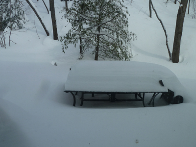
That’s our deck furniture…a table and a tipped over chair (blown over by the wind). That looks like AT LEAST two feet, doesn’t it???? The neighbors across the street:

Don’t pity them too much. They hire a service to come and clear out the driveway and the sidewalks, etc. Our service was my husband, who unburied us…maybe we’ll hire someone to do it next time? (eh, honey?) Pshaw! What’s the fun of being a New Englander if you can’t gripe about the weather whilst heaving wet heavy snow over a five foot wall of ice? Needless to say, I was going postal with cabin fever. At least we didn’t lose power…I would have just stayed in bed all day if we had! (just kidding, honeeey!!!)
The following weekend, my son and I walked through the blustering cold to a nearby friend’s house for his birthday party. It was so fun, albeit total chaos: twenty kids tearing around the house screaming while shoving cheese and crackers into their mouths. My son, so practical, gave me his half eaten crackers/cheese to hold so that he could run around more easily. Everytime someone introduced themselves and shook my hand, they ended up with a palmful of crumbs. I had a glass of sangria to get me through it.
One of the activities for the kids was to make paper bag puppets. You know…like the ones that advertise Fandango:

Notice that his nose is a croissant. You can see the ad here. Ridiculous right? Anyway, the kids made paper bag puppets. Can you guess what the theme of the party was?

No, that’s NOT a woman in a niqab. It’s a NINJA! Isn’t that hilarious and adorable????? Like THIS:

But not like THIS:

Luckily, our kids haven’t gotten into this level of commercialism yet. Coincidentally, NPR did a segment recently on the history of ninjas. You can listen to it here. I learned that ninjas were meant to be spies, not so much warriors. And definitely not turtles. There is no mention of turtles being ninjas in Japan in the 15th century. You have to wait until the 20th century in the U.S.A. Well, AT LEAST the kids learned the names of famous artists: Leonardo, Raphael, Donatello, and Michelangelo! Too bad that they think they’re turtles with nunchucks (or “nunchuku” for you purists out there…)
With every day that passes, I’m more convinced that we’re all going to hell in a handbasket.
As I managed to get out of the house this week, I went to Brickbottom Gallery in Somerville to see a show that my advisor is participating in. The show is, “Surface Matters: Exploring the Sense and Substance of Paint.” It features the works of: Adria Arch (my advisor), Ron Brunelle, Jessie Morgan, and Diane Novetsky. I have some images from the show:
Adria Arch, Exhale 2, Acrylic on panel
This is the work of my advisor! She works with other people’s doodles, manipulating and arranging them into new colors and configurations. It’s like a graphic language of the subconscious. Fascinating! More:

Adria Arch, Triangle Tangle, Acrylic on panel
This is a very large diptych. I LOVED the colors in this one and the repetition of the shapes at different scales, colors, and layers. These panels are built up a bit, almost like the layers of encaustic, but with acrylics.
Next:

Jessie Morgan, Night Tide #925, Mixed media on plexi
This artist had a really interesting process of somehow squeegeeing large swaths of color on slick plexi. The ridges of paint are visible, and it seems that she uses both sides of the plexi. The colors in this piece are gorgeous. You can’t tell from the photo, but there are subtle horizontal bands of a pale green that are embedded behind the dark vertical layers. This is a rather large piece…maybe 48″x48″?
Next:

Ron Brunelle, You Speak My Language, Acrylic on wood panel
This work also had the look of encaustic. He gets and amazing amount of layering and color in his work. His work also made me think of the rich and saturated hues of ceramic glazes.
All of the artists have visual depth/layering in their works, without necessarily building up a lot on the panel surface. I think that they’ve all honed some interesting techniques. I really enjoyed this show…so go see it if you’re in Somerville!

Ahh…Somerville. How I miss your grittiness. This was nearby the gallery. You might want to bring a ninja with you if you go after dark. If you don’t have an actual ninja to bring (who does?), you’ll have to channel your “inner ninja,” whatever that is…
Just sayin’.
Filed under: Drawing, Fleeting thoughts... | Tags: architecture, art, artist, drawing, Fimo, First Friday, painting, sculpture
Yes, you heard me. This latest drawing that I am working on is an example of me having bitten of more than I can chew. Because I am typically unhappy with a drawing until the final stages, I cannot bear to show you the “progress” images. Needless to say, I’m going to be working on this one for awhile. So, as I cannot entice you to read on with images of my own work…I’m going to digress into OTHER people’s work.
Last friday, a friend and I went to the South End’s “First Friday”, where all of the galleries are open for people to visit and schmooze. As I hardly know anyone, I was more of the former than the latter. I won’t go on about those that I didn’t like…but focus on one that I did. I LOVED the work of Peter Opheim at Steven Zevitas Gallery. Take a look:

You can see that this painting is enormous…8’x8′. It is beautifully done…and so wry. Opheim creates these little figures, and then does a painting of them. In the press release, it states, “…Opheim’s paintings function as sculpture, and he does not consider them to be pictures.” HMM! I could sit here for an hour pondering that one…but I don’t know if I would have a profound thought in response. HMM! (just one of the reasons why I am not an art critic). But, they aren’t sculptures, so what is there about the translation process from object to painting that is significant? I feel that I am working on similar thoughts. What is the difference between having full scale sculptures of these made, to having full scale color photos, to having these enormous paintings? I find that kind of thing to be FASCINATING. Overall, I found these paintings to be wonderful, humorous, and provocative. Bravo! Fimo elevated to Fine Art! I love being “confronted” by these little creatures. It’s as if a part of everyone’s childhood (unless you were allergic to clay, I suppose), has now come back to haunt us, or to make us wonder who we are. Seriously! I look at these and they immediately make me think, “who are we, really?”. Don’t you think that they’re like contemporary fetishes?

Maybe I need to cut back on the tofu again?
As I have none of my own work to show…I’m going to yet again showcase the work by my four-year old son. This is a beach scene, I am told:

Don’t you love how ORDERLY it is? Apparently, the tiny scribbles in the rectangles are items such as: a beach umbrella, his swimsuit, my husband’s swimsuit, my swimsuit, etc. I’m not sure where we are, but our clothes are there. The complicated part at the bottom is some kind of mechanism, but I forgot what. The other in this “series”:

I cannot remember what this is. The top part may be an antenna, but I’m not sure. Thoughts? What would Freud say? That I’m an awful mom? I really hope not. At least he’s not drawing those little crying faces in cages, as I showed in an earlier post. Now, THAT was worrisome…
Yesterday, I went to visit the building that I worked on before I quit my job to be a better mom. It was the ribbon cutting ceremony, so everyone who wasn’t involved in construction was getting to visit the building for the first time.

I was thrilled to see it complete. Finally. Every door was in place, every duct where it should be…and every detail realized. I had a tremendous mix of emotions. I was overjoyed to be finally walking around the building that I spent so many months slaving over. But I also felt a great amount of sadness as well.

I felt sad that this was not my world anymore. I felt sad that I had passed the construction of the project over to others. I knew that it was in good hands…but I still handed it over…let it go. There is nothing in architecture that is a solo endeavour. Everything is accomplished by an enormous team of people…from the donors, to the institution, to the facilities department, to the architects…engineers…contractor…lighting designer…food service consultant…geotech…and the list goes on. So, this isn’t “my” building by any stretch of the imagination. Still, it feels like mine. Only because I worked on it with every shred of my being that I had left after trying to be a reasonable wife and mother. Every single thing…from a fire door, to an exhaust louver, to a wood ceiling, was a “labor of love” which took months to coordinate and design. And here it is. Finally done…both because of me, and in spite of my absence.

I look at it with extreme joy, but also with a heavy heart.
Filed under: Drawing, painting | Tags: abstract, art, artist, drawing, painting, Pencil, still life
Okay. I know that I was going to TRY to focus only on black and white drawings, but I still have a couple of painting classes left…so the color is not dead yet. Here is the painting that I did today:

Talk about less is not more! I know. As soon as I get a paintbrush in my hand, I lose all sense of editing and moderation. Is there a color that I didn’t use? I don’t think so. The little “painting-within-a-painting” was my teacher’s idea. I kind of like it. It must be so hard to be a minimalist painter…the temptation to just go crazy with colors and marks is tough to ignore. Maybe minimalist painters get that out of their system by age 5 or so. Not me. Not yet!
I am still working on my drawings. I’m going to now try to slow down and spend more time on them. I’m also experimenting with new papers/surfaces. This drawing was on plate bristol:

I am happy with this. I really need an easel, though. I just try propping that whole drawing board up on either my knee, or the handle of my luggage cart for my acrylic paints. Clearly, this is not how Picasso probably worked. I also have decided that I need a little clip on light for my drawing board, as it’s sometimes difficult to see the first pencil lines that I put down. Here is a close up:

I have to work on my technique some more. I think getting an easel might help, as I won’t be wrestling to balance the silly drawing board while I’m trying to create poetic and ethereal cross hatching.
My son keeps asking for the little clock/CD player that I took out of his room after he kept squawking about the music that I put on. I have it at my desk in the basement. Now I don’t want to give it back! I keep listening to “A Charlie Brown Christmas”. It’s the only classical/jazz cd that I have that isn’t stashed away in the attic somewhere. It’s amazing how I can keep listening to that and not get tired of it. Maybe I won’t feel that way by Dec. 25, but right now…it’s music to work by. I just have to keep changing the subject whenever the topic of that little CD player comes up. I hope that this doesn’t make me a bad mom. Maybe I’ll have to get him his own little CD player for Christmas…along with some Lego monstrosity…because you can never have too much Lego, right?
Filed under: Fleeting thoughts..., painting, printmaking | Tags: abstract, art, artist, drypoint, painting, printmaking
So, this week’s portrait class was fun…we did drypoint prints of the model. A drypoint print is made by taking a plate (copper, plexi, etc.), and using a sharp steel tool to “draw”, or gouge, the lines into the plate. Then, the plate is wiped with ink so that the ink stays in the gouges…and then we print it! We were using plexiglass. The most difficult part of this is that you can’t really see your drawing very well. You have to keep tilting the plexi under the light to see where the lines are, as they are so faint and hard to see. Again, we have the model who looks like Alanis Morrisette:

She was reading her book. I was pretty happy with how this turned out. Here is the second one:

I’m not happy with that one. Sigh! We only have one more class, after Thanksgiving. I may take another stab at doing a drypoint (just a little printmaking humor…).
I’ve done more work on my vise drawing series. I haven’t photographed the drawings, so I’ll have to show you them later. As one of my infinite diversions, I was playing around with a few small, gouache paintings. Here is the first one:

I like doing these messy, crazy things. It started out somewhat realistic, with the blue sky…but then it took a turn for the weird at some point. The next one:

Garish, right? I like garish. Last one:

I don’t know where I’m going with these. I just like doing them.
Any comments? Helpful suggestions?
Does it matter that no one may like these, as long as I like to do them?
Does it matter that I clearly am not interested in “editing”?
Does it matter that I often like to use practically every color that is out there?
Metallics…I don’t have any metallic paint yet…
Filed under: Drawing, painting, printmaking | Tags: art, artist, charcoal, drawing, painting, portrait, woodblock printing
So, a bit of good news!!! I submitted three pieces of work to the upcoming show at the Arlington Center for the Arts…and all three were accepted! I was pretty excited, as I had no idea what to expect. The work is all abstract, but varied: one woodblock print, one monotype, and one acrylic painting. Exciting! The show, titled “Regeneration”, runs from November 21 through January 27. The opening is December 2 at 7:30 pm…I hope that I can go! Here’s what was selected:

and:

and:

So exciting!
On another front, I wanted to highlight the work of a local artist, Regina Valluzzi. She is uber smart, and combines her scientific background with her artistic vision to create amazing works. This is one of her paintings, titled, “Vacuum Energy”:

“Vacuum Energy” by Regina Valluzzi
Amazing, right? I wish that I could begin to understand the influences in her work, but as I am lacking a doctorate in physics, I can only talk about how I really love what she does…Please check out both her website and her blog. Here is another of her paintings, titled, “Emergent Order”:

“Emergent Order” by Regina Valluzzi
I’m such a fan of the colors, layering and complexity…She has two works that are going to be in an exhibit in Boston’s Hynes Convention Center from January 4 – 7. In addition, two of her drawings will also be in the aforementioned upcoming show at the Arlington Center for the Arts! Congrats, Regina!
I’ve been working on a WIDE variety of stuff, as per usual. In my portrait class, we worked with that same model that you’ve seen me draw in past blog posts. This time, however, instead of drawing….we did linoleum prints! Here’s mine:

Kind of interesting…in a Durer-esque sort of way. I wasn’t really finished with it, but I printed it anyway, as we were running out of time. Lots of stuff that I’d do different next time, but my first linoleum print from a model. The model looks like a brunette Gwen Stefani to me.
I also did a couple more woodblock prints. These are just using the blocks that I already carved before:

I actually did several, but that one is just an example of the colors that I was using. I also made ghost prints as well:

I’m not totally sure about the colors. It was good to play around with these blocks again, though!
I’ve been continuing to work on my vise study/series. I’m enjoying these drawings, as they are rather quick and messy (charcoal!). I am forcing myself just to do them, without over-analyzing the whole thing. I love using charcoal…it’s soooo tactile. I mean, you can draw a thin line…a fat line…a really WIDE line with the side of the stick…you can smudge it…lift it…amazing! I’m going to end up with black lung by the time this is over. I need a drawing-vac to suck up all of the charcoal dust. Again, does wonders for the laundry area where the vise is situated…But, I digress…here is one from last week:

I started to play with the anthropomorphic qualities of the vise…one from this week:

and one from today:

I really like that one. I’m not sure if I’m finished with it. I think that I should just leave it, so that I don’t “over-work” it. That’s what my painting teacher is always threatening us about. I am a virtuoso at over-working…both in my art and my life…but I’m trying to fix that in both too!
Speaking of painting, my recent painting from that class turned out…hmmm. Here it is:

Hmm…I was trying to do a self-portrait…but from memory. No photo or mirror. Once I got home, and looked in the mirror…I saw TONS of stuff that was off. It will be obvious to those who know me that this is only marginally a likeness. I think that I might try it again. Detail:

I really don’t think that my painting teacher liked it. I think that he was concerned that I looked so depressed! He asked us to do a painting inspired by writing/literature. I was working from Shakespeare’s sonnet #159, which I had to memorize in high school. DID I MENTION THAT I CAN STILL RECITE IT???? Scary! Anyway, thinking of all of that generated this painting. Once again…I got sucked into “realism”. I just love painting faces, though, so I like to do it. Next time, however, I’m going to really try to stay with abstraction, as I prefer that kind of art generally. Well…just as my high school field hockey coach would yell with her Dutch accent…”PUUUUSH YOURSELF!” Thanks, Anneke!!!
Filed under: painting, printmaking | Tags: abstract, acrylic, art, artist, painting, printmaker. visual arts, printmaking, woodblock print, woodcut print
Okay. Remember how I was complaining about the “dusting” of snow the other week? WELL. As those of you in the Northeast well know, now we had something to really cry about. Yes, snow…lots of it…before Halloween. I am lucky to be writing this email at all, as there are many people who are STILL without power. Can you imagine? Not good. Think, “The Shining” but with more, yet likely smaller, houses. Really not good. The scene of our backyard:

Looks worse than that last photo I posted, right? Now, I grew up in upstate New York for my elementary school years. Their snow makes our snow look plain silly. BUT…I do not recall EVER having snow in upstate New York before Halloween. It’s just not right.

I’ll stop whining now.
My son’s halloween costume, which he refused to wear trick or treating but was happy to wear at home in order to help dad with the mail:

No, I did not make that costume. I gave up for two reasons: 1. a crocodile was too complicated to make, and 2. I had a strong suspicion that he would not wear the costume in the first place. Don’t even get me started about the costume that I slaved over last year that he also did not wear. My child finds halloween too stressful. Hmm.
Art-wise…I think that this was a pretty successful week. I had a GREAT printmaking workshop with Catherine Kernan over the weekend. SOOOO GREAT. She does all sorts of crazy things with woodblock prints. I found her to be such a good teacher and very inspiring. Here are my prints from the weekend:

I like it! Next:

It’s odd how different the background paper looks, even though it was the same for all of the prints ( I mean the white area at the perimeter).

I saved that one above from being a muddy mess. Nice!

Catherine really liked that one above. It looks better in real life. Last print:

You can tell if you have a good teacher when the quality of your work really improves. I felt that this was true at this workshop. It was a lot of fun! All of those prints are made from just two blocks.
I also had some success with painting. Here it is:

My teacher really liked it. He had some helpful comments along the way. It also didn’t feel hard to do. I’m wondering if the fact that I was actually in a bit of pain at the time of doing it (think: big headache), somehow helped. Because of that, I wasn’t totally focused. My thoughts kept getting interrupted by my discomfort. This sort of quieted down any inner discussion about judging the work as it progressed, as my mind was preoccupied. Not that I’d like to be in pain when I paint, but I am wondering somehow if it actually was a help! Sound crazy? Perhaps so.
I like the painting anyway. Comments? Everyone have a good halloween? I think that I’ve consumed enough candy to last me until 2013 at least…not that I’m letting that stop me from munching on more “fun size” calorie bombs.
Filed under: Drawing, painting, printmaking | Tags: abstract, acrylic, art, artist, colored pencil, etching press, klimt, painting, portrait, profile, Stencil
Today, my car said it was 32 degrees. That’s cold. I know…talk to me in February…that will seem balmy. Still, I feel like I was wearing sandals just yesterday. Not only is it cold…but it SNOWED last night. Here’s what is left on our yard:

Look at that sad little water table in the background! It can be a skating rink for squirrels.
This week, I definitely made some odd stuff. I decided to dabble again with figurative work. I started by “copying” a face from a Klimt painting:

Klimt’s painting is, of course, stunning. I was just trying to study his way of rendering the face. Then, I did this one:

A little blurry…think of it as a “fuzzy filter” to improve the appearance. Hmm! Then the next one:

Strangely enough, that one looks a little like me. Not on a good day, of course. I showed these to my painting teacher. He said that they were “postmodern”. Hmm. I guess that means anything that isn’t “modern” pretty much. He likes modern painters, like Pollock and De Kooning. So…I think that he prefers much more loose and “painterly” paintings. That means more apparent brushstrokes, etc. As a result, I tried in his class to invent a figure painting that was more painterly:

I know. The red is a bit much. I think that I’ll try again, but with a more neutral color for the figure. It’s hard for me to paint a figure without one in front of me to look at! I know…practice, practice, practice. Detail:

He had some positive things to say…but this might have been to encourage me. He did not like the red, though. Hmm!
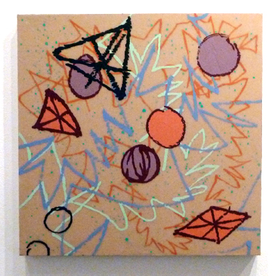
In my other painting class, we worked on an long 18″ x 48″ painting. We were told to pick three colors inspired by “regeneration”. Then, we had to mix the colors, and choose one for the background. The shapes were made with stencils that we cut out of paper which were insipred by shapes from green/red peppers. Interesting! The teacher, Adria Arch, is wonderful. I highly recommend taking one of her classes. The outcome:

It was fun to do. I’d flatter myself to think that it looked a bit Marimekko.
In my portrait class, we used colored pencils. I asked why colored pencils never seem to be in “high art”, only commercial art. Who knows??? Somehow, it’s just not seen as a fine art medium. Does anyone out there know of an artist who uses colored pencils? What do you think of his/her work? Here is my profile portrait:

I was really happy with how this turned out. This isn’t a great photo, but I think that I got a good resemblance and the coloring was decent. Maybe I should do portraiture? Only because I enjoy it so much…

Okay…the BIG surprise of this week is….
I have a small etching press!!!!!!!

CHECK. IT. OUT!!!!
Yes, it’s small. But it has a press bed of around 13″ w x 20″ l. This will take some typical sized plates and paper: 8×10 plate…9×12 plate. Ideally, I would have a bigger press. BUT…a bigger press is big $$$$. This little press was being sold by a lovely gentleman in Newburyport. It was his wife’s. I hope that he felt that it was going to a good home. I’m worried that the shoddy desk will collapse under it’s weight. I hope not. I haven’t printed with it yet…CAN’T WAIT!!!!
Filed under: painting | Tags: acrylic, art, artist, Paint, painting, portrait, self portrait, still life, visual art
My painting teacher asked us to bring in an object to paint, or “present”, in his words. I didn’t know what that meant, but it sounded intimidating. He brought over a Rauchenberg book to show me an example of what he meant when I asked him about it. Hmmm. No pressure. Setting the bar astronomically high…okay. Have I already mentioned that I love Rauchenberg’s work? I probably should have just crawled under my easel at that point, but I didn’t. Maybe if I had a stuffed goat and a tire, I might be able to sort of get within the same solar system as Rauchenberg’s work. Maybe not.
Anyway, I picked a small elephant toy that I’ve had since I was a kid. My childhood friend, Anita, gave it to me. Her dad was from India, and they went there on vacation. So, here is my little elephant…in pretty good shape if you consider how old it is…

Cute, right? He doesn’t stand up well, and tends to tip forward. I think that either his trunk puts him off balance, or his front legs are a little too short. I empathize.
So, here is my painting of this little guy:

I’m happy with it. I mean…it’s no Rauchenberg. I know. Trust me. This is what happens when you don’t crawl under your easel. I’ve always thought that still life painting was kind of…ummm…not so exciting. I gravitate towards abstract and messy art, so still lifes are so…well, still. Maybe I need to try it again? My teacher said nice things about it. Again, I know. He has to walk that delicate line of being somewhat frank, but not completely squelching me with reality. It’s only my third class, so I think that he’s still trying not to scare/offend anyone. He mentioned that three people left one of the other classes that he teaches, so perhaps he was worried about making the beginners in the class, like myself, run as well. Comments?
So, I’m still not done with this odd/icky self portrait. I know. Just paint over the whole thing and start again. My teacher suggested some abstract colored blobs to break it up a bit:

I don’t know. I’d like to help it somehow, but it might bother me too much to keep working on it. This is one of those painful confrontations with reality. I need to go out and buy a lot more titanium white to fix this thing. Maybe just getting a large tub of gesso and a paint gun would do the trick…I think that I get points for even posting it though, right? Maybe not. Sigh.
Filed under: painting | Tags: acrylic, art, artist, Canvas, charcoal, figurative, Paint, painting, portrait, visual art
For one weekend every year, my husband and I go back to where we were married…sans enfants. Thanks to the generosity of my mom who is willing to watch my son, we can have a weekend escape! I know. How lucky! We go to the place where we were married in the Berkshires. It’s SO lovely…so quiet…just the noise of the wind moving through the trees. Ahhhh. I wish that I could bottle that and bring it home. Perhaps that’s what those Bose noise cancelling headphones are like…sounds appealing.
So, I’m thinking about my next painting class coming up. My teacher suggested figurative work. I like drawing people, so perhaps I’ll like painting them too! I made an effort not to “draw” the paintings. Don’t get me wrong…I love the way that drawn lines look in a painting. I just thought that I’d try to keep my paintings truer to the medium. I basically reworked the two canvases that I had started in class. This proved to be a challenge, as both canvases were VERY textured. I mean…REALLY textured. So, it was tough to do something on top that wasn’t abstract. Here was the first one, based upon a suggestion by my teacher:

I think that you can see what I’m talking about with the “extreme” texture. Here is a close up:

Okay, it wasn’t an assemblage, but still. It was really tough to paint over that goopy surface. Anyhoo…this was kind of fun. I liked using the odd colors too. I decided to do another one:

Hmm. I layered this one a bit more, as I felt that it needed something to tie the abstract background with the portrait. Perhaps I need to be a bit more abstract with the portraits. Hmmm…
I’ve started another one, but this time…I began with a charcoal drawing on the canvas. I have also added some texture to the canvas, but it actually relates to the image, as opposed to the two paintings above. We’ll see how this one goes!

I found that the charcoal sort of smeared when I went over it with the acrylic medium, so I actually put most of the medium on the background.
I’ve also got a woodblock that I have to make some progress on. I’m not using the gourmet shina plywood, but some other plywood from Woodcraft, a store in Woburn. This is a royal pain. I’m so spoiled with the shina plywood. This other plywood splinters, is hard to cut, and is a general pain. It’s made me sort of drag my feet about carving it. I need to finish it up though! Hopefully, I’ll have some prints next week to show of it.
The opening reception for the portrait show that I have a drawing in is this Friday! So, if you are in the area…please stop by the Belmont Gallery of Art between 6-8pm on Friday. I’ll be there!
