Filed under: Drawing, painting, printmaking | Tags: abstract, acrylic, art, artist, colored pencil, etching press, klimt, painting, portrait, profile, Stencil
Today, my car said it was 32 degrees. That’s cold. I know…talk to me in February…that will seem balmy. Still, I feel like I was wearing sandals just yesterday. Not only is it cold…but it SNOWED last night. Here’s what is left on our yard:
Look at that sad little water table in the background! It can be a skating rink for squirrels.
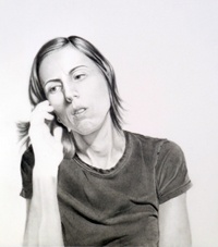
This week, I definitely made some odd stuff. I decided to dabble again with figurative work. I started by “copying” a face from a Klimt painting:
Klimt’s painting is, of course, stunning. I was just trying to study his way of rendering the face. Then, I did this one:
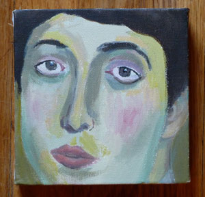
A little blurry…think of it as a “fuzzy filter” to improve the appearance. Hmm! Then the next one:
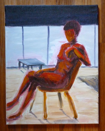
Strangely enough, that one looks a little like me. Not on a good day, of course. I showed these to my painting teacher. He said that they were “postmodern”. Hmm. I guess that means anything that isn’t “modern” pretty much. He likes modern painters, like Pollock and De Kooning. So…I think that he prefers much more loose and “painterly” paintings. That means more apparent brushstrokes, etc. As a result, I tried in his class to invent a figure painting that was more painterly:
I know. The red is a bit much. I think that I’ll try again, but with a more neutral color for the figure. It’s hard for me to paint a figure without one in front of me to look at! I know…practice, practice, practice. Detail:
He had some positive things to say…but this might have been to encourage me. He did not like the red, though. Hmm!
In my other painting class, we worked on an long 18″ x 48″ painting. We were told to pick three colors inspired by “regeneration”. Then, we had to mix the colors, and choose one for the background. The shapes were made with stencils that we cut out of paper which were insipred by shapes from green/red peppers. Interesting! The teacher, Adria Arch, is wonderful. I highly recommend taking one of her classes. The outcome:
It was fun to do. I’d flatter myself to think that it looked a bit Marimekko.
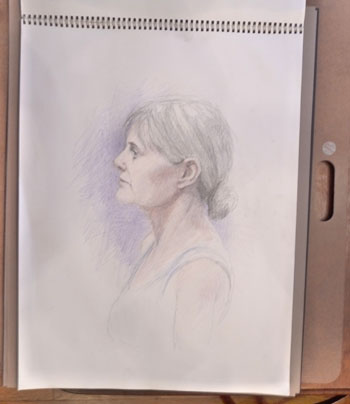
In my portrait class, we used colored pencils. I asked why colored pencils never seem to be in “high art”, only commercial art. Who knows??? Somehow, it’s just not seen as a fine art medium. Does anyone out there know of an artist who uses colored pencils? What do you think of his/her work? Here is my profile portrait:
I was really happy with how this turned out. This isn’t a great photo, but I think that I got a good resemblance and the coloring was decent. Maybe I should do portraiture? Only because I enjoy it so much…
Okay…the BIG surprise of this week is….
I have a small etching press!!!!!!!
CHECK. IT. OUT!!!!
Yes, it’s small. But it has a press bed of around 13″ w x 20″ l. This will take some typical sized plates and paper: 8×10 plate…9×12 plate. Ideally, I would have a bigger press. BUT…a bigger press is big $$$$. This little press was being sold by a lovely gentleman in Newburyport. It was his wife’s. I hope that he felt that it was going to a good home. I’m worried that the shoddy desk will collapse under it’s weight. I hope not. I haven’t printed with it yet…CAN’T WAIT!!!!
Arlington Open Studios was this weekend. WHEW! I am TIRED! It was a great experience, albeit exhausting. I really enjoyed talking to the people who stopped by to see my work. It felt good when someone wanted to look through every print that I had. It felt even better when someone wanted to buy a print! I mostly sold greeting cards that were hand printed. This makes perfect sense, as they are much more affordable than an actual print. I did sell a few prints…but mostly to my friends. 🙂 (thank you!) Thanks also to all of you who stopped by to say “hi”! I really appreciated it! This was the first time that I have had a good chunk of my work all together. Granted, this was only my printmaking work. I wonder how it would have gone if I had incorporated my drawings? Hmm…
So, I have a relief print of the local theater in Arlington. You can see it on the table in the picture below. It was a very popular print for people to stop and look at, as it’s a local icon. No one purchased it, though, as it is hand printed and an edition of only 3. Thus, the price for each is over $100. I’m thinking that perhaps I should make computer prints of this image, as I’m sure that a more inexpensive option would have sold. Maybe even T-shirts and mugs? Hmmm. I was trying to keep this fairly “art” focused, not “commodity” focused. I mean that I was selling originals, not reproductions. Any comments out there on this idea???? I noticed that an artist who has watercolors was selling reproductions of his originals. They were still over $100 each, so I wonder how well they sold. Hmmm…thoughts?
Here are some images of my set-up:
another:
last one:
I’m pretty happy about the set-up. I was trying to be really frugal, and not spend more than I needed to. Most of the cost was spent on packaging the prints. Unlike paintings, you can’t just hang bare prints up. They are too delicate and likely to get creased or marked. So, that was an expense packaging them. Other than that…the baskets I already owned…the table was borrowed…the boards in the back were rotting in our garage, and I “repurposed” them as part of my display, etc. Not bad, right? Next time, I’m going to make my display taller. When we had a meeting before the open studios, the artists behind me were concerned that my display would block people’s views to them past me. WELL…look at the enormous set up behind me! Next year, I know not to worry about that kind of thing, as no one else seemed to let that hinder them.
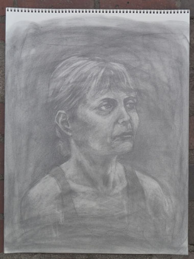
Beyond the open studios, my classes have been going well. I really enjoyed my portrait class last week, as we were working in a “subtractive” way of drawing. This means that the paper was made darker by a coating of powdered graphite. Then, in order to get highlights…I erased the graphite and exposed the white paper. Here is the drawing:
I was happy with this. A close up:
It’s a nice way of working, as the midtones are already there for you. I might have to pick up some of that powdered graphite.
My painting classes are a bit of a mixed bag. In one of the classes, we had a model to paint from. This is what I did:
Please excuse her face. I need to rework that IMMEDIATELY. Anyway, my teacher liked this, but I wasn’t so sure. I liked the charcoal drawings that were in the background. I painted over them and incorporated them into the painting. I’d like to be a bit more abstract with what I do. It’s hard for me not to try to draw the model, as I did in the portraits above.
My other painting class was fun and messy:
That was really fun to make. Not so rigid, right?
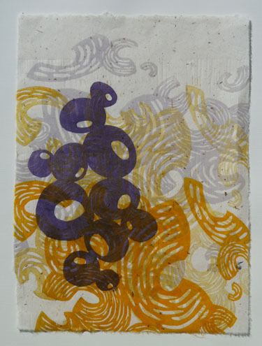
My prints from my printmaking class were not stellar:
The color palette was not good. Any time that I see yellow and red together, I can only think of McDonalds. Grrr. I have a new block, which is the fine, squiggly lines. I’m not sure if I’m crazy about it. I need to play with it a bit more to see. It might be too “even” for my taste.
So, has anyone out there participated in an open studio? How did it go for you, and what did you learn from it? I learned that having lots of lower priced items will help sales. I also learned that some people are receptive when you say “hello!”, and others want to be left alone to look. It’s a challenge trying to gauge which approach to use with a person. My favorite was when someone grabbed some candy as they walked by my table and were looking at the display across from me. Seriously! I think that if you are going to help yourself to the candy that someone is offering, you at least owe the person a smile and some eye contact. Right? A FASCINATING weekend of studying human nature…Thanks to everyone who stopped by and did chat with me!
I feel like I haven’t posted in AGES. I’ve been working on getting my prints ready for open studios this next weekend. It’s amazing how much work goes into participating in one of those things. You think that you just need a table and the art, but it takes more than that. I think that the next post I do will be AFTER the event. I’ll let you know how it goes. If you’re local to MA, here’s a link to the event. I’m still packaging prints, figuring out pricing, deciding how to display, etc. etc.
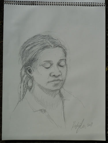
My portrait class actually met last week! I was thrilled. It was going to be cancelled for low enrollment. Then, when I was at the first class, someone actually left after an hour because they thought that the class was going to be too complicated. NOOOO!!!! So, there’s only TWO of us taking the class, now! I hope that they don’t cancel it. I love drawing people. Time just slips away when I’m doing it. Here’s one of my drawings from that night…done in 45 min/1 hr.:
I’m generally happy with it. I was using a 6B pencil on charcoal paper. I actually recognized the model. She must do this for lots of art classes!
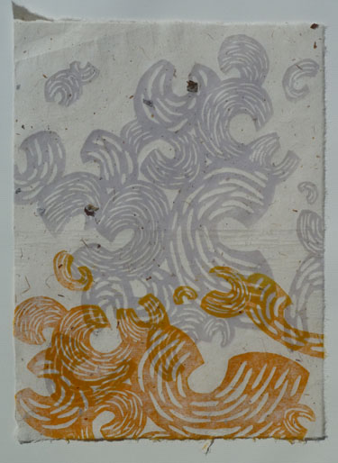
I’ve also done some prints from my woodblock class. I was working on a piece of really difficult plywood for this block. It was impossible to cut…the wood splintered so easily…and it made the process a general pain. No more. My teacher said that wood like that is generally why people don’t like making woodblocks for printing. I couldn’t agree more. I’m only going to use the shina plywood from now on. Here are the prints from that night:
I liked this one below the best:
It’s really interesting paper…filled with all sorts of bark and other fragments in it. I loved it.
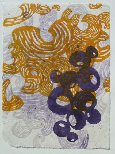
And another:
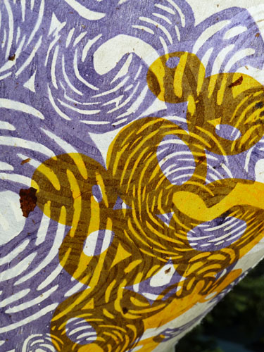
Okay, I held one of the prints up to the sun, so that you can see how transparent the paper is:
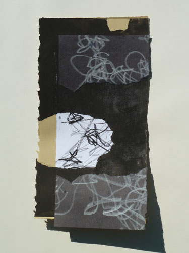
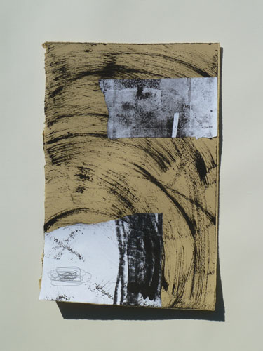
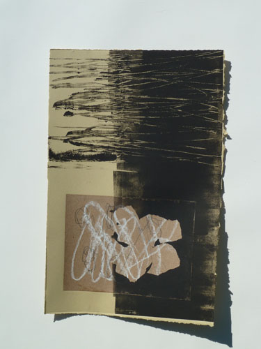
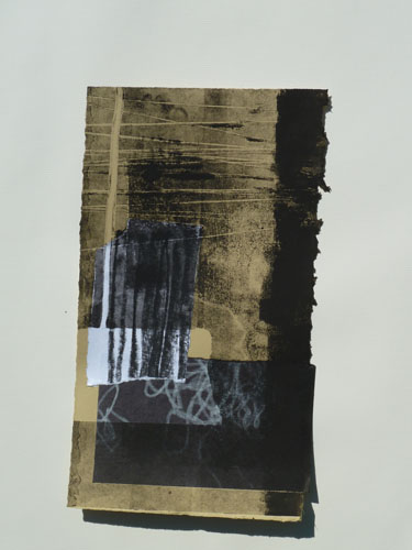
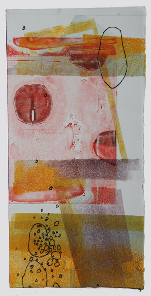
I also dropped into a drawing/printmaking class taught by Deb Putnoi in Brighton, Ma. It was very fun! Lots of messy drawing and printmaking combined. Here are the assortment of prints from that class:
You’ll have to excuse the shadows, as the prints are all really curled for some reason…
I liked that one above. Next:
Next:
That one above has a good bit of collage in it too…next:
Next:
Next:
I really liked the limited palette. It was fun to be more “messy” and casual with the printmaking. Printmaking can be SO fussy. It just depends on how you want your prints to be. Traditionally, they should be pristine…no thumbprints allowed and with perfect plate registration. So, it’s fun to throw all of that out the window and just be more casual.
Okay…wish me luck with open studios! I may have a bowl of some kind of candy on the table to entice visitors. I suppose something that melts and becomes sticky or chocolatey would be bad. No rice krispy treats or candy bars. Come by and say “hi!”.
Filed under: Drawing, printmaking | Tags: art, artist, Center for Contemporary Printmaking, drawing, portrait, printmaking, visual art, woodblock printing
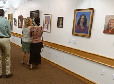
So, this past Friday evening was the opening to the portrait show that I have a drawing in! It’s really VERY low key…but I was excited nonetheless. The show is titled, “See You, See Me: The Art of the Portrait”, and it’s at the Belmont Gallery of Art until November 13, 2011. Here is what some of the works looked like in the first room:
See the two women standing in front of a large painting? The woman on the right is the artist of that painting, and it was so amazing. It appears to be a portrait of her daughter looking at picture books in a sunny, but dark, room. It’s an oil painting, and she’s clearly a talented painter. Her name is Noriko Fox, and here is her website.
This is the room where my drawing was…you can see it on the back wall…just to the left of the guy in black:
closer…
Here it is!
Here is the funniest thing…So, I had to put a title on this drawing. I did not know the name of the model, nor did I know any possible way to find out his name. So, I made up a name…”Michael”. He just looked like a Michael to me. I just didn’t want to call him “Man”, or “Portrait”. WELL…would you believe that there was someone else who had also done a portrait of him? I am not kidding! Of course, she had his correct name, which is “Dan”. My friend, Janet, came to see the show and recognized him and confirmed that his name is really Dan. Sigh. If only I knew that! At least we both did a good job creating a likeness of him, as pretty much everyone recognized that it was the same person!
Some other good news this week is that I sold three prints from the show at the Center for Contemporary Printmaking in Norwalk, CT! I was really happy. Only one of my prints was selected for the official show, but the other two prints were in binders with all of the other prints that didn’t make the cut. However, someone bought not only the one officially in the show, but the other two as well! Not the same person, I’m sure.
My last bit of good news is that my basement workspace is finally furnished, and I’ve moved in! I will show you a photo at some point, but it’s a bit messy right now. I’m preparing for the Arlington Open Studios, so I haven’t had much time to really organize it. I’ve been trying to make progress on packaging all of the prints that I plan to bring to the open studios. Mark it on your calendar! October 15 & 16 from 12-5pm at the Arlington Center for the Arts. I’ll be in the big auditorium space.
Here is part of a woodblock that I have been working on. This was printed by hand, but I’m hoping to print it with a press on Monday. I’ll update you on how it turned out!
Filed under: painting, printmaking | Tags: absract, art, artist, Paint, painting, printmaking, visual art
So, today was my last open print studio at Cambridge Adult Ed. It was great to spend time with Paula and Cindy (hello, if you’re reading this!!!). They are both accomplished artists, so I look to them for advice and suggestions. Today, Paula suggested that I try to incorporate my drawing skills (limited), with the abstract work that I am so interested in. As I struggled to think of something to “draw” today, I just looked around the studio for inspiration. We share the printmaking studio with clay, jewelry, and…woodworking! So, my subject today turned to the drill press. Yes…inspiration can truly be found anywhere. Here was my first print:
That’s slightly wonky, right? Anyway, when I did it in studio…I was not impressed. But now that I look at it again, it’s kind of interesting. Cindy remarked how one’s frame of mind really affects how we view our artwork. Old watercolor paintings that she had previously set aside were better than she remembered when looked at anew. Distance makes the heart grow fonder? Maybe. The second one:
I can’t really make a series about drill presses…as those are the only two that they have! Maybe a power tools series in general would be interesting…not sure what that’s all about.
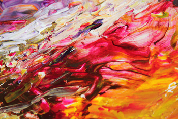
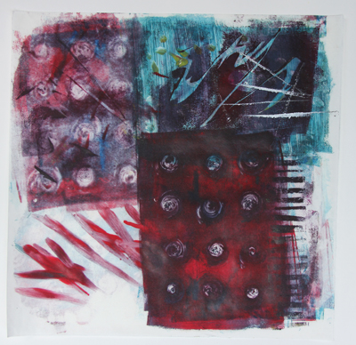
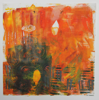
I also worked on some VERY messy paintings. These were very fun…albeit a big mess. Here is the first one:
I know. Garish colors. I kind of like garish colors, though. I feel like that person on the current season of Project Runway who feels compelled to “BEDAZZLE” everything. If only I’d had some glitter… a detail:
Messy fun! Then, I did ANOTHER messy one. Seriously. You’ll see…blobs of paint everywhere…
I know…right? Another “hot mess”. Another Project Runway reference…I need to get a life. Detail:
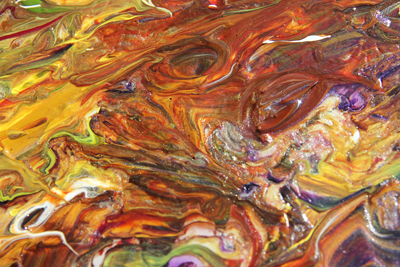
Then I decided that less is definitely not more, so I did ANOTHER super chaotic one:
I know that if I was at school, a teacher would have taken away my paints by now. Boo!
Detail:
Doesn’t it look like the melted ice cream in the bottom of your bowl when you have slathered on a grotesque quantity of colored sprinkles? By the way…what ARE sprinkles anyway? Have you ever eaten them straight? They’re disgusting. Like little wax chips…and the chocolate ones are no better.
Okay…so tell me the truth about the messy “paintings”. (notice that “paintings” is in quotes). What do you think? Keep the messy stuff for when I’m eating ice cream only? Should I put away my paints permanently? Should I have my artistic license revoked? Hmpfh.
Wish me luck on that portrait show. I’ll break the good/bad news to you when I find out myself!
Filed under: painting, printmaking | Tags: abstract, acrylic, art, artist, monotype, painting, printmaking
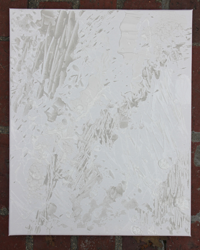
So, I started a new class. It’s called “Supercharged Painting”. VERY fun so far. Lots of messy, gloppy stuff. This week, we were playing around with acrylic mediums to create texture in our work. So, I have two canvases that I started…but there is no color yet. I kind of like them plain…but they won’t stay that way! First one:
It’s hard to see in a photo, but these blobs are different textures…some gritty…some smooth…
In Christian Siriano’s words…it does look like a “hot mess”. That’s okay. It will get worse…trust me… :p
The other canvas:
I think that I upped the contrast on this image too much, but you get the idea. Big blobs! What fun!
Most of the other students in the class are “regulars”. There are only a few of us that are new. The “regulars” all know what they’re doing…and it was sooo great! It’s so amazing to be surrounded by so many talented artists! I loved watching them work. When I find out their names (beyond their first name), I can put some links in my posts so that you can see what they are doing.
Last week, I had a so-so time in the print studio. A motley array of prints:
Hmmm…
I liked some of the color combinations in that one…
Here are others more on the theme of what I did last week:
And the other:
Those prints get a sustained, “hmmm”, from me. Comments? Thoughts? This week’s class will probably be my last one for the year. Let’s see what happens!
I had coffee with a local artist, Regina Valluzzi. Please check out her work. She is really having some great success, and was so kind in making suggestions for me. We weren’t discussing our artwork, specifically, but were just talking about the local art scene. She’ll be at the Arlington Open Studios (as will I) in October. Please stop by and see her work firsthand! She currently has a show at the Blue Glass Gallery in the lobby of the Hancock tower in Boston. Go see it!
Filed under: printmaking | Tags: abstract, art, artist, Jacob Hashimoto, print, printmaking, visual art
I was lucky enough to get to go to the print studio today, thanks to my mother who watched my son for me. There were only three of us there, so we REALLY spread out. When given the chance, printmakers are like molasses…oozing out in every direction, taking up more and more and more space. I guess in the “heat of the moment” while working on a print, you just grab any space you can get to put something down, or to work on. The more plates that you work with for a single print also means that you need more and more room. ANYWAY…it was a great luxury today to be there and to have so much room.
I felt that it was a productive day. Some days, I’m just off and the whole thing becomes so frustrating. This day was better…probably because the studio was quiet and roomy. It’s hard to think when it’s crowded, there is a line to use the press, and you have no space to work. Here is the first print that I did:
Not my favorite…it wasn’t going well, and then I added the thin, black layer. This helped. I may have to revisit this one…but I’m going to leave it alone for now. Next:
This one was also just okay…I like the bright colors, but the textures did not turn out as I had hoped. It was a bit of an experiment, so I learned a bit…well, a bit of what didn’t quite work. The black helped this one too. Next:
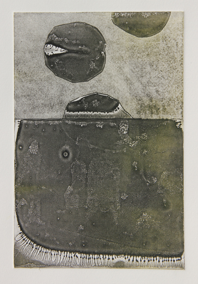
I like that one, and it was a bit of a happy accident. This was what was left on one of my plates from working the previous prints. Odd, right? The textures are delicate and interesting. Maybe I can get better at this, and fine tune it a bit more. Next:
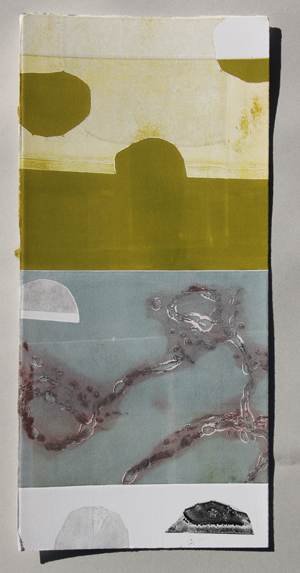
So, I ran out of paper, and started to use these long scraps that I had. It was fun to do the full bleed printing and the vertical format. These three vertical ones work together well…a classmate suggested that I keep going with this series…
I like that one too.
I realize now that I should have taken a picture with all three together. So, I’ll mash them together in photoshop, instead:
Hmmm! Maybe I should keep going with these. They would also be fun to turn into an artist book. I’d love to do that. Maybe that’s what I’ll work on next time…
Comments? Artists that I should look at?
Here’s an artist that EVERYONE should look at. Check out Jacob Hashimoto. I WORSHIP his work. So stunning…I have yet to see it in person, but I hope to do so some day. Has anyone seen his work first hand? If so, tell me what you think!
So lovely…
Filed under: painting, printmaking | Tags: Acrylic paint, art, artist, gelatin printing, gouache, Ink, Paint, painting, portrait, print, printmaking
I spent the morning doing some gelatin printing. I’m not sure that I’m a huge fan of this type of printing. I was also testing out different inks and paints to see which worked best. I think that the Akua inks worked well, as they don’t dry until they are on paper. The acrylic paint and the speedball ink were both just so-so. The only problem with the Akua ink is that it does take an eternity to dry. I’ll probably still be wiping blue off of my hands every time I pick up one of these prints. Here’s one of the first ones:
Eh…feh…blech…some interesting aspects to it. I like how the silver ink turned out in the lower left corner. Next:
Also kind of interesting. These are printed on some very thin mystery Asian paper that I have. The art store in Cambridge had rolls of random paper for sale…10 sheets for $5. What a bargain! So, this is why I don’t know what the paper is. Next:
I experimented with a stencil a little. That’s where the leaf shape comes from. Next:
I liked the random stamped lines in the lower left area. Next:
I like the greenish yellowish color with the greenish blue color. Any comments? Does anyone out there also do gelatin printing? What inks do you like to use? Do you have any pointers for me?
Last night, I kept myself up doing a gouache painting. Okay…It was VERY frustrating. I have seriously debated showing this at all, as it looks bizarre…but here it goes:
See how small I made the picture? Maybe it’s still too big. Anyway, I know that this looks really weird. He looks like he has a skin condition. DRAMATIC SIGH. I painted this based on a photo. Hmm…while I like the challenge of painting or drawing people…it also is rather daunting. I’m going to need A LOT more practice before I start doing this on the streets of New York…
I am the monitor for the print studio in Cambridge on Friday. As a result, I’ve needed to come up with what I’m going to do during that time. So, I have tried a little experiment. I painted gouache onto two 8″ x 10″ sheets of plexi. I’m going to see if they print onto damp paper. Here’s the first plate:
Kind of fun. The bubblegum pink is a bit much, but I’ll see how it prints. Here is the other one:
These are really an experiment. I hope that they print. If they don’t, I’m going to be disappointed.
So, where am I going with all of this? Who knows. I’m going in every direction at the same time. Let’s hope that some of this eventually leads somewhere!
Filed under: painting, printmaking | Tags: abstract, art, artist, Center for Contemporary Printmaking, nature, painting, printmaking, watercolor
So, I finally visited the “8th Biennial International Minature Print Exhibition” at the Center for Contemporary Printmaking in Norwalk, CT. Why did I go? BECAUSE…I actually have a print there! Yes! My first juried exhibition…so I had to go and see it. I do not plan on doing that drive regularly, as it was around 3 hours each way. ANYWAY, here is what my print looked like on the wall:
Not bad, right? Notice the little red dot? THAT MEANS THAT SOMEONE BOUGHT ONE! I’m not kidding. My first sale! I’m very excited. Here is my print on the wall with other prints:
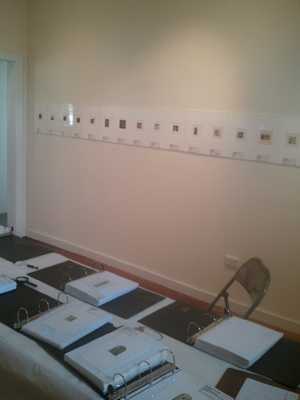
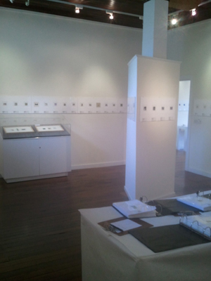
I think that mine is the 10th one from the left. Prints that were not “wall worthy” went in these binders in the foreground. So, there were so many amazing prints to look at! Here is another view of one of the rooms of the show:
Not bad, right? I have not entered another competition…so perhaps I should get on that and see what’s available.
My classes are over, so I have no more access to a press for printing. This was one of my last prints:
Hmmm. What do you think???? I was sort of blaise about it…but my printmaking teacher seemed to really like it. Comments?
I’ve also done some random watercolors (actually gouache)…but I think that it just isn’t my thing:
and:
Hmm. Just hmm.
I’m trying to decide on classes for the fall. This is always tough, as everything sounds great…but there is only so much time and money. BTW…I ALMOST have a workspace. The basement renovation is nearing completion! I can’t wait…
Filed under: printmaking | Tags: art, artist, lithography, print, printmaking, pronto plates
So, I just finished up a one-day visit with Annie Silverman, a printmaker in Somerville. She is holding a four-day intensive, but I could only attend for one! Anyway, she sometimes uses pronto plates in her printmaking. I had a tutorial last year in using pronto plates for printing, but I still felt that it was somehow more difficult than it was supposed to be. So, I was really excited to take Annie’s class, and to get another try at learning this type of printing.
Pronto plates, or “polyester plate lithography”, is a sort of poor man’s lithography. Real lithography uses a massive stone…marks are made on the stone, the stone is wet, ink is rolled on the stone, then paper is laid on top and the whole thing is run through a litho press. Pronto plates are thin, plastic-like sheets of paper that you can mark on in the same way as you’d mark a litho stone, but you can easily run these thin plates through a typical etching press. I have also printed them by hand at home, but this is obviously less successful than with a press.
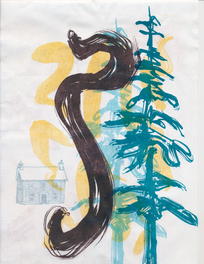
ANYWAY, this type of printing can be fun and “collage-like”. You can keep layering on the images. Here are some of my things from this tutorial:
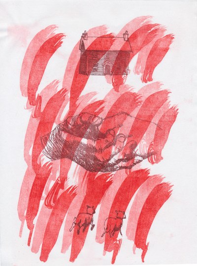
You’ll see a repeat of the imagery throughout these prints:
This next one needs more:
Next:
Next:
Next:
Next:
Last:
My teacher liked the last one. I tried to be a bit restrained, and I think that it turned out well. Some of the marks were made from an ink drawing that I scanned…some were from floor wax…some were from a pen drawing…and some were from a ballpoint pen. Interesting, right?
This is actually the second time that I am writing this post, as wordpress decided to throw out 75% of the post the first time that I wrote it. Grrr. Technology…grrr.
So, what do you think of these prints? Thumbs up? Down? More sheep needed????
